Animated banner tutorial
How to make this banner...

Made in PS CS1 and ImageReady. The banner part, I believe, it's perfectly translatable. Not sure about the animation part.
Warnings:
Long, no dial-up friendly tutorial! (I suppose...I have no dial-up)
I'm no expert, I'm just describing what I did. If you know an easier way, please share =)
It may content weird use of English...if you don't understand the terms, use your imagination - or ask (that's maybe better)
For
lancelotfan =)
We'll start with the banner. I made a new document (400x170px) and dragged my cap (from http://www.walkingindaydreams.com/.) into it. Do the usual stuff -sharpen, blur, screen- according to your pic and liking. My pic's not centered, doesn't matter, won't be noticeable in the final result.
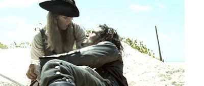
-Make a new layer. Fill with E3E8AE. Set to soft light.
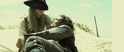
-Make a new layer. Fill with 070E33. Set to exclusion (surprised you there!)
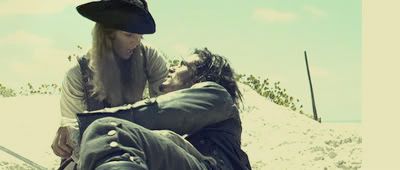
-Curves layer...should look like this.
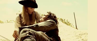
-Green photofilter layer 25% density
-Selective colour layer (could skip this step in fact...I used the same file for all the banners and this must have been for other pic...it just enhances the reds a bit in this case)
reds -35 +2 +8 0
yellows +2 +15 -1 0
greens +100 0 -12 0
blues +100 0 -12 0
magentas 0 0 -100 0
-New fill layer DCE2DE. Set to colour burn 100%
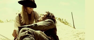
-Add this texture by
lovelamp. Set to multiply 100%
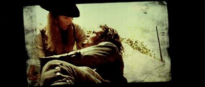
-Now we add the polaroid texture, from stock.xchng, resize it to your liking. Set it to hard light. Right click, blending options, drop shadow.
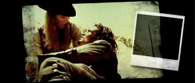
-New layer, fill with BAE3B6. Set to soft light 100%
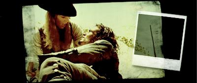
-Grab this texture by
lovelamp. Duplicate, mirror, merge, set to softlight 100%
-Add this texture by
gender, linear burn 100%.
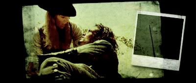
-I used a mixture of textures from this set by
lovelamp, I selected parts of them with the marquee tool, went to layer >new>layer via cut, moved them around, deleted bothering parts, set to screen, linear/colour burn or multiply.
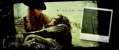
-Grab a blurred brush and paint some shade on the left side of the banner. Set to linear burn 60%
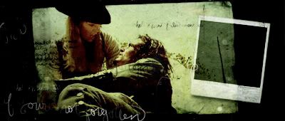
Flatten image.....and we are done with the static part...
Note: I saved the right pics with the right colouring..and when I uploaded them on photobucket, they look terribly greenish! no clue how to fix it... I could upload them again on ImageShack and replace the links to see if they work, but ermm...I'm lazy. Pretend they look like the original.
Onto the animation now =)
My caps are from the DMC trailer. There are many ways to get the caps...you can open the .mov or .avi file in ImageReady, then you'll get a window asking you to select what part you wanna open...or you can make one by one yourself, put them in a folder together (in order, of course), open IR, go to file>import> folder as frames. Either way, you'll get your animation up and running in IR. We'll just use IR to get the caps in order, we need to go to PS to resize, etc. Hit this button and we'll get to PS.

Open the 400x170 banner and drag it on top of all the animation layers. With the lasso tool cut out the polaroid, so you only keep the frame. Link all the animation layers (11 in my case), scale and rotate.
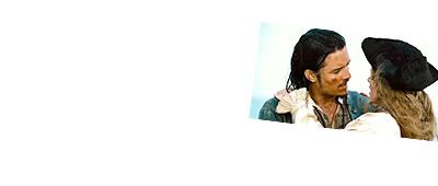
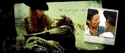
-We could be done by now, but there's too much contrast between the images so select the last layer of the animation and make a new levels layer:
Green
input levels 0 1,13 25
output levels 0 255
Blue
input levels 0 0,96 255
output levels 0 204
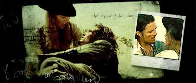
-Grab this icon texture by
dusty_memories.. Rotate and set to multiply.
-Grab this texture by ??? (lemme know if you know) and set to multiply linear burn.
-New brightness contrast layer
contrast +12
So now we see this:
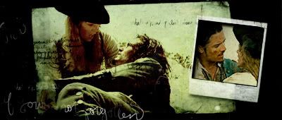
Do not forget to always keep the banner layer on top of all the rest!
We go back to IR...
Can happen you won't see your frames...so click the tiny arrow on the top right side of the animation window and select make frames from layers.

You can delete the texture frames on the animation window, we won't need them there...select the frames and click the rubbish bin button.
Note: I forgot to select the banner itself in the screencap (frame #16) You should delete that too.

Now we have to paste the banner to every frame...select the banner layer and right click. Select match, then tick all rollovers. The banner will appear in every frame. Repeat this step with the 2 icon texture layers, the brightness and levels layers (make them visible if they are not). If you decide you do not like the effect, you can do it again by turning the layer off.


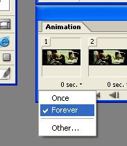
To make the animation run in a loop, make sure it's set to forever. In this case, I went to the last frame and changed the time to 0,5.
To adjust the size of the file, go to window and tick optimize. The optimize window will appear. Tweak with the settings, colours and dithering and you'll get different variations (ie if you select 2-up, 4-up) In this case I didn't need this 'cos I had no restrictions with the size. I clicked on the arrow on the optimize window>optimize to file size>600.


Go to file>save optimized as and you'll get your gif!
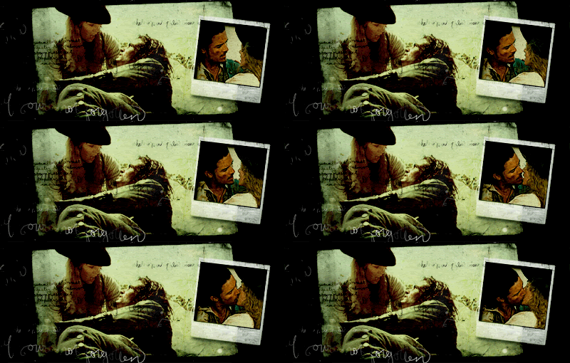
For more examples with the same tutorial go here.
If you found this useful, drop me a line! I'd like to know what you all think =)