Icons! Tutorial #8 - Gossip Girl
In my last icon post I said I'd take tutorial requests. misty_writes asked for one for a Gossip Girl icon, so I've delivered.
I had to re-create this from memory and by trial and error as I didn't keep the psd for the icon, but it came out pretty damn close to the original! I know this isn't how I created the original, but that just goes to show that there's more than one way to get to a result!
If anyone else would like a tutorial I'll do my best to get it posted for you, just ask!
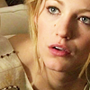
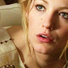
Go from this: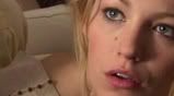
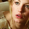
to this:
01) I resized the image to about 300px wide to get the base I liked. I never actually crop an image anymore; instead I like to be able to move an image around once I get it in my 100x100 to see what catches my eye.

02) Duplicated the base and set to soft light.
03) Duplicated the base again and set to screen on top of the soft light layer. So base --> soft light --> screen. Then I sharpened the screened layer. This is generally what I always do but depending on what sort of quality the image is in to begin with I might have to sharpen the soft light layer for LESS sharpening or BOTH the soft light and the screen layer to get it where I like it. I like well defined features in an icon so I'm a big fan of sharpening.
04) The image was too pink/red for my liking. It looked a little like the blue and red levels of selective colouring had already attacked the icon so I went to image --> adjustments --> variations next. This part is really trial and error. I played with the yellow, blue, greens and cyans a bit and threw in a little red. Since doing this step this way will only apply to the top layer it's going to be a much subtler effect than what it shows on the image while you're doing it. This is where edit --> fade variations comes in handy. I don't use the variations tool ALL the time or as often as I could so there's probably a better, easier way to do it on its own layer but I am not aware of it right now.
05) I applied this gradient next as a gradient map: and set it to soft light. I used it twice in a row, both set to soft light.

-->
-->
06) Next I used a selective colour layer. There's no point posting the exact numbers I used for the different levels because they won't look the same on any other icon but I'll tell you what I adjusted and why.

Under RED I adjusted the red level only, to try and keep the colour on Serena's lips and cheeks, but just a little.
With YELLOW I played with the reds VERY little, upped the yellow a bit because of her hair and dress but reduced it overall by bringing the black level down just a smidge, to make it less over powering.
I used the WHITE colour the most. I didn't up the black level, as I usually do to make white parts of icons look less washed out, instead I reduced it a bit to make her skin smoother and paler. I also upped the cyan and blue levels JUST A BIT. Tinting someone's skin blue/cyan to an unnatural level washes the icon out and makes them look like they have frostbite to an extreme degree. Using it on the right images can highlight lighter parts, especially parts of people turned to the light, and contrast against the more coloured/darker parts of the icon.
Finally, I used BLACK and upped the black slider enough to make the darker parts of the icon... well, darker, and I moved the cyan slider to the red side a little, to take the edge off the black parts.
07) Finally, I ended with a brightness/contrast layer. I LOOOOOVE the brightness/contrast layer. A lot. I only upped the contrast a little, just enough to make the details of the dress a bit sharper. And lo, the finished product!
I had to re-create this from memory and by trial and error as I didn't keep the psd for the icon, but it came out pretty damn close to the original! I know this isn't how I created the original, but that just goes to show that there's more than one way to get to a result!
If anyone else would like a tutorial I'll do my best to get it posted for you, just ask!
Go from this:
to this:
01) I resized the image to about 300px wide to get the base I liked. I never actually crop an image anymore; instead I like to be able to move an image around once I get it in my 100x100 to see what catches my eye.
02) Duplicated the base and set to soft light.
03) Duplicated the base again and set to screen on top of the soft light layer. So base --> soft light --> screen. Then I sharpened the screened layer. This is generally what I always do but depending on what sort of quality the image is in to begin with I might have to sharpen the soft light layer for LESS sharpening or BOTH the soft light and the screen layer to get it where I like it. I like well defined features in an icon so I'm a big fan of sharpening.
04) The image was too pink/red for my liking. It looked a little like the blue and red levels of selective colouring had already attacked the icon so I went to image --> adjustments --> variations next. This part is really trial and error. I played with the yellow, blue, greens and cyans a bit and threw in a little red. Since doing this step this way will only apply to the top layer it's going to be a much subtler effect than what it shows on the image while you're doing it. This is where edit --> fade variations comes in handy. I don't use the variations tool ALL the time or as often as I could so there's probably a better, easier way to do it on its own layer but I am not aware of it right now.
05) I applied this gradient next as a gradient map: and set it to soft light. I used it twice in a row, both set to soft light.
-->
-->
06) Next I used a selective colour layer. There's no point posting the exact numbers I used for the different levels because they won't look the same on any other icon but I'll tell you what I adjusted and why.
Under RED I adjusted the red level only, to try and keep the colour on Serena's lips and cheeks, but just a little.
With YELLOW I played with the reds VERY little, upped the yellow a bit because of her hair and dress but reduced it overall by bringing the black level down just a smidge, to make it less over powering.
I used the WHITE colour the most. I didn't up the black level, as I usually do to make white parts of icons look less washed out, instead I reduced it a bit to make her skin smoother and paler. I also upped the cyan and blue levels JUST A BIT. Tinting someone's skin blue/cyan to an unnatural level washes the icon out and makes them look like they have frostbite to an extreme degree. Using it on the right images can highlight lighter parts, especially parts of people turned to the light, and contrast against the more coloured/darker parts of the icon.
Finally, I used BLACK and upped the black slider enough to make the darker parts of the icon... well, darker, and I moved the cyan slider to the red side a little, to take the edge off the black parts.
07) Finally, I ended with a brightness/contrast layer. I LOOOOOVE the brightness/contrast layer. A lot. I only upped the contrast a little, just enough to make the details of the dress a bit sharper. And lo, the finished product!