Icons! Tutorial #9 - Claire from 'Lost'
If you ever have any questions about how I make my icons or wish to see a tutorial on a certain icon, comment to ask and I'll see what I can do. Sometimes I forget how I made something but I'll always give it a go to see what I can come up with.
As I said in my last icon post I have textures to post and I'm working on icons for other people, but last night I wrote up a quick tutorial since I liked the way this turned out.
This is a Claire from Lost tutorial, made in CS3. It's super simple, super short (five steps!) AND has no selective colouring. Whee!
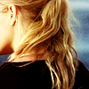
Go from
-->
Please be aware that because I've written everything in this tutorial out, step-by-step, I WILL NOT give out a psd. The BEST way to learn how to use your graphics programme and how to make icons is to experiment. Take the steps of this tutorial and incorporate them into what you already know to add your own spin on it.
01) I resized the main image and dragged it over to my 100x100 image to futz with the placement. This image is a bit limited with the focus, which also forces you to look at different ways to position the image. I could have focused on her face but the majority of the cap is her back and hair. It's sort of an obvious choice but, at the same time, a lot of people would rather focus on her face.
That's why I prefer resizing the main image and then dragging it to the icon. You can drag it all around and try a bunch of different positionings without having to crop the image every time.
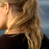
02) Often times I duplicate the image twice, set the second layer to soft light and the third to screen. This time I set the second layer to multiply and the third to screen. This is because the image is already very light and her blonde hair and light skin would have been too bright and harsh if I'd gone with a soft light layer. Multiply under a screen layer is a nice balance without the sharp angles a soft light layer can bring. Try it out on your next icon and play around with the positioning of the layers.
I sharpened the screened layer.
base --> multiply --> screen (sharpened)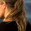
-->
03) I added a gradient map next. I've said this in tutorials before but gradient maps? ARE THE SHIT. I often set mine on soft light to add colour subtly, although experimenting with other gradients on different modes can result in amazing things. I keep meaning to do up a gradient map tutorial, of sorts, but I've been distracted.

-->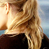
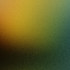
04) Next I added a texture by cielo_gris next, set to soft light. Soft light is my icon bff, I swear. I love light to dark textures for the contrast they add to the images. Here the yellow in the icon highlights her skin and the side of her face that you can't see, and bleeds into her hair. The green just settles into the darker parts of her hair and shirt without affecting the colour too much. If it had, though, I probably would have tried to mask it out so it didn't look too weird or unnatural.
-->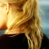
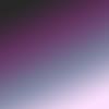
05) The icon was a little too yellow for my liking. I could have tried to tone it down with selective colouring and counterbalanced the yellow with some reds and blues, maybe, but instead I went back to gradient maps, again set on soft light. I sometimes just click around in my gradients and see what does what with the light and angles of the image I have. The best happy accidents happen like that, as it did with this one.
-->
The final result is a little darker and redder than I might have normally gone but the difference between the textured result and the one with the extra gradient map was satisfying to me. The darker purple colours tightened up the edges of her face, the details of her ear and hair. The overall look I was going for turned out well, I think, the hair being the focus.
See my other tutorials here.
As I said in my last icon post I have textures to post and I'm working on icons for other people, but last night I wrote up a quick tutorial since I liked the way this turned out.
This is a Claire from Lost tutorial, made in CS3. It's super simple, super short (five steps!) AND has no selective colouring. Whee!
Go from

-->

Please be aware that because I've written everything in this tutorial out, step-by-step, I WILL NOT give out a psd. The BEST way to learn how to use your graphics programme and how to make icons is to experiment. Take the steps of this tutorial and incorporate them into what you already know to add your own spin on it.
01) I resized the main image and dragged it over to my 100x100 image to futz with the placement. This image is a bit limited with the focus, which also forces you to look at different ways to position the image. I could have focused on her face but the majority of the cap is her back and hair. It's sort of an obvious choice but, at the same time, a lot of people would rather focus on her face.
That's why I prefer resizing the main image and then dragging it to the icon. You can drag it all around and try a bunch of different positionings without having to crop the image every time.

02) Often times I duplicate the image twice, set the second layer to soft light and the third to screen. This time I set the second layer to multiply and the third to screen. This is because the image is already very light and her blonde hair and light skin would have been too bright and harsh if I'd gone with a soft light layer. Multiply under a screen layer is a nice balance without the sharp angles a soft light layer can bring. Try it out on your next icon and play around with the positioning of the layers.
I sharpened the screened layer.
base --> multiply --> screen (sharpened)

-->

03) I added a gradient map next. I've said this in tutorials before but gradient maps? ARE THE SHIT. I often set mine on soft light to add colour subtly, although experimenting with other gradients on different modes can result in amazing things. I keep meaning to do up a gradient map tutorial, of sorts, but I've been distracted.

-->

04) Next I added a texture by cielo_gris next, set to soft light. Soft light is my icon bff, I swear. I love light to dark textures for the contrast they add to the images. Here the yellow in the icon highlights her skin and the side of her face that you can't see, and bleeds into her hair. The green just settles into the darker parts of her hair and shirt without affecting the colour too much. If it had, though, I probably would have tried to mask it out so it didn't look too weird or unnatural.

-->

05) The icon was a little too yellow for my liking. I could have tried to tone it down with selective colouring and counterbalanced the yellow with some reds and blues, maybe, but instead I went back to gradient maps, again set on soft light. I sometimes just click around in my gradients and see what does what with the light and angles of the image I have. The best happy accidents happen like that, as it did with this one.

-->

The final result is a little darker and redder than I might have normally gone but the difference between the textured result and the one with the extra gradient map was satisfying to me. The darker purple colours tightened up the edges of her face, the details of her ear and hair. The overall look I was going for turned out well, I think, the hair being the focus.
See my other tutorials here.