TUTORIALS!
twinsfan33 requested coloring tutorials for these:


These all deal with the same basic coloring techniques so I'll be making icons that correspond pretty closely with them. I don't keep .PSDs but I tend to make batches of icons in the same way for a bit.
ANYWAY I'll be making these:

In PSP but are completely translatable.
TUTORIAL: JOHN CHO'S HOT FACE.
Okay! We're going to start with this picture of John Cho (aka Sulu).
Crop it down. I use a lot of center crops lately, I don't know why but there you have it.

Duplicate and sharpen. You don't want to sharpen on your background because you're not able to control the opacity.

Take a light tan and keep it at normal but reduce the opacity down till it feels right. This ended up at 27.

->
Obviously you need some contrast here. Take a dark brown and set it at burn, reduce the opacity down till it feels right. This ended up at 30.

->
This is fine, very much what the original John Cho icon went like. BUT for this I want to add some light, so I'm going to use light textures.
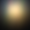
by bea_lost ->
This is set at soft light, opacity 57. Adds a nice light focus to Cho's face.

by bea_lost ->
Another texture by bea_lost. This time set to soft light, opacity 88.
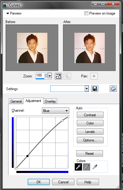
This is coming together but I want a little something else. Time for some curves. Now with curves it's a lot of trial and error, figuring out what does what and why it does it. Fiddle with the settings. I wanted a nice contrast and a bit more blue.
For the contrast, dragging the first circle upwards will create a more light in the image. Dragging the second circle downwards will create more darkness (follow the gradients on the sides and bottom of the grid, this will help you judge where you're going with light/shadow).

There's a different curves setting or canvas for different colors. Since I want more blue, I went to the blue setting. I wanted a bit of a blue highlight so I dragged the top circle upwards towards the pure blue (again on the side it has the blue to black gradient for you to judge how much blue/how little blue).
Final product:

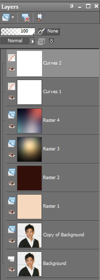
Layers:
TUTORIAL 2: CHRIS FINE.
We'll be working with this picture of Chris Pine.
Crop it, resize it to 100x100.

Now for this I really wanted a lot of negative space in here, I loved the blank canvas of the walls. So, copy and paste this onto a new blank 100x100 canvas. Then while holding your shift key down, resize it down.

Obviously this is really really blurry and that won't do. Duplicate and then sharpen. I did this twice and then lowered the opacity on the 2nd layer a little bit. There is no exact number, it's what looks right for your base.

I didn't want that border for this icon so I need to exand the wall behind it. Take your smudge tool and carefully push your negative space off the canvas.

Something to remember about smudging is: it doesn't need to be perfect. A little texture and a little unevenness (not a word?) makes it a bit more interesting.
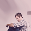
Now for the color. Take a blue base, baby blueish, set it to burn at around 40 opacity.

->
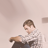
Take a light pink. Keep it at normal, set it to 36ish.

->
I need a bit more depth and contrast to this.
by bea_lost ->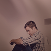
Set to multiply ->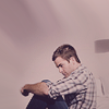
36 opacity.
Still needs something, a bit more contrast. Time for curves!
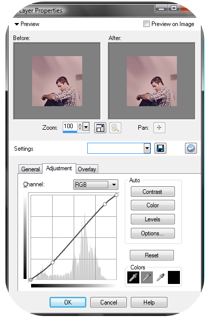
I tried to get artistic with this crop and it did not work out for me. But regardless, here you are. If you go a bit more with the contrast you'll get more of the original coloring. Grabbing the top node and dragging it up more will brighten it up. I chose not to for this because I kind of liked how this version turned out.
And you can leave it there but I wanted a different tone so I went to my color balance and fiddled lightly with it.

And that's it.

Feel free to ask me questions. I hope this was somewhat what you were looking for, twinsfan33.
Request a tutorial.


These all deal with the same basic coloring techniques so I'll be making icons that correspond pretty closely with them. I don't keep .PSDs but I tend to make batches of icons in the same way for a bit.
ANYWAY I'll be making these:


In PSP but are completely translatable.
TUTORIAL: JOHN CHO'S HOT FACE.
Okay! We're going to start with this picture of John Cho (aka Sulu).
Crop it down. I use a lot of center crops lately, I don't know why but there you have it.

Duplicate and sharpen. You don't want to sharpen on your background because you're not able to control the opacity.

Take a light tan and keep it at normal but reduce the opacity down till it feels right. This ended up at 27.

->

Obviously you need some contrast here. Take a dark brown and set it at burn, reduce the opacity down till it feels right. This ended up at 30.

->

This is fine, very much what the original John Cho icon went like. BUT for this I want to add some light, so I'm going to use light textures.

by bea_lost ->

This is set at soft light, opacity 57. Adds a nice light focus to Cho's face.

by bea_lost ->

Another texture by bea_lost. This time set to soft light, opacity 88.
This is coming together but I want a little something else. Time for some curves. Now with curves it's a lot of trial and error, figuring out what does what and why it does it. Fiddle with the settings. I wanted a nice contrast and a bit more blue.
For the contrast, dragging the first circle upwards will create a more light in the image. Dragging the second circle downwards will create more darkness (follow the gradients on the sides and bottom of the grid, this will help you judge where you're going with light/shadow).

There's a different curves setting or canvas for different colors. Since I want more blue, I went to the blue setting. I wanted a bit of a blue highlight so I dragged the top circle upwards towards the pure blue (again on the side it has the blue to black gradient for you to judge how much blue/how little blue).

Final product:

Layers:

TUTORIAL 2: CHRIS FINE.
We'll be working with this picture of Chris Pine.
Crop it, resize it to 100x100.

Now for this I really wanted a lot of negative space in here, I loved the blank canvas of the walls. So, copy and paste this onto a new blank 100x100 canvas. Then while holding your shift key down, resize it down.

Obviously this is really really blurry and that won't do. Duplicate and then sharpen. I did this twice and then lowered the opacity on the 2nd layer a little bit. There is no exact number, it's what looks right for your base.

I didn't want that border for this icon so I need to exand the wall behind it. Take your smudge tool and carefully push your negative space off the canvas.

Something to remember about smudging is: it doesn't need to be perfect. A little texture and a little unevenness (not a word?) makes it a bit more interesting.
Now for the color. Take a blue base, baby blueish, set it to burn at around 40 opacity.

->

Take a light pink. Keep it at normal, set it to 36ish.

->

I need a bit more depth and contrast to this.

by bea_lost ->

Set to multiply ->

36 opacity.
Still needs something, a bit more contrast. Time for curves!

I tried to get artistic with this crop and it did not work out for me. But regardless, here you are. If you go a bit more with the contrast you'll get more of the original coloring. Grabbing the top node and dragging it up more will brighten it up. I chose not to for this because I kind of liked how this version turned out.
And you can leave it there but I wanted a different tone so I went to my color balance and fiddled lightly with it.

And that's it.

Feel free to ask me questions. I hope this was somewhat what you were looking for, twinsfan33.
Request a tutorial.