Tutorials! (3 in total) Disney Movie Tutorials
So I finally decided to make up for the tutorials I promised :P I had told someone on the last Disney movie icon post that I would make an Animated icon tutorial. So to make up for doing it months later, I have 3!! :P
There's one from Aladdin that's just some basic coloring. The second is also from Aladdin, and it was to show you how to fix bases with an extensive amount of one color, to even out the colors and tones. The third is from Hercules, and it is basically like the first, but instead I used a little different coloring, and I used a saturation layer, which wasn't used in the first. I just wanted to show the difference, and when you should use it and not.
-As a heads-up, all three tutorials include Adjustment layers, either Selective Coloring or Hue/Saturation.
-These are all created using Photoshop CS2, but they should be easily translatable.
Tutorial One: Go from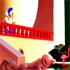
to
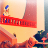
1. First, start off with your base. Mine is from Aladdin. Crop it. I usually crop mine and then resize it to 200x200 to start off with. Mines sized to 100x100 because I forgot to resize when I went back to do the tutorial :P Fix up your base as you like. I usually duplicate the base layer, and smart sharpen the new layer. My settings for smart sharpening are:
Remove: Gaussian Blur
Amount: 48%
Radius: 64.0 Pixels
I then delete the original base.
Result--->
2. Create a new layer. Fill it with a dark blue color (#002157). Set it to Exclusion 100% opacity.

----------->
3. Create another layer. Fill this one with a peachy/salmon color (#f9ad810. Set this to Multiply 100% opacity.

----------->
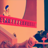
4. Create yet another new layer. Fill this one with a light blue (#7da7d8). Set this to Soft Light 100% opacity.

----------->
5. One more new layer. Fill this one with a light green (#7cc576). Set it to soft light 50% opacity.

----------->
6. Now for a Selective Color layer. My settings are as follows:
Reds: Cyan: -18
Magenta: 17
Yellow: 48
Yellows: Cyan: -100
Magenta: -49
Yellow: -43
Greens: Cyan: -100
Magenta: -100
Yellow: 100
Cyans: Cyan: 100
Magenta: -3
Yellow: -19
Blues: Cyan: 98
Magenta: 100
Yellow: -49
Magentas: Cyan: 100
Magenta: 100
Yellow: 100
Set this layer to Color 100% opacity.
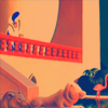
7. Duplicate your base and drag it to the top. Set it to Soft Light 70% opacity. At this point I usually sharpen this layer once, and then change the image size to 100x100.

8. Add this scratchy light texture by blimey_icons, putting it on top of all the layers. Set it to Screen 100% opacity.
-------------->
9. For the last step, I just added a bit of tiny text in the icon. I used this tiny text brush by unmasked_icons. I put it in a new layer on top of all the other layers in white, and left it at normal, 100% opacity.

--------------->
Your finished!!
Tutorial Two: Go from
to
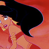
Start out with your base. Mine is from Aladdin. Crop and make your base however you like. I crop my image and size it to 200x200. Then I duplicate the base, and smart sharpen the new layer. I set the smart sharpen to:
Remove: Gaussian Blur
Amount: 35%
Radius: 64.0
I then delete the original base.

2. Duplicate your new base and set the new layer to Screen 100% opacity.

3. Now, because this base is EXTREMELY red, I need to bring out the other colors a bit more, and tone down the red. The first thing I do to acomplish this is create a new Photo Filter layer. You can do this by either selecting Photo Filter from the adjustment layer drop-down, or below your layers window, there is a few little buttons, click the one the middle thats a circle thats half black and half white, and in the drop-down you can find the Photo Filter layer adjustment as well. I picked the Cooling Filter (82) and set the Density to 50%.
4. Create a new layer. Fill it with a dark blue (#002157). Set it to Exclusion 100% opacity.

------------>
5. Create another new layer. Fill it with a light blue (#7da7d8). Set it to Soft Light at 100% opacity.

------------>
6. Create another new layer. Fill it with a lightish orange (#fbaf5d). Set it to Soft Light at 100% opacity.

------------>
7. One last new layer. Fill it with a light green (#7cc576). Set it to Soft Light at 50% opacity.

------------>
8. Now for a Selective Color layer. My settings for it are as follows:
Reds: Cyan: 45
Magenta: 26
Yellow: 62
Yellows: Cyan: -39
Magenta: -38
Yellow: -28
Cyans: Cyan: 100
Magenta: 100
Blues: Cyan: 100
Magenta: 100
Magentas: Cyan: -100
Magenta: 100
Yellow: 100
Neutrals: Cyan: 14
Magenta: 3
Yellow: 15
Set this layer to Color 100%.

9. Another new adjustment layer! This time a Hue/Saturation layer. The settings are as follows:
Saturation: 30

10. Duplicate your base and drag it to the top. Desaturate it, then go to Edit and fade it 50%. Set the layer to Soft Light at 100% opacity. At this point I usually sharpen this layer once, then shrink the image to 100x100.
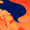
11. Next I got out a scratchy light texture by blimey_icons. I rotated it horizontally, and then set it on top of all the layers. Set it to Lighten 100% opacity.

-------------->
12. Lastly, I finished it off by putting some tiny text on the icon. I got the brush from unmasked_icons.

------------->
Your done!
Tutorial 3: Go from
to
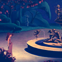
1. Start off with your base. Mine is from Hercules. Crop your base and fix it up however you like. I crop my base and resize it to 200x200 to begin with. Then I duplicate the layer and use smart sharpen on the new layer. My settings for it are:
Remove: Gaussian Blur
Amount: 94%
Radius: 64.0
I then delete the original base.

2. Next I make a new layer. Fill it with a dark blue (#002157). Set it to Exclusion 100% opacity.

------------>
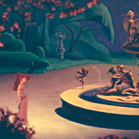
3. Create another new layer. Fill it with a lightish orange (#fbaf5d). Set it to Soft Light 100% opacity.

------------>
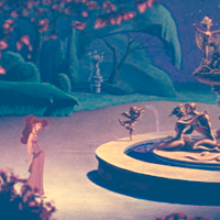
4. Create another new layer (or duplicate the last layer). Fill it with a light blue (#7da7d8). Set it to Soft Light 100% opacity.

------------>
5. Create another new layer (or duplicate the last layer). Fill it with a light pink (#f49ac1). Set it to Soft Light 50% opacity.

------------>
6. Create one last new layer (or duplicate last layer). Fill it with a light green (#7cc576). Set it to Soft Light 50% opacity.

------------>
7. Now for a Selective Color layer. My settings are as follows:
Reds: Cyan: -100
Magenta: 37
Yellow: 100
Yellows: Cyan: -100
Magenta: 100
Yellow: -16
Greens: Cyan: 100
Magenta: 100
Yellow: 100
Cyans: Cyan: -4
Magenta: 17
Blues: Cyan: 100
Magenta: 100
Yellow: -100
Magentas: Cyan: -100
Magenta: 100
Yellow: 100
Set this layer to color 100% opacity.
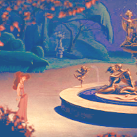
8. Another adjustment layer, this time a Hue/Saturation layer. My settings are as follows:
Saturation: 25

9. Duplicate your bottom layer and drag it to the top. Set it to Soft Light 100% opacity. At this point I usually sharpen this layer, then shrink the image down to 100x100. If its still blurry once you shrink it, feel free to sharpen again.
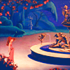
10. Next I added a light texture by elliptica. Before adding it to the icon image, I rotated it once horizontally. Put it right below your Hue/Saturation layer, so the color is brighter. Set the texture to Lighten at 100% opacity.

-------------->
11. Lastly I added a scratchy texture by (I'm not sure, if its yours, let me know). I set it to Screen 100% opacity.

-------------->
Your Done!!
There's one from Aladdin that's just some basic coloring. The second is also from Aladdin, and it was to show you how to fix bases with an extensive amount of one color, to even out the colors and tones. The third is from Hercules, and it is basically like the first, but instead I used a little different coloring, and I used a saturation layer, which wasn't used in the first. I just wanted to show the difference, and when you should use it and not.
-As a heads-up, all three tutorials include Adjustment layers, either Selective Coloring or Hue/Saturation.
-These are all created using Photoshop CS2, but they should be easily translatable.
Tutorial One: Go from

to

1. First, start off with your base. Mine is from Aladdin. Crop it. I usually crop mine and then resize it to 200x200 to start off with. Mines sized to 100x100 because I forgot to resize when I went back to do the tutorial :P Fix up your base as you like. I usually duplicate the base layer, and smart sharpen the new layer. My settings for smart sharpening are:
Remove: Gaussian Blur
Amount: 48%
Radius: 64.0 Pixels
I then delete the original base.
Result--->

2. Create a new layer. Fill it with a dark blue color (#002157). Set it to Exclusion 100% opacity.

----------->

3. Create another layer. Fill this one with a peachy/salmon color (#f9ad810. Set this to Multiply 100% opacity.

----------->

4. Create yet another new layer. Fill this one with a light blue (#7da7d8). Set this to Soft Light 100% opacity.

----------->

5. One more new layer. Fill this one with a light green (#7cc576). Set it to soft light 50% opacity.

----------->

6. Now for a Selective Color layer. My settings are as follows:
Reds: Cyan: -18
Magenta: 17
Yellow: 48
Yellows: Cyan: -100
Magenta: -49
Yellow: -43
Greens: Cyan: -100
Magenta: -100
Yellow: 100
Cyans: Cyan: 100
Magenta: -3
Yellow: -19
Blues: Cyan: 98
Magenta: 100
Yellow: -49
Magentas: Cyan: 100
Magenta: 100
Yellow: 100
Set this layer to Color 100% opacity.

7. Duplicate your base and drag it to the top. Set it to Soft Light 70% opacity. At this point I usually sharpen this layer once, and then change the image size to 100x100.

8. Add this scratchy light texture by blimey_icons, putting it on top of all the layers. Set it to Screen 100% opacity.

-------------->

9. For the last step, I just added a bit of tiny text in the icon. I used this tiny text brush by unmasked_icons. I put it in a new layer on top of all the other layers in white, and left it at normal, 100% opacity.

--------------->

Your finished!!
Tutorial Two: Go from

to

Start out with your base. Mine is from Aladdin. Crop and make your base however you like. I crop my image and size it to 200x200. Then I duplicate the base, and smart sharpen the new layer. I set the smart sharpen to:
Remove: Gaussian Blur
Amount: 35%
Radius: 64.0
I then delete the original base.

2. Duplicate your new base and set the new layer to Screen 100% opacity.

3. Now, because this base is EXTREMELY red, I need to bring out the other colors a bit more, and tone down the red. The first thing I do to acomplish this is create a new Photo Filter layer. You can do this by either selecting Photo Filter from the adjustment layer drop-down, or below your layers window, there is a few little buttons, click the one the middle thats a circle thats half black and half white, and in the drop-down you can find the Photo Filter layer adjustment as well. I picked the Cooling Filter (82) and set the Density to 50%.

4. Create a new layer. Fill it with a dark blue (#002157). Set it to Exclusion 100% opacity.

------------>

5. Create another new layer. Fill it with a light blue (#7da7d8). Set it to Soft Light at 100% opacity.

------------>

6. Create another new layer. Fill it with a lightish orange (#fbaf5d). Set it to Soft Light at 100% opacity.

------------>

7. One last new layer. Fill it with a light green (#7cc576). Set it to Soft Light at 50% opacity.

------------>

8. Now for a Selective Color layer. My settings for it are as follows:
Reds: Cyan: 45
Magenta: 26
Yellow: 62
Yellows: Cyan: -39
Magenta: -38
Yellow: -28
Cyans: Cyan: 100
Magenta: 100
Blues: Cyan: 100
Magenta: 100
Magentas: Cyan: -100
Magenta: 100
Yellow: 100
Neutrals: Cyan: 14
Magenta: 3
Yellow: 15
Set this layer to Color 100%.

9. Another new adjustment layer! This time a Hue/Saturation layer. The settings are as follows:
Saturation: 30

10. Duplicate your base and drag it to the top. Desaturate it, then go to Edit and fade it 50%. Set the layer to Soft Light at 100% opacity. At this point I usually sharpen this layer once, then shrink the image to 100x100.

11. Next I got out a scratchy light texture by blimey_icons. I rotated it horizontally, and then set it on top of all the layers. Set it to Lighten 100% opacity.

-------------->

12. Lastly, I finished it off by putting some tiny text on the icon. I got the brush from unmasked_icons.

------------->

Your done!
Tutorial 3: Go from

to

1. Start off with your base. Mine is from Hercules. Crop your base and fix it up however you like. I crop my base and resize it to 200x200 to begin with. Then I duplicate the layer and use smart sharpen on the new layer. My settings for it are:
Remove: Gaussian Blur
Amount: 94%
Radius: 64.0
I then delete the original base.

2. Next I make a new layer. Fill it with a dark blue (#002157). Set it to Exclusion 100% opacity.

------------>

3. Create another new layer. Fill it with a lightish orange (#fbaf5d). Set it to Soft Light 100% opacity.

------------>

4. Create another new layer (or duplicate the last layer). Fill it with a light blue (#7da7d8). Set it to Soft Light 100% opacity.

------------>

5. Create another new layer (or duplicate the last layer). Fill it with a light pink (#f49ac1). Set it to Soft Light 50% opacity.

------------>

6. Create one last new layer (or duplicate last layer). Fill it with a light green (#7cc576). Set it to Soft Light 50% opacity.

------------>

7. Now for a Selective Color layer. My settings are as follows:
Reds: Cyan: -100
Magenta: 37
Yellow: 100
Yellows: Cyan: -100
Magenta: 100
Yellow: -16
Greens: Cyan: 100
Magenta: 100
Yellow: 100
Cyans: Cyan: -4
Magenta: 17
Blues: Cyan: 100
Magenta: 100
Yellow: -100
Magentas: Cyan: -100
Magenta: 100
Yellow: 100
Set this layer to color 100% opacity.

8. Another adjustment layer, this time a Hue/Saturation layer. My settings are as follows:
Saturation: 25

9. Duplicate your bottom layer and drag it to the top. Set it to Soft Light 100% opacity. At this point I usually sharpen this layer, then shrink the image down to 100x100. If its still blurry once you shrink it, feel free to sharpen again.

10. Next I added a light texture by elliptica. Before adding it to the icon image, I rotated it once horizontally. Put it right below your Hue/Saturation layer, so the color is brighter. Set the texture to Lighten at 100% opacity.

-------------->

11. Lastly I added a scratchy texture by (I'm not sure, if its yours, let me know). I set it to Screen 100% opacity.

-------------->

Your Done!!