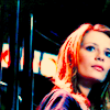
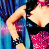
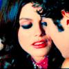
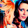
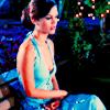
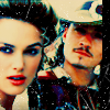
(no subject)
Hey guys!! I have a tutorial for you all :) I had a few requests for tutorials for a couple different icons, but I figured since I really used the same technique for all the icons in the batch they were requested from that one should do the trick :) So here it is!
Info:
- For Photoshop CS2! It isn't translatable because of the Selective Coloring layers.
- Let me know what you think of the tutorial, or if anythings confusing :)
How to go from this-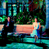
to this-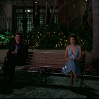
1. Crop your base. I have my cropper set to 100 in width by 100 in height so its automatically made to resize to 100x100. Change the image size to 200x200. I keep it this size at first to see more of the detail before I make it 100x100.

2. Duplicate your base. Smart sharpen the copy (filter>sharpen>smart sharpen). My settings for it are:
Amount: 178%
Radius: 64 pixels
Remove: Gaussian Blur
I do this because I hate the kind of blur over the top of all bases. It tends to make the icon have a really ugly gritty effect in some darker spots later on.
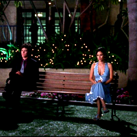
3. Delete the original base. Duplicate your new base and set it to screen 100%. I duplicated it a second time and set the opacity to 50%, but its up to you. I like brighter icons, and you'll probably change it later anyways.
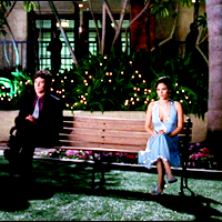
4. Create a new layer, and fill it with a light tan color, #fee7ae, and set it to Multiply at 100%.

>>>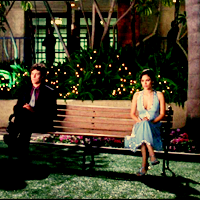
5. Create another new layer, and fill it with a light pink color, #F1B2FF, and set it to Soft Light at 60%. I usually set this layer to either 60% or 70%, depending on the coloring of the base. If its a more warm color, set it to 60%, and if its a cooler (bluer) base, set it to 60%. Its also usually higher if its a darker base, and lower if its lighter.

>>>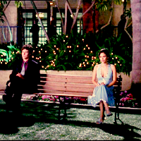
6. Create another new layer, and fill it with a teal color, #6DCFF6, and set it to Color Burn 60%. This is the same as the previous color layer. Set it to 60% if the base is cooler, and 70% if its warmer, lighter if the base is darker, and darker if the base is lighter. Also, if your base is already pretty blue, you might want to use this color instead: #C0FFF8.

>>>
7. Time for a selective color layer! (layer>new adjustment layer>selective color). My settings are as follows:
Reds- Cyan: -100
Magenta: +100
Yellow: +100
Yellows- Cyan: -100
Magenta: +100
Yellow: +100
Basically I wanted to just bring out all of the reds in this base as much as possible. It's pretty pale and I really like bright colors. Because this base is pale, this only works best with this specific base, and most pale/cool bases. You're probably going to have to play with the settings for most bases.
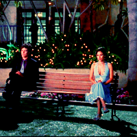
8. Make another selective color layer. My settings are:
Neutrals- Cyan: +37
Magenta: -10
Yellow: -20
This is pretty standard for almost every icon I do. The only thing that usually varies is the Cyan setting, the other two are the same for almost everything.
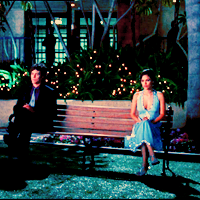
9. One last selective color layer! My settings are:
Reds- Cyan: 0
Magenta: +17
Yellow: +18
Yellows- Cyan: -100
Magenta: +100
Yellow: +100
Greens- Cyan: +100
Magenta: -100
Yellow: +100
Cyans- Cyan: +100
Magenta: +41
Yellow: 0
Blues- Cyan: +100
Magenta: +37
Yellow: -16
Magentas- Cyan: -100
Magenta: +100
Yellow: +100
This is basically to even out the other two layers, and to bring out the greens and magentas. Everything except the Greens settings are pretty much standard for me for all my icons, and the Greens settings almost always need to be played with, because if you bring them out too much in bases with lots of blue or cyan, it looks kinda weird. Sometimes I don't even do anything to the Green settings, so this doesn't mean you need to do anything with them.

10. Go down and click on the teal color layer. Create a new layer right above it. Fill it with a light green, #7cc576, and set it to Soft Light 60%. I usually set this at either 50% or 60%, depending on how much you need to tone down the reds and even out the blues/cyans.

11. Go back to the top layer. Create a new Color Balance layer. (layer>new adjustment layer>color balance). My settings are:
Color Levels: +33 -39 -8
Tone Balance: Midtones
Preserve Luminosity: Checked
This is to even out the warm colors in the icon. For some reason I've been making icons with a lot of magenta/pink in them.

12. Create another new Color Balance layer. My settings are:
Color Levels: -47 +26 +9
As well as liking a lot of magenta/pink, I also really like a lot of cyan, usually a lot more then blue.
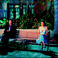
13. At this point I went down to the top Screen layer, the one set to 50%, and increased it to opacity 100%. You can mess with the opacity if you want, like I said earlier, I like brighter icons.
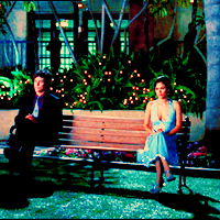
14. Go back to the top layer. This is optional, but I really like to make the colors pop, so I always add a Hue/Saturation layer on top. (layer>new adjustment layer>hue/saturation) My settings are:
Master- Saturation: +10

15. Resize your icon to 100x100. I've been told in constructive crit often that I have slightly oversharpened icons. So I figured I would come up with a way to fix it, and this works pretty well. Stamp all your layers into a new layer (ctrl>shift>alt>E). Gaussian blur the new layer with these settings:
Radius: .5 Pixels
Set the layer to Darken, and I changed the opacity to 50%. The opacity should be whatever you want, depending if you just want to soften it a little, or give it a more blurred effect. I like my icons a bit blurry.
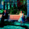
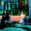
16. The last two steps are optional. I'm honestly not sure how I came across this idea, but I really like the effect it gives icons. Drag this texture on top of all the other layers. (by toybirds). Set it to Soft Light 40%. This brings out the color more, and takes care of any overly-red problems.
>>>
17. Duplicate your texture layer. Change it from Soft Light to Color Burn, and leave the opacity at 40%. I find this has a simular effect to if you add a contrast adjustment layer, but I like it more then an adjustment layer. For all I know this might not actually do anything at all, but I like it, which is why these two steps are optional.

>>>
Your done!!! This is different a bit from the original, mostly because its a different cap (I couldn't figure out which one I used :P) The original is also slightly darker and pinker (I think the second screen layer was set to 75% instead of 100%, and the first color balance layer had a higher magenta coloring (the second color level #)). The gaussian blur level is also a lower opacity I think.
The original icon: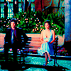
I used this technique on pretty much every single icon in this post, so thats why I'm only doing one tutorial, despite the fact that one was requested for a few other icons. The only thing changes between the icons is usually the opacity for color layers/texture layers, and a few settings in the color adjustment layers. So make sure not to follow this exactly, because this is just for this specific base!!
Other icons made using this:


Info:
- For Photoshop CS2! It isn't translatable because of the Selective Coloring layers.
- Let me know what you think of the tutorial, or if anythings confusing :)
How to go from this-

to this-

1. Crop your base. I have my cropper set to 100 in width by 100 in height so its automatically made to resize to 100x100. Change the image size to 200x200. I keep it this size at first to see more of the detail before I make it 100x100.

2. Duplicate your base. Smart sharpen the copy (filter>sharpen>smart sharpen). My settings for it are:
Amount: 178%
Radius: 64 pixels
Remove: Gaussian Blur
I do this because I hate the kind of blur over the top of all bases. It tends to make the icon have a really ugly gritty effect in some darker spots later on.

3. Delete the original base. Duplicate your new base and set it to screen 100%. I duplicated it a second time and set the opacity to 50%, but its up to you. I like brighter icons, and you'll probably change it later anyways.

4. Create a new layer, and fill it with a light tan color, #fee7ae, and set it to Multiply at 100%.

>>>

5. Create another new layer, and fill it with a light pink color, #F1B2FF, and set it to Soft Light at 60%. I usually set this layer to either 60% or 70%, depending on the coloring of the base. If its a more warm color, set it to 60%, and if its a cooler (bluer) base, set it to 60%. Its also usually higher if its a darker base, and lower if its lighter.

>>>

6. Create another new layer, and fill it with a teal color, #6DCFF6, and set it to Color Burn 60%. This is the same as the previous color layer. Set it to 60% if the base is cooler, and 70% if its warmer, lighter if the base is darker, and darker if the base is lighter. Also, if your base is already pretty blue, you might want to use this color instead: #C0FFF8.

>>>

7. Time for a selective color layer! (layer>new adjustment layer>selective color). My settings are as follows:
Reds- Cyan: -100
Magenta: +100
Yellow: +100
Yellows- Cyan: -100
Magenta: +100
Yellow: +100
Basically I wanted to just bring out all of the reds in this base as much as possible. It's pretty pale and I really like bright colors. Because this base is pale, this only works best with this specific base, and most pale/cool bases. You're probably going to have to play with the settings for most bases.

8. Make another selective color layer. My settings are:
Neutrals- Cyan: +37
Magenta: -10
Yellow: -20
This is pretty standard for almost every icon I do. The only thing that usually varies is the Cyan setting, the other two are the same for almost everything.

9. One last selective color layer! My settings are:
Reds- Cyan: 0
Magenta: +17
Yellow: +18
Yellows- Cyan: -100
Magenta: +100
Yellow: +100
Greens- Cyan: +100
Magenta: -100
Yellow: +100
Cyans- Cyan: +100
Magenta: +41
Yellow: 0
Blues- Cyan: +100
Magenta: +37
Yellow: -16
Magentas- Cyan: -100
Magenta: +100
Yellow: +100
This is basically to even out the other two layers, and to bring out the greens and magentas. Everything except the Greens settings are pretty much standard for me for all my icons, and the Greens settings almost always need to be played with, because if you bring them out too much in bases with lots of blue or cyan, it looks kinda weird. Sometimes I don't even do anything to the Green settings, so this doesn't mean you need to do anything with them.

10. Go down and click on the teal color layer. Create a new layer right above it. Fill it with a light green, #7cc576, and set it to Soft Light 60%. I usually set this at either 50% or 60%, depending on how much you need to tone down the reds and even out the blues/cyans.

11. Go back to the top layer. Create a new Color Balance layer. (layer>new adjustment layer>color balance). My settings are:
Color Levels: +33 -39 -8
Tone Balance: Midtones
Preserve Luminosity: Checked
This is to even out the warm colors in the icon. For some reason I've been making icons with a lot of magenta/pink in them.

12. Create another new Color Balance layer. My settings are:
Color Levels: -47 +26 +9
As well as liking a lot of magenta/pink, I also really like a lot of cyan, usually a lot more then blue.

13. At this point I went down to the top Screen layer, the one set to 50%, and increased it to opacity 100%. You can mess with the opacity if you want, like I said earlier, I like brighter icons.

14. Go back to the top layer. This is optional, but I really like to make the colors pop, so I always add a Hue/Saturation layer on top. (layer>new adjustment layer>hue/saturation) My settings are:
Master- Saturation: +10

15. Resize your icon to 100x100. I've been told in constructive crit often that I have slightly oversharpened icons. So I figured I would come up with a way to fix it, and this works pretty well. Stamp all your layers into a new layer (ctrl>shift>alt>E). Gaussian blur the new layer with these settings:
Radius: .5 Pixels
Set the layer to Darken, and I changed the opacity to 50%. The opacity should be whatever you want, depending if you just want to soften it a little, or give it a more blurred effect. I like my icons a bit blurry.

16. The last two steps are optional. I'm honestly not sure how I came across this idea, but I really like the effect it gives icons. Drag this texture on top of all the other layers. (by toybirds). Set it to Soft Light 40%. This brings out the color more, and takes care of any overly-red problems.

>>>

17. Duplicate your texture layer. Change it from Soft Light to Color Burn, and leave the opacity at 40%. I find this has a simular effect to if you add a contrast adjustment layer, but I like it more then an adjustment layer. For all I know this might not actually do anything at all, but I like it, which is why these two steps are optional.

>>>

Your done!!! This is different a bit from the original, mostly because its a different cap (I couldn't figure out which one I used :P) The original is also slightly darker and pinker (I think the second screen layer was set to 75% instead of 100%, and the first color balance layer had a higher magenta coloring (the second color level #)). The gaussian blur level is also a lower opacity I think.
The original icon:

I used this technique on pretty much every single icon in this post, so thats why I'm only doing one tutorial, despite the fact that one was requested for a few other icons. The only thing changes between the icons is usually the opacity for color layers/texture layers, and a few settings in the color adjustment layers. So make sure not to follow this exactly, because this is just for this specific base!!
Other icons made using this:
