(no subject)
Hey guys!! I have like 10 minutes before class, so I'm gonna use that time to post a tutorial REALLY quickly! (thats code for sorry if somethings messed up, I'll fix it later :P)
This tutorial was requested by loudlunacy
This is a tutorial for how to go from this-
to this-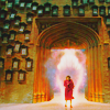
Specs-
- For Photoshop, made on CS 2.
- Non-translatable because of the Adjustment layers, sorry.
- Difficulty- Medium (need knowledge of adjustment layers)
- DO NOT COPY THIS EXACTLY!!! Use your own base, please.
1. Get your cap. I got mine, a shot of Umbridge from Order of the Phoenix, from homeofthenutty. Crop and resize it to 200x200. You don't have to resize it to that if you don't want to, but that's how I work with my icons for the most part.
CAP >>>
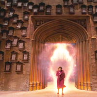
2. Rename your base layer to whatever you want so that it's no longer locked (or duplicate base and delete original). Duplicate your base layer twice. Set the first duplicate up to Soft Light, 100% opacity. Set the next up to screen, 100% opacity. I alternate between using Smart Sharpen and Soft light layers to do this, and for a lot of these OotP caps, I used the Soft light method, because it made slightly less contrasty, sharp end results. I use this method when a cap is really dull and low contrast to sharpen it up a bit. Soft light is nice when the cap has spots that are really bright as well as really dark spots, so that you don't over contrast either of these areas. If your cap is more even in the dark and light areas, I would suggest using smart sharpen instead, especially in really dark or really light caps, because using the soft light method can still leave some ugly pixelation when you use screen to lighten the base up.
After looking at it for a second, I added another screen layer, because I like really bright icons. If you do this, move your soft light layer up so its between the two screen layers. You always want your soft light layer right below the top screen layer, or it'll get too fuzzy.
>>>
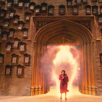
3. Now for some color layers. I like to use color layers sometimes to give the coloring in the picture a little extra boost that I find more effective then using just adjustment layers.
Create a new layer. Fill it with a light skin tone color (#fee7ae). Set it to Multiply 60% opacity.

>>>
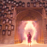
4. Another new layer, fill it with a light pink/fuschia (#f1b2ff). Set it to Soft Light 50% opacity.

>>>
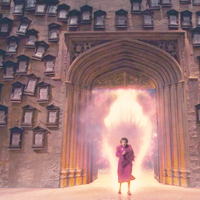
5. Another new layer, fill it with a light cyan color (#6dcff6). Set it to Soft Light 60% opacity.

>>>
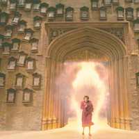
6. Yet another new layer, fill it with yellow (#fff200). Set it to Soft Light 35% opacity.

>>>
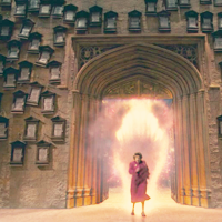
7. One last new layer! Last one, I swear :P Fill it with a really light blue (#c7e1ff). Set it to Color Burn 100% opacity.

>>>
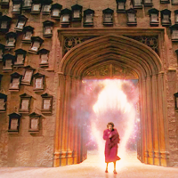
8. Now for some Adjustment layers!! Start off with a Selective Color layer, settings as follows (**If it's not listed, leave it as it is**):
Reds:
-Magenta: +53
-Yellow: +28
Whites:
-Cyan: +100
-Magenta: -21
-Yellow: -100
Neutrals:
-Cyan: -19
-Magenta: +6
-Yellow:+17
Blacks:
-Cyan: +27
-Magenta: +19
-Yellow: +20
Basically I have two Selective Color layers; The first to increase the reds and to fix the white and black levels. The adjustments in the Whites is kind of a personal preference, because I like how you can add some hue to the lighter areas. The adjustments to the black areas are to add some contrast to the icon.
>>>
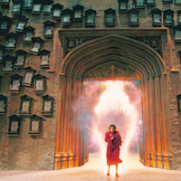
9. Now for the second Selective Color layer:
Reds:
-Magenta: +28
-Yellow: +62
Neutrals:
-Cyan: +51
-Magenta: -10
-Yellow: -20
This second selective color layer is to bring out the blues, greens, and cyans a bit more. I like an even balance between the two that stands out a bit. I add in a bit more red to keep it from being overpowered by the neutrals changes.
>>>
10. One more adjustment layer. I like to use Curves a lot, because it's a really powerful tool that can have some pretty nifty results if you know how to use it right. My settings are as follows:
Channel: (input#/output#)
-RGB: (68/62), (121/132), (182/194)
-Red: (121/131), (197/182)
-Green: (64/63), (118/133), (182/194)
-Blue: (68/57), (174/200)
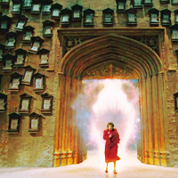
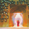
11. Now resize your image to 100x100. Create a new layer. Fill it with a light greyish blue (#b9c9dd) (I learned this step from threeeyespie, just to give her credit). Set it to Luminosity 50% opacity. Now go down to your Soft Light layer of the base, duplicate it, and drag it to the top above the Luminosity layer. Leave it at 100% opacity. I really like this method a lot, because it gives your icon a beautiful, colorful, saturated look, without the ugly side effects of just using a Hue/Saturation layer.
>>>
12. Now the icon is a little too fuzzy and low contrast for me. This step is optional, but I really prefer to use it. Create a new layer. Fill it with 20% opacity grey (#d7d7d7), and set it to Color Burn. Adjust the opacity to your liking, as I've found it varies GREATLY between caps. For this cap, I set it to 75% opacity.
>>>
And your done!!! This is a little bit different then the original, and I'm not completely sure how.. I think its a bit more contrasty, but I kind of like this version a little better, and it's basically the same color result, if not a little brighter, and a bit bluer, which I like a lot.
This tutorial was requested by loudlunacy
This is a tutorial for how to go from this-

to this-

Specs-
- For Photoshop, made on CS 2.
- Non-translatable because of the Adjustment layers, sorry.
- Difficulty- Medium (need knowledge of adjustment layers)
- DO NOT COPY THIS EXACTLY!!! Use your own base, please.
1. Get your cap. I got mine, a shot of Umbridge from Order of the Phoenix, from homeofthenutty. Crop and resize it to 200x200. You don't have to resize it to that if you don't want to, but that's how I work with my icons for the most part.
CAP >>>

2. Rename your base layer to whatever you want so that it's no longer locked (or duplicate base and delete original). Duplicate your base layer twice. Set the first duplicate up to Soft Light, 100% opacity. Set the next up to screen, 100% opacity. I alternate between using Smart Sharpen and Soft light layers to do this, and for a lot of these OotP caps, I used the Soft light method, because it made slightly less contrasty, sharp end results. I use this method when a cap is really dull and low contrast to sharpen it up a bit. Soft light is nice when the cap has spots that are really bright as well as really dark spots, so that you don't over contrast either of these areas. If your cap is more even in the dark and light areas, I would suggest using smart sharpen instead, especially in really dark or really light caps, because using the soft light method can still leave some ugly pixelation when you use screen to lighten the base up.
After looking at it for a second, I added another screen layer, because I like really bright icons. If you do this, move your soft light layer up so its between the two screen layers. You always want your soft light layer right below the top screen layer, or it'll get too fuzzy.
>>>

3. Now for some color layers. I like to use color layers sometimes to give the coloring in the picture a little extra boost that I find more effective then using just adjustment layers.
Create a new layer. Fill it with a light skin tone color (#fee7ae). Set it to Multiply 60% opacity.

>>>

4. Another new layer, fill it with a light pink/fuschia (#f1b2ff). Set it to Soft Light 50% opacity.

>>>

5. Another new layer, fill it with a light cyan color (#6dcff6). Set it to Soft Light 60% opacity.

>>>

6. Yet another new layer, fill it with yellow (#fff200). Set it to Soft Light 35% opacity.

>>>

7. One last new layer! Last one, I swear :P Fill it with a really light blue (#c7e1ff). Set it to Color Burn 100% opacity.

>>>

8. Now for some Adjustment layers!! Start off with a Selective Color layer, settings as follows (**If it's not listed, leave it as it is**):
Reds:
-Magenta: +53
-Yellow: +28
Whites:
-Cyan: +100
-Magenta: -21
-Yellow: -100
Neutrals:
-Cyan: -19
-Magenta: +6
-Yellow:+17
Blacks:
-Cyan: +27
-Magenta: +19
-Yellow: +20
Basically I have two Selective Color layers; The first to increase the reds and to fix the white and black levels. The adjustments in the Whites is kind of a personal preference, because I like how you can add some hue to the lighter areas. The adjustments to the black areas are to add some contrast to the icon.
>>>

9. Now for the second Selective Color layer:
Reds:
-Magenta: +28
-Yellow: +62
Neutrals:
-Cyan: +51
-Magenta: -10
-Yellow: -20
This second selective color layer is to bring out the blues, greens, and cyans a bit more. I like an even balance between the two that stands out a bit. I add in a bit more red to keep it from being overpowered by the neutrals changes.
>>>

10. One more adjustment layer. I like to use Curves a lot, because it's a really powerful tool that can have some pretty nifty results if you know how to use it right. My settings are as follows:
Channel: (input#/output#)
-RGB: (68/62), (121/132), (182/194)
-Red: (121/131), (197/182)
-Green: (64/63), (118/133), (182/194)
-Blue: (68/57), (174/200)

11. Now resize your image to 100x100. Create a new layer. Fill it with a light greyish blue (#b9c9dd) (I learned this step from threeeyespie, just to give her credit). Set it to Luminosity 50% opacity. Now go down to your Soft Light layer of the base, duplicate it, and drag it to the top above the Luminosity layer. Leave it at 100% opacity. I really like this method a lot, because it gives your icon a beautiful, colorful, saturated look, without the ugly side effects of just using a Hue/Saturation layer.
>>>

12. Now the icon is a little too fuzzy and low contrast for me. This step is optional, but I really prefer to use it. Create a new layer. Fill it with 20% opacity grey (#d7d7d7), and set it to Color Burn. Adjust the opacity to your liking, as I've found it varies GREATLY between caps. For this cap, I set it to 75% opacity.
>>>

And your done!!! This is a little bit different then the original, and I'm not completely sure how.. I think its a bit more contrasty, but I kind of like this version a little better, and it's basically the same color result, if not a little brighter, and a bit bluer, which I like a lot.