Icon Tutorial #2 - Hermione Granger
Hello, again!
It's been quite some time since I posted my first tutorial. Since people enjoyed it, I decided to make a new one, this time a Harry Potter one.
Stills of the 5th movie are flying like Quidditch Seekers after the Golden Snitch and I couldn't resist them for much long.
But let's cut the chit chat and start the fun!
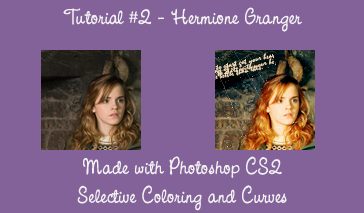
1 - First thing you need to notice is that this tutorial is a variation from the one posted by my dear Australian friend pippins_mcgee13. You can find the original one here.
2- Starting with the original picture, I cropped it to 100x100, making it my new base.
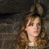
3- Duplicate your base and set it to screen:
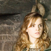
4- Let's add some curves to it. I went to Layer >> New Adjustment Layer >> Curves and set it like this:
RGB
Point One
Input: 50
Output: 87
Point Two
Input: 207
Output: 221
Here's my result:
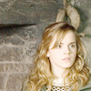
5- What about some spice to Mione's hair and face? She's looking so pale it scares me. Go to Layer >> New Adjustment Layer >> Hue/Saturation and increase the saturation to 29.
My result?
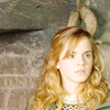
Kinda cute, right? Not quite, but we're getting there!
6- Selective Color time, guys! Let's do it like this: Layer >> New Adjustment Layer >> Selective Colour
Notice you can play with opacities, depending how bright/dark is your picture. Here are my numbers:
REDS
C: -21
M: +10
Y: +92
B: +15
YELLOWS
C: -100
M: +16
Y: +87
B: +8
GREENS
C: +100
M: -100
Y: -100
B: +68
CYANS
C: +100
M: -100
Y: -100
B: +38
NEUTRALS
C: 0
M: 0
Y: -21
B: 0
BLACKS
C: 0
M: 0
Y: 0
B: +100
Here's my result:
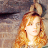
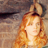
7- pippins_mcgee13's tutorial ended on the last step, but I thought something was missing, so I went on. Now we're gonna add a new layer and filled it with a tan color. I used #F8D7B0 and set it to Multiply with a 51% of Opacity. You can play with it until you feel comfortable with your result.
Here's mine:
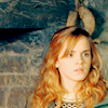
8- I still wasn't happy with the result, so I added another layer and filled with a light blue color. My choice was a #A7E9F1, which I set it to Color Burn, leaving the Opacity on 100%.
I got:
9- Almost there and we'll be done, I promise. To bring more of the environment and also Mione, I decided to go back to my base and duplicate it. Bringing it to the top of all my layers, I set it to Soft Light.
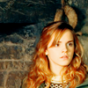
10- Flatten your image and hello stranger! We got a pretty new icon!
The following steps are completely optional, but feel free if you wanna try them.
11- I added this scratch texture (sorry I don't know who made it, but you're for sure credited on my profile!) and set it to Screen.
12- I also added some tiny text brush on it and here's my result.
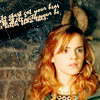
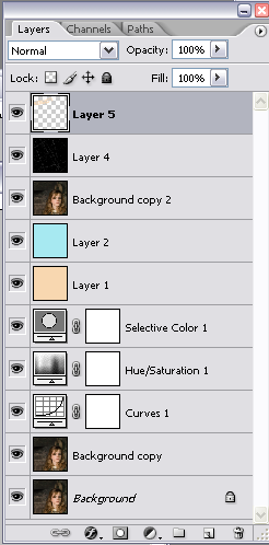
Here's my layer palette if you wanna check it out:
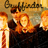
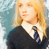
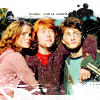
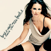
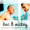
These are also icons made with the same tutorial. Notice that we can achieve some major differences using it.
1
2
3
4
5
6
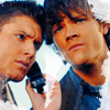
Hope you all enjoy it!
[+] Hotlinking is bad.
[+] Comments = l-o-v-e!
[+] If taking, please credit mscellym
[+] Show me your results, don't be shy!
It's been quite some time since I posted my first tutorial. Since people enjoyed it, I decided to make a new one, this time a Harry Potter one.
Stills of the 5th movie are flying like Quidditch Seekers after the Golden Snitch and I couldn't resist them for much long.
But let's cut the chit chat and start the fun!

1 - First thing you need to notice is that this tutorial is a variation from the one posted by my dear Australian friend pippins_mcgee13. You can find the original one here.
2- Starting with the original picture, I cropped it to 100x100, making it my new base.

3- Duplicate your base and set it to screen:

4- Let's add some curves to it. I went to Layer >> New Adjustment Layer >> Curves and set it like this:
RGB
Point One
Input: 50
Output: 87
Point Two
Input: 207
Output: 221
Here's my result:

5- What about some spice to Mione's hair and face? She's looking so pale it scares me. Go to Layer >> New Adjustment Layer >> Hue/Saturation and increase the saturation to 29.
My result?

Kinda cute, right? Not quite, but we're getting there!
6- Selective Color time, guys! Let's do it like this: Layer >> New Adjustment Layer >> Selective Colour
Notice you can play with opacities, depending how bright/dark is your picture. Here are my numbers:
REDS
C: -21
M: +10
Y: +92
B: +15
YELLOWS
C: -100
M: +16
Y: +87
B: +8
GREENS
C: +100
M: -100
Y: -100
B: +68
CYANS
C: +100
M: -100
Y: -100
B: +38
NEUTRALS
C: 0
M: 0
Y: -21
B: 0
BLACKS
C: 0
M: 0
Y: 0
B: +100
Here's my result:

7- pippins_mcgee13's tutorial ended on the last step, but I thought something was missing, so I went on. Now we're gonna add a new layer and filled it with a tan color. I used #F8D7B0 and set it to Multiply with a 51% of Opacity. You can play with it until you feel comfortable with your result.
Here's mine:

8- I still wasn't happy with the result, so I added another layer and filled with a light blue color. My choice was a #A7E9F1, which I set it to Color Burn, leaving the Opacity on 100%.
I got:

9- Almost there and we'll be done, I promise. To bring more of the environment and also Mione, I decided to go back to my base and duplicate it. Bringing it to the top of all my layers, I set it to Soft Light.

10- Flatten your image and hello stranger! We got a pretty new icon!
The following steps are completely optional, but feel free if you wanna try them.
11- I added this scratch texture (sorry I don't know who made it, but you're for sure credited on my profile!) and set it to Screen.
12- I also added some tiny text brush on it and here's my result.

Here's my layer palette if you wanna check it out:

These are also icons made with the same tutorial. Notice that we can achieve some major differences using it.
1
2
3


4
5
6


Hope you all enjoy it!
[+] Hotlinking is bad.
[+] Comments = l-o-v-e!
[+] If taking, please credit mscellym
[+] Show me your results, don't be shy!