Icon Tutorial: Blueish-Red
antios suggested that I write a tutorial on how to achieve the coloring of the header of my personal LJ. I decided to use the same picture, though in icon form.
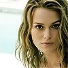
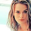
We'll be going from this:
to this:
Made with Photoshop CS2, requires selective coloring.
Firstly, prep your base, sharpen or blur it if you like, etc. I sharpened mine.

Duplicate your base and set the blending mode to Soft Light, 30% opacity. Not much difference, but there's a bit more contrast.

Go to Layer> New Fill Layer> Color Fill. Fill with #fff468, and set this one to Soft Light at 30% too.

Layer> New Adjustment Layer> Hue/Saturation. Select Master from the drop-down menu, and up the saturation to around +31.

Layer>New Adjustment Layer> Selective Coloring:
R: -100, 0, +100, 0
Y: -100, 0, +100, 0
C: -100, -100, +100, 0
B: -100, -100, -100, 0
N: +19, 0, -45, 0

Nasty and yellowish now, right? But selective coloring usually works best when the image is really yellow.
Layer> New Adjustment Layer> Selective Color again:
R: -100, 0, +100, 0
Y: +100, 0, -83, 0
C: +100, -100, -100, 0
B: +100, -100, -100, -100
N: +35, 0, -22, 0

And now for the finishing touches:
R: 0, 0, 0, +25
N: +34, 0, 0, 0

And there you have it! I hope this tutorial was easy to follow. And if you all like it, the best way you can thank me is by trying it and posting your results... *hint**hint*
We'll be going from this:

to this:

Made with Photoshop CS2, requires selective coloring.
Firstly, prep your base, sharpen or blur it if you like, etc. I sharpened mine.

Duplicate your base and set the blending mode to Soft Light, 30% opacity. Not much difference, but there's a bit more contrast.

Go to Layer> New Fill Layer> Color Fill. Fill with #fff468, and set this one to Soft Light at 30% too.

Layer> New Adjustment Layer> Hue/Saturation. Select Master from the drop-down menu, and up the saturation to around +31.

Layer>New Adjustment Layer> Selective Coloring:
R: -100, 0, +100, 0
Y: -100, 0, +100, 0
C: -100, -100, +100, 0
B: -100, -100, -100, 0
N: +19, 0, -45, 0

Nasty and yellowish now, right? But selective coloring usually works best when the image is really yellow.
Layer> New Adjustment Layer> Selective Color again:
R: -100, 0, +100, 0
Y: +100, 0, -83, 0
C: +100, -100, -100, 0
B: +100, -100, -100, -100
N: +35, 0, -22, 0

And now for the finishing touches:
R: 0, 0, 0, +25
N: +34, 0, 0, 0

And there you have it! I hope this tutorial was easy to follow. And if you all like it, the best way you can thank me is by trying it and posting your results... *hint**hint*