Icon Tutorial: Briony
How to make 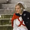
into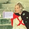
Made using Photoshop CS3, requires selective coloring.
Make your base. Crop, sharpen or blur, and all that jazz. Mine's a pic of Briony from the upcoming "Atonement" movie adaptation.

Layer>New Adjustment Layer>Color Balance:
Shadows: 0, 0, -100
Midtones: 0, -16, -100
Set to Normal blending mode, 100% opacity.
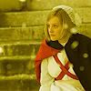
Duplicate the color balance layer, and set to Screen, 30%.
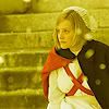
Yes, yes, I know... it's very yellow. But we'll fix that. You'll thank me later.
Selective coloring layer, numero uno:
Reds: -100, +40, +40, -4
Yellows: -30, -40, -80, 0
Neutrals: +30, +10, +10, -30
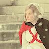
Another selective coloring layer:
Reds: -100, +50, +60, 0
Neutrals: +70, -30, -30, -10
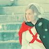
And ANOTHER selective coloring layer:
Reds: -100, 0, 0, 0
Yellows: -40, 0, 0, +75

That's it for the coloring! You could stop here if you want. Depends on your icon.
For mine, I cropped this texture: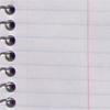
by
dusty_memories , resized and brightened it, pasted it on my icon and moved it around to my liking. Then I typed some text over the notebook texture (the font I used was Bickham Script Pro, size 0.4).
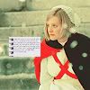
For the finishing touches, I made a lens flare texture on a 50 x 50 new window (don't know how to make one? Check out this tutorial @
may_icons), copied and pasted it over the notebook texture, and set the lens flare layer to Lighten, 100%.

Hope this was helpful! :)
Like all coloring techniques, this one will look great on some pieces and horrible on others. It's also versatile, though. Here's what would have happened had I skipped the first color balance layer:
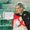
So experiment! Make it your own! :)
(To see some more examples of icons I made using the coloring in this tut, see this post.)

into

Made using Photoshop CS3, requires selective coloring.
Make your base. Crop, sharpen or blur, and all that jazz. Mine's a pic of Briony from the upcoming "Atonement" movie adaptation.

Layer>New Adjustment Layer>Color Balance:
Shadows: 0, 0, -100
Midtones: 0, -16, -100
Set to Normal blending mode, 100% opacity.

Duplicate the color balance layer, and set to Screen, 30%.

Yes, yes, I know... it's very yellow. But we'll fix that. You'll thank me later.
Selective coloring layer, numero uno:
Reds: -100, +40, +40, -4
Yellows: -30, -40, -80, 0
Neutrals: +30, +10, +10, -30

Another selective coloring layer:
Reds: -100, +50, +60, 0
Neutrals: +70, -30, -30, -10

And ANOTHER selective coloring layer:
Reds: -100, 0, 0, 0
Yellows: -40, 0, 0, +75

That's it for the coloring! You could stop here if you want. Depends on your icon.
For mine, I cropped this texture:

by
dusty_memories , resized and brightened it, pasted it on my icon and moved it around to my liking. Then I typed some text over the notebook texture (the font I used was Bickham Script Pro, size 0.4).

For the finishing touches, I made a lens flare texture on a 50 x 50 new window (don't know how to make one? Check out this tutorial @
may_icons), copied and pasted it over the notebook texture, and set the lens flare layer to Lighten, 100%.

Hope this was helpful! :)
Like all coloring techniques, this one will look great on some pieces and horrible on others. It's also versatile, though. Here's what would have happened had I skipped the first color balance layer:

So experiment! Make it your own! :)
(To see some more examples of icons I made using the coloring in this tut, see this post.)