Voting Post, Week 3
Yeeeaaaah.... incredibly late. Once again. I might get a co-mod one of these days >.>
To make sure that you read this, I'm typing the whole thing in bold.
On the last results post most of you should've noticed the extensive complaints about a certain brand of critique that some of you like to give out as you make your voting selections.
I'm going to tell you right now that "It's too plain." and "It's too simple." are not valid critiques in most cases. A LOT of the time, an icon is perfectly fine because of that simplicity or "plain-ness." If you REALLY think that the icon could've done with more, then SAY what you think it needs. Why do you think it's plain? What can the icon-maker have done better? What could've been added to make it "pop" out at you?
Any critiques that are just "It's too plain/simple" will be discounted.
Thank You,
The Management
And now... to voting...
...The numbers are so f'd up for this game. Hopefully participation will become more regular in the next round.
Voting Summary
Elimination - Vote for the four weakest icons.
Bonus - Vote for Best Design
Spectator's Choice - Vote for one favorite icon.
01
02
03
04
05


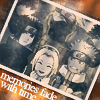
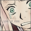

06
07
08
09
10




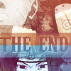
11
12
13
14
15





16
17
18
19
20
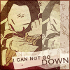

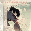


21
22
23
24
25

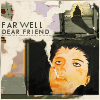


no
icon
To make sure that you read this, I'm typing the whole thing in bold.
On the last results post most of you should've noticed the extensive complaints about a certain brand of critique that some of you like to give out as you make your voting selections.
I'm going to tell you right now that "It's too plain." and "It's too simple." are not valid critiques in most cases. A LOT of the time, an icon is perfectly fine because of that simplicity or "plain-ness." If you REALLY think that the icon could've done with more, then SAY what you think it needs. Why do you think it's plain? What can the icon-maker have done better? What could've been added to make it "pop" out at you?
Any critiques that are just "It's too plain/simple" will be discounted.
Thank You,
The Management
And now... to voting...
...The numbers are so f'd up for this game. Hopefully participation will become more regular in the next round.
Voting Summary
Elimination - Vote for the four weakest icons.
Bonus - Vote for Best Design
Spectator's Choice - Vote for one favorite icon.
01
02
03
04
05


06
07
08
09
10


11
12
13
14
15


16
17
18
19
20


21
22
23
24
25


no
icon