Results, Week 4
Okieday, AWESOME voting turnout again guys. Please please please keep it up! ^_^
Elimination
All of you have done a great job, please consider playing again! ^_^
Bonus - Best Use of Lyrics
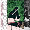
devious_tofu
Spectator's Choice
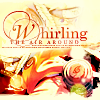
blooming_cosmo
And yes, all of you that have won Bonus and Spectator's choice will get banners. I only have a week and a half of school left and when I get home I'm going to do them all! (Including the ones I owe for naruto_stills and kunoichi_stills >.>';;)
Critique
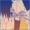
#04: While I love the coloring, the text isn't very organized. I started to read with "suffocating", but then I saw the word above it. It's pretty sloppily placed.
4. The text looks bad. If it had beeen straight it would have been better, and' suffocting' is drawing attention to Sasuke's nose, which I don't want my attention to go to a nose...
4. I think the image is a little too faded behind the colors and the texture. also, I'm not sure the text fits the theme of the image; the font could have been a little better, too.
#04 - The use of colors makes the icon look muddy; nothing really stands out. The text placement seems smushed together and kind of 'forced' into that small space in the image.
4- If the text is that simple and plain, then I feel the rest of the icon should be just as bare and simplified, (like only bw, for example) to match it more. otherwise...I don't feel it fits the icon. with its purple haze.
#04 - The monotone colors in this one are a bit boring; also, a more interesting font could've been used, and the text is a bit difficult to read.
4) It just seems like all that was done was a gradient pasted over it. The text could have been a bit more suiting.
5 - The coloring is really weird on this, especially at the bottom of the icon.
05) I feel the light texture's a bit too much; somewhat less opacity might have been better.
06 > the poor text placement and icon composition; the separation bar ( with the dotted squiggly ) takes away the flow of the icon
06: Generally not bad as an icon, but has some flaws. The dotted line is a nice idea but the shape in which you did it (looks like you sort of stopped and started, looks messy, etc) isn't great. Also the image is a little dark.
6- I don't get why the highlight is on her shoulder.
07 - I don't like the color contrasts of the image. The green clashes with that icky dried-blood color. The text choice was good. But the font is too simple.
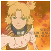
09 > awkward colouring; naruto's bright yellow hair seems to pop too much on the pale plain background
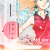
#10: The words don't really match the icon. The text could have been placed better.
10: The colour theme of the icon does not go well with the lyric you have chosen. Although the text says 'the cold season', the colour theme uses green, brown and overall, warm colours. Thus it may have been better to try and use cold colours such as blue, purple and perhaps green.
#10: text does not seem to really relate to the image
10 - Gaara looks too heavily outlined, the texture in the background is awkward looking, and the text looks too squeezed in. :\
11. I really don't like the border. It looks bad. If it had curved along with the border, it would have looked better. I also don't like that font choice. It looks awkward.
11: Although I love your idea of using Sai's picture book (and it does go very well with the lyrics ^_^) The text seems to stand out too much. Its size makes it very readable but at the same time it makes it look too fake. I'm actually not sure myself what I would have done if I were to use this image but maybe try using more coloured textures? Or perhaps put the text separately (not on the book) and just have the book desaturated?
11. I like the idea behind this one, but the cropping could have been a little more interesting (maybe move it a little more to the left and top?), and the font chosen could have been better. it also looks a little odd to have most of the words capitalized.
11 - I like everything about this icon but the text. It's a fitting choice, but the actual font doesn't flow well with the rest of the icon at all. It doesn't fit.
#11-i LOVE the text on the booklet,but the textures up on top dont seem to match the rest of the icon.
#11 - The colors were kind of odd, it made it somewhat hard to tell who is holding the book, and I didn't find the font type fitting.
12. I really don't like the border on this icon. It's taking away from the other parts of the icon. Also the text looks a little blurry, and it would have been better if it was clearer.
12) Looks like it could have had a texture, something to spiff up the picture.
13. the idea for this icon is really cool, and I like the coloring. however, the font bothers me (I don't like the capitalized words; maybe if they were entirely capitalized, like THIS?), and I don't really like the border around every separate piece of the icon.
#13 - The coloring is pretty good, but the design isn't so well. It would look better if you found an alternative to the white box, because it takes up too much space and makes the icon look more empty than it is.
13 - The only thing I really don't like about this icon is the text. All caps would have been more consistent and would have added more elegance (which any icon with Neji in it needs, i.m.o). Subject's good, lyric choice's good. But the inconsistency ruins the icon for me.
14. The cropping is poor on this icon. It cuts poor Sakura right through her eye! It would have been better if the cropping cut the eye out completely or left it there.
#14- I hate to do this, because the icon is pretty good, but the text just doesn't fit. At all. Did you forget to check "Anti-Alias"?
14- The red spot on the icon sort of confuses me, the chose in font could have been better as well since it looks over sharpened. If it wern't for the fact of this being a lyrical challenge I would say just lose he text.
14: The sidebar is awkward and cluttered and the text would have looked better if flipped so it's vertical and perhaps placed on the sidebar? Also, the cropping of the image is mediocre, we want to see Sakura-chan's face~!
#14: the left side is really off and the text is hard to see
#14-i really like the color's you used in this icon,but there is a little too much going in the icon,it looks way to busy.
#14 - Too many textures/effects and the text seems a bit too sharp. Also, I don't like how you can only see half of Sakura's eye.
14- I don't understand why the four dots have been highlighted. it looks like a speech bubble coming from the side, and Sakura's ignoring it.
#14 - I don't quite understand what's going on on the left side of this icon - the texture seems strange
#15 - With Naruto and the text both being placed on the right/ lower-right side of the icon, it seems cramped in that one location while the rest of the icon is free space.
#15 - The icon is pretty - I really like the colors, but the cutout in the corner seems a bit odd; it's too dark, I was honestly wondering what it was at first.
16 > i kind of dig the wash-out look of the icon, but it makes the text a tad illegible :(
16 - overall I think it's too dull/greyish. color contrast would have brightened it as well as mayb esome textures to make it more interesting. also hard to tell what the top panel is.
#16-i really really like this icon!! but i have to vote for it because i car barley read the text,and its a little too bland.maybe if you brightened it a bit,it look great!:)
#16 - I can hardly read text on this one; maybe brightening the color a bit would make it more readable?
16) The blue hue's a bit overpowering to me; it could be for aesthetic purposes, but I think it'd look better with a bit more contrast
#17: It's hard to tell where Sakura ends and the rest of the icon begins. It seems way too bright, and the words don't really fit.
17: The image of Sakura seems too bright when it goes with the light background. It may have been better also if the top image was desaturated a little and the overall lines more visible. And although I like your use of text (especially the colours) the cursive text in the background is distracting and makes the icon look a little busy when it's not, try lowering the opacity or blurring it a bit.
17- Too over sharpened, and the brightness of the icon sort of makes her skin color look weird. Text choice could have been done better as well.
17: I actually really like this one, but the image seems to saturated and the lines are very thin so it all kind of blends together and makes it look off.
#17 - The "out of season" text stands out a bit too much (maybe a softer color could've been used?), and it's difficult to read the text underneath it.
#18: It seems quickly made, and the dots over Temariaren't very flattering. The text also looks like it was pasted on with no thought.
18. I don't like the coloring, here; temari looks kind of faded. also, the text could have been a better color, and positioned somewhere else that would add more to the icon.
#18 - The text isn't very good, it doesn't fit well. The icon is a little plain as well.
18- The image is rather dull and could have used some sharpening and some brighter layers to make the image better.
#18: text is difficult to read
18 - the text is kind of randomly placed and organized. also, maybe some textures or a border would have spiced it up. to me it just looks like a cropped image with some text on it.
#18-i like the cropping on the icon,but i cant read the text very well.maybe if you sharpened it,or used a differnt color it be wonderful^^
#18 - The text placement doesn't fit too well with the image. It's all placed on a small portion of the right side while there's so much empty space.
#18 - I love how you placed the text, but I didn't find the textures used too fitting. Also, the image could have been sharpened a bit.
18- The entire scene is rather flat. I see an arc of light by the text, that's nice. But I don't feel any special impact/interest in the icon. It looks too much like a simple screencap still. Maybe up contrast, or color variation, change something about it and make it YOURS.
18 - Nothing that really pops about this. The text is too muted against the icon.
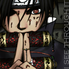
20 > poor text execution; in placement ( it barely fits onto the icon D: ) and colour ( the grey washes out into the black making it hard to read )
20: Although I like your colouring, the text seems to blend in too much with the background, and its placement seems a little awkward (perhaps it would have been better to have it horizontal? And have 'I see' on one line and 'through' on another?). And also it may have been better to use a texture to create a focus in one place, as currently the icon looks a little cluttered.
#20 - The icon is really plain, and the text doesn't look very good. The text would look better if it were red (the same red as his eye and the scrolls
20- Looks as if the image was just cropped to 100x100 and words were just put on the side. The cropping is nice, but it could have faired better if you added some sharpening and a bit of color to bring out the red in his eyes and on the scroll.
20: The text is very plain, some kind of simple background behind it would have made the icon look more finished or perhaps a choice of a different font.
#20: icon is too dark and the text is barely visible at all
20 - It seems too dark... and I can barely read the text.
20 - text is strangely placed and a little hard to read. the icon needs more color contrast also, and maybe a border or some textures/brushes would have made it more interesting. text doesn't really fit the icon either, to me.
#20 - The icon is way too dark! It's incredibly difficult to read the text; I didn't even know it had text when I first glanced at it.
20 - Text does not stand out enough. If I lean back in my chair, I can't see it anymore.
So, I'm thinking that the folks that make it through challenge 5 will be promoted to chuunin! Get working on it ^___^ Just remember, if you drop out for week five, you will only be eligible for promotion if you make it through challenge 6!
Remember, ask for snagging icons here.
Elimination


All of you have done a great job, please consider playing again! ^_^
Bonus - Best Use of Lyrics

devious_tofu
Spectator's Choice

blooming_cosmo
And yes, all of you that have won Bonus and Spectator's choice will get banners. I only have a week and a half of school left and when I get home I'm going to do them all! (Including the ones I owe for naruto_stills and kunoichi_stills >.>';;)
Critique
#04: While I love the coloring, the text isn't very organized. I started to read with "suffocating", but then I saw the word above it. It's pretty sloppily placed.
4. The text looks bad. If it had beeen straight it would have been better, and' suffocting' is drawing attention to Sasuke's nose, which I don't want my attention to go to a nose...
4. I think the image is a little too faded behind the colors and the texture. also, I'm not sure the text fits the theme of the image; the font could have been a little better, too.
#04 - The use of colors makes the icon look muddy; nothing really stands out. The text placement seems smushed together and kind of 'forced' into that small space in the image.
4- If the text is that simple and plain, then I feel the rest of the icon should be just as bare and simplified, (like only bw, for example) to match it more. otherwise...I don't feel it fits the icon. with its purple haze.
#04 - The monotone colors in this one are a bit boring; also, a more interesting font could've been used, and the text is a bit difficult to read.
4) It just seems like all that was done was a gradient pasted over it. The text could have been a bit more suiting.
5 - The coloring is really weird on this, especially at the bottom of the icon.
05) I feel the light texture's a bit too much; somewhat less opacity might have been better.
06 > the poor text placement and icon composition; the separation bar ( with the dotted squiggly ) takes away the flow of the icon
06: Generally not bad as an icon, but has some flaws. The dotted line is a nice idea but the shape in which you did it (looks like you sort of stopped and started, looks messy, etc) isn't great. Also the image is a little dark.
6- I don't get why the highlight is on her shoulder.
07 - I don't like the color contrasts of the image. The green clashes with that icky dried-blood color. The text choice was good. But the font is too simple.
09 > awkward colouring; naruto's bright yellow hair seems to pop too much on the pale plain background
#10: The words don't really match the icon. The text could have been placed better.
10: The colour theme of the icon does not go well with the lyric you have chosen. Although the text says 'the cold season', the colour theme uses green, brown and overall, warm colours. Thus it may have been better to try and use cold colours such as blue, purple and perhaps green.
#10: text does not seem to really relate to the image
10 - Gaara looks too heavily outlined, the texture in the background is awkward looking, and the text looks too squeezed in. :\
11. I really don't like the border. It looks bad. If it had curved along with the border, it would have looked better. I also don't like that font choice. It looks awkward.
11: Although I love your idea of using Sai's picture book (and it does go very well with the lyrics ^_^) The text seems to stand out too much. Its size makes it very readable but at the same time it makes it look too fake. I'm actually not sure myself what I would have done if I were to use this image but maybe try using more coloured textures? Or perhaps put the text separately (not on the book) and just have the book desaturated?
11. I like the idea behind this one, but the cropping could have been a little more interesting (maybe move it a little more to the left and top?), and the font chosen could have been better. it also looks a little odd to have most of the words capitalized.
11 - I like everything about this icon but the text. It's a fitting choice, but the actual font doesn't flow well with the rest of the icon at all. It doesn't fit.
#11-i LOVE the text on the booklet,but the textures up on top dont seem to match the rest of the icon.
#11 - The colors were kind of odd, it made it somewhat hard to tell who is holding the book, and I didn't find the font type fitting.
12. I really don't like the border on this icon. It's taking away from the other parts of the icon. Also the text looks a little blurry, and it would have been better if it was clearer.
12) Looks like it could have had a texture, something to spiff up the picture.
13. the idea for this icon is really cool, and I like the coloring. however, the font bothers me (I don't like the capitalized words; maybe if they were entirely capitalized, like THIS?), and I don't really like the border around every separate piece of the icon.
#13 - The coloring is pretty good, but the design isn't so well. It would look better if you found an alternative to the white box, because it takes up too much space and makes the icon look more empty than it is.
13 - The only thing I really don't like about this icon is the text. All caps would have been more consistent and would have added more elegance (which any icon with Neji in it needs, i.m.o). Subject's good, lyric choice's good. But the inconsistency ruins the icon for me.
14. The cropping is poor on this icon. It cuts poor Sakura right through her eye! It would have been better if the cropping cut the eye out completely or left it there.
#14- I hate to do this, because the icon is pretty good, but the text just doesn't fit. At all. Did you forget to check "Anti-Alias"?
14- The red spot on the icon sort of confuses me, the chose in font could have been better as well since it looks over sharpened. If it wern't for the fact of this being a lyrical challenge I would say just lose he text.
14: The sidebar is awkward and cluttered and the text would have looked better if flipped so it's vertical and perhaps placed on the sidebar? Also, the cropping of the image is mediocre, we want to see Sakura-chan's face~!
#14: the left side is really off and the text is hard to see
#14-i really like the color's you used in this icon,but there is a little too much going in the icon,it looks way to busy.
#14 - Too many textures/effects and the text seems a bit too sharp. Also, I don't like how you can only see half of Sakura's eye.
14- I don't understand why the four dots have been highlighted. it looks like a speech bubble coming from the side, and Sakura's ignoring it.
#14 - I don't quite understand what's going on on the left side of this icon - the texture seems strange
#15 - With Naruto and the text both being placed on the right/ lower-right side of the icon, it seems cramped in that one location while the rest of the icon is free space.
#15 - The icon is pretty - I really like the colors, but the cutout in the corner seems a bit odd; it's too dark, I was honestly wondering what it was at first.
16 > i kind of dig the wash-out look of the icon, but it makes the text a tad illegible :(
16 - overall I think it's too dull/greyish. color contrast would have brightened it as well as mayb esome textures to make it more interesting. also hard to tell what the top panel is.
#16-i really really like this icon!! but i have to vote for it because i car barley read the text,and its a little too bland.maybe if you brightened it a bit,it look great!:)
#16 - I can hardly read text on this one; maybe brightening the color a bit would make it more readable?
16) The blue hue's a bit overpowering to me; it could be for aesthetic purposes, but I think it'd look better with a bit more contrast
#17: It's hard to tell where Sakura ends and the rest of the icon begins. It seems way too bright, and the words don't really fit.
17: The image of Sakura seems too bright when it goes with the light background. It may have been better also if the top image was desaturated a little and the overall lines more visible. And although I like your use of text (especially the colours) the cursive text in the background is distracting and makes the icon look a little busy when it's not, try lowering the opacity or blurring it a bit.
17- Too over sharpened, and the brightness of the icon sort of makes her skin color look weird. Text choice could have been done better as well.
17: I actually really like this one, but the image seems to saturated and the lines are very thin so it all kind of blends together and makes it look off.
#17 - The "out of season" text stands out a bit too much (maybe a softer color could've been used?), and it's difficult to read the text underneath it.
#18: It seems quickly made, and the dots over Temariaren't very flattering. The text also looks like it was pasted on with no thought.
18. I don't like the coloring, here; temari looks kind of faded. also, the text could have been a better color, and positioned somewhere else that would add more to the icon.
#18 - The text isn't very good, it doesn't fit well. The icon is a little plain as well.
18- The image is rather dull and could have used some sharpening and some brighter layers to make the image better.
#18: text is difficult to read
18 - the text is kind of randomly placed and organized. also, maybe some textures or a border would have spiced it up. to me it just looks like a cropped image with some text on it.
#18-i like the cropping on the icon,but i cant read the text very well.maybe if you sharpened it,or used a differnt color it be wonderful^^
#18 - The text placement doesn't fit too well with the image. It's all placed on a small portion of the right side while there's so much empty space.
#18 - I love how you placed the text, but I didn't find the textures used too fitting. Also, the image could have been sharpened a bit.
18- The entire scene is rather flat. I see an arc of light by the text, that's nice. But I don't feel any special impact/interest in the icon. It looks too much like a simple screencap still. Maybe up contrast, or color variation, change something about it and make it YOURS.
18 - Nothing that really pops about this. The text is too muted against the icon.
20 > poor text execution; in placement ( it barely fits onto the icon D: ) and colour ( the grey washes out into the black making it hard to read )
20: Although I like your colouring, the text seems to blend in too much with the background, and its placement seems a little awkward (perhaps it would have been better to have it horizontal? And have 'I see' on one line and 'through' on another?). And also it may have been better to use a texture to create a focus in one place, as currently the icon looks a little cluttered.
#20 - The icon is really plain, and the text doesn't look very good. The text would look better if it were red (the same red as his eye and the scrolls
20- Looks as if the image was just cropped to 100x100 and words were just put on the side. The cropping is nice, but it could have faired better if you added some sharpening and a bit of color to bring out the red in his eyes and on the scroll.
20: The text is very plain, some kind of simple background behind it would have made the icon look more finished or perhaps a choice of a different font.
#20: icon is too dark and the text is barely visible at all
20 - It seems too dark... and I can barely read the text.
20 - text is strangely placed and a little hard to read. the icon needs more color contrast also, and maybe a border or some textures/brushes would have made it more interesting. text doesn't really fit the icon either, to me.
#20 - The icon is way too dark! It's incredibly difficult to read the text; I didn't even know it had text when I first glanced at it.
20 - Text does not stand out enough. If I lean back in my chair, I can't see it anymore.
So, I'm thinking that the folks that make it through challenge 5 will be promoted to chuunin! Get working on it ^___^ Just remember, if you drop out for week five, you will only be eligible for promotion if you make it through challenge 6!
Remember, ask for snagging icons here.