Results, Week 5
Week Five results, lickety split.
Elimination
Bonus - Most Creative
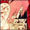
blooming_cosmo
Spectators' Choice
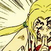
theshadowlover
Critique
01- The image looks a bit dull, but it's good that you enhanced the color, but to me I think it would have been nicer to make it slightly darker maybe by desaturating the base layer and setting it to soft light over the whole thing. Furthermore, the choice of tiny text and the lack of image sharpment also hinder the icon.
01 - Tiny text is awkward & the image looks unfinished (could have used some interesting texture or coloring).
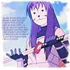
1 - the huge block of tiny text there just kind of draws my eye away from yuugao. maybe a border would have made it more interesting as well. doesn't really depict an action, either, in my opinion... she's just standing there.
01 - The image doesn't seem to fit the theme as well as some of the others. The text looks blockish, too. If the text were a few lines running across the image (and the opacity lowered) it would look better.
01. I don't want to say it looks like nothing was done to this icon, but there are no noticeable alterations except for the tiny text which is a little intrusive. I do like the cold color, it captures the image well, and the cropping was good, but the tiny text is much too distracting.
1 - The tiny text arrangment is very awkward, to me. The rugged border and faded color don't work very well; try for something more colorful with a more contemporary border.
#01 - The text, in this case, seems obstructive. To get away with text like that (in that size) there would need to be more contrast in the image itself. I wholly believe it would look a lot better without the text.
#1 - The border is a little blurry on the edges which makes the icon seem a little blurry as well. Other than that, the icon is very nicely made.
01. Firstly, the text on the icon seems too cluttered, perhaps it may have been better to use just two lines (or one actually) of tiny text. Because at the moment it seems that there is text you wanted us to read that we can't read (those that make sense?). But despite that I think you did a pretty good job with the colouring of the icon.
01: Too much tiny texts. Also, not really voting for the whole blue/purple-y thing; makes it seem like not much effort is done. Though the cropping and image quality is really nice.
#2 - the right side is really empty and too white
02 > the right-side of the icon gets washed-out by light texture.
2 - I don't like colors so faded out. Also, what's going on towards the right of the icon? O_o It fades out abruptly. This does nothing for the icon and seems to have no point at all.
#5 - the separation of the 2 images is too abrupt and the 2 vertical borders is pretty weird.
05 - The two images look too balanced and kind of boring. If one took up 2/3 of the icon it would look more interesting. Nice color choice, though.
#05 - Good concept and coloring, but the borders on the side look akward.
#05 - The icon looks a little weak, like you put together two pictures then added a gradient over it. You should blend the pictures a little, and maybe add some more seeable text.
#05 - The concept is good except it could have been better executed. The icon looks a little choppy because there is nothing between the two pictures.
6. I don't really like the light texture; there's a large bright spot right over sakura's arm, and you lose a lot of detail to it. also, I think it takes away from the focus of the icon, which is the action of Sakura about to punch someone/thing.
7. I don't like how they brought out the image from the manga. It's not very smooth. If they could have fixed that it would have been better. Also I don't like the light textrue, it doesn't complement Sakura.
7. I think I'd like this icon a little more if the use of textures didn't make it look like sakura were floating in outer space or something. overall, the cropping is good. there's a spot of the texture up in the top left corner that bothers me, too, because it's so bright you lose some of the edge.
#07 - I love the action depicted here, but the textures clash with the icon and draw attention away from Sakura.
#07 - The coloring is well done, but the borders are distracting. The image seems a tad dark.
#07: The light textures(s) covering Sakura take away from the overall appeal of the icon.
08 > the thick white borders put unnecessary emphasis on the main picture.
8 - The dark bars of color on the top and bottom impose on Sakura and, being blocky, seem to fade her out. The image also looks oversharpened
09. Although I like the contrast between the black, grey and the red, the blue clashes with the red and stands out too much thus making it a bit distracting. This may be because I'm a lover of harmonious colours so I'm sorry if the colour contrast was supposed to be the intended effect. (oh and I like the flower of the icon=lotus ^_^)
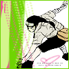
10. I like the subtle coloring on neji, but the texture, with the bright greens and pinks, is very distracting and my eye immediately jumps to it.
10- The mix of green and pink is very startling. A different texture for the background would have been much better.
10 - The background (green and pink) doesn't match the text and image of Neji - it looks awkward together.
10. The choice of colors pull the eye away from Neji. They're a little bright. Perhaps a little bit of color on Neji would have made this icon pop out a little bit more... and I'm not sure what a heart has to do with Neji about to beat someone up.
10. The simplicity of your icon is the key reason I have to sadly vote this icon out. Although I like your use of the one texture, it makes the texture stand out too much (perhaps even more than Neji). Also, the colouring of Neji could have been improved because at the moment the only colours a\I can see on him is his weapon bag. He is overall pale but you could have perhaps coloured his shirt grey/cream colour, and his skin a light cream colour. It may also have been better to use a background texture to give the icon more colour and to avoid the 'too simple' look.
10: Neji doesn't seem to blend well with the background. Also, the cropping isn't really good. A more neutral texture and toning down the brightness of Neji's picture would've made it better =)
10 - Neji's fighting stance really doesn't compliment the color scheme chosen.
#10: The neon green seems to be the focus of the icon instead of Neji. The chosen colors just don't work well together.
10 - The manga scan used looks low quality, though that could have just been from resizing it. But really...bright green textures and Neji do not go well. At all. The stark white space behind him is not flattering, either.
10 - The green and pink with hearts really doesn't seem to match Neji very well. And he's somewhat out of focus next to the colors used.
(-1 for bonus)
11. I'm sorry, I'm about to say it, it's too plain. If they added a brighter light textrue or some sort of brush would make this icon much better.
11- I think the image you used is great, but it could have used better cropping and even better image enhancement. Like it would have been really nice looking had the image come out a little lighter and sharpened.
11 - Too plain (omg, I said it~!). It could have used a texture, more interesting coloring, or some tiny text to spice it up. It doesn't really look like much was done to the image.
11 > i find the crop of the icon awkward and the texture is too subtle to be immediately noticed
11 - doesn't look like much was done to it. i can see sort of a texture in the background, but more would have made it more visually interesting. maybe a bit of tiny text and decorative brushes would have caught the eye as well.
11 - This icon seems too dark. The border does not complement and the texture on it only distracts from the actual image.
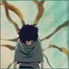
#11 - The cropping of the image could have been better. Perhaps if Gaara was either placed more to the side or dead-center, the icon would seem more appealing. The use of textures make the icon look muddy and unattractive.
#11 - Compared to the others, this is really plain. More effort could have been put into it. A more unique border could have added to it.
11: The image seems kind of blurry to me. It's like, Gaara blends too much with the background and it's not really good. A texture or some kind of image adjustment would make it better.
#11: I really like the simplicity of the icon, but the striped texture takes away from the focus and makes my eyes wander to the top corner.
11 - Texture(s) were not used effectively here. You can sort of see them, but they really add nothing to the icon, making it look like not much more than a basic crop.
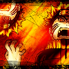
12. There is way too much going on in this icon. It hurts my eyes. I also don't like the border. It looks like it was a line brush, and then the just rotated it 180° to make the bottom border. If they added to two sides it might have been better. Also I don't like the second Naruto head there. I also think if it wasn't there it would make the icon much better.
12- The colors are very overwhelming, which really takes the focus away from the icon. Tone down the icon's orangeness and it would really look cool.
12 - Pretty good, but the colors are too bright and distracting, dimming it down so the image was clearer would be better. ^^ Otherwise I like this one.
#12 - there's too much orange and too overburnt to the point that at first glance it's hard to tell what the image is
12 > image was oversharpened and black border brushes, i feel were an unnessary addition.
12 - too red/orange, it dominates too much. i also don't like the thick black border.. i can understand that you were kind of going for a rough grungy look but overall the icon is just too much red and orange.
12. I like the cropping and the colors, but the color is just too much and it takes away from the picture of Naruto.
#12 - The image is sharpened too much, and the contrast between the colors is too great. If it was toned own just a bit, the icon would have looked better
#12 - The icon is way too bright. Too much orange and the black border doesn't work well with the icon.
#12 - It looks as if the coloring is too blurry thus making the icon messy looking. The bright use of red/orange colors contrasts a little too much with the black
12: It's too... orange? I can only recognize Naruto's face on the right side and that's it. Can't really tell what's going on for the rest of the icon without leaning in too close and staring.
#12: There's too much red, and it's too bright as well. It hurts my eyes.
12 - It's a good action, but the icon is just kind of...too bright. The bold coloring
#13 - The icon is a bit plain. More could have been done to enhance it. The coloring is good, but maybe if you added a few textures or a border it would be even better.
14 - The colors are too dull and they don't compliment the picture because the image itself is not as movement orientated as the other entries. There needs to be more contrast, maybe use a different texture/brush.
15 - Border is /very/ distracting.
15 - the border doesn't really go with the image -- it might have looked better just smooth and not broken up. also, i didn't understand that she was twirling a kunai at first - at first it just looked like some weird brush. :/
#15 - The border is not a good choice for the icon. The cropping is a little odd as well.
18. I don't know if they were going for this, but the contrast is way too high. It's also very shart and it doesn't look all that good.
18. I'm...not entirely sure what's going on in this icon. oO; the sun-like object is weird, and the yellow and red clash and it's very distracting. also, the image itself...it's really hard to even tell what it is.
#18 - very hard to see what is happening and the sun in the background is very odd with the situation (really looks like a body falling and a head blowing off towards the sky but I don't know what's happening)
18. I don't know what's going on in this picture.
#18 - The texture/colors overpower the icon. It's extremely difficult to make out the image in the icon.
#18 - It's difficult ot tell what this icon is off, and the colors are too bright. The browns don't look very pleasing.
18. I like your idea of incorporating the 'Japan' theme into your icon with the sun in the background and the colours used makes the icon stand out. But at the same time the colours are harsh on the eyes and it's very hard to see the details and what's happening in the icon. It may have been better to desaturate the icon and make one point (the fighting scene) the main focus point.
18 - I can't even figure out who's in the icon.
Congrats to everyone that made it through, keep working hard!
Elimination


Bonus - Most Creative

blooming_cosmo
Spectators' Choice

theshadowlover
Critique
01- The image looks a bit dull, but it's good that you enhanced the color, but to me I think it would have been nicer to make it slightly darker maybe by desaturating the base layer and setting it to soft light over the whole thing. Furthermore, the choice of tiny text and the lack of image sharpment also hinder the icon.
01 - Tiny text is awkward & the image looks unfinished (could have used some interesting texture or coloring).
1 - the huge block of tiny text there just kind of draws my eye away from yuugao. maybe a border would have made it more interesting as well. doesn't really depict an action, either, in my opinion... she's just standing there.
01 - The image doesn't seem to fit the theme as well as some of the others. The text looks blockish, too. If the text were a few lines running across the image (and the opacity lowered) it would look better.
01. I don't want to say it looks like nothing was done to this icon, but there are no noticeable alterations except for the tiny text which is a little intrusive. I do like the cold color, it captures the image well, and the cropping was good, but the tiny text is much too distracting.
1 - The tiny text arrangment is very awkward, to me. The rugged border and faded color don't work very well; try for something more colorful with a more contemporary border.
#01 - The text, in this case, seems obstructive. To get away with text like that (in that size) there would need to be more contrast in the image itself. I wholly believe it would look a lot better without the text.
#1 - The border is a little blurry on the edges which makes the icon seem a little blurry as well. Other than that, the icon is very nicely made.
01. Firstly, the text on the icon seems too cluttered, perhaps it may have been better to use just two lines (or one actually) of tiny text. Because at the moment it seems that there is text you wanted us to read that we can't read (those that make sense?). But despite that I think you did a pretty good job with the colouring of the icon.
01: Too much tiny texts. Also, not really voting for the whole blue/purple-y thing; makes it seem like not much effort is done. Though the cropping and image quality is really nice.
#2 - the right side is really empty and too white
02 > the right-side of the icon gets washed-out by light texture.
2 - I don't like colors so faded out. Also, what's going on towards the right of the icon? O_o It fades out abruptly. This does nothing for the icon and seems to have no point at all.
#5 - the separation of the 2 images is too abrupt and the 2 vertical borders is pretty weird.
05 - The two images look too balanced and kind of boring. If one took up 2/3 of the icon it would look more interesting. Nice color choice, though.
#05 - Good concept and coloring, but the borders on the side look akward.
#05 - The icon looks a little weak, like you put together two pictures then added a gradient over it. You should blend the pictures a little, and maybe add some more seeable text.
#05 - The concept is good except it could have been better executed. The icon looks a little choppy because there is nothing between the two pictures.
6. I don't really like the light texture; there's a large bright spot right over sakura's arm, and you lose a lot of detail to it. also, I think it takes away from the focus of the icon, which is the action of Sakura about to punch someone/thing.
7. I don't like how they brought out the image from the manga. It's not very smooth. If they could have fixed that it would have been better. Also I don't like the light textrue, it doesn't complement Sakura.
7. I think I'd like this icon a little more if the use of textures didn't make it look like sakura were floating in outer space or something. overall, the cropping is good. there's a spot of the texture up in the top left corner that bothers me, too, because it's so bright you lose some of the edge.
#07 - I love the action depicted here, but the textures clash with the icon and draw attention away from Sakura.
#07 - The coloring is well done, but the borders are distracting. The image seems a tad dark.
#07: The light textures(s) covering Sakura take away from the overall appeal of the icon.
08 > the thick white borders put unnecessary emphasis on the main picture.
8 - The dark bars of color on the top and bottom impose on Sakura and, being blocky, seem to fade her out. The image also looks oversharpened
09. Although I like the contrast between the black, grey and the red, the blue clashes with the red and stands out too much thus making it a bit distracting. This may be because I'm a lover of harmonious colours so I'm sorry if the colour contrast was supposed to be the intended effect. (oh and I like the flower of the icon=lotus ^_^)
10. I like the subtle coloring on neji, but the texture, with the bright greens and pinks, is very distracting and my eye immediately jumps to it.
10- The mix of green and pink is very startling. A different texture for the background would have been much better.
10 - The background (green and pink) doesn't match the text and image of Neji - it looks awkward together.
10. The choice of colors pull the eye away from Neji. They're a little bright. Perhaps a little bit of color on Neji would have made this icon pop out a little bit more... and I'm not sure what a heart has to do with Neji about to beat someone up.
10. The simplicity of your icon is the key reason I have to sadly vote this icon out. Although I like your use of the one texture, it makes the texture stand out too much (perhaps even more than Neji). Also, the colouring of Neji could have been improved because at the moment the only colours a\I can see on him is his weapon bag. He is overall pale but you could have perhaps coloured his shirt grey/cream colour, and his skin a light cream colour. It may also have been better to use a background texture to give the icon more colour and to avoid the 'too simple' look.
10: Neji doesn't seem to blend well with the background. Also, the cropping isn't really good. A more neutral texture and toning down the brightness of Neji's picture would've made it better =)
10 - Neji's fighting stance really doesn't compliment the color scheme chosen.
#10: The neon green seems to be the focus of the icon instead of Neji. The chosen colors just don't work well together.
10 - The manga scan used looks low quality, though that could have just been from resizing it. But really...bright green textures and Neji do not go well. At all. The stark white space behind him is not flattering, either.
10 - The green and pink with hearts really doesn't seem to match Neji very well. And he's somewhat out of focus next to the colors used.
(-1 for bonus)
11. I'm sorry, I'm about to say it, it's too plain. If they added a brighter light textrue or some sort of brush would make this icon much better.
11- I think the image you used is great, but it could have used better cropping and even better image enhancement. Like it would have been really nice looking had the image come out a little lighter and sharpened.
11 - Too plain (omg, I said it~!). It could have used a texture, more interesting coloring, or some tiny text to spice it up. It doesn't really look like much was done to the image.
11 > i find the crop of the icon awkward and the texture is too subtle to be immediately noticed
11 - doesn't look like much was done to it. i can see sort of a texture in the background, but more would have made it more visually interesting. maybe a bit of tiny text and decorative brushes would have caught the eye as well.
11 - This icon seems too dark. The border does not complement and the texture on it only distracts from the actual image.
#11 - The cropping of the image could have been better. Perhaps if Gaara was either placed more to the side or dead-center, the icon would seem more appealing. The use of textures make the icon look muddy and unattractive.
#11 - Compared to the others, this is really plain. More effort could have been put into it. A more unique border could have added to it.
11: The image seems kind of blurry to me. It's like, Gaara blends too much with the background and it's not really good. A texture or some kind of image adjustment would make it better.
#11: I really like the simplicity of the icon, but the striped texture takes away from the focus and makes my eyes wander to the top corner.
11 - Texture(s) were not used effectively here. You can sort of see them, but they really add nothing to the icon, making it look like not much more than a basic crop.
12. There is way too much going on in this icon. It hurts my eyes. I also don't like the border. It looks like it was a line brush, and then the just rotated it 180° to make the bottom border. If they added to two sides it might have been better. Also I don't like the second Naruto head there. I also think if it wasn't there it would make the icon much better.
12- The colors are very overwhelming, which really takes the focus away from the icon. Tone down the icon's orangeness and it would really look cool.
12 - Pretty good, but the colors are too bright and distracting, dimming it down so the image was clearer would be better. ^^ Otherwise I like this one.
#12 - there's too much orange and too overburnt to the point that at first glance it's hard to tell what the image is
12 > image was oversharpened and black border brushes, i feel were an unnessary addition.
12 - too red/orange, it dominates too much. i also don't like the thick black border.. i can understand that you were kind of going for a rough grungy look but overall the icon is just too much red and orange.
12. I like the cropping and the colors, but the color is just too much and it takes away from the picture of Naruto.
#12 - The image is sharpened too much, and the contrast between the colors is too great. If it was toned own just a bit, the icon would have looked better
#12 - The icon is way too bright. Too much orange and the black border doesn't work well with the icon.
#12 - It looks as if the coloring is too blurry thus making the icon messy looking. The bright use of red/orange colors contrasts a little too much with the black
12: It's too... orange? I can only recognize Naruto's face on the right side and that's it. Can't really tell what's going on for the rest of the icon without leaning in too close and staring.
#12: There's too much red, and it's too bright as well. It hurts my eyes.
12 - It's a good action, but the icon is just kind of...too bright. The bold coloring
#13 - The icon is a bit plain. More could have been done to enhance it. The coloring is good, but maybe if you added a few textures or a border it would be even better.
14 - The colors are too dull and they don't compliment the picture because the image itself is not as movement orientated as the other entries. There needs to be more contrast, maybe use a different texture/brush.
15 - Border is /very/ distracting.
15 - the border doesn't really go with the image -- it might have looked better just smooth and not broken up. also, i didn't understand that she was twirling a kunai at first - at first it just looked like some weird brush. :/
#15 - The border is not a good choice for the icon. The cropping is a little odd as well.
18. I don't know if they were going for this, but the contrast is way too high. It's also very shart and it doesn't look all that good.
18. I'm...not entirely sure what's going on in this icon. oO; the sun-like object is weird, and the yellow and red clash and it's very distracting. also, the image itself...it's really hard to even tell what it is.
#18 - very hard to see what is happening and the sun in the background is very odd with the situation (really looks like a body falling and a head blowing off towards the sky but I don't know what's happening)
18. I don't know what's going on in this picture.
#18 - The texture/colors overpower the icon. It's extremely difficult to make out the image in the icon.
#18 - It's difficult ot tell what this icon is off, and the colors are too bright. The browns don't look very pleasing.
18. I like your idea of incorporating the 'Japan' theme into your icon with the sun in the background and the colours used makes the icon stand out. But at the same time the colours are harsh on the eyes and it's very hard to see the details and what's happening in the icon. It may have been better to desaturate the icon and make one point (the fighting scene) the main focus point.
18 - I can't even figure out who's in the icon.
Congrats to everyone that made it through, keep working hard!