Results, Week 6
So, we're almost done.
Elimination
Bonus and Spectator's Choice
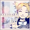
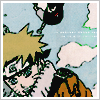
light_flower
Critique
3. I don't like the really dark tiny text. It stands out too much and looks bad. Also Sajura isn't complemented all that well.
3. it took me a couple of minutes to even realize WHAT it was, let alone WHO. the cropping could definitely use a bit of work. I'm not sure I like the coloring of the dominant image; admittedly, the theme was "blue", but I think it could have been executed better. also, the texture has little to do with the rest of the icon, and the tiny text stands out a tad bit too much.
3 - I really, really don't like the tiny text. It seems to be more lines than text. It just really kills the icon for me.
#03 - The size of the image is too small; the texture behind it draws attention away from the image itself. Because of the way the top image is cropped/colored, it took me a minute to figure out it was Sakura.
03 > image is seems over sharpened, the background texture's hue seems too light to really match the contrast of images, and the tiny text is slightly distracting to the continuity of the icon.
3. The frame doesn't blend well with the pictures, and it's a very odd cropping job.
03 - It's really hard to tell it's Sakura - too much destaturation/dark texture. The text is also too awkward, the opacity should be turned down a bit or it should be set to 'antialias'.
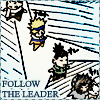
4. I don't like how think the manga lines look here, especially around Naruto's face. It looks awkward...
4. I like the cropping, but the first thing I noticed was that the use of a color burn layer was too obvious; the opacity could have been lessened a little. also, I don't like how gray/brown Naruto's hair and jacket look. and did you miss a spot when coloring the sky, next to Sasuke's leg? that just looks odd.
4 - Coloring is good, but the icon is a little dark and I don't like how thick the lines of the manga image are.
04- The icon would be so much better if the image were better picked. The colors would look better if they were vibrant.
#04 - The lines in this image are much too thick; the coloring doesn't do much for the icon.
04 > i like the colouring job on this icon, however the thick lines of the low quality manga scan is distracting.
#04 - The colors on Naruto seemed a bit too dark. If you had at least made his hair lighter, the icon would have been much better. Also, the tiny text(?) seems a bit randomly placed, especially with the empty space between the lines.
4. The coloring was done well but it's just a tad bit flat, and the lines are a little too dense, and I feel like the blue tine to it took away from the dynamic image.
#4 The outlines are too dark and the colours are dull
#04 - I think a cleaner scan could've been used, or maybe brighter colors - the overall look seems a bit muddy
#05 - I personally would have dropped the scanlines, especially on Naruto himself. The text also seems a bit blurred. Other than that, the colors used are really pretty.
05- Some experimenting with the image would have been much nicer. Scan lines aren't necessary, and the text could have been spaced out a little so that it doesn't look all clumped up in the corner.
#05 - It's a nice icon, but the font choice is a bit boring, and the scan lines don't add much to it
05 - The white strip at the bottom looks odd, instead of using it perhaps you could have just lightened up the section where you wanted the text.
6. The text on this icon doesn't look good. It's too big, and the stroke around it isn't very good either. Also, it's too plain. If they used a light texture, it would have been better.
6 - Looks oversharpened. Text is crunched together and awkwardly placed.
06 > scan quality isn't the greatest and i feel the colouring is alittle too subtle.
#06 - The border didn't fit, and the image seems a bit too sharp.
6. The icon is adorable, but the simple cropping-coloring-text kind of took away from it. It feels very rushed. A different texture or blue background would have complimented this icon very well.
06 - The image looks blockish - the lines are too thick and the text looks like it was just lumped in the corner as an afterthought.
8. The text bubble distracts the eye and generally takes away from the icon.
09- The colors aren't handled very well in this one. It would have been so much nicer had the colors remained vibrant with maybe the bottom image desaturated. Then a light texture would have been a nice touch as well.
09 > this icon seems very cookie-cutter/generic; as in [ and i sincerely apologize if this isn't the case, but... ] it was taken straight from icon_tutorial and just swapped out the image and text
#09 - I really like the way of placing text on the icon, but what I don't like is when the carpenter font go over the text below (g, y). Fading out the parts that go over would make it flow much better. Also, the colors on the image seems a bit odd to me.
#9 The top text was somewhat difficult to read and the glow around the text is not flattering.
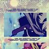
10. I don't like the little bit off to the right, with the smaller mirror image of Sasuke. what REALLY bugs me about it is the translucent box; it's a little distracting. I think the icon would have looked better without that entire section on top of everything. also, the light texture, just barely visible across Sasuke's legs, bothers me. his legs and pants lose a little too much detail to it.
#10 - I like the design, but I think it would look really nice if this one were a bit brighter - maybe less monotone
#11 - This icon just looks like a cropped image that was colored (though I like the coloring) and not much else was done to it. Perhaps if you put a border/text/something on it, it would seem more complete.
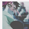
12. I don't like the streak of red across Gaara's face. It looks bad. Also, the tiny text is place awkwardly. If it was moved down a bit it would have been batter.
12. the picture in this icon is a little too faded for my tastes, and I don't really like the light texture; the red in it detracts from the overall icon, I think.
12 - I don't like the red streak across Gaara's face. It makes no sense.
12- The colors are clashing. It really would have looked better if it weren't desaturated. That and it needs some sharpening.
#12 - The pinkish splotch going across Gaara's face looks kind of funky. If you had left that out, the icon would have looked more appealing.
#12 The icon is too dark and the small text placement is awkward
#12 - The light texture over Gaara's face is kind of weird, and the grey two-sides border seems kind of out of place
#13 The desaturation done at the bottom is too dark and neutralized.
13 - I don't think this icon fits the theme as well as it could have, the text looks too green, as well as the background of the image.
Elimination


Bonus and Spectator's Choice

light_flower
Critique
3. I don't like the really dark tiny text. It stands out too much and looks bad. Also Sajura isn't complemented all that well.
3. it took me a couple of minutes to even realize WHAT it was, let alone WHO. the cropping could definitely use a bit of work. I'm not sure I like the coloring of the dominant image; admittedly, the theme was "blue", but I think it could have been executed better. also, the texture has little to do with the rest of the icon, and the tiny text stands out a tad bit too much.
3 - I really, really don't like the tiny text. It seems to be more lines than text. It just really kills the icon for me.
#03 - The size of the image is too small; the texture behind it draws attention away from the image itself. Because of the way the top image is cropped/colored, it took me a minute to figure out it was Sakura.
03 > image is seems over sharpened, the background texture's hue seems too light to really match the contrast of images, and the tiny text is slightly distracting to the continuity of the icon.
3. The frame doesn't blend well with the pictures, and it's a very odd cropping job.
03 - It's really hard to tell it's Sakura - too much destaturation/dark texture. The text is also too awkward, the opacity should be turned down a bit or it should be set to 'antialias'.
4. I don't like how think the manga lines look here, especially around Naruto's face. It looks awkward...
4. I like the cropping, but the first thing I noticed was that the use of a color burn layer was too obvious; the opacity could have been lessened a little. also, I don't like how gray/brown Naruto's hair and jacket look. and did you miss a spot when coloring the sky, next to Sasuke's leg? that just looks odd.
4 - Coloring is good, but the icon is a little dark and I don't like how thick the lines of the manga image are.
04- The icon would be so much better if the image were better picked. The colors would look better if they were vibrant.
#04 - The lines in this image are much too thick; the coloring doesn't do much for the icon.
04 > i like the colouring job on this icon, however the thick lines of the low quality manga scan is distracting.
#04 - The colors on Naruto seemed a bit too dark. If you had at least made his hair lighter, the icon would have been much better. Also, the tiny text(?) seems a bit randomly placed, especially with the empty space between the lines.
4. The coloring was done well but it's just a tad bit flat, and the lines are a little too dense, and I feel like the blue tine to it took away from the dynamic image.
#4 The outlines are too dark and the colours are dull
#04 - I think a cleaner scan could've been used, or maybe brighter colors - the overall look seems a bit muddy
#05 - I personally would have dropped the scanlines, especially on Naruto himself. The text also seems a bit blurred. Other than that, the colors used are really pretty.
05- Some experimenting with the image would have been much nicer. Scan lines aren't necessary, and the text could have been spaced out a little so that it doesn't look all clumped up in the corner.
#05 - It's a nice icon, but the font choice is a bit boring, and the scan lines don't add much to it
05 - The white strip at the bottom looks odd, instead of using it perhaps you could have just lightened up the section where you wanted the text.
6. The text on this icon doesn't look good. It's too big, and the stroke around it isn't very good either. Also, it's too plain. If they used a light texture, it would have been better.
6 - Looks oversharpened. Text is crunched together and awkwardly placed.
06 > scan quality isn't the greatest and i feel the colouring is alittle too subtle.
#06 - The border didn't fit, and the image seems a bit too sharp.
6. The icon is adorable, but the simple cropping-coloring-text kind of took away from it. It feels very rushed. A different texture or blue background would have complimented this icon very well.
06 - The image looks blockish - the lines are too thick and the text looks like it was just lumped in the corner as an afterthought.
8. The text bubble distracts the eye and generally takes away from the icon.
09- The colors aren't handled very well in this one. It would have been so much nicer had the colors remained vibrant with maybe the bottom image desaturated. Then a light texture would have been a nice touch as well.
09 > this icon seems very cookie-cutter/generic; as in [ and i sincerely apologize if this isn't the case, but... ] it was taken straight from icon_tutorial and just swapped out the image and text
#09 - I really like the way of placing text on the icon, but what I don't like is when the carpenter font go over the text below (g, y). Fading out the parts that go over would make it flow much better. Also, the colors on the image seems a bit odd to me.
#9 The top text was somewhat difficult to read and the glow around the text is not flattering.
10. I don't like the little bit off to the right, with the smaller mirror image of Sasuke. what REALLY bugs me about it is the translucent box; it's a little distracting. I think the icon would have looked better without that entire section on top of everything. also, the light texture, just barely visible across Sasuke's legs, bothers me. his legs and pants lose a little too much detail to it.
#10 - I like the design, but I think it would look really nice if this one were a bit brighter - maybe less monotone
#11 - This icon just looks like a cropped image that was colored (though I like the coloring) and not much else was done to it. Perhaps if you put a border/text/something on it, it would seem more complete.
12. I don't like the streak of red across Gaara's face. It looks bad. Also, the tiny text is place awkwardly. If it was moved down a bit it would have been batter.
12. the picture in this icon is a little too faded for my tastes, and I don't really like the light texture; the red in it detracts from the overall icon, I think.
12 - I don't like the red streak across Gaara's face. It makes no sense.
12- The colors are clashing. It really would have looked better if it weren't desaturated. That and it needs some sharpening.
#12 - The pinkish splotch going across Gaara's face looks kind of funky. If you had left that out, the icon would have looked more appealing.
#12 The icon is too dark and the small text placement is awkward
#12 - The light texture over Gaara's face is kind of weird, and the grey two-sides border seems kind of out of place
#13 The desaturation done at the bottom is too dark and neutralized.
13 - I don't think this icon fits the theme as well as it could have, the text looks too green, as well as the background of the image.