Results, Week 7
Sorry to keep you guys waiting so long... it was just important that I got enough votes in. I think that's the fairest way to conduct the game. The voting came really really close for the third elimination spot.
Elimination
Moderator's Choice There were multiple ties for Spectators' Choice... so I axed it this week. XP
hitomik
Critique
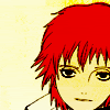
#01 - The lines seem oversharpened and I don't like the different shades of yellow in the icon.
1 - I don't like the yellowish tone to it.
1. I'm going to say it again. It's boring. If they aded a snazy texture or something, it would be nicer, and the hair is too bright, and poor Sasori looks sick. He's very yellow.
01- It looks so yellow. I don't know what texture you used over Sasori's face, but it really is too much for the icon. If you removed that and put a nice background texture to compliment the image and colors then it would have come out much better.
#1 - The texture used in this icon doesn't blend well with the image.
#01 - The crop of this icon is strange and there is too much yellow. Using an exclution would've been better.
01: This icon just seems empty. The coloring is very nice, but the red just seemed to pop out under all that subtle yellow. Some light textures and some text might have made this icon even better.
01 - The yellow highlights above his head and around his eyes bother me.
01 - The texture(?) used is too.. yellow. If you used the eraser on at least his face, it would look so much better imo. Also, some text(even tiny text) would probably help too, as it looks sort of plain.
1 - It just looks like you colored Sasori and threw a yellowish multiply layer over him - a texture, some text, some tiny text would have made this icon /much/ better.
1 - The coloring over his face makes him look sick.
#01: There's too much empty space, and all the yellow makes it look washed out.
01 > i feel the contrast between his hair and the background/his skin is too much; not a big fan of the colour scheme
01. I like the picture placement but it may have been better to have a simple text to fill the empty space (top left corner)
02. Although I love the topic you've chosen, the colour doesn't seem to match the entire picture. May have been better to use a softer picture.
3. I know the weird...things coming out of Kakuzu's back are part of the picture, but they're odd and they're distracting. also, I don't like the inclusion of the word "stitches", or the black box beneath the "needle & thread" with the tiny text; I think the icon might have looked better without them. the border also doesn't really fit the color scheme; it seems to be mostly browns, and the red in the border doesn't match it.
03: I like the idea of this icon...but I can't really read the text that well.
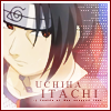
4. there's something about this icon that bothers me, part of which is because I kept briefly looking over them and thinking it was Sasuke, but whatever. anyway. XD; I like the cropping, but the entire thing is a little too light to really FIT an icon of itachi. I don't like all the tiny text or cloud light texture-like look or even the border; it's distracting, and it doesn't add anything to the icon.
4. I noticed that all the other entries are manga, so instantly, this one pops out. I have to say, that I really don't like this one. The text is to boring. Yes, I reilize it's Itachi. And the white tiny text along the side is destracting.
04- The icon came out really light. I think it would have been cool if you manipulated the image more then you did and maybe use a light texture.
#04 -The tiny text on the side doesn't really fit with the icon at all. Seems strange to me.
04 - There is too much small text on the right side - it looks awkward.
04 - Too much tiny text use, I have to say ^^; and the one under "uchiha itachi" looks a bit randomly placed. Also, Itachi's face is too light compared to the border.. but that might just be me being a bit too picky. *having a hard time choosing*
04 - I didn't think this was really the best image choice.. Just looks like you slapped some text & tiny text on there. The border's nice, but something's missing - maybe a light texture or something.
#4 - The small text on the right side is not flattering and the image does not look like much was done
04 > placement of the tiny text could be more flattering to the layout of the icon
04. The only thing I don't like about this icon is the amount of tiny text. It may have been better to use only a few lines, or decrease the opacity.
5 - The text is too large to fit... the grayish shade of it doesn't tie in.
5. It's fuzzy. It's giving me a headache looking at it. If it was cleaned up, and sharpened, I would like it better.
05- I do like your icon though it would have looked much cooler if you took the same image and cropped it on the bottom under the text.
05: The icon itself seems too ordinary, and some textures would add a very nice touch to it.
05 > nothing about this icon makes me say "oh, wow!"; the overall icon, i feel, lacks creativity and artistic unique-ness.
05 - The black box isn't very attractive. Maybe if it were blurred so that it would be less apparant or something it would look better.
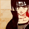
#06 - The scan isn't of great quality and the red light is distracting.
#6 - i like the image and texture you chose,but the red blob seems out of place in the icon.
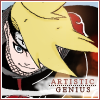
7 - I dislike the look of it. It looks very un-made; like someone just colored it, slapped on text, and entered it. I dislike the text; the color-change method normally gives needed contrast, but this one just looks bad.
#7 - the cropping is wonderful in this icon,but Deidara's face seems out of place,the rest of her is colored but her face and it stand out very much.if you colored it though,it be perfect!
#07 -The white line and the white smudge for the text seem strange.
07 - The colors look kind of dull and the white background for the text looks messy and quickly done.
#07: It looks like there's nothing but coloring and text; an effect or two would have been nice.
07 - Try using Book Antiqua instead of Times New Roman (I think both come on the standard computer). It's like...too sharp, it sticks out too much, and just looks really bad. =/
07 - The text is way to sharp, it detracts from the image of Deidara.
#09 - I'm all for glowing effects, but this icon glows TOO much. It detracts from the actual image.
9. I'll admit that the blue theme to this icon is rather refreshing compared to the main theme of red this week has, but...it doesn't quite FIT. maybe if it were a darker blue, as opposed to the light, silvery blue here, but...*shrug* also, the bottom text is very small and a little hard to read, and I don't like the faded edges of the two pieces of the picture. also, the color of the "S" could have been better chosen.
09 - It just seems.. oversharpened. And the colors look somewhat odd to me. But I like the general idea, especially the text~
09 - The text is a little plain (a more interesting font perhaps?) and I'm not too fond of what it says. Also, er, Sasori's hair is red. However I like the border and the eyes. ^^
#9 - The text is difficult to read and the border doesn't work well with the image.
#09: The style is very similar to past icons made, so it doesn't look original at all. The bottom text is too hard to read. I had to squint to make it out.
Elimination


Moderator's Choice There were multiple ties for Spectators' Choice... so I axed it this week. XP

hitomik
Critique
#01 - The lines seem oversharpened and I don't like the different shades of yellow in the icon.
1 - I don't like the yellowish tone to it.
1. I'm going to say it again. It's boring. If they aded a snazy texture or something, it would be nicer, and the hair is too bright, and poor Sasori looks sick. He's very yellow.
01- It looks so yellow. I don't know what texture you used over Sasori's face, but it really is too much for the icon. If you removed that and put a nice background texture to compliment the image and colors then it would have come out much better.
#1 - The texture used in this icon doesn't blend well with the image.
#01 - The crop of this icon is strange and there is too much yellow. Using an exclution would've been better.
01: This icon just seems empty. The coloring is very nice, but the red just seemed to pop out under all that subtle yellow. Some light textures and some text might have made this icon even better.
01 - The yellow highlights above his head and around his eyes bother me.
01 - The texture(?) used is too.. yellow. If you used the eraser on at least his face, it would look so much better imo. Also, some text(even tiny text) would probably help too, as it looks sort of plain.
1 - It just looks like you colored Sasori and threw a yellowish multiply layer over him - a texture, some text, some tiny text would have made this icon /much/ better.
1 - The coloring over his face makes him look sick.
#01: There's too much empty space, and all the yellow makes it look washed out.
01 > i feel the contrast between his hair and the background/his skin is too much; not a big fan of the colour scheme
01. I like the picture placement but it may have been better to have a simple text to fill the empty space (top left corner)
02. Although I love the topic you've chosen, the colour doesn't seem to match the entire picture. May have been better to use a softer picture.
3. I know the weird...things coming out of Kakuzu's back are part of the picture, but they're odd and they're distracting. also, I don't like the inclusion of the word "stitches", or the black box beneath the "needle & thread" with the tiny text; I think the icon might have looked better without them. the border also doesn't really fit the color scheme; it seems to be mostly browns, and the red in the border doesn't match it.
03: I like the idea of this icon...but I can't really read the text that well.
4. there's something about this icon that bothers me, part of which is because I kept briefly looking over them and thinking it was Sasuke, but whatever. anyway. XD; I like the cropping, but the entire thing is a little too light to really FIT an icon of itachi. I don't like all the tiny text or cloud light texture-like look or even the border; it's distracting, and it doesn't add anything to the icon.
4. I noticed that all the other entries are manga, so instantly, this one pops out. I have to say, that I really don't like this one. The text is to boring. Yes, I reilize it's Itachi. And the white tiny text along the side is destracting.
04- The icon came out really light. I think it would have been cool if you manipulated the image more then you did and maybe use a light texture.
#04 -The tiny text on the side doesn't really fit with the icon at all. Seems strange to me.
04 - There is too much small text on the right side - it looks awkward.
04 - Too much tiny text use, I have to say ^^; and the one under "uchiha itachi" looks a bit randomly placed. Also, Itachi's face is too light compared to the border.. but that might just be me being a bit too picky. *having a hard time choosing*
04 - I didn't think this was really the best image choice.. Just looks like you slapped some text & tiny text on there. The border's nice, but something's missing - maybe a light texture or something.
#4 - The small text on the right side is not flattering and the image does not look like much was done
04 > placement of the tiny text could be more flattering to the layout of the icon
04. The only thing I don't like about this icon is the amount of tiny text. It may have been better to use only a few lines, or decrease the opacity.
5 - The text is too large to fit... the grayish shade of it doesn't tie in.
5. It's fuzzy. It's giving me a headache looking at it. If it was cleaned up, and sharpened, I would like it better.
05- I do like your icon though it would have looked much cooler if you took the same image and cropped it on the bottom under the text.
05: The icon itself seems too ordinary, and some textures would add a very nice touch to it.
05 > nothing about this icon makes me say "oh, wow!"; the overall icon, i feel, lacks creativity and artistic unique-ness.
05 - The black box isn't very attractive. Maybe if it were blurred so that it would be less apparant or something it would look better.
#06 - The scan isn't of great quality and the red light is distracting.
#6 - i like the image and texture you chose,but the red blob seems out of place in the icon.
7 - I dislike the look of it. It looks very un-made; like someone just colored it, slapped on text, and entered it. I dislike the text; the color-change method normally gives needed contrast, but this one just looks bad.
#7 - the cropping is wonderful in this icon,but Deidara's face seems out of place,the rest of her is colored but her face and it stand out very much.if you colored it though,it be perfect!
#07 -The white line and the white smudge for the text seem strange.
07 - The colors look kind of dull and the white background for the text looks messy and quickly done.
#07: It looks like there's nothing but coloring and text; an effect or two would have been nice.
07 - Try using Book Antiqua instead of Times New Roman (I think both come on the standard computer). It's like...too sharp, it sticks out too much, and just looks really bad. =/
07 - The text is way to sharp, it detracts from the image of Deidara.
#09 - I'm all for glowing effects, but this icon glows TOO much. It detracts from the actual image.
9. I'll admit that the blue theme to this icon is rather refreshing compared to the main theme of red this week has, but...it doesn't quite FIT. maybe if it were a darker blue, as opposed to the light, silvery blue here, but...*shrug* also, the bottom text is very small and a little hard to read, and I don't like the faded edges of the two pieces of the picture. also, the color of the "S" could have been better chosen.
09 - It just seems.. oversharpened. And the colors look somewhat odd to me. But I like the general idea, especially the text~
09 - The text is a little plain (a more interesting font perhaps?) and I'm not too fond of what it says. Also, er, Sasori's hair is red. However I like the border and the eyes. ^^
#9 - The text is difficult to read and the border doesn't work well with the image.
#09: The style is very similar to past icons made, so it doesn't look original at all. The bottom text is too hard to read. I had to squint to make it out.