xspin
in
narutolims
Session 1 Round 1 - Results!
Okay~~~ I wish we could have had more votes. ;; We do have enough to get by, though. ^^; Thank you for everyone that DID vote. :D
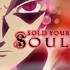
This week we bid goodbye to two iconers. ;; Thank you both very much for participating, I hope to see you again in future sessions!
With -12 votes...
And with -6 votes...
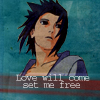
I will miss both of you very much. D: Thank you for participating, please continue to vote. ^^;
The winner of SC is orlandogirl
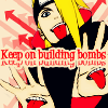
Mod's Choice:
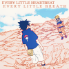
light_flower
I really loved the softer coloring on this, and the text used with it... *tear*.
Spectator's Choice:
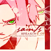
blooming_cosmo
And the crit:
002: The colored version of Gaara doesn't stand out well from the "background", because the background has almost the same color as Gaara's robe.
#5: I really like the concept, first of all ^^ But the text is scrunched together and hard to read, and the coloring is a little flat.
006: The white lines around the pictures look out of place. Background texture doesn't seem appropriate - too rough.
007: The font chosen simply doesn't go with the mood/theme that you're trying to set. While the theme is a very good one the crop, blur behind the text, and red stroke don't help it at all. Lovely idea but it's a little... lacking in practice.
#007 - The pink stroke around the text is unattractive and doesn't really help to blend the text into the icon. Perhaps a lighter color would've worked better?
#7: I like the text paired with the image a lot! However the texture and crop don't go with each other very well, and especially the crop is too large. The text outline is a bit blocky as well.
#07 - Nice placement, but the image could use more contrast and the text is a little too pixelated.
007: The base seems a little overpowered by the reddish tint to the icon and the enlarged text. If it weren't for the presence of the sharingan I'm not sure I'd be able to tell who was in the icon.
007: The pink around the text doesn't seem to match the overall of the icon, and another colour would've been a better choice
#07 - The border around the text just didn't fit. The crop could have been better, and I also think this is one of the icons that would look better with a border around it.
007: The red around the text doesn't look good against the tan color of his face.
7 - The cropping wasn't the best, the text probably looks better without the thick outline
#7 -The light texture is nice with the image and the font is good but the pink stroke and black text does not match the icon colors and seems to not blend in well with it.
07. I'm not fond of the lighting texture - it feels out of place when compared to the image and it stands out a little too much. Maybe a different shade or a softer opacity would help that, but as it is, it just distracts. The stroke (outerglow?) effect for the text also really stands out; blending that layer might make it work better. I like the idea behind it though!
007- The border around the text kills me. D: It would have looks so much better without that as well as making the image a but sharper and darker.
10 - The two pictures isn't blended well
012: The font used doesn't seem to suit the icon, though the text chosen suits the subject well.
#012 - The text doesn't fit the color scheme of the icon since it's just solid black like that and the rest of the icon is more red and blue. Also, the border seems unnecessary and is unevenly distributed.
12 - The image seems plain, like there isn't much added to it and it's just generally boring. The border is distracting as well.
014: The coloring is a bit monochromatic and makes the icon feel washed out in my opinion.
014: The black shadow of the text doesn't fit the icon's colors.
#16 - The light textures are kinda distracting and don't really add anything to the picture.
017: The stripped pattern takes away the icon's mood.
17 - The scanlines bothers the icon, the text could have used a little more anti-aliasing
#17 -I like the stripped grid effect but it seems to overpower the icon and make it looks to busy.
017- The scan lines aren't necessary and sort of takes away my focus.
#017 - The font is too pixelated and the diagonal line pattern detracts more than adds to the icon since it's rather distracting.
#18 - The icon looks way too messy, and the text could have been easier to read; black on an already dark icon really doesn't do it.
#18 -The black text is very hard to read and blends in to well with the background.
018- It doesn't stand out very well, and the text isn't handled well here. It should look a little smoother then it is here.
018: The text looks too plain, and the picture could've been better; it's a bit hard to see the Akatsuki members
019: The text is hard to read, and the little red splotch seems a tad pointless.
019 - The text is too hard to read for an icon where it seems to be the main focus.
020 - While ineligible text can be used as a great decoration for an icon, this seems to be a bit much. Which line are we supposed to be focusing on? Any? None at all?
021: The text is hard the see. Contrast seems to be a little high but the colors are nice.
022: The text and font used were great! I loved the idea of this but it's just so dark and Sasuke hardly seems to stand out at all. What's the subject of the icon, Sasuke, or your font?
022: The image is too dark and the text is pixely.
022 - The blue texture is a bit much and the text, where it in my opinion, could have saved the icon by giving it a wistful sort of feel, fell kind of flat. Good original picture and text choice though.
#22 - The texture doesn't enhance the image, and the font doesn't flow with what the text reads.
022: The picture is too dark, so it's hard to see, and the text could've been better by choosing a different font
22 - The crop is plain and uninteresting. The text is centered with doesn't add interest as well. The font choice could have been better too.
#23: The second half of the text is small and hard to read. Also the division of the two images is not so clear. The concept really fits the image though, I love that!
023: The icon is too cluttered, so the visual appeal goes way down.
23 - The text is a bit hard to read. There's no blending or barrier between the two images, besides a small border, and it seems strange.
23. While I appreciate the idea behind it and do think the scene is fitting for the lyrics, it's basically just a crop of a manga panel, colored in. To that effect, it seems a little plain compared to the other icons prsented.
024: I'm a big fan of simple icons but I think the text's font and placement is somewhat plain/could be more decorative.
#24 - The "border" kind of threw me off here - especially since it's only covering half the icon. That, and I think you could have done more to the text.
24. I think the text is really fitting for the image and I love manga coloring as much as the next person, but the icon still seems very empty. The white divider works great, but something with the text just leaves me wanting more. Maybe masking the lyrics with tiny text or anything would work better. Like I said though, I love the idea behind it.
If the winners of the SC, Mod's Choice or Spectator's Choice would like a banner, please comment here! :D
Next challenge will be up soon~~~
This week we bid goodbye to two iconers. ;; Thank you both very much for participating, I hope to see you again in future sessions!
With -12 votes...

And with -6 votes...

I will miss both of you very much. D: Thank you for participating, please continue to vote. ^^;
The winner of SC is orlandogirl

Mod's Choice:

light_flower
I really loved the softer coloring on this, and the text used with it... *tear*.
Spectator's Choice:

blooming_cosmo
And the crit:
002: The colored version of Gaara doesn't stand out well from the "background", because the background has almost the same color as Gaara's robe.
#5: I really like the concept, first of all ^^ But the text is scrunched together and hard to read, and the coloring is a little flat.
006: The white lines around the pictures look out of place. Background texture doesn't seem appropriate - too rough.
007: The font chosen simply doesn't go with the mood/theme that you're trying to set. While the theme is a very good one the crop, blur behind the text, and red stroke don't help it at all. Lovely idea but it's a little... lacking in practice.
#007 - The pink stroke around the text is unattractive and doesn't really help to blend the text into the icon. Perhaps a lighter color would've worked better?
#7: I like the text paired with the image a lot! However the texture and crop don't go with each other very well, and especially the crop is too large. The text outline is a bit blocky as well.
#07 - Nice placement, but the image could use more contrast and the text is a little too pixelated.
007: The base seems a little overpowered by the reddish tint to the icon and the enlarged text. If it weren't for the presence of the sharingan I'm not sure I'd be able to tell who was in the icon.
007: The pink around the text doesn't seem to match the overall of the icon, and another colour would've been a better choice
#07 - The border around the text just didn't fit. The crop could have been better, and I also think this is one of the icons that would look better with a border around it.
007: The red around the text doesn't look good against the tan color of his face.
7 - The cropping wasn't the best, the text probably looks better without the thick outline
#7 -The light texture is nice with the image and the font is good but the pink stroke and black text does not match the icon colors and seems to not blend in well with it.
07. I'm not fond of the lighting texture - it feels out of place when compared to the image and it stands out a little too much. Maybe a different shade or a softer opacity would help that, but as it is, it just distracts. The stroke (outerglow?) effect for the text also really stands out; blending that layer might make it work better. I like the idea behind it though!
007- The border around the text kills me. D: It would have looks so much better without that as well as making the image a but sharper and darker.
10 - The two pictures isn't blended well
012: The font used doesn't seem to suit the icon, though the text chosen suits the subject well.
#012 - The text doesn't fit the color scheme of the icon since it's just solid black like that and the rest of the icon is more red and blue. Also, the border seems unnecessary and is unevenly distributed.
12 - The image seems plain, like there isn't much added to it and it's just generally boring. The border is distracting as well.
014: The coloring is a bit monochromatic and makes the icon feel washed out in my opinion.
014: The black shadow of the text doesn't fit the icon's colors.
#16 - The light textures are kinda distracting and don't really add anything to the picture.
017: The stripped pattern takes away the icon's mood.
17 - The scanlines bothers the icon, the text could have used a little more anti-aliasing
#17 -I like the stripped grid effect but it seems to overpower the icon and make it looks to busy.
017- The scan lines aren't necessary and sort of takes away my focus.
#017 - The font is too pixelated and the diagonal line pattern detracts more than adds to the icon since it's rather distracting.
#18 - The icon looks way too messy, and the text could have been easier to read; black on an already dark icon really doesn't do it.
#18 -The black text is very hard to read and blends in to well with the background.
018- It doesn't stand out very well, and the text isn't handled well here. It should look a little smoother then it is here.
018: The text looks too plain, and the picture could've been better; it's a bit hard to see the Akatsuki members
019: The text is hard to read, and the little red splotch seems a tad pointless.
019 - The text is too hard to read for an icon where it seems to be the main focus.
020 - While ineligible text can be used as a great decoration for an icon, this seems to be a bit much. Which line are we supposed to be focusing on? Any? None at all?
021: The text is hard the see. Contrast seems to be a little high but the colors are nice.
022: The text and font used were great! I loved the idea of this but it's just so dark and Sasuke hardly seems to stand out at all. What's the subject of the icon, Sasuke, or your font?
022: The image is too dark and the text is pixely.
022 - The blue texture is a bit much and the text, where it in my opinion, could have saved the icon by giving it a wistful sort of feel, fell kind of flat. Good original picture and text choice though.
#22 - The texture doesn't enhance the image, and the font doesn't flow with what the text reads.
022: The picture is too dark, so it's hard to see, and the text could've been better by choosing a different font
22 - The crop is plain and uninteresting. The text is centered with doesn't add interest as well. The font choice could have been better too.
#23: The second half of the text is small and hard to read. Also the division of the two images is not so clear. The concept really fits the image though, I love that!
023: The icon is too cluttered, so the visual appeal goes way down.
23 - The text is a bit hard to read. There's no blending or barrier between the two images, besides a small border, and it seems strange.
23. While I appreciate the idea behind it and do think the scene is fitting for the lyrics, it's basically just a crop of a manga panel, colored in. To that effect, it seems a little plain compared to the other icons prsented.
024: I'm a big fan of simple icons but I think the text's font and placement is somewhat plain/could be more decorative.
#24 - The "border" kind of threw me off here - especially since it's only covering half the icon. That, and I think you could have done more to the text.
24. I think the text is really fitting for the image and I love manga coloring as much as the next person, but the icon still seems very empty. The white divider works great, but something with the text just leaves me wanting more. Maybe masking the lyrics with tiny text or anything would work better. Like I said though, I love the idea behind it.
If the winners of the SC, Mod's Choice or Spectator's Choice would like a banner, please comment here! :D
Next challenge will be up soon~~~