3 tutorials
1 Jesse Mccartney Banner
RP based
1 Kevin Zegers Banner
RP based
1 Emma Rigby Icon
Start with your base picture, cut down to 400x250px.
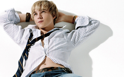
Since this was made for an RP, I needed his tie to be black and yellow. So I added a bit of yellow colour on the tie where it was missing.

Next add a colour balance layer with these settings: 0 - 0 - -100 (That is bringing the yellow bar all the way down!)
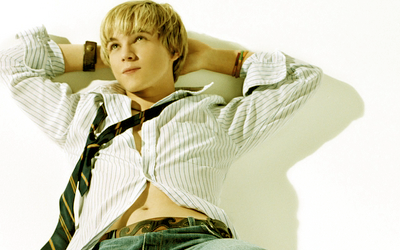
Next add a colourfill layer with something along the lines of #C08D53 and set it to hard light, erasing over your subject.
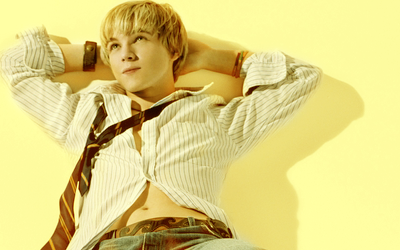
Duplicate your base and drag it to the top, setting it to darken.
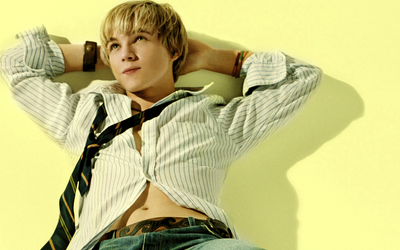
Now add another picture, set to muliply. Erase as needed. Mine had a white background so I didn't need to erase anything.
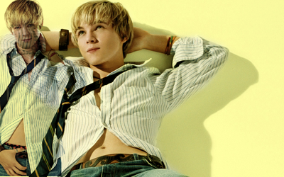
That looks weird. So create a new layer BENEATH that picture, and colour some white to make it more visable.

Repeat that colouring yellow on the tie. So it matches.
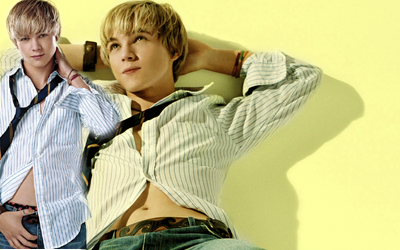
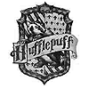
Then, since I needed to make it seem kind of Harry Potterish, I added this little Hufflepuff crest. This is a brush I have, but I don't remember the awesome person who made it.
I reduced the opacity to 50%.
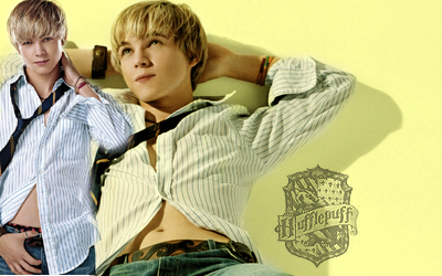
Then I added my text. Again, this was for an RP, so I just stuck on the character's name. I wrote it in AdineKirnberg-Script at 38pt (Why it needed to be so big, I have no clue) with 100 spacing.
I gave it an outer glow of the background colour and set it at 75% opacity.
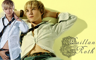
And that's that.
We start with our base, cut and positioned at 400x250px.
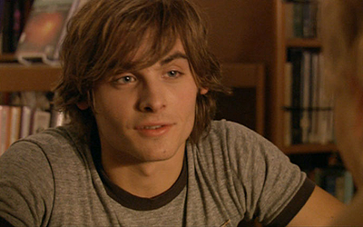
Add a curves layer with two points. The first is input:61 output:91 and the second is input:191 output: 234
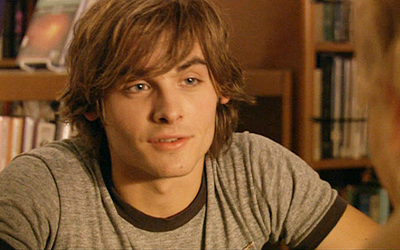
Add a colourfill layer with something around #EDDCC1 set at multiply.
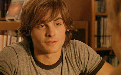
Add another colourfill layer with something around #070B21 set at exclusion.
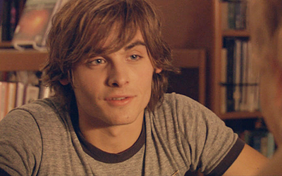
Create a new layer and stamp it (ctrl+alt+shift+E) and move it a little. Then smudge the side, or just colour it over with a light colour.
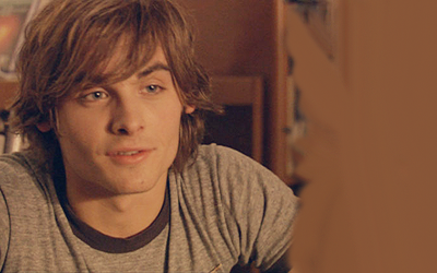
Paste on a second picture over the light colour and set it to 56% opacity.
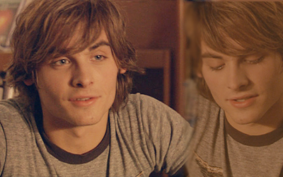
Add a gradient map (black to white) and set it to soft light.

Stamp your layers again and blur wherever needs blurring. I just blurred his skin because it was a little too pixely for me.
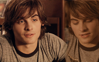
Create a colour balance layer with these settings: -45 - 0 - +12
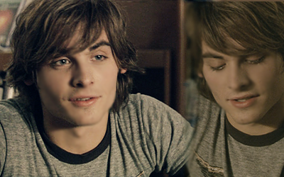
Create another colour balance layer with these settings: +30 - 0 - 0
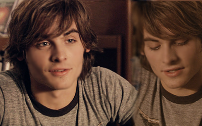
Now this is for an RP as well, the same one the last one is, so I added this Gryffindor crest. It's a brush, but I don't remember the awesome person of awesomeness who made it.
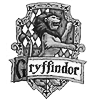
I stamped that in white and added a drop shadow in black, increasing the shadow to 100% opacity. Then I decreaced the opacity of the whole layer to 25%.
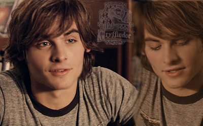
Lastly I added some text. The character's name, again. The font is Aramis (my favourite font!) set at 18pt with 100 spacing. And decreased to 50% opacity.
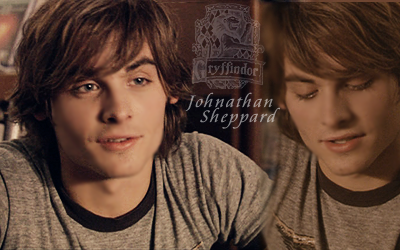
And that's another one down.
Start with your base: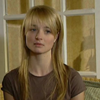
Sharpen it! And blur as needed!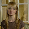
Create a curves layer input:65 output:97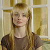
Create a colourfill layer somewhere around #F4DEC5 and set it to multiply: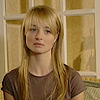
Create another colourfill layer somewhere around #0A0A34 and set it to exclusion: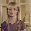
Duplicate the base and drag it to the top, setting it at screen, 50% opacity: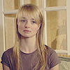
Create a gradient map from black to white and set it to soft light: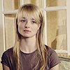
Create a colour balance layer at these settings: +11 - 0 - +35: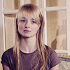
Duplicate your gradient map and put it at the top: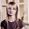
Duplicate your exclusion layer and put it on top set at 50% opacity: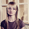
Duplicate your base and put it to the top, setting it to soft light at 50% opacity:
Create a brightness/contrast layer with settings of -7 and +7: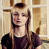
Add this texture by darkdreaming:
Set it to screen at 50% opacity. Rotate is 90 degrees counter clockwise (CCW):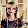
Erase the bit on her chest: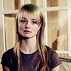
And it's done.
RP based
1 Kevin Zegers Banner
RP based
1 Emma Rigby Icon
Start with your base picture, cut down to 400x250px.

Since this was made for an RP, I needed his tie to be black and yellow. So I added a bit of yellow colour on the tie where it was missing.

Next add a colour balance layer with these settings: 0 - 0 - -100 (That is bringing the yellow bar all the way down!)

Next add a colourfill layer with something along the lines of #C08D53 and set it to hard light, erasing over your subject.

Duplicate your base and drag it to the top, setting it to darken.

Now add another picture, set to muliply. Erase as needed. Mine had a white background so I didn't need to erase anything.

That looks weird. So create a new layer BENEATH that picture, and colour some white to make it more visable.

Repeat that colouring yellow on the tie. So it matches.

Then, since I needed to make it seem kind of Harry Potterish, I added this little Hufflepuff crest. This is a brush I have, but I don't remember the awesome person who made it.

I reduced the opacity to 50%.

Then I added my text. Again, this was for an RP, so I just stuck on the character's name. I wrote it in AdineKirnberg-Script at 38pt (Why it needed to be so big, I have no clue) with 100 spacing.
I gave it an outer glow of the background colour and set it at 75% opacity.

And that's that.
We start with our base, cut and positioned at 400x250px.

Add a curves layer with two points. The first is input:61 output:91 and the second is input:191 output: 234

Add a colourfill layer with something around #EDDCC1 set at multiply.

Add another colourfill layer with something around #070B21 set at exclusion.

Create a new layer and stamp it (ctrl+alt+shift+E) and move it a little. Then smudge the side, or just colour it over with a light colour.

Paste on a second picture over the light colour and set it to 56% opacity.

Add a gradient map (black to white) and set it to soft light.

Stamp your layers again and blur wherever needs blurring. I just blurred his skin because it was a little too pixely for me.

Create a colour balance layer with these settings: -45 - 0 - +12

Create another colour balance layer with these settings: +30 - 0 - 0

Now this is for an RP as well, the same one the last one is, so I added this Gryffindor crest. It's a brush, but I don't remember the awesome person of awesomeness who made it.

I stamped that in white and added a drop shadow in black, increasing the shadow to 100% opacity. Then I decreaced the opacity of the whole layer to 25%.

Lastly I added some text. The character's name, again. The font is Aramis (my favourite font!) set at 18pt with 100 spacing. And decreased to 50% opacity.

And that's another one down.
Start with your base:

Sharpen it! And blur as needed!

Create a curves layer input:65 output:97

Create a colourfill layer somewhere around #F4DEC5 and set it to multiply:

Create another colourfill layer somewhere around #0A0A34 and set it to exclusion:

Duplicate the base and drag it to the top, setting it at screen, 50% opacity:

Create a gradient map from black to white and set it to soft light:

Create a colour balance layer at these settings: +11 - 0 - +35:

Duplicate your gradient map and put it at the top:

Duplicate your exclusion layer and put it on top set at 50% opacity:

Duplicate your base and put it to the top, setting it to soft light at 50% opacity:

Create a brightness/contrast layer with settings of -7 and +7:

Add this texture by darkdreaming:

Set it to screen at 50% opacity. Rotate is 90 degrees counter clockwise (CCW):

Erase the bit on her chest:

And it's done.