096;

>>>

Cordy icon tutorial requested by fuuurs
If you want to request some tutorial here is my thread for Ask The Maker activity ;)
I found the .psd of this icon, but it was a variation of another icon,
so I had to recreate it, I hope it is close enough!
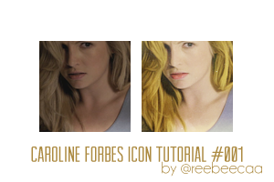
Original:

Recreation:

First of all, I have to say I'm sorry!
I used a lot of textures in this icon, and I can't tell who made them.
I have a lot of textures saved and when I open them in my ps,
I completly forget who made them. So if anyone know, please let me know and I'll edit the post!
I'm sorry again... Let's start!
ONE.
First of all, I cropped the cap, duplicated it and sharpen it.
I lowered the opacity to 72%, but that depends on the cap.
TWO.
Textues! Lot of textures! What would be icons without textures?
I used this one set to screen 84% opacity.
This one set to screen 51% opacity.
This one set to screen 87% opacity.
This one set to darken 19% opacity.
This one set to darken 36% opacity
And this is how it would look:

THREE.
Color Balance:
Midtones: 51, 0, 31.
Color Balance:
Midtones: -15, 0, -19
FOUR.
Another texture. Yep, another one.
This one set to linear burn 41% opacity.
And the icon should look like this:

FIVE.
Color Balance:
Midtones: -23, 0, 30
SIX.
Take the first layer, the cap cropped, dublicate it and drag it above all the layers.
Then desaturate it and put it to soft light.
SEVEN.
Did I mention that I love caps? Well, if not...
This one to soft light 100% opacity.
This one to screen 100% opacity.
This one to screen 77% opacity.
And... THAT'S ALL!
This is what I got;

Well, I hope this is useful for someone!
If you have any doubt, please let me know and I'll try to resolve it!
Rules
»Comments are really apreciated.
»Please, don't just copy/paste, be creative!
»Resource post here.
Tumblr | Welovecaps
Previous tutorial post:
