Sphere Tutorial + Textures
This tutorial's just so you can get a similar effect, I'm not going into great lengths with the coloring bit.
Going from
to
Start by resizing [this] image from Odin Sphere. This icon was largely inspired by the game title.
Ignore the image first. Let's start off with this off-black color layer [#041123] as your base. Next, use this texture by me and remember it is positioned slightly to the right.
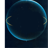

Duplicate the texture THREE times on screen. On the 3rd screen layer, set the opacity to to 35%. You should get something like this
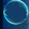
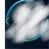
Next use this <--- [It's just the original texture with bits I erased], set that on Soft Light. Duplicate and then set on soft light as well. That means, both layers should be on soft light.
Your results -->
(just trying to balance out the surface)


Where does the image come in? Not yet.. be patient. Next, mess around with these 2 light textures by la_bellivie. For my icon, I set them on screen duplicated/rotated/erased bit here and there...
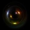

Next use this scratch textures and set it on screen but erase any bits covering the insides of the sphere.
After all that messing around, you get something quite like this -->


Hooray! We can finally use the image! Paste the image and set it on soft light. Duplicate and set on soft light again. So you have TWO soft light layers of the image.


Duplicate the image one more time, but this time, set it on screen @ 90%

ERASE YO~!
Using the erase tool, erase anything outside of the sphere. You don't have to do a very clean job, in fact, being able to see bits and pieces of the original picture has a nice effect.


SHIFT-CTRL-ALT-E to copy current icon. Set that on SCREEN @ 70%

ROUND SELECT
SHIFT-CTRL-ALT-E again to copy current icon. Then using your round select tool, select the sphere and copy it. Then paste that layer on top, set on SCREEN to get something like this -->
You don't have to be very accurate with the round sphere. In fact, being messy has a nice effect.
[In the original,notice how the body and hands seems to join more, that's because I made another icon with the character slightly moved down before using the round select tool on it]

ERASE AGAIN!
Erasing time again. Erase any bits covering his face. After you're done, duplicate that layer and set it on screen again so that it's bright and shiny!


We're basically done here since images differ and I'll leave you to your own coloring methods. For this image, I used an exclusion layer [#001b76] and duplicate the bottom layers and set them on soft light twice.
Then I just messed around with the brightness, increased the blue colors and saturation for some bits of the icon. Added tiny text, sharpen etc.

For this method, I'll just like to say that you might have to do heavy adjustments depending on the image you use. So don't follow it exactly, mess around =)
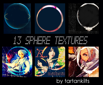
Very basic stuffs. Nothing fancy. =D
Download [HERE]
You can view all tutorials/ available brushes & textures at the master's list [HERE]
x Comments are nice
x Credit not necessary
x Feel free to FRIEND this journal for future updates.
x Enjoy!
Going from

to
Start by resizing [this] image from Odin Sphere. This icon was largely inspired by the game title.

Ignore the image first. Let's start off with this off-black color layer [#041123] as your base. Next, use this texture by me and remember it is positioned slightly to the right.


Duplicate the texture THREE times on screen. On the 3rd screen layer, set the opacity to to 35%. You should get something like this


Next use this <--- [It's just the original texture with bits I erased], set that on Soft Light. Duplicate and then set on soft light as well. That means, both layers should be on soft light.
Your results -->
(just trying to balance out the surface)


Where does the image come in? Not yet.. be patient. Next, mess around with these 2 light textures by la_bellivie. For my icon, I set them on screen duplicated/rotated/erased bit here and there...


Next use this scratch textures and set it on screen but erase any bits covering the insides of the sphere.
After all that messing around, you get something quite like this -->


Hooray! We can finally use the image! Paste the image and set it on soft light. Duplicate and set on soft light again. So you have TWO soft light layers of the image.


Duplicate the image one more time, but this time, set it on screen @ 90%

ERASE YO~!
Using the erase tool, erase anything outside of the sphere. You don't have to do a very clean job, in fact, being able to see bits and pieces of the original picture has a nice effect.


SHIFT-CTRL-ALT-E to copy current icon. Set that on SCREEN @ 70%

ROUND SELECT
SHIFT-CTRL-ALT-E again to copy current icon. Then using your round select tool, select the sphere and copy it. Then paste that layer on top, set on SCREEN to get something like this -->
You don't have to be very accurate with the round sphere. In fact, being messy has a nice effect.
[In the original,notice how the body and hands seems to join more, that's because I made another icon with the character slightly moved down before using the round select tool on it]

ERASE AGAIN!
Erasing time again. Erase any bits covering his face. After you're done, duplicate that layer and set it on screen again so that it's bright and shiny!


We're basically done here since images differ and I'll leave you to your own coloring methods. For this image, I used an exclusion layer [#001b76] and duplicate the bottom layers and set them on soft light twice.
Then I just messed around with the brightness, increased the blue colors and saturation for some bits of the icon. Added tiny text, sharpen etc.
For this method, I'll just like to say that you might have to do heavy adjustments depending on the image you use. So don't follow it exactly, mess around =)

Very basic stuffs. Nothing fancy. =D
Download [HERE]
You can view all tutorials/ available brushes & textures at the master's list [HERE]
x Comments are nice
x Credit not necessary
x Feel free to FRIEND this journal for future updates.
x Enjoy!