*steps onto 3d soapbox*
Saw Open Season today. It has driven me to make a huge-ass post. So please, feel free to come along with me, if only to look at the pretty pictures I"ll be posting. :)
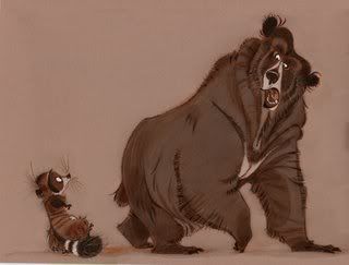
Man. I had such high hopes for Open Season. Fantastic character design, the trailer had me laughing, it was Sony's first contender in the CG race, and I had been following the blogs of so many talented artists involved. So what happened? The story did not match its pretty cover. Like so many animated movies today, jokes were often lowered to toilet humor and that of 10 year old boys. It's furthering the myth that animated movies are only for kids and should be written as such. NO! It is a medium that was pioneered for ADULTS by adults. We forget that because most of our generation grew up with the "classics" airing during Saturday morning cartoons, when they were originally shown before all genres of film sharing the same production company (MGM and Warner Bros.). So many animated films today are writing as if in a fraternity, and as an audience member I resent being catered to as if I were stupid.
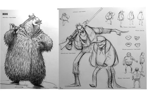
So Open Season first. Again character design had me hopeful. The look of Boog completely won me over. Those arms! That mouth! The fur! Fantastic.
Didn't care so much for the voice talent as usual. My hopes were quickly falling during the opening credits when the voice actors' names began popping onscreen. FINE, just ruin my emotional connection and believability from the get-go. Now I'll just be waiting to hear so-and-so actor and not paying attention to the story. GeeTHANKS. I really hate that, and I'm seeing it a lot. Completely diminishes whatever world you're about to remember. So by then I had pretty much resigned myself to *another* mediocre movie.
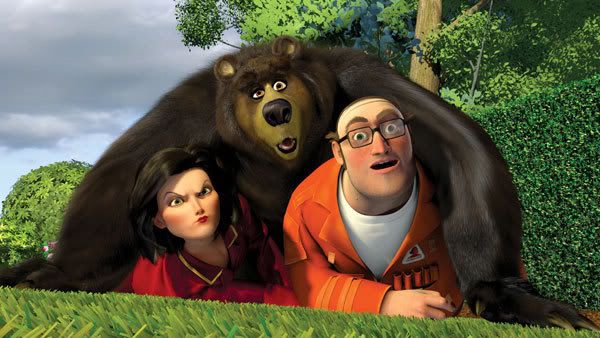
Ok, and look at that concept art again. The villain with the gun looks pretty interesting design-wise, right? Well he was, and translated pretty well to 3D. But look at the other guy, who plays the sheriff. Booooooring, as were the rest of the humans in the film. Why can't most studios create interesting looking humans. Most of the time they look plain weird, with too many pores and really awkward movement. HOWEVER, it can be done! By surprisesurprise, Pixar, of course. The Incredibles is pretty much everything a CG animated movie should be. It's got a fucking awesome story that is at once simple: Good Guy vs. Bad Guy; and complex: the struggle of hiding who you are, settling for mediocrity, sacrifice for family, just making a family WORK. Each character is established and developed in nearly the same scene they're introduced. No time is wasted; everything has a purpose. And what's amazing is how each character changes from beginning to end. I love seeing how independent and wild SuperHelen was before having a family, which later matures her and turns her into the one who only wants to settle down and enjoy her family. I digress. I really just wanted to point out that human characters can be visually interesting and not only shapes with fat fingers and hair that looks like it's on the head of a Barbie. It's why animation is so amazing!: you're imitating life but have the ability to control EVERYTHING. Screw with propoprtions, shapes, colors, every little thing!! It's a blank canvas, people. Why isn't it pushed more? Everything comes back to the basic design principles. Recognize shapes, forms and the connotations they bring with them. What shapes go well together, next to each other, in combination? What's more stimulating, variety or similarity? VARIETY. I mean, *look* at this line-up of the Parr family:
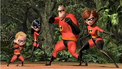
Look at Bob's tiny legs under that giant chest! Perhaps not possible, but it WORKS. Look at how different each character is from the next. V-A-R-I-E-T-Y. No one looks the same in real life (excluding identicals) so why animate the boring same old same old humans? It doesn't have to be tha way!
Now look at this cap from Shrek 2.
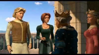
See the difference? They're like squares with arms attached and don't vary much from the other. I'm bored just looking at it.
And I wish I had scanned some of the concept from Incredibles from my book, because they translated Tony Fucile's designs beautifully to 3D. I've noticed a lot of the concept art for CG movies surpasses the end result by far. And that's so sad. Seems like talent gone down the drain. Over the Hedge was actually one of the better releases I've seen in the last few months. Even better than Cars, in my opinion. But I look at these amazing concept drawings and want to cry that the film couldn't have looked more like this:
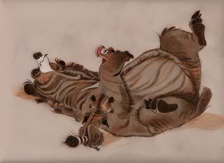
the weight! the expressions! these stagnant drawings have more energy and fun than the actual movie.
here's Vincent the bear in movie form:
not bad, but a little lost in translation. however, the simulation of his hair was great. i just wanted to reach out and touch it, it looks so soft. and again, look at those UGLY people!
more ugly people.
ew ew EW. motion capture BAAAAD.
And what kills me is how movie critics raved over Monster House's motion capture technique and how it's going to reinvent the animated movie. *barf* Just look at this snipit of Mick LaSalle's review in The LA Times:
Animated films always had the advantage of being able to go anywhere and show anything, to defy the laws of physics and follow the imagination as far as it could go. But they never had the ability to show the human face. There was never any point to a close-up in an animated film -- there was never really anything to see. But with the motion-capture process, real actors give their performances with computer sensors attached to their face and body, and that recorded information becomes the template for the computer animation. If an actor is bug-eyed, the character will look bug-eyed. Moreover, if the actor is thinking or is full of doubt, the technology will be able to render subtle qualities of pensiveness or doubt in the animation.
Imagine what Disney might have done with this in the creation of the Seven Dwarfs. Imagine all the things that will be done with this in the future. "Monster House" looks like the ground floor of something important.
Read a great response from storyboard artist Jenny Lerew. Even better is Pixar story artist Jeff Pidgeon's
letter to LaSalle, and LaSalle's clipped response:
MICK LASALLE RESPONDS: Thank you for a thoughtful message. I appreciate it. (Don't agree with it, any of it, but I appreciate being accurately quoted and not being cursed at.)
Asshole. I mean c'mon! "Never had the ability to show the human face"????? Are you blind??? The characters in Monster House looked liked actors in frumpy suits, lumbering across the screen. Expressions were bland and not, well, animated. Boo, LaSalle.
Again I'm going back to why animated movies should push everything they can, which IS basically everything. The entire world is whatever they make it, and they have to create this breathing, believable world for only 90 minutes. Set the scene! Show us without telling us because you don't have time to spell every emotion out and if you did, we'd feel you think your audience is stupid. So...what can you do? Hmmm, lemme see...oh COLOR. Yeah, that's an immediate mood maker. So WHY don't you people you use it! I am so sick and tired of these 3D/2D films being all saturated colors ALL the time. It's uninteresting and it hurts my eyes. Also, my eyes don't know where to focus with all of these colors battling for each other. Didn't you take color theory?? Apparently not. SHOW me where you want me to be looking at this, exact moment. Alllllso, give me some eye-candy. Compliment asymmetrical shots by complimentary or dramatic colors. Separate foreground from background. It can be so EASY and appealing at the same time. Geez.
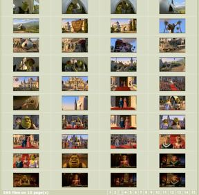
Ok, I want to play a game. While searching through screencaps archives of certain CGI movies, I was amazed by the difference between successfully designed movies and the not so successful just by looking at a page of thumbnails. The difference is striking.
Which movies look more interesting to you? These?:

Madagascar and Shrek2 (Dreamworks)
or these?:
The Incredibles
Finding Nemo
It's glaringly obvious to me. I saw Madagascar and it was SO hard to focus on the action because One: the animation was on speed, and Two: it was hard to separate the characters from their environment. Look how changing the color palette could have helped with that. It's the same greens and yellows and browns across the screen. And they're supposed to be on a tropical island! LOST knows how to show the colors on an island. Aaaaand Shrek, my least favorite of the CG bunch. Fugly character designs and little boy humor. Boo. Another uninteresting color palette. It's the same color scheme from setting to setting: just changes in saturation whether it be day or night.
Then there's Pixar. Glory Hallelujah, if my eyes could drool they would. I'm almost tempted to print out these thumbnails and hang them on my wall. The staging! The colors! Not a boring frame in the bunch, if you ask me. I especially love the color changes from scene to scene in The Incredibles. And some of those scenes are being show simultaneously, like, not just following each other, but going back and forth like with Bob's mission and Helen's meeting with E. And just looking at it you can see so much is simple color theory. Bob's bright oranges contrasting with Helen's muted blues. It's establishing conflicts/contrasts without having to spell it out for us.
We're so emotionally tied to color, and it's often a universal thing, it's so simple to use. More love for Incredibles because I saved these caps before I realized about the thumbnails. Just wanted to show how they illustrate mood change. Mainly how when everything is "Super", that world is shown in a hyper-saturated way, illustrating "the good ol' days" whey they didn't have to shelve their powers and could use them to help others.
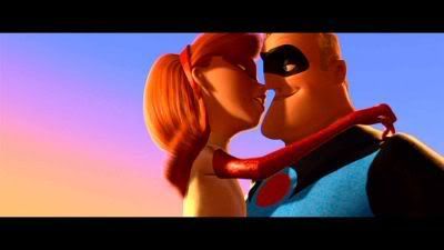
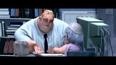
After the whole montage of the lawsuits and how their crimefighting days were over, we're thrown into the present day of miserable Bob: where things are desaturated drastically and almost monochromatic. The "good ol' days" are over:
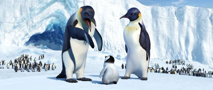
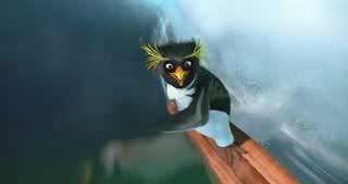
And the future is looking to be a lot more deja vu-ish. We have two high profile movies concerning rats: Pixar's Ratatouille and Dreamworks/Aardman's (which has already split) Flushed Away. Not to mention the penguin flux we seem to be having. I have mixed feelings for both Sony's Surf's Up and WB's Happy Feet. I think the rats will have more charm and success, and I'm swaying a little closer to Happy Feet. I can't help it, the new trailer with Queen's "Somebody to Love" gets me. And when they make a heart in the water? It's just timed in the trailer nicely and I'm A FUCKING SAP. Ok? I've lost all credibility, right? Back on track...wish the penguins could be more stylized. A little too realistic for my taste, although I love that old, fat penguin in Happy Feet with the 6-pack holder around his neck, lol. And Robin Williams is always an entertaining voice (and he's voicing at least 2 birds here). However, they seem to be pushing the voice talent too much from the start. Still no idea who thought Elijah Wood would be a good hero voice. *scratches head* And with Surf's Up being another venture by Sony, who's proven good design and talent already....I'm kinda hoping. Not sure if the story will float, but it penguins surfing looks kind of fun, if a bit silly.
Happy Feet
Surf's Up
Still, none of these can be as bad as Arthur and The Invisibles. The design is HORRIBLE, and it has Madonna as a main voice. *cries* Let's just hope this CG booms dies down and studios can use the time to work on some original stories and a look that separates tham from the rest. See? Wasn't this fun? Haha. I doubt anyone actually scrolled through this entire thing. If so, I salute and love you. And thank you for putting up with my rant. It's been building up some time now.
Man. I had such high hopes for Open Season. Fantastic character design, the trailer had me laughing, it was Sony's first contender in the CG race, and I had been following the blogs of so many talented artists involved. So what happened? The story did not match its pretty cover. Like so many animated movies today, jokes were often lowered to toilet humor and that of 10 year old boys. It's furthering the myth that animated movies are only for kids and should be written as such. NO! It is a medium that was pioneered for ADULTS by adults. We forget that because most of our generation grew up with the "classics" airing during Saturday morning cartoons, when they were originally shown before all genres of film sharing the same production company (MGM and Warner Bros.). So many animated films today are writing as if in a fraternity, and as an audience member I resent being catered to as if I were stupid.
So Open Season first. Again character design had me hopeful. The look of Boog completely won me over. Those arms! That mouth! The fur! Fantastic.
Didn't care so much for the voice talent as usual. My hopes were quickly falling during the opening credits when the voice actors' names began popping onscreen. FINE, just ruin my emotional connection and believability from the get-go. Now I'll just be waiting to hear so-and-so actor and not paying attention to the story. GeeTHANKS. I really hate that, and I'm seeing it a lot. Completely diminishes whatever world you're about to remember. So by then I had pretty much resigned myself to *another* mediocre movie.
Ok, and look at that concept art again. The villain with the gun looks pretty interesting design-wise, right? Well he was, and translated pretty well to 3D. But look at the other guy, who plays the sheriff. Booooooring, as were the rest of the humans in the film. Why can't most studios create interesting looking humans. Most of the time they look plain weird, with too many pores and really awkward movement. HOWEVER, it can be done! By surprisesurprise, Pixar, of course. The Incredibles is pretty much everything a CG animated movie should be. It's got a fucking awesome story that is at once simple: Good Guy vs. Bad Guy; and complex: the struggle of hiding who you are, settling for mediocrity, sacrifice for family, just making a family WORK. Each character is established and developed in nearly the same scene they're introduced. No time is wasted; everything has a purpose. And what's amazing is how each character changes from beginning to end. I love seeing how independent and wild SuperHelen was before having a family, which later matures her and turns her into the one who only wants to settle down and enjoy her family. I digress. I really just wanted to point out that human characters can be visually interesting and not only shapes with fat fingers and hair that looks like it's on the head of a Barbie. It's why animation is so amazing!: you're imitating life but have the ability to control EVERYTHING. Screw with propoprtions, shapes, colors, every little thing!! It's a blank canvas, people. Why isn't it pushed more? Everything comes back to the basic design principles. Recognize shapes, forms and the connotations they bring with them. What shapes go well together, next to each other, in combination? What's more stimulating, variety or similarity? VARIETY. I mean, *look* at this line-up of the Parr family:
Look at Bob's tiny legs under that giant chest! Perhaps not possible, but it WORKS. Look at how different each character is from the next. V-A-R-I-E-T-Y. No one looks the same in real life (excluding identicals) so why animate the boring same old same old humans? It doesn't have to be tha way!
Now look at this cap from Shrek 2.
See the difference? They're like squares with arms attached and don't vary much from the other. I'm bored just looking at it.
And I wish I had scanned some of the concept from Incredibles from my book, because they translated Tony Fucile's designs beautifully to 3D. I've noticed a lot of the concept art for CG movies surpasses the end result by far. And that's so sad. Seems like talent gone down the drain. Over the Hedge was actually one of the better releases I've seen in the last few months. Even better than Cars, in my opinion. But I look at these amazing concept drawings and want to cry that the film couldn't have looked more like this:
the weight! the expressions! these stagnant drawings have more energy and fun than the actual movie.
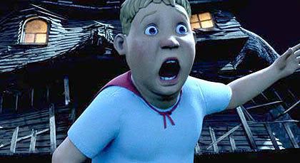
here's Vincent the bear in movie form:
not bad, but a little lost in translation. however, the simulation of his hair was great. i just wanted to reach out and touch it, it looks so soft. and again, look at those UGLY people!
more ugly people.
ew ew EW. motion capture BAAAAD.
And what kills me is how movie critics raved over Monster House's motion capture technique and how it's going to reinvent the animated movie. *barf* Just look at this snipit of Mick LaSalle's review in The LA Times:
Animated films always had the advantage of being able to go anywhere and show anything, to defy the laws of physics and follow the imagination as far as it could go. But they never had the ability to show the human face. There was never any point to a close-up in an animated film -- there was never really anything to see. But with the motion-capture process, real actors give their performances with computer sensors attached to their face and body, and that recorded information becomes the template for the computer animation. If an actor is bug-eyed, the character will look bug-eyed. Moreover, if the actor is thinking or is full of doubt, the technology will be able to render subtle qualities of pensiveness or doubt in the animation.
Imagine what Disney might have done with this in the creation of the Seven Dwarfs. Imagine all the things that will be done with this in the future. "Monster House" looks like the ground floor of something important.
Read a great response from storyboard artist Jenny Lerew. Even better is Pixar story artist Jeff Pidgeon's
letter to LaSalle, and LaSalle's clipped response:
MICK LASALLE RESPONDS: Thank you for a thoughtful message. I appreciate it. (Don't agree with it, any of it, but I appreciate being accurately quoted and not being cursed at.)
Asshole. I mean c'mon! "Never had the ability to show the human face"????? Are you blind??? The characters in Monster House looked liked actors in frumpy suits, lumbering across the screen. Expressions were bland and not, well, animated. Boo, LaSalle.
Again I'm going back to why animated movies should push everything they can, which IS basically everything. The entire world is whatever they make it, and they have to create this breathing, believable world for only 90 minutes. Set the scene! Show us without telling us because you don't have time to spell every emotion out and if you did, we'd feel you think your audience is stupid. So...what can you do? Hmmm, lemme see...oh COLOR. Yeah, that's an immediate mood maker. So WHY don't you people you use it! I am so sick and tired of these 3D/2D films being all saturated colors ALL the time. It's uninteresting and it hurts my eyes. Also, my eyes don't know where to focus with all of these colors battling for each other. Didn't you take color theory?? Apparently not. SHOW me where you want me to be looking at this, exact moment. Alllllso, give me some eye-candy. Compliment asymmetrical shots by complimentary or dramatic colors. Separate foreground from background. It can be so EASY and appealing at the same time. Geez.
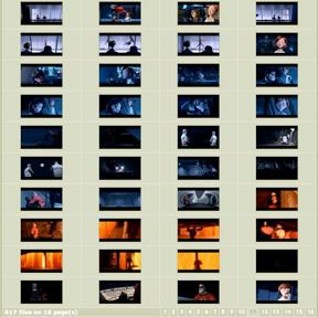
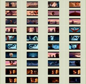
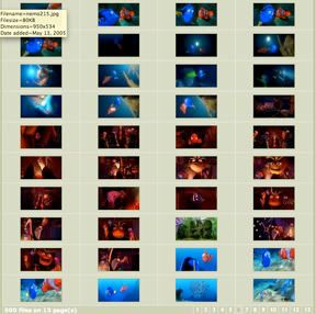
Ok, I want to play a game. While searching through screencaps archives of certain CGI movies, I was amazed by the difference between successfully designed movies and the not so successful just by looking at a page of thumbnails. The difference is striking.
Which movies look more interesting to you? These?:
Madagascar and Shrek2 (Dreamworks)
or these?:
The Incredibles
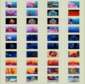
Finding Nemo
It's glaringly obvious to me. I saw Madagascar and it was SO hard to focus on the action because One: the animation was on speed, and Two: it was hard to separate the characters from their environment. Look how changing the color palette could have helped with that. It's the same greens and yellows and browns across the screen. And they're supposed to be on a tropical island! LOST knows how to show the colors on an island. Aaaaand Shrek, my least favorite of the CG bunch. Fugly character designs and little boy humor. Boo. Another uninteresting color palette. It's the same color scheme from setting to setting: just changes in saturation whether it be day or night.
Then there's Pixar. Glory Hallelujah, if my eyes could drool they would. I'm almost tempted to print out these thumbnails and hang them on my wall. The staging! The colors! Not a boring frame in the bunch, if you ask me. I especially love the color changes from scene to scene in The Incredibles. And some of those scenes are being show simultaneously, like, not just following each other, but going back and forth like with Bob's mission and Helen's meeting with E. And just looking at it you can see so much is simple color theory. Bob's bright oranges contrasting with Helen's muted blues. It's establishing conflicts/contrasts without having to spell it out for us.
We're so emotionally tied to color, and it's often a universal thing, it's so simple to use. More love for Incredibles because I saved these caps before I realized about the thumbnails. Just wanted to show how they illustrate mood change. Mainly how when everything is "Super", that world is shown in a hyper-saturated way, illustrating "the good ol' days" whey they didn't have to shelve their powers and could use them to help others.
After the whole montage of the lawsuits and how their crimefighting days were over, we're thrown into the present day of miserable Bob: where things are desaturated drastically and almost monochromatic. The "good ol' days" are over:
And the future is looking to be a lot more deja vu-ish. We have two high profile movies concerning rats: Pixar's Ratatouille and Dreamworks/Aardman's (which has already split) Flushed Away. Not to mention the penguin flux we seem to be having. I have mixed feelings for both Sony's Surf's Up and WB's Happy Feet. I think the rats will have more charm and success, and I'm swaying a little closer to Happy Feet. I can't help it, the new trailer with Queen's "Somebody to Love" gets me. And when they make a heart in the water? It's just timed in the trailer nicely and I'm A FUCKING SAP. Ok? I've lost all credibility, right? Back on track...wish the penguins could be more stylized. A little too realistic for my taste, although I love that old, fat penguin in Happy Feet with the 6-pack holder around his neck, lol. And Robin Williams is always an entertaining voice (and he's voicing at least 2 birds here). However, they seem to be pushing the voice talent too much from the start. Still no idea who thought Elijah Wood would be a good hero voice. *scratches head* And with Surf's Up being another venture by Sony, who's proven good design and talent already....I'm kinda hoping. Not sure if the story will float, but it penguins surfing looks kind of fun, if a bit silly.
Happy Feet
Surf's Up
Still, none of these can be as bad as Arthur and The Invisibles. The design is HORRIBLE, and it has Madonna as a main voice. *cries* Let's just hope this CG booms dies down and studios can use the time to work on some original stories and a look that separates tham from the rest. See? Wasn't this fun? Haha. I doubt anyone actually scrolled through this entire thing. If so, I salute and love you. And thank you for putting up with my rant. It's been building up some time now.