I may not know much about art...
...but I know what I like.
Actually, I'm often not really sure what I like, especially in the visual arts, where many years of experience have demonstrated to me that I just don't really care enough about good graphic design to be particularly good at it. But the BSFA challenges me to cast a vote on the nominees for its award for best artwork, so I have been looking at the entrants.
As ever, I rank them here in reverse order of preference. Also I hope my snipping and inserting here of bits of each artwork can be considered fair use.

I wasn't wildly impressed by Nitzan Kramer's alternate cover for Jules Verne's 20,000 Leagues Under The Sea. Taken on its own, it is blocky and cartooney, and the eyes of the giant sea monster seem poorly placed; in context, of course, it misses the point of the book which is about human interactions, the sea monster being a mere incident.

Adam Tredowski has three of his covers for Interzone on the shortlist; the one for issue 220 is imaginative enough but didn't quite grab me - one meanly suspects that it has been tilted at an angle to try and distract you from the fact that it's not really clear what the picture is about. Nice contrasts, I admit.

I liked his cover for Interzone #225 slightly better; two minuscule figures pick their way past fantastic and twisted ruined tubular machinery to a blindingly lit gulf (so bright that it almost hurts the eyes). I don't know if it related to a particular story (Interzone covers don't always) but I would read whatever this is based on.

Even more so with Tredowski's cover for Interzone #224, where a green belvedere clings to a fertile escarpment, with a troubled sea lying below and strange habitats (I suppose) floating high above in the background. Somehow the balance of colour and detail works for me here in a rather pleasing way.

Stephanie Pui-Mun Law's "Emerald" is in a totally different league; an enigmatic image from a dream - a giant tree, a burst of natural vitality; are the figures at its foot supplicants, victims, offspring? I love the sense of energy and mystery about it. This is the only one of the artworks where we are given a legend to help explain what it is about (unless you count "20,000 מיל מתחת למים" for Kramer's piece), but the description raises more questions than it answers.

In the end though my top vote goes to Stephan Martinière's cover art for Ian McDonald's Desolation Road (jacket design by Jacqueline Nasso Cooke). It has a tremendous futuristic feel; it basically tells you that this is a book which includes giant railway trains on Mars, which is accurate enough. The sense of confrontation between the human figure and the locomotive engine is palpable; so is the idea that we are seeing just one part of a big, big world. The concept is slightly similar to Tredowski's Interzone #225 cover, but I prefer the way it is done here.
I have to say that I approve whole-heartedly of giving the award to individual artworks rather than to artists as the Hugos do. It seems to me that if the other awards are for individual works of fiction or non-fiction, art should be treated the same way.
Actually, I'm often not really sure what I like, especially in the visual arts, where many years of experience have demonstrated to me that I just don't really care enough about good graphic design to be particularly good at it. But the BSFA challenges me to cast a vote on the nominees for its award for best artwork, so I have been looking at the entrants.
As ever, I rank them here in reverse order of preference. Also I hope my snipping and inserting here of bits of each artwork can be considered fair use.
I wasn't wildly impressed by Nitzan Kramer's alternate cover for Jules Verne's 20,000 Leagues Under The Sea. Taken on its own, it is blocky and cartooney, and the eyes of the giant sea monster seem poorly placed; in context, of course, it misses the point of the book which is about human interactions, the sea monster being a mere incident.
Adam Tredowski has three of his covers for Interzone on the shortlist; the one for issue 220 is imaginative enough but didn't quite grab me - one meanly suspects that it has been tilted at an angle to try and distract you from the fact that it's not really clear what the picture is about. Nice contrasts, I admit.
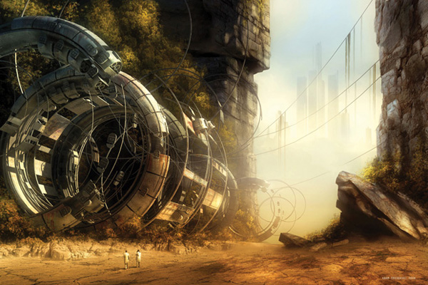
I liked his cover for Interzone #225 slightly better; two minuscule figures pick their way past fantastic and twisted ruined tubular machinery to a blindingly lit gulf (so bright that it almost hurts the eyes). I don't know if it related to a particular story (Interzone covers don't always) but I would read whatever this is based on.
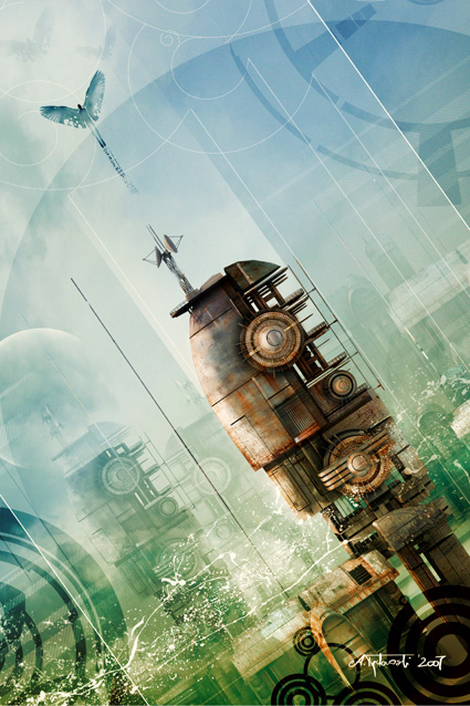
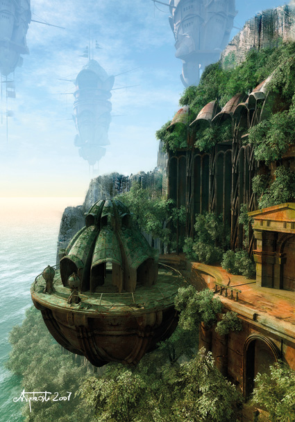
Even more so with Tredowski's cover for Interzone #224, where a green belvedere clings to a fertile escarpment, with a troubled sea lying below and strange habitats (I suppose) floating high above in the background. Somehow the balance of colour and detail works for me here in a rather pleasing way.
Stephanie Pui-Mun Law's "Emerald" is in a totally different league; an enigmatic image from a dream - a giant tree, a burst of natural vitality; are the figures at its foot supplicants, victims, offspring? I love the sense of energy and mystery about it. This is the only one of the artworks where we are given a legend to help explain what it is about (unless you count "20,000 מיל מתחת למים" for Kramer's piece), but the description raises more questions than it answers.
In the end though my top vote goes to Stephan Martinière's cover art for Ian McDonald's Desolation Road (jacket design by Jacqueline Nasso Cooke). It has a tremendous futuristic feel; it basically tells you that this is a book which includes giant railway trains on Mars, which is accurate enough. The sense of confrontation between the human figure and the locomotive engine is palpable; so is the idea that we are seeing just one part of a big, big world. The concept is slightly similar to Tredowski's Interzone #225 cover, but I prefer the way it is done here.
I have to say that I approve whole-heartedly of giving the award to individual artworks rather than to artists as the Hugos do. It seems to me that if the other awards are for individual works of fiction or non-fiction, art should be treated the same way.