TUTORIAL #03
This tutorial follows the process I used to make all the icons in this batch of icons I did. I made this using PHOTOSHOP ELEMENTS 4.0, however since Photoshop programs are nearly all alike I'm sure it's easily translatable.
How to make this icon:
Step 1:

Crop it how you like it.
Step 2:

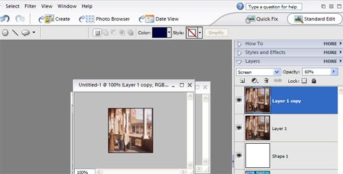
Duplicate the base and set the top layer to SCREEN. Change the SCREEN layer's opacity to 60%.
Step 3:

Set this square to EXCLUSION on top of your base and screened layer. Put its opacity to 55%.
Step 4:

FLATTEN the image. [This can be done by going to LAYER in the menu bar then FLATTEN IMAGE].
Step 5:

You should now have one layer, duplicate this and set this top layer to SOFT LIGHT.
Step 6:

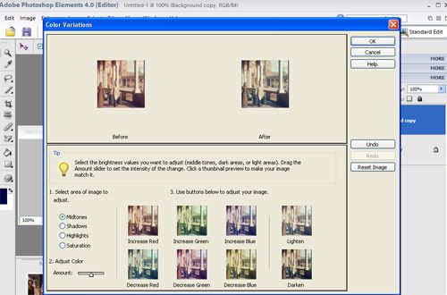
Using the "soft light" layer, go to ENHANCE in the menu bar then ADJUST COLOUR than COLOUR VARIATIONS.
I pressed the DECREASE RED option once.
[If you are using normal Photoshop, this same thing can be done by going to Image than Adjustments than Variations - thanks to
areyoudying].
Step 7:

In the "soft light" layer I increased the saturation by +65 and the brightness by +30.
[Adjust saturation can be found under ENHANCE in the menu bar than ADJUST COLOUR. Adjust brightness can be found under ENHANCE in the menu bar than ADJUST BRIGHTNESS/CONTRAST.]
Step 8:

In the base layer I increased the saturation by +20.
Step 9:

In the "soft light" layer I increased saturation by +50 and I also sharpened the layer.
Step 10:

And then I needed to increase the saturation some more because Photobucket decreases colour vibrancy when I upload icons. But technically I was finished after step 9.
FINISHED! Now it's really only a matter of finding the right balance between brightness and saturation for different images.
If you have made any icons using this tutorial I would love to see them and if you have any questions feel free to ask! :)
p.s.
Want to be a Pirate? Join
elite_pirates!
Want to share the photoshopelements love? Join
elementheads!
How to make this icon:

Step 1:

Crop it how you like it.
Step 2:

Duplicate the base and set the top layer to SCREEN. Change the SCREEN layer's opacity to 60%.
Step 3:

Set this square to EXCLUSION on top of your base and screened layer. Put its opacity to 55%.
Step 4:

FLATTEN the image. [This can be done by going to LAYER in the menu bar then FLATTEN IMAGE].
Step 5:

You should now have one layer, duplicate this and set this top layer to SOFT LIGHT.
Step 6:

Using the "soft light" layer, go to ENHANCE in the menu bar then ADJUST COLOUR than COLOUR VARIATIONS.
I pressed the DECREASE RED option once.
[If you are using normal Photoshop, this same thing can be done by going to Image than Adjustments than Variations - thanks to

areyoudying].
Step 7:

In the "soft light" layer I increased the saturation by +65 and the brightness by +30.
[Adjust saturation can be found under ENHANCE in the menu bar than ADJUST COLOUR. Adjust brightness can be found under ENHANCE in the menu bar than ADJUST BRIGHTNESS/CONTRAST.]
Step 8:

In the base layer I increased the saturation by +20.
Step 9:

In the "soft light" layer I increased saturation by +50 and I also sharpened the layer.
Step 10:

And then I needed to increase the saturation some more because Photobucket decreases colour vibrancy when I upload icons. But technically I was finished after step 9.
FINISHED! Now it's really only a matter of finding the right balance between brightness and saturation for different images.
If you have made any icons using this tutorial I would love to see them and if you have any questions feel free to ask! :)
p.s.
Want to be a Pirate? Join

elite_pirates!
Want to share the photoshopelements love? Join

elementheads!