Cutout Tutorial
Someone requested after this batch of icons.
I posted some icons in a style that I'd seen a few people using and had a request to do a tutorial. This tutorial was made using Adobe Photoshop Elements because that's all I have on this computer. It can also be used for Adobe Photoshop CS, which is what I usually use, or other versions but the ways around may be different.
For my last post I used bases, which works just as good and is must faster. For the tutorial I'll make my own base.
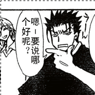
1. Choose your image and do the necessary cropping (Shift+drag while select = perfect square). Here's what I chose:
2. Edit to your liking. Delete anything unwanted either with the eraser tool or select with the magic wand and delete.
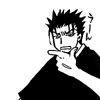
I edited out the background, took out the bubble and filled in where Kuro's shirt suddenly had giant holes. Fill the grey in with a black brush and darken the image then bump up the contrast (PS CS = Edit> Adjustments> Brightness/Contrast. PS E = Enhance> Adjust Brightness/Contrast> Brightness/Contrast). Sharpen the image (Filter> Sharpen> Sharpen) and then resize to 100x100.
3. Now choose a background. There are a lot of journals that make icon textures that I really great to use and have a lot of pattern and color. I downloaded (not really, ihrtgehcwbys did the downloading) a set from _iconographer.

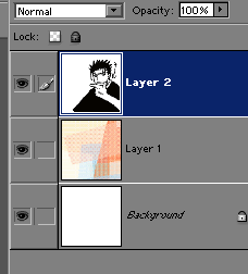
4. Whether you want to make a new document or keep the same, depending on if you want to keep things separate, you need to have the background on the bottom layer and the base on its own layer above.
5. Use the Polygonal Lasso tool.

Select where you want the white to be. What I've select is what is going to be deleted.
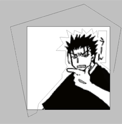
Double click so that the line connects and becomes a selection. And delete or erase!
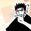
6. Make a new layer on top of the previous ones. Use the Polygonal Tool again to select a fun shape in the background if you'd like. This will be used to place text or a symbol.
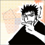
Fill in with white (or any other color. I'll use white here).
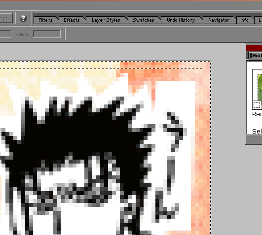
7. On the same layer select a two pixel boarder around the edges with the Rectangular Marquee Tool and fill in. I'll use white again.
8. Now time for text or an image. I'm using text. Arial Black, 9pt. Use the eyedropper tool to select a color that matches the background. So far, everything looks like this (you can't tell there's a border but it'll show up once on color):
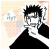
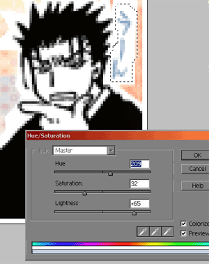
9. Finishing touches to make things match now. I'm going to make sure I'm on the layer of the base and select the characters by Kuro's head and adjust the colors of them to match the color of the text. (PS CS= Edit> Adjustment> Hue/Saturation. PS E= Enhance> Adjust Color> Hue/Saturation.) Play around the the Hue and Saturation to get it close to what you want. It doesn't have to be perfect it just needs to look close. Because what we're changing is black you'll need to lighten in quite a bit. Be sure you've checked the colorize box.
Now you're done! View your finished product. Fast and cute! Play around with backgrounds, pictures, and cropping.
Please anyone tell me if something isn't clear or is hard to follow. I've never done tutorial before...
Kuro Tutorial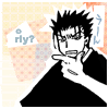
I posted some icons in a style that I'd seen a few people using and had a request to do a tutorial. This tutorial was made using Adobe Photoshop Elements because that's all I have on this computer. It can also be used for Adobe Photoshop CS, which is what I usually use, or other versions but the ways around may be different.
For my last post I used bases, which works just as good and is must faster. For the tutorial I'll make my own base.
1. Choose your image and do the necessary cropping (Shift+drag while select = perfect square). Here's what I chose:

2. Edit to your liking. Delete anything unwanted either with the eraser tool or select with the magic wand and delete.
I edited out the background, took out the bubble and filled in where Kuro's shirt suddenly had giant holes. Fill the grey in with a black brush and darken the image then bump up the contrast (PS CS = Edit> Adjustments> Brightness/Contrast. PS E = Enhance> Adjust Brightness/Contrast> Brightness/Contrast). Sharpen the image (Filter> Sharpen> Sharpen) and then resize to 100x100.

3. Now choose a background. There are a lot of journals that make icon textures that I really great to use and have a lot of pattern and color. I downloaded (not really, ihrtgehcwbys did the downloading) a set from _iconographer.
4. Whether you want to make a new document or keep the same, depending on if you want to keep things separate, you need to have the background on the bottom layer and the base on its own layer above.

5. Use the Polygonal Lasso tool.

Select where you want the white to be. What I've select is what is going to be deleted.

Double click so that the line connects and becomes a selection. And delete or erase!

6. Make a new layer on top of the previous ones. Use the Polygonal Tool again to select a fun shape in the background if you'd like. This will be used to place text or a symbol.

Fill in with white (or any other color. I'll use white here).
7. On the same layer select a two pixel boarder around the edges with the Rectangular Marquee Tool and fill in. I'll use white again.

8. Now time for text or an image. I'm using text. Arial Black, 9pt. Use the eyedropper tool to select a color that matches the background. So far, everything looks like this (you can't tell there's a border but it'll show up once on color):

9. Finishing touches to make things match now. I'm going to make sure I'm on the layer of the base and select the characters by Kuro's head and adjust the colors of them to match the color of the text. (PS CS= Edit> Adjustment> Hue/Saturation. PS E= Enhance> Adjust Color> Hue/Saturation.) Play around the the Hue and Saturation to get it close to what you want. It doesn't have to be perfect it just needs to look close. Because what we're changing is black you'll need to lighten in quite a bit. Be sure you've checked the colorize box.

Now you're done! View your finished product. Fast and cute! Play around with backgrounds, pictures, and cropping.
Please anyone tell me if something isn't clear or is hard to follow. I've never done tutorial before...
Kuro Tutorial