Tutorial 04
I've had a few tutorials requested in the past couple of weeks, and I'm probably going to answer all of them, but they take a bit of time to write, so bear with me. The first request I'm answering is from the very cool prevents, and features Van from Tenkuu no Escaflowne, only one of my favourite anime characters ever. Huzzah.
So, today I'll be showing you how to get from...
This base >>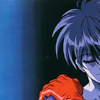
...to...
<< this icon.
Warning: This tutorial is image-heavy, and is for use in Photoshop 7.
Also, please bear in mind I have never used any version of PSP in my life, and therefore know nothing about it. If you have a question regarding how to transfer this tutorial over to that program, I'm afraid I can't be of any assistance. The best I can offer is to try asking the friendly folk over at icon_tutorial.
So, I started out with this very awesome picture of Van, as he appears in the ending sequence to the show. Bear in mind, hi-res wins at life. In this case, I would hardly call this hi-res, but it was the best I could find, and it's better than most DVD captures. Just remember, the higher quality picture you start with, the better bases you'll be able to make your icons from.
So, to start out, Sharpen (Filter > Sharpen > Sharpen) the image once.
Remember, when working with animated images versus live-action images, making a clear base can be trickier than you'd think. First tip -- never over-sharpen. A way to avoid doing this is to do your sharpening before you get down to 100x100. For a much cooler explanation than I'm giving, check out this awesome sharpening tutorial by wooed.
Also, when working with animated images, over-sharpening looks worse than over-sharpening on live-action images. And considering how bad over-sharpening looks on them, we're talking pretty bad here. In short: DON'T over sharpen your icons. Doing so makes the baby Jesus cry. If you're the religious type, that is. If not, it makes babies cry. Then again, if you're like me, and have a severe dislike for babies and children in general, just don't do it, because I say so.
All right, now to make your base. Using the Crop Tool (
), crop your image how you'd like it, down to 100x100 pixels. After doing so, we get this base:

Another note: try not to center the subject of your icon; it looks rather boring. I'm pretty fond of having the focus of the icon to the left or right.
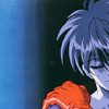
Duplicate your base layer (Layer > Duplicate Layer), and set it to Screen at 40% opacity:
Duplicate the Screen layer, change the new Screen layer's opacity to 30%, and then Desaturate it (Ctrl + Shift + U):
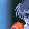
I know, I know, it looks pretty fugly and washed out, but believe me, we're going to fix all that.
Duplicate your base layer again, and drag the duplicate up above all the other layers to the top. Now, apply the Gaussian Blur effect to it (Fitler > Blur > Gaussian Blur). Choose the following for your blur settings (or muck around with them to your liking):
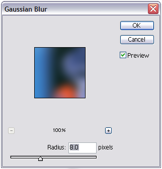
Then we desaturate again, and set this blurred layer to Soft Light at 100% opacity:
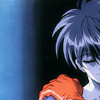
Soft Light always adds a nice depth, and blurring the layer is going to help give that "glowy" look a lot of people have been asking me about. However, we're still pretty far off from the end result.
Duplicate your base again, drag it again to the top of all the layers, and desaturate again. This time, though, only Blur the layer (Filter > Blur > Blur), and set it to Soft Light at 75% opacity:
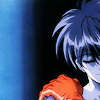
Now, we want to merge all our layers and make a brand new one as it looks now. To do so, make a new layer (Ctrl + Shift + N) and then make a merged copy of all the underlying layers (Ctrl + Alt + Shift + E).
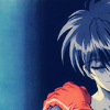
Next, another new layer, which we fill with a nice dark blue (#04103C). Set the color layer to Exclusion at 100% opacity:
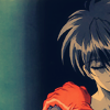
Another color layer above that one, this time a dark orange-brown (#FFCC99). Set this layer to Multiply at 100% opacity:
Yet another color layer; this one a bright aqua (#A8F5F6). Set this one to Color Burn at 100% opacity:
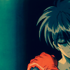
Now, we duplicate that last, burned blue, layer, and keep it set to 100% opacity:
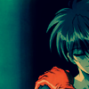
See the green tones starting to pop out? Pretty nifty, yes? Indeed. Light blue-ish color burn layers are my new best friend.
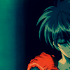
Next, we want to accentuate the red of the glove Van's wearing. Make a new layer and, using a nice, deep red (#C20101), with the paintbrush tool (soft round, 5 pixels), paint over the area where the glove is. Then set the layer to Soft Light at 35% opacity:
Make another layer with all previous ones merged (Ctrl + Shift + N and Ctrl + Alt + Shift + E) above all the rest. Apply Gaussian Blur again, and set this one to Soft Light at 100% opacity:
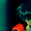
That blue stripe on the whole left side of the icon was bugging me, so I made a new layer, chose black (#000000), and, using the same size paintbrush as before, painted a rough "corner" onto the upper left of the icon. Blur (Filter > Blur > Blur) this black layer once, then set it to Color Burn at 100% opacity:
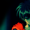
To make it a bit darker, duplicate the black "corner" layer, apply Gaussian Blur, and set this layer to Soft Light at 100% opacity:
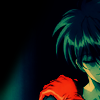
Now, for the oh-so-famous Tiny Text. Make a new layer, with the following text settings -- Font: Lainie Day; Size: 1.5; Weight: Bold, All Caps; Kerning: 1000; Quality: Crisp. For the font color, I used a bright red (#EA1D0A), which I selected from the glove -- tip: always pick a color that’s already present in the icon. Type whatever you like; gibberish or something meaningful. If you do type gibberish, though, I'd recommend adding some spaces here and there, to spread it out a bit. Once we add the text, we get this:

And, though it barely changes anything, I make one more Gaussian Blur, desaturated Soft Light layer, at 10%. Why? Because I’m anal like that. I don't know. Anyway, once you've done that, we're done!
Finished product:
So, in answer to all the “How do you get that … glowy look on all your icons?” questions I've been getting, I say "Lots of Soft Light layers (grayscale or color) with the Gaussian Blur effect." Those are my other new best friend. The thing that keeps the icon from the just plain and ugly sort of blurry is actually very important -- make sure you start with a sharp base. Not over-sharpened, but a nice, clean base. Again, the higher resolution picture you make a base out of, the better your base will be. If you have a nice, crisp base, and don’t over-do the blur layers, it looks soft in all the right ways.
Well, I hope this helped! If you have any questions, just ask, and I'll do my best to help out. And while it would be nice if you don't copy the tutorial exactly word for word when you're making your own icons -- experimenting on your own is more fun, anyway -- I'd still love to see what you get out of it. :)
So, today I'll be showing you how to get from...
This base >>
...to...
<< this icon.
Warning: This tutorial is image-heavy, and is for use in Photoshop 7.
Also, please bear in mind I have never used any version of PSP in my life, and therefore know nothing about it. If you have a question regarding how to transfer this tutorial over to that program, I'm afraid I can't be of any assistance. The best I can offer is to try asking the friendly folk over at icon_tutorial.
So, I started out with this very awesome picture of Van, as he appears in the ending sequence to the show. Bear in mind, hi-res wins at life. In this case, I would hardly call this hi-res, but it was the best I could find, and it's better than most DVD captures. Just remember, the higher quality picture you start with, the better bases you'll be able to make your icons from.
So, to start out, Sharpen (Filter > Sharpen > Sharpen) the image once.
Remember, when working with animated images versus live-action images, making a clear base can be trickier than you'd think. First tip -- never over-sharpen. A way to avoid doing this is to do your sharpening before you get down to 100x100. For a much cooler explanation than I'm giving, check out this awesome sharpening tutorial by wooed.
Also, when working with animated images, over-sharpening looks worse than over-sharpening on live-action images. And considering how bad over-sharpening looks on them, we're talking pretty bad here. In short: DON'T over sharpen your icons. Doing so makes the baby Jesus cry. If you're the religious type, that is. If not, it makes babies cry. Then again, if you're like me, and have a severe dislike for babies and children in general, just don't do it, because I say so.
All right, now to make your base. Using the Crop Tool (

), crop your image how you'd like it, down to 100x100 pixels. After doing so, we get this base:
Another note: try not to center the subject of your icon; it looks rather boring. I'm pretty fond of having the focus of the icon to the left or right.
Duplicate your base layer (Layer > Duplicate Layer), and set it to Screen at 40% opacity:
Duplicate the Screen layer, change the new Screen layer's opacity to 30%, and then Desaturate it (Ctrl + Shift + U):
I know, I know, it looks pretty fugly and washed out, but believe me, we're going to fix all that.
Duplicate your base layer again, and drag the duplicate up above all the other layers to the top. Now, apply the Gaussian Blur effect to it (Fitler > Blur > Gaussian Blur). Choose the following for your blur settings (or muck around with them to your liking):

Then we desaturate again, and set this blurred layer to Soft Light at 100% opacity:
Soft Light always adds a nice depth, and blurring the layer is going to help give that "glowy" look a lot of people have been asking me about. However, we're still pretty far off from the end result.
Duplicate your base again, drag it again to the top of all the layers, and desaturate again. This time, though, only Blur the layer (Filter > Blur > Blur), and set it to Soft Light at 75% opacity:
Now, we want to merge all our layers and make a brand new one as it looks now. To do so, make a new layer (Ctrl + Shift + N) and then make a merged copy of all the underlying layers (Ctrl + Alt + Shift + E).
Next, another new layer, which we fill with a nice dark blue (#04103C). Set the color layer to Exclusion at 100% opacity:
Another color layer above that one, this time a dark orange-brown (#FFCC99). Set this layer to Multiply at 100% opacity:
Yet another color layer; this one a bright aqua (#A8F5F6). Set this one to Color Burn at 100% opacity:
Now, we duplicate that last, burned blue, layer, and keep it set to 100% opacity:
See the green tones starting to pop out? Pretty nifty, yes? Indeed. Light blue-ish color burn layers are my new best friend.
Next, we want to accentuate the red of the glove Van's wearing. Make a new layer and, using a nice, deep red (#C20101), with the paintbrush tool (soft round, 5 pixels), paint over the area where the glove is. Then set the layer to Soft Light at 35% opacity:
Make another layer with all previous ones merged (Ctrl + Shift + N and Ctrl + Alt + Shift + E) above all the rest. Apply Gaussian Blur again, and set this one to Soft Light at 100% opacity:
That blue stripe on the whole left side of the icon was bugging me, so I made a new layer, chose black (#000000), and, using the same size paintbrush as before, painted a rough "corner" onto the upper left of the icon. Blur (Filter > Blur > Blur) this black layer once, then set it to Color Burn at 100% opacity:
To make it a bit darker, duplicate the black "corner" layer, apply Gaussian Blur, and set this layer to Soft Light at 100% opacity:
Now, for the oh-so-famous Tiny Text. Make a new layer, with the following text settings -- Font: Lainie Day; Size: 1.5; Weight: Bold, All Caps; Kerning: 1000; Quality: Crisp. For the font color, I used a bright red (#EA1D0A), which I selected from the glove -- tip: always pick a color that’s already present in the icon. Type whatever you like; gibberish or something meaningful. If you do type gibberish, though, I'd recommend adding some spaces here and there, to spread it out a bit. Once we add the text, we get this:
And, though it barely changes anything, I make one more Gaussian Blur, desaturated Soft Light layer, at 10%. Why? Because I’m anal like that. I don't know. Anyway, once you've done that, we're done!
Finished product:
So, in answer to all the “How do you get that … glowy look on all your icons?” questions I've been getting, I say "Lots of Soft Light layers (grayscale or color) with the Gaussian Blur effect." Those are my other new best friend. The thing that keeps the icon from the just plain and ugly sort of blurry is actually very important -- make sure you start with a sharp base. Not over-sharpened, but a nice, clean base. Again, the higher resolution picture you make a base out of, the better your base will be. If you have a nice, crisp base, and don’t over-do the blur layers, it looks soft in all the right ways.
Well, I hope this helped! If you have any questions, just ask, and I'll do my best to help out. And while it would be nice if you don't copy the tutorial exactly word for word when you're making your own icons -- experimenting on your own is more fun, anyway -- I'd still love to see what you get out of it. :)