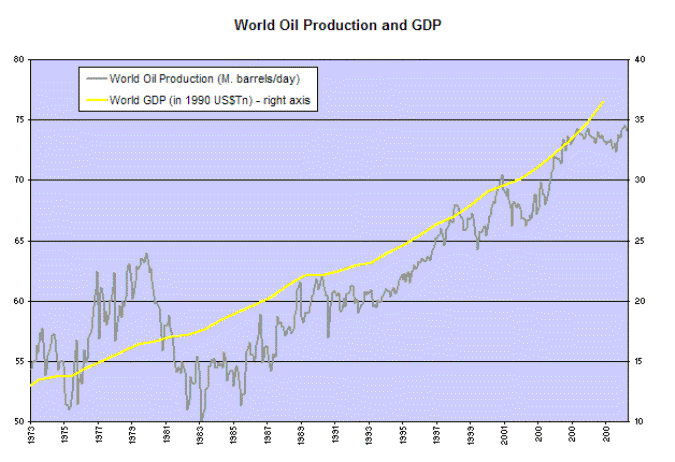
What split between GDP and production? The lines are in sync from 1983 to the present.
The yellow line is where it is because there's a big spike in production 1975-1980. That followed an increase in price, which was due to OPEC's manipulating the distribution.
and I thought you were gonna give me grief about 1990.
I'm particularly interested in the leveling of the line after 2005. Aside form the World's Most Expensive Military being commanded by the chimp in chief, I can't imagine production would fall off that hard.
Oil production has dropped with lessened demamd due to the recession/depression. You can see the division back in the 70s supply wars of OPEC. They have to run in tandem. Either world GDP is going to hit the floor (that's what I think) or the production of oil is going to lurch upward.
Recsssion/depression didn't start until 2008. The trend separation I'm interested in starts in 2005. I found this while looking for a graph of GDP falling with gas prices and production, but decided this was an interesting second best.
Comments 7
( ... )
Reply
Reply
The yellow line is where it is because there's a big spike in production 1975-1980. That followed an increase in price, which was due to OPEC's manipulating the distribution.
Reply
I'm particularly interested in the leveling of the line after 2005. Aside form the World's Most Expensive Military being commanded by the chimp in chief, I can't imagine production would fall off that hard.
Reply
They have to run in tandem. Either world GDP is going to hit the floor (that's what I think) or the production of oil is going to lurch upward.
Reply
Glad to have you here.
Reply
Reply
Leave a comment