(no subject)
METHOD:
* done in GIMP 2
* uh, lasso tool to custom select bits of the icon, then tinting with specific colour mixes :(
* minor tweaks e.g. darkening/lightening/opacities/fills, covered below
* little manual shading, other than on characters' eyes usually, or on smooth shiny gems.
REFERENCE LIST--COLOR BALANCE VALUES FOR FULL-COLOUR ICONS / ICON SETS:
POPE:
BACKGROUND/BLUSH - pink (red 40 / magenta 10) + level adjust/dodge (lightening); no neutral fill color because I can't find one that offsets him well)
ROBE - very light blue/white (cyan 30 / blue 20)
BLING - gold (red 100 / yellow 100)
HAIR/EYES - medium brown (red 80 / yellow 60) + some manual tweaking/highlighting/shading for eyes
SKIN: medium flesh (red 60 / yellow 60)
BLOOD: crimson red + burn (darkening)
OTHER: other characters in the icons, except Caterina and that one Petros one, are solidly tinted in order not to overshadow the Pope.
CATERINA:
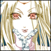
HAIR - blonde-gold (yellow 90 / red 40)
BLING/MONOCLE - gold (red 100 / yellow 100)
ROBE/LIPS/BLOOD - crimson red (red 150) + burn (darkening)
EYES - mid-blue (cyan 50 / blue 50)
SKIN: light flesh (red 50 / yellow 50)
SETH:
HAIR/SQUIRREL: slight blues (cyan 10 / blue 30)
EYES: depending on tone detail, either bright green (green 70 / yellow 100) or manual shading with brush tool
SKIN: flesh (yellow 70 / red 60)
EMPRESS CLOTHES: medium green (green 60 + burn, I think); gems manually shaded; veil blue-gray (cyan 30 / blue 20). Note: I don't like her Empress icons very much because green clashes a little bit with most of the other tints I use for her skin/hair/eyes/whatever. 8(
TEA-SELLER CLOTHES: light red (red 100) + burn; gold trim; blue-white front
SOLDIER CLOTHES: liberal use of burn to darken; dark blue (blue 100 / cyan 50); gold (red 100 / yellow 100) trim
MED STUDENT CLOTHES: blue-white (cyan 50 / blue 30) with gold (red 90 / yellow 90) trim
CRUSNIK: only eyes are tinted crimson (red 150) and burned somewhat darker
BACKGROUND: varies; either dodge-lighten and shade bits accordingly, if there are detailed objects behind her, or fill with pale neutral blue (f3ffff)
RADU:
HAIR: lighter blue-violet (cyan 50 / blue 70)
EYES/FIRE: intense blue (cyan 100 / blue 100)
SKIN: flesh (yellow 70 / red 60); there is fill in one or two of them because the blue in his hair overwhelmed the flesh toning on his face and made him look patchy
DESERT CLOTHES: various shades of blue (IDK D8); turban deep blue-violet (blue 150) + burn
EMPIRE CLOTHES: blue (blue 50 / cyan 30-50) with gold (red 80 / yellow 80) trimmings and pale blue (cyan 30 / blue 20) sleeves; gold (red 80 / yellow 80) trim
BLOOD: crimson red (red 150) + liberal burn
BACKGROUND: mostly the background detail in Radu's icons is cropped out! I select all the blank white space and then set up a gradient for a light violet/blue shade (it ended up varying, since I made his icons over a long period of time) to solid white. Opacity is 60%, and GIMP lets me select gradient type and area. I try to make it so whatever part of the icon Radu's in is the one 'shadowed' by the violet-blue. It worked out surprisingly well.
MIRKA (AKA THE MOST GORGEOUS SET I HAVE EVER MADE):


HAIR: blonde gold (yellow 90 / red 40)
SKIN: light flesh (red 50 / yellow 50); lips get additional pinkening (red 40 / magenta 10)
EYES: I love the Fortuna eye colour. Rose-gold (red 100 / yellow 40).
VEIL: blue-gray (cyan 30 / blue 20).
CLOTHING/RIBBONS: Pink (red 50-60 / magenta 10-20) with blue-whites, reds, and golds.
BACKGROUND: same neutral blue as Seth's (f3ffff)
MITHOS/YGGDRASIL:
HAIR: blond (yellow 100 / red 50) with pale fill (fefee9) / slightly darker/richer as Yggdrasil
SKIN: flesh (yellow 60 / red 50) with pale fill (fffcf1) / slightly darker as Yggdrasil
EYES: completely manually shaded, using dark blue (142e79), brighter blue(1e3dcf), white and black, with various opacities/burn + dodge levels to accommodate shades.
CLOTHING: blue (cyan 50 / blue 50) + coppery bracelets (red 90 / yellow 90) / pale blue-white and gold with gold fill for Yggdrasil. Note: Mithos's tunic is canonically greenish, and his bracelets purple.
WINGS: gradients + manual toning; varies per icon, but pink to purple each time.
BACKGROUND: neutral blue (f6fffe) OR, if background was toned, lighter levels + blue (cyan 50 / blue 50) tint / 60% opacity pink-to-white gradient for Yggdrasil OR any icons with wings.
* I always desaturate teeth, and the eyes before colouring in the pupils. If the inside of the mouth is toned, I tint it pink as well.
* Hair is usually the trickiest and most difficult to select, especially in TB icons, so I just tint the whole icon the colour of the hair, then select/desaturate/retint the other parts separately.
* I don't use layers, but I often fiddle with the opacity on fill/brush tools--it's easier to fill a character's mouth in with 60% opacity pink than 100% opacity. Softer effect, no stray unfilled-looking rough areas near the lines.
* TO DATE I have not found a dark fill-in colour that I like using for any icon set. Pale shades of blue seem to work best.
* leaving 'black' and 'white' areas of an icon untinted bother me because they make it look kind of unfinished! As you can see, I tend to tinge them either slightly blue or slightly cyan.
* Solid fills work best if the colours used are fairly light and not at 100% opacity! I don't use them for Trinity Blood icons, because Kiyo does such detailed toning that when I tint it, the large white areas also seem to take on the surrounding tone colour. But Tales of Symphonia has a bolder art style and fewer tones, so I had to use solid fills to strengthen the tinted lines.
* cleaning icons can be difficult--I scan in a lot of HQ stuff for castmates, but some of the later TB chapters are not out in volume form and the scans are fairly HQ but also dark and saturated and stuff. I try out various mixes of desaturate, level lightening, brightness/contrast and burn/dodge until something works. 8(
* if there is a bright light source in an object (e.g. flame, moon, explosion) I will lighten the surrounding area accordingly with dodge.
* if at all possible, I will either clone in Paint OR manually redraw in GIMP to get rid of speech bubbles.