Icon Tutorial.
Here's my first icon tutorial. And probably the last because I suck at keeping track of stuff like this. I hope it helps someone. Especially Kaity. >:D
Oh. And this tutorial has been made keeping in mind that you guys are aware of basic Photoshop tools and functions and have the patience to duplicate layers and then merge them. Again and again and again. Have fun.
1. Select the picture you want to make the icon out of. I'm going to use a nice little pic of Interpol because they rock.
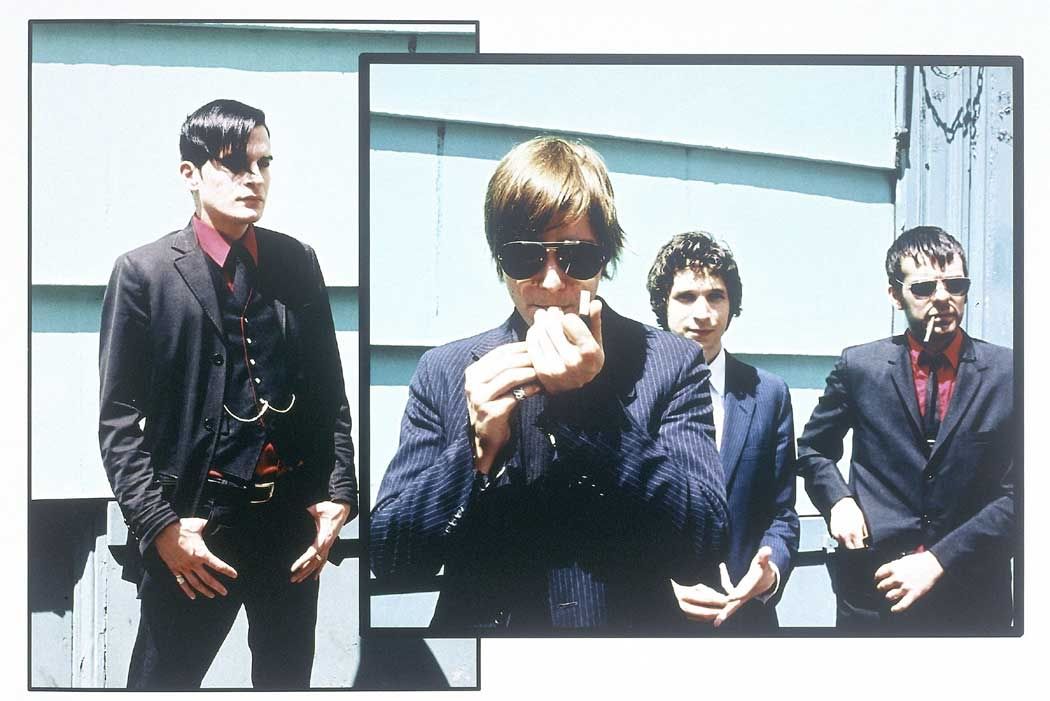
2. Right. Select the area which you want to show off in the icon and crop away. I'm leaning towards Sam and his ciggie.

3. The dimensions are 100 x 100? Right then. The resolution is 72 pixels/inch, yeah? Otherwise your text will go all bonkers and you don't want that now do ya? ;]
4. The cropped little thing looks a bit fuzzeh. I'm going to duplicate the layer and then use the 'SHARPEN' filter. Now merge those layers.

5. Much better. Since the quality of the pic is quite high so the SHARPEN filter hasn't grotesquely distorted how Sam looks which is good. If you feel that some bits of the base look too sharp, you can always go to EDIT >> FADE SHARPEN. Then select the 'BLUR' tool with a soft round brush and touch up any overly angular bits.
6. Sam looks too sunny. Lets remedy that by duplicating the layer once more, setting the blend mode of the duplicated layer to 'MULTIPLY'.

7. eep. Too dark. Bring down the 'OPACITY' to 48%. Or to you own liking, yeah. Merge the layer. ^^

8. Now, since I have decided the theme of my icon is "smoke porn" ::winkwink::, I'm going to emphasize Sam's smoke and run away with cropping a bit closer to his hands and adding that in a little frame on the side in the icon. Duplicate the layer once again.
9. Open up the ORIGINAL pic and crop away on the thing you want to emphasize. In my case it is Sam's cig/lighter/thingy.

10. Make sure the SIZE of the new cropped base is smaller than the original icon size and can be tucked away into your original icon base. My tiny base is of 77 x 38 pixels. See?
11. Repeat steps 4-7 on the new tiny base.
12. Add a nice thick 4 pixels border around the little base in WHITE since white is the new black, dahling.

13. Now. Use your artistic imagination. I'm gonna do just that and flip the tiny base otherwise known as IMAGE >> ROTATE CANVAS >> 90 degrees CW.
14. Now, select that little mofo and copy it. EDIT >> COPY.
15. Maximize your original icon base and do a quick paste. EDIT >> PASTE.
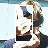
16. Oye vey. All over Sam's face! Shift it to a corner so that it's outta the way!!
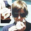
17. Satisfied with where the little mofo is? Good. Merge away.
18. Nothing very sparkly here right now but there's a catch! Open up your
LIGHT TEXTURE BASE.
19. The lovely teh_indy is offering nice big 800 x 600 light textures. You can crop them to your own liking and slap 'em on in this step but right here I'm going to use an already cropped LIGHT TEXTURE BASE made by the awesome girl behind disappearicons.

20. Duplicate the original icon base and open up the LIGHT TEXTURE BASE you have decided to use.
21. COPY the light texture base and PASTE it on the original icon base. oops! Where did Sam go? Nowhere, really. Set the blending mode of the newly pasted light texture base to SCREEN.
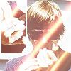
22. We wants those vibrant colors back! Set the blending mode of the DUPLICATED LAYER of the original icon base to OVERLAY. Drag this duplicated layer over the light texture layer.
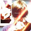
23. Play with OPACITY and set it to the shade you like. I like them scorching. >:D
24. FLATTEN image.
25. Duplicate layer.
26. TEXT TIME. I'm going to write '*SMOKE P0RN*' on the icon. Surprise, surprise.
27. Select yer favorite FONT. I'm gonna go with plain old ARIAL NARROW.
28. Use your best judgement when placing text on the icon. This is crucial because it can either make your icon look teh fabulous or teh blah. Nobody wants a teh blah icon. >.>
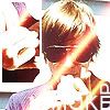
29. Now, since the colors in the icons are quite bright, the WHITE colored text in all caps sized 18 pixels isn't showing up too clearly. Any wise person would go for another color for the text but since I never claimed such a thing like, EVER, so I'm going to remedy that another way. ;P;P
30. See that your TEXT LAYER is selected on the LAYER PALETTE. Go to LAYER >> LAYER STYLE >> BLENDING OPTIONS.
31. Select OUTER GLOW. Set the blending mode to MULTIPLY.
32. Choose a color for the OUTER GLOW that isn't too intrusive with the overall effect of the icon but still serves its purpose of making the text readeable. I used #6E5657 on 72% opacity for this.

33. Happy with everything? Let the layers embrace and become one. OMGLOLZtehSensual!1!
34. BUT! Duplicate once again. :P
35. Add a 4 pixel white border to the entire icon, huzza!
36. I added a bit of text from one of the Interpol songs in really tiny size on the icon as an afterthought [Song = NARC // 'you should be in my space,
you should be in my life' ::hinthint::] in all caps sized 4, blending mode set to MULTIPLY in color #A5A8B4. As beautiful as it sounds, it is more of an ornamental thing - not to be read. So you can even type something like 'omG! liek, i wish i was Collin Farrell's wig in Alexander or better yet, JRM's ancient Greek skirt! :D:D' and it won't matter. FLATTEN IMAGE, babeh.
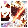
37. You have a nifty little icon. Whatchu waiting for? Show it off!
38. If you don't know who Interpol are...go buy their CDs.
39. If you do know who Interpol are...send me their MP3s. Seriously.
40. Feedback? Comments? Suggestions? Toss them all my way. But please don't yell at me for no apparent reason. I just watch and learn and this tutorial was totally based on what I have taught myself in icon making by looking around at gorgeous icons of people like teh_indy and playing around in Photoshop. No, she's not paying me to mention her name here. If it all sounds shirty to you, don't be hating.
41. Link to this tutorial in your journal if you feel like this is good enough to help out other people. The more good icons there are, the more we are free from the horrors of something like this:

[This was made by me too, by the way. XD]
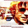
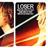
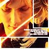
42.Some icons made with using roughly the same technique and resources:
1.
2.
3.
4.
5.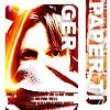
[Why yes, I do love Beck too.]
Feel free to take any of the icons here - just credit and comment, yeah? Ooooh and show me what you come up with after following this tut.
Okay, okay I'm gone for sure now. ::poof::
ETA: this might sound very lame to everyone but...that's not Sam in the icon! That's Paul! As a newly initiated fanatic to the Interpol fandom, I thought that I should repent quick. And since I have no intention of going through the entire tut - I'm just saying it here: when I say 'Sam', I mean 'Paul'. It's a twisted cognitive process.
Oh. And this tutorial has been made keeping in mind that you guys are aware of basic Photoshop tools and functions and have the patience to duplicate layers and then merge them. Again and again and again. Have fun.
1. Select the picture you want to make the icon out of. I'm going to use a nice little pic of Interpol because they rock.

2. Right. Select the area which you want to show off in the icon and crop away. I'm leaning towards Sam and his ciggie.

3. The dimensions are 100 x 100? Right then. The resolution is 72 pixels/inch, yeah? Otherwise your text will go all bonkers and you don't want that now do ya? ;]
4. The cropped little thing looks a bit fuzzeh. I'm going to duplicate the layer and then use the 'SHARPEN' filter. Now merge those layers.

5. Much better. Since the quality of the pic is quite high so the SHARPEN filter hasn't grotesquely distorted how Sam looks which is good. If you feel that some bits of the base look too sharp, you can always go to EDIT >> FADE SHARPEN. Then select the 'BLUR' tool with a soft round brush and touch up any overly angular bits.
6. Sam looks too sunny. Lets remedy that by duplicating the layer once more, setting the blend mode of the duplicated layer to 'MULTIPLY'.

7. eep. Too dark. Bring down the 'OPACITY' to 48%. Or to you own liking, yeah. Merge the layer. ^^

8. Now, since I have decided the theme of my icon is "smoke porn" ::winkwink::, I'm going to emphasize Sam's smoke and run away with cropping a bit closer to his hands and adding that in a little frame on the side in the icon. Duplicate the layer once again.
9. Open up the ORIGINAL pic and crop away on the thing you want to emphasize. In my case it is Sam's cig/lighter/thingy.

10. Make sure the SIZE of the new cropped base is smaller than the original icon size and can be tucked away into your original icon base. My tiny base is of 77 x 38 pixels. See?
11. Repeat steps 4-7 on the new tiny base.
12. Add a nice thick 4 pixels border around the little base in WHITE since white is the new black, dahling.

13. Now. Use your artistic imagination. I'm gonna do just that and flip the tiny base otherwise known as IMAGE >> ROTATE CANVAS >> 90 degrees CW.
14. Now, select that little mofo and copy it. EDIT >> COPY.
15. Maximize your original icon base and do a quick paste. EDIT >> PASTE.

16. Oye vey. All over Sam's face! Shift it to a corner so that it's outta the way!!

17. Satisfied with where the little mofo is? Good. Merge away.
18. Nothing very sparkly here right now but there's a catch! Open up your
LIGHT TEXTURE BASE.
19. The lovely teh_indy is offering nice big 800 x 600 light textures. You can crop them to your own liking and slap 'em on in this step but right here I'm going to use an already cropped LIGHT TEXTURE BASE made by the awesome girl behind disappearicons.
20. Duplicate the original icon base and open up the LIGHT TEXTURE BASE you have decided to use.
21. COPY the light texture base and PASTE it on the original icon base. oops! Where did Sam go? Nowhere, really. Set the blending mode of the newly pasted light texture base to SCREEN.

22. We wants those vibrant colors back! Set the blending mode of the DUPLICATED LAYER of the original icon base to OVERLAY. Drag this duplicated layer over the light texture layer.

23. Play with OPACITY and set it to the shade you like. I like them scorching. >:D
24. FLATTEN image.
25. Duplicate layer.
26. TEXT TIME. I'm going to write '*SMOKE P0RN*' on the icon. Surprise, surprise.
27. Select yer favorite FONT. I'm gonna go with plain old ARIAL NARROW.
28. Use your best judgement when placing text on the icon. This is crucial because it can either make your icon look teh fabulous or teh blah. Nobody wants a teh blah icon. >.>

29. Now, since the colors in the icons are quite bright, the WHITE colored text in all caps sized 18 pixels isn't showing up too clearly. Any wise person would go for another color for the text but since I never claimed such a thing like, EVER, so I'm going to remedy that another way. ;P;P
30. See that your TEXT LAYER is selected on the LAYER PALETTE. Go to LAYER >> LAYER STYLE >> BLENDING OPTIONS.
31. Select OUTER GLOW. Set the blending mode to MULTIPLY.
32. Choose a color for the OUTER GLOW that isn't too intrusive with the overall effect of the icon but still serves its purpose of making the text readeable. I used #6E5657 on 72% opacity for this.

33. Happy with everything? Let the layers embrace and become one. OMGLOLZtehSensual!1!
34. BUT! Duplicate once again. :P
35. Add a 4 pixel white border to the entire icon, huzza!
36. I added a bit of text from one of the Interpol songs in really tiny size on the icon as an afterthought [Song = NARC // 'you should be in my space,
you should be in my life' ::hinthint::] in all caps sized 4, blending mode set to MULTIPLY in color #A5A8B4. As beautiful as it sounds, it is more of an ornamental thing - not to be read. So you can even type something like 'omG! liek, i wish i was Collin Farrell's wig in Alexander or better yet, JRM's ancient Greek skirt! :D:D' and it won't matter. FLATTEN IMAGE, babeh.

37. You have a nifty little icon. Whatchu waiting for? Show it off!
38. If you don't know who Interpol are...go buy their CDs.
39. If you do know who Interpol are...send me their MP3s. Seriously.
40. Feedback? Comments? Suggestions? Toss them all my way. But please don't yell at me for no apparent reason. I just watch and learn and this tutorial was totally based on what I have taught myself in icon making by looking around at gorgeous icons of people like teh_indy and playing around in Photoshop. No, she's not paying me to mention her name here. If it all sounds shirty to you, don't be hating.
41. Link to this tutorial in your journal if you feel like this is good enough to help out other people. The more good icons there are, the more we are free from the horrors of something like this:
[This was made by me too, by the way. XD]
42.Some icons made with using roughly the same technique and resources:
1.
2.
3.
4.
5.
[Why yes, I do love Beck too.]
Feel free to take any of the icons here - just credit and comment, yeah? Ooooh and show me what you come up with after following this tut.
Okay, okay I'm gone for sure now. ::poof::
ETA: this might sound very lame to everyone but...that's not Sam in the icon! That's Paul! As a newly initiated fanatic to the Interpol fandom, I thought that I should repent quick. And since I have no intention of going through the entire tut - I'm just saying it here: when I say 'Sam', I mean 'Paul'. It's a twisted cognitive process.