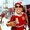
Anywayz, these are so awesome as per usual, I really like the ones with the blue sort of tint (11-13) and I also love 17 & 18. Oh and 14 because I adore that pic, they're both so cute *squishes them*.
Oh and I love the UB ones aswell, the text on the first one is soooooo true :P
Oh so pretty and colorful! I adore the text layout in 13 & 14 and the colors in 07 are unbelievable!! The overall layout of 06, 08 and 09 is awesome and so different from the usual icons you see around the net! Everytime I see your icons I feel mine are boring cause all I do is crop and color. :( Ha, I'm snatiching the Raquel icon! Cause she's a pretty girl and there can never be enough pretty girls in this world!
I also adore the Ugly Betty icons because they have this rally fresh and clean coloring! Especially 03 and 06 are my favs cause of the red splashes!
Thank you very much! :D #7 was the Ferrari that started off being a little too pink ;) #9 was the one that I had the biggest war with and which probably drove me the most mad! awwwww no, your icons are not boring!!! I feel like mine are boring so I guess maybe it shows that everyone thinks their own icons are boring? I look at icons which are just cropped and coloured and then if I try doing it I think they look boring and lacking in something. :D :D I think she looks great in that picture!!
I must admit I was very impressed with how the colouring worked on the Ugly Betty icons! It certainly felt like it was made for those stills!
All so pretty! I didn't realise Raquel was there that weekend! The one of Nando looking at her is just adoreable. Great work, great style. :D Will credit if I use any
Yeah, I guess she was there because it was his birthday. She sang him happy birthday when Ferrari gave him (and the other two) the cake. Yeah, I love the look on his face. So cute! Thank you :D
Comments 10
Reply
Reply
*cough*
Anywayz, these are so awesome as per usual, I really like the ones with the blue sort of tint (11-13) and I also love 17 & 18. Oh and 14 because I adore that pic, they're both so cute *squishes them*.
Oh and I love the UB ones aswell, the text on the first one is soooooo true :P
Reply
Thank you!!! :D :D LOL, I saw the picture of Fernando and Seb and had to think of you. I wonder why ;P It is a very cute picture!!
Thanks! *grins* that picture of Daniel is just far too sexy!!!
Reply
I also adore the Ugly Betty icons because they have this rally fresh and clean coloring! Especially 03 and 06 are my favs cause of the red splashes!
Lovely icons hun, lovely!
Reply
I must admit I was very impressed with how the colouring worked on the Ugly Betty icons! It certainly felt like it was made for those stills!
Reply
Reply
Reply
Reply
Reply
Leave a comment