Five BSFA 'Best Artwork' nominations
I'm nominating five pieces of artwork for this year's BSFA 'Best Artwork' Award, all cover illustrations in great variety. And if you've left it late like me, get your nominations in quick by midnight on 13 January!
Listed alphabetically by cover artist:

'Nautili', cover illustration for Clarkesworld #53 by Julie Dillon, February 2011.
Clarkesworld usually have gorgeous covers to their issues, and whilst at first appearing to be a straightforward fantasy illustration one's perspective on this one is altered by a closer look at the model's hands, making the viewer wonder further what is going on here. Apart from the gorgeous colour, my favourite aspect is the way the artist has concealed the model's face just enough to suggest 'she' has becomes somehow lost in underwater wonders. The nautili and fish tell you the imagery is very much of this earth, yet everything also appears very otherworldly.
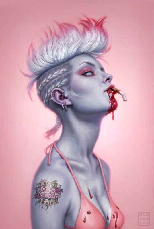
Cover illustration for My Life as a White Trash Zombie by Diana Rowland, artwork by Dan Dos Santos (DAW).
What's not to love about this cover illustration? It's pink all over. It's cotton candy punk. It's the best cover DAW have had in a long time. It doesn't need any explanation from me, but Dan Dos Santos's illuminating post about the painting's evolution from concept to completion can be found here. ’Nuff said.
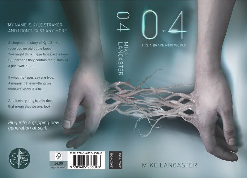
Cover for 0.4 by Mike Lancaster, artwork by Tom Hartley (Egmont Books, publication date 3 January 2011)
Mike Lancaster's debut science fiction novel for young adults 0.4 is a case study in good cover design: the front provides the teaser, and the way the illustration then continues around the spine to have the concept completed on the back makes one wonder "Does this actually happen in the book?" Yes it does, and it shows why the cover has been well thought out. It looks fresh and different and still creeps me out and, as someone who spends a sizeable amount of time thinking about book cover design, the overall concept was integral in making me buy and read it straight away. Job done, brilliantly.
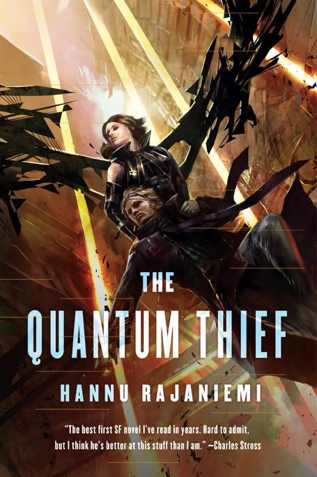
Cover illustration for The Quantum Thief by Hannu Rajaniemi, artwork by Kekai Kotaki (Pyr).
As much as I like Chris Moore's cover for Gollancz's first edition, I like this cover for the US edition even more. It illustrates a specific moment in the book and the composition is especially strong, with the faded-out lower quarter providing some lift to the almost-silhouetted characters, and its strongly vertical perspective is interrupted by the bizarre 'wings' that shred their way across the picture. I imagine Hannu was rather delighted with this.
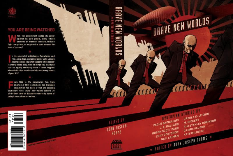
Cover for Brave New Worlds by John Joseph Adams, artwork by Cody Tilson (Night Shade).
What a gorgeous cover this is. Brave New Worlds is a thick book of short stories on the theme of dystopias, and this strong wraparound design appears industrial while also suggesting uphill battles against propaganda and huge government forces. It pulls off the trick of appearing gritty without being rough. Neville Brody's font 'Industria' is used for the heading, and great design like this could only be enhanced by a zeppelin.
Listed alphabetically by cover artist:
'Nautili', cover illustration for Clarkesworld #53 by Julie Dillon, February 2011.
Clarkesworld usually have gorgeous covers to their issues, and whilst at first appearing to be a straightforward fantasy illustration one's perspective on this one is altered by a closer look at the model's hands, making the viewer wonder further what is going on here. Apart from the gorgeous colour, my favourite aspect is the way the artist has concealed the model's face just enough to suggest 'she' has becomes somehow lost in underwater wonders. The nautili and fish tell you the imagery is very much of this earth, yet everything also appears very otherworldly.
Cover illustration for My Life as a White Trash Zombie by Diana Rowland, artwork by Dan Dos Santos (DAW).
What's not to love about this cover illustration? It's pink all over. It's cotton candy punk. It's the best cover DAW have had in a long time. It doesn't need any explanation from me, but Dan Dos Santos's illuminating post about the painting's evolution from concept to completion can be found here. ’Nuff said.
Cover for 0.4 by Mike Lancaster, artwork by Tom Hartley (Egmont Books, publication date 3 January 2011)
Mike Lancaster's debut science fiction novel for young adults 0.4 is a case study in good cover design: the front provides the teaser, and the way the illustration then continues around the spine to have the concept completed on the back makes one wonder "Does this actually happen in the book?" Yes it does, and it shows why the cover has been well thought out. It looks fresh and different and still creeps me out and, as someone who spends a sizeable amount of time thinking about book cover design, the overall concept was integral in making me buy and read it straight away. Job done, brilliantly.
Cover illustration for The Quantum Thief by Hannu Rajaniemi, artwork by Kekai Kotaki (Pyr).
As much as I like Chris Moore's cover for Gollancz's first edition, I like this cover for the US edition even more. It illustrates a specific moment in the book and the composition is especially strong, with the faded-out lower quarter providing some lift to the almost-silhouetted characters, and its strongly vertical perspective is interrupted by the bizarre 'wings' that shred their way across the picture. I imagine Hannu was rather delighted with this.
Cover for Brave New Worlds by John Joseph Adams, artwork by Cody Tilson (Night Shade).
What a gorgeous cover this is. Brave New Worlds is a thick book of short stories on the theme of dystopias, and this strong wraparound design appears industrial while also suggesting uphill battles against propaganda and huge government forces. It pulls off the trick of appearing gritty without being rough. Neville Brody's font 'Industria' is used for the heading, and great design like this could only be enhanced by a zeppelin.