Fan Art : Jared - Smoke & Lightning
Fan Art : Jared - Smoke & Lightning

The full size version is available here : http://img705.imageshack.us/img705/4897/jaredsmokelighteningneo.jpg
GENERAL QUESTIONS
ABOUT SMOKE AND LIGHTNING
What's the concept ?
I discovered few months ago thanks to her Deviant Art page the photo manips of Miss Bloodyadorable and I immediately feel in love with them. Spn Boys + tattoos ? Definitely epic win for me! Here are some of her works (my favorite ones actually) but if you really want to discover all her manips, don't hesitate to go to her DA page for more "bad boys" mayhem.
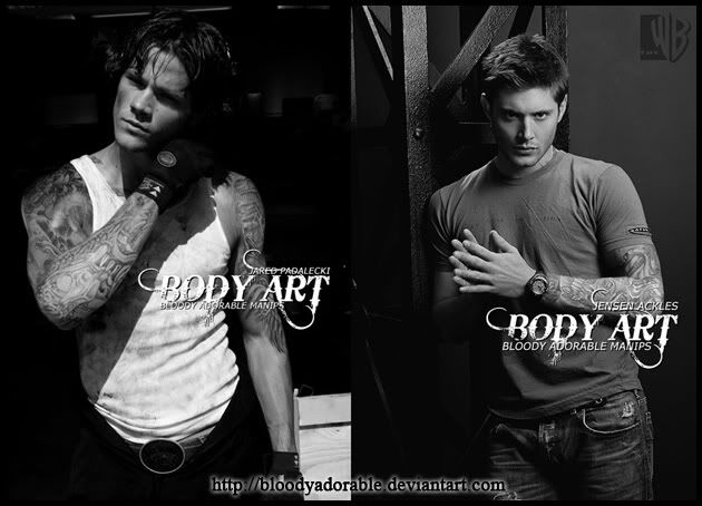
I didn't realize however those photos were not just manips "on their own" but illustration arts for a Spn AU fan fiction called Smoke and Lightning written by Bloodyadorable herself and her friend Miss Eviltwin.
Two or three weeks ago, I contacted Bloodyadorable and she kindly gave me the link to the fic. Saying that I was stunned is an understatement. I wasn't really expecting something like this ! To be completely honest, I thought it was going to be, at best, a "nice little 40 page fic" with a sappy story line but guess what ? Smoke and Lightening is a real novel, composed of two books (434p + 373p) with a very good story line. That's what I call a nice job ladies ! I started to read, very reluctantly (RLC + Slash + Alternative Universe, tsss, not for me !!) and all I can say is that it was amazing. The story, the characters, the general atmosphere were very appealing.
What about the story ?
Two teens who have nothing in common (Jared, tattooed troublemaker fan of old bikes and Jensen good little rich boy with daddy issues) will meet, love each other and learn a lot from each other's presence. As Kipling would say "You'll be a Man, my son". The story is so rich that it is quite hard to sum up the whole plot without being spoilery so I let you discover by yourself what Smoke and Lightning is all about.
Where can I find the fic ?
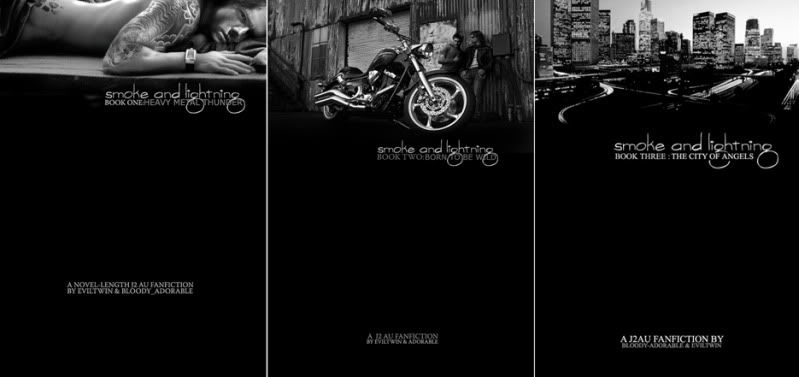
If you want to discover Eviltwin & Bloodyadorable's fic check out the master posts for Smoke and Lightening :
- Book One (Complete) : http://community.livejournal.com/arealwildchild/9553.html
- Book Two (Complete) : http://community.livejournal.com/arealwildchild/27680.html
- Book Three (In Progress) : http://community.livejournal.com/arealwildchild/52119.html
Does it mean you actually draw arts for fan fictions ? Can I send you my fic so that you can create a fan art ?
I'm going to be pretty clear on that one : NO F-R-E-A-K-I-N-G WAY . Period.
Even if my fic is like...super awesome ?
It won't change anything. You can be the Salinger of fan fiction, I won't draw you a fan art because for the LAST time, I don't take commissions. I may sound super pretentious and condescending with that kind of very straight-forward answer but you cannot even imagine the number of notes on DA, mails, and private messages on LJ that I receive every week asking me a fan art of ----- (insert name of a show) or a commission for a fan fiction. I choose my own projects so please, try to understand. ^^;;
CREATING THE ART
Ok, What about your drawing then ?
My drawing represents Jared "pre-Smoke and Lightning" when he was a teen hanging out with bikers in some loosy bars and that having troubles with the cops was a part of his everyday life. To cut a long story short, the embodiment of the (lost) bad boy with an attitude.
Why not drawing Jared as he is described in the fic, as a young adult ?
Well, the girls have already done a great job with their 3246576 thousand photomanips (available on Bloodyadorable's DA page and on the fic masters post here and here) so it was a way to draw something different and original. In addition, the description of Jared at about 14-15 year old inspired me, so I chose that option. And no, I don't have a thing for 15 year old teens, I'm not Michael Jackson ^^
Why Jared and not Jensen ?
I am a "Dean girl" which means that I have already drawn several Jensen fan arts so it was time to pay tribute to "the other one" and I must admit that, in that particular story, I preferred Jared and his devil-may-care attitude.
It looks like a book cover...
That's how I built the image. As a book cover or a movie poster with a space left blank on the right for the title and the authors' names. I didn't want to draw a fan art as I always do and put my name at the bottom, it wouldn't have been fair. I had to pay tribute to the two authors who did a great job ;) I then came up with the idea of the neon sign, which was a good way on the one hand to respect the atmosphere of the story (the biker bar) and on the other hand to include the title and the authors' names without using a banal font (Comic Sans anyone ? ^^).
Where did you find a reference picture of Jared where he looks so young ?
Jared started acting and modeling pretty young and there's a lot of photos available on the Internet, however exactly like I did with with my preceding fan art, I started with a photo of Jared at around 21 and thanks to the magic of my Wacom Tablet, I made him look younger (made his face more "chubby", soften his features, changed his nose and mouth, etc). It was easier than Jensen, believe me.
I used this pic as a reference for drawing the face : http://i217.photobucket.com/albums/cc27/petite_madame/017copy.jpg
Some of his tattoos are in color, and one is in black and grey..It's strange, no ?
You don't get a tattoo sleeve in one day, even when you are a biker with some of your friends working as tattoo artists. It's a long and painful process that takes hours and hours to complete, if not months. I let the tattoo on his right arm in black and grey to show his tattoos are still a work in progress which is pretty normal when you are about 15 years old.
For once no zombies, no monsters, no wendigos ?
Agh, no, unfortunately... The fic is, as I was telling you above, an AU fic set in "the normal world" so there are no monsters but thanks God, as least, there are some fantastic tattoos...
Not even a little blood splatter or a wound on his face ?
I thought about adding some bruises on his faces to enhanced the "bad guy" appeal but finally I dropped the idea for two reasons :
1) I'm satisfied with the face as it is and the texture is, hum, yummy...
2) The drawing is already full of details like the tattoos, the Mötley Crüe shirt, the guitar...I didn't think it was necessary to add something more to distract the viewer's eyes.
Funniest thing to draw ?
The hair and the tattoos.
Most boring ?
The guitar. I suck at "mechas" like cars, trunks, guitars, etc..I ike the final result but I am thankful I never had to draw a rock band with 6 or 7 members.
The right arm...Not entirely satisfied with that one because the perspective wasn't really easy to reproduce.
LET'S TALK ABOUT TECHNIQUE
What software did you use ?
The usual drill, Photoshop CS, Painter, and Paint Shop Pro.
Tablet : Wacom Graphire 4
How long did it take you ?
More than 15 hours for that one. 3 hours and a half for the guitar alone.
What brushes did you use ?
Photoshop : Mainly default brushes from the "basic brushes set" (Opacity 30%-50%), and a "dry brush" for the shadows and outlines. I also used pre-defined brushes downloaded on the net for the tattoos and the smoke (hence the almost photographic effect). I can't tell you where those brushes come from because I downloaded them ages ago. Here are however a small glimpse at the main brushes I used so that you can have an idea.

Painter : Acrylics and digital watercolors with a very low opacity.
Paint Proshop : "Soft focus" to soften Jared's feature
His skin is, hum..yummy, particularly on his face.
Four steps :
1) Draw the face using default brushes and colors like dark green and purple for the shadows (Photoshop CS) then add details with the "Acrylics" tool (Painter)
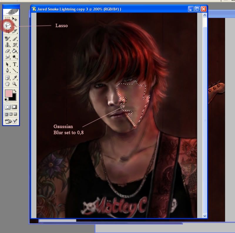
2) Select with the lasso everything except the eyes and add a "gaussian blur". It will give the skin that extra smooth texture. You have to do this for the whole face. The picture below shows you only a particular selection. (Photoshop CS)
3) Add "soft focus" (Paint Shop Pro)
4) Add a texture with a new layer, opacity set to "Multiply" (20%). It really gives the impression the skin has a real texture and doesn't look like plastic. I used this texture found on Deviant Art : http://wojtar-stock.deviantart.com/art/Paper-texture-4-79471503
The background looks like real wood !
Because I used a photo of a wood texture and added it to the pic thanks to the "stamp tool" with a layer set to "Multiply" with an opacity of 30%. You can check the texture here : http://i217.photobucket.com/albums/cc27/petite_madame/bg_wood-1.jpg
How did you create the neon sign ?
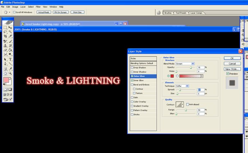
A piece of cake, it works with any font. Use the type tool to type your text. Choose a light color for instance light pink if you want your neon sign to be red and very light blue, almost white, if you want it to be blue. Then go to the "layer style" and choose "Outer Glow" and "Inner Glow". The color chosen for the "Outer Glow" must be dark, like dark red or dark blue for instance. Play with the "spread" and the "range" to give the effect you like. Et voilà !
Filters, textures ?
Of course, they are very important as you can see here ^^
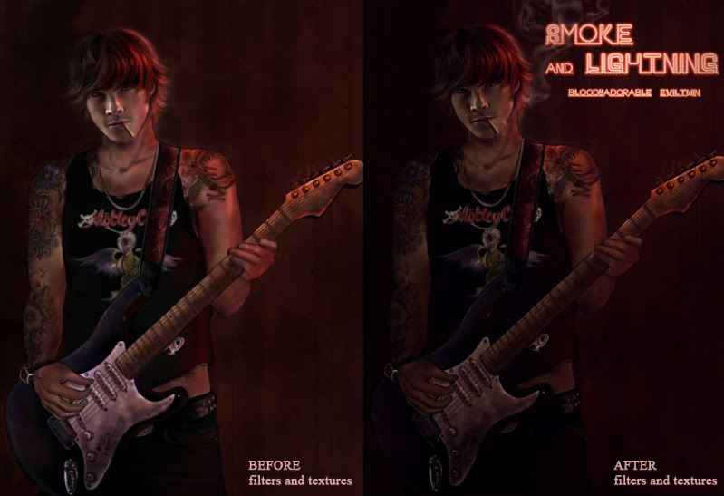
Filters : "warming filters" (I added shadows and hightlights with a soft default brush set on "Multiply"). I also changed the tones thanks to the "color balance" and "variations" (more red)
Textures : I used this texture with a very very low opacity (around 20%) with my layer set to "multiply" to give that "grunge effect".
Et voilà!!!
That's all folks, sorry for the very long post and for my English.
Hope you enjoyed the technical explanations ^^
FAN ARTS MASTER POST (Click Below)


The full size version is available here : http://img705.imageshack.us/img705/4897/jaredsmokelighteningneo.jpg
GENERAL QUESTIONS
ABOUT SMOKE AND LIGHTNING
What's the concept ?
I discovered few months ago thanks to her Deviant Art page the photo manips of Miss Bloodyadorable and I immediately feel in love with them. Spn Boys + tattoos ? Definitely epic win for me! Here are some of her works (my favorite ones actually) but if you really want to discover all her manips, don't hesitate to go to her DA page for more "bad boys" mayhem.

I didn't realize however those photos were not just manips "on their own" but illustration arts for a Spn AU fan fiction called Smoke and Lightning written by Bloodyadorable herself and her friend Miss Eviltwin.
Two or three weeks ago, I contacted Bloodyadorable and she kindly gave me the link to the fic. Saying that I was stunned is an understatement. I wasn't really expecting something like this ! To be completely honest, I thought it was going to be, at best, a "nice little 40 page fic" with a sappy story line but guess what ? Smoke and Lightening is a real novel, composed of two books (434p + 373p) with a very good story line. That's what I call a nice job ladies ! I started to read, very reluctantly (RLC + Slash + Alternative Universe, tsss, not for me !!) and all I can say is that it was amazing. The story, the characters, the general atmosphere were very appealing.
What about the story ?
Two teens who have nothing in common (Jared, tattooed troublemaker fan of old bikes and Jensen good little rich boy with daddy issues) will meet, love each other and learn a lot from each other's presence. As Kipling would say "You'll be a Man, my son". The story is so rich that it is quite hard to sum up the whole plot without being spoilery so I let you discover by yourself what Smoke and Lightning is all about.
Where can I find the fic ?
If you want to discover Eviltwin & Bloodyadorable's fic check out the master posts for Smoke and Lightening :
- Book One (Complete) : http://community.livejournal.com/arealwildchild/9553.html
- Book Two (Complete) : http://community.livejournal.com/arealwildchild/27680.html
- Book Three (In Progress) : http://community.livejournal.com/arealwildchild/52119.html

Does it mean you actually draw arts for fan fictions ? Can I send you my fic so that you can create a fan art ?
I'm going to be pretty clear on that one : NO F-R-E-A-K-I-N-G WAY . Period.
Even if my fic is like...super awesome ?
It won't change anything. You can be the Salinger of fan fiction, I won't draw you a fan art because for the LAST time, I don't take commissions. I may sound super pretentious and condescending with that kind of very straight-forward answer but you cannot even imagine the number of notes on DA, mails, and private messages on LJ that I receive every week asking me a fan art of ----- (insert name of a show) or a commission for a fan fiction. I choose my own projects so please, try to understand. ^^;;
CREATING THE ART
Ok, What about your drawing then ?
My drawing represents Jared "pre-Smoke and Lightning" when he was a teen hanging out with bikers in some loosy bars and that having troubles with the cops was a part of his everyday life. To cut a long story short, the embodiment of the (lost) bad boy with an attitude.
Why not drawing Jared as he is described in the fic, as a young adult ?
Well, the girls have already done a great job with their 3246576 thousand photomanips (available on Bloodyadorable's DA page and on the fic masters post here and here) so it was a way to draw something different and original. In addition, the description of Jared at about 14-15 year old inspired me, so I chose that option. And no, I don't have a thing for 15 year old teens, I'm not Michael Jackson ^^
Why Jared and not Jensen ?
I am a "Dean girl" which means that I have already drawn several Jensen fan arts so it was time to pay tribute to "the other one" and I must admit that, in that particular story, I preferred Jared and his devil-may-care attitude.
It looks like a book cover...
That's how I built the image. As a book cover or a movie poster with a space left blank on the right for the title and the authors' names. I didn't want to draw a fan art as I always do and put my name at the bottom, it wouldn't have been fair. I had to pay tribute to the two authors who did a great job ;) I then came up with the idea of the neon sign, which was a good way on the one hand to respect the atmosphere of the story (the biker bar) and on the other hand to include the title and the authors' names without using a banal font (Comic Sans anyone ? ^^).
Where did you find a reference picture of Jared where he looks so young ?
Jared started acting and modeling pretty young and there's a lot of photos available on the Internet, however exactly like I did with with my preceding fan art, I started with a photo of Jared at around 21 and thanks to the magic of my Wacom Tablet, I made him look younger (made his face more "chubby", soften his features, changed his nose and mouth, etc). It was easier than Jensen, believe me.
I used this pic as a reference for drawing the face : http://i217.photobucket.com/albums/cc27/petite_madame/017copy.jpg
Some of his tattoos are in color, and one is in black and grey..It's strange, no ?
You don't get a tattoo sleeve in one day, even when you are a biker with some of your friends working as tattoo artists. It's a long and painful process that takes hours and hours to complete, if not months. I let the tattoo on his right arm in black and grey to show his tattoos are still a work in progress which is pretty normal when you are about 15 years old.
For once no zombies, no monsters, no wendigos ?
Agh, no, unfortunately... The fic is, as I was telling you above, an AU fic set in "the normal world" so there are no monsters but thanks God, as least, there are some fantastic tattoos...
Not even a little blood splatter or a wound on his face ?
I thought about adding some bruises on his faces to enhanced the "bad guy" appeal but finally I dropped the idea for two reasons :
1) I'm satisfied with the face as it is and the texture is, hum, yummy...
2) The drawing is already full of details like the tattoos, the Mötley Crüe shirt, the guitar...I didn't think it was necessary to add something more to distract the viewer's eyes.
Funniest thing to draw ?
The hair and the tattoos.
Most boring ?
The guitar. I suck at "mechas" like cars, trunks, guitars, etc..I ike the final result but I am thankful I never had to draw a rock band with 6 or 7 members.
The right arm...Not entirely satisfied with that one because the perspective wasn't really easy to reproduce.
LET'S TALK ABOUT TECHNIQUE
What software did you use ?
The usual drill, Photoshop CS, Painter, and Paint Shop Pro.
Tablet : Wacom Graphire 4
How long did it take you ?
More than 15 hours for that one. 3 hours and a half for the guitar alone.
What brushes did you use ?
Photoshop : Mainly default brushes from the "basic brushes set" (Opacity 30%-50%), and a "dry brush" for the shadows and outlines. I also used pre-defined brushes downloaded on the net for the tattoos and the smoke (hence the almost photographic effect). I can't tell you where those brushes come from because I downloaded them ages ago. Here are however a small glimpse at the main brushes I used so that you can have an idea.

Painter : Acrylics and digital watercolors with a very low opacity.
Paint Proshop : "Soft focus" to soften Jared's feature
His skin is, hum..yummy, particularly on his face.
Four steps :
1) Draw the face using default brushes and colors like dark green and purple for the shadows (Photoshop CS) then add details with the "Acrylics" tool (Painter)
2) Select with the lasso everything except the eyes and add a "gaussian blur". It will give the skin that extra smooth texture. You have to do this for the whole face. The picture below shows you only a particular selection. (Photoshop CS)

3) Add "soft focus" (Paint Shop Pro)
4) Add a texture with a new layer, opacity set to "Multiply" (20%). It really gives the impression the skin has a real texture and doesn't look like plastic. I used this texture found on Deviant Art : http://wojtar-stock.deviantart.com/art/Paper-texture-4-79471503
The background looks like real wood !
Because I used a photo of a wood texture and added it to the pic thanks to the "stamp tool" with a layer set to "Multiply" with an opacity of 30%. You can check the texture here : http://i217.photobucket.com/albums/cc27/petite_madame/bg_wood-1.jpg
How did you create the neon sign ?
A piece of cake, it works with any font. Use the type tool to type your text. Choose a light color for instance light pink if you want your neon sign to be red and very light blue, almost white, if you want it to be blue. Then go to the "layer style" and choose "Outer Glow" and "Inner Glow". The color chosen for the "Outer Glow" must be dark, like dark red or dark blue for instance. Play with the "spread" and the "range" to give the effect you like. Et voilà !

Filters, textures ?
Of course, they are very important as you can see here ^^

Filters : "warming filters" (I added shadows and hightlights with a soft default brush set on "Multiply"). I also changed the tones thanks to the "color balance" and "variations" (more red)
Textures : I used this texture with a very very low opacity (around 20%) with my layer set to "multiply" to give that "grunge effect".
Et voilà!!!
That's all folks, sorry for the very long post and for my English.
Hope you enjoyed the technical explanations ^^
FAN ARTS MASTER POST (Click Below)
