Icon Tutorial...Pink Six Icon
This icon was made using Photoshop CS2. I'm pretty sure it can be made using other graphics software, so don't despair. :)
We are going to make this icon.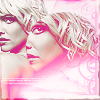
from this Hi-Def Photograph of Six/Tricia Helfer from Battlestar Galactica.
Making the original two icons
I made the Pink Six Icon by putting together two other icons I made.
I took the photograph of Six looking over her shoulder and changed it from 300 resolution to 72 resolution. That made it smaller and easier to handle.
I made two Six icons.
This one
and this one
This is a basic idea of how I made them.
First crop your bases. One is a close up and one is pulled out a little more. Do whatever it is you do to prepare your base. This photograph doesn't need much preparation since it's hi-def.
Next use the steps below in the graphic as a guide. It's your basic icon with a blue exclusion layer and a light blue color burn layer. (Leave out the top two layers I have in the graphic. You'll see why later)
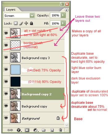
You do not have to make your icons the way I did.
Making the Pink Six Icon
This second icon will be your base. You can flatten it or just leave it in layers. It doesn't matter.
This one...
Flatten your close up icon and drag it to the top of your base. Your icon should look like this now with the close-up Six icon on top.

Take your "eliptical marquee tool" and drag it out into a circle around Six's face. Like this. This should be done on the top layer, the layer you just dragged.
(It's kind of hard to see so please look carefully to see the dashed circle)
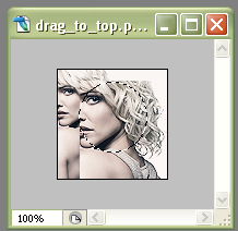
Go to "select" and click on "inverse". Your icon should look like this.
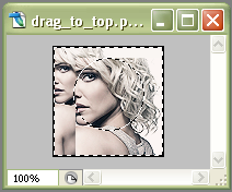
Now hit the "delete" key. You will be left with a circle of Six's face on your top layer. (Select>deselect to get rid on the moving dotted lines.)

Now you can move that circle of Six's face around on it's layer till you get it where you want it.
I took this light texture by and put it on the top in a new layer.
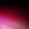
Then I flipped it horizontal and set it to "lighten" at 100% opacity. Now your icon should look like this. Pretty cool, but it needs something else.
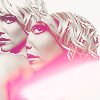
I added a tiny text brush in white and placed it near the bottom of the icon so that it blended into the white part of my light texture. (Unfortunately, I looked and looked through my brushes and I could not find that exact tiny text brush. Very frustrating. But you could use this one if you don't have any. It would work fine for this icon. Or you could just type your own tiny text on the icon) If anyone knows who tiny text brush this is please let me know so I can credit
Anyway, your icon will look something like this after you added the text.
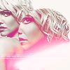
Next, I took my eyedropper tool and picked up a med. pink color from the light texture. Which ended up being...#fd76b1. Then I used this swirly border brush by happyconfusion and stamped it in that pink color on a new layer. I left it at normal at 39% opacity.

You will notice that I have erased part of the brush. This is up to you. I thought the bottom part of the brush was distracting so I erased it.
Then I duplicated the brush layer (NOTE: I duplicated the original brush layer before I lowered the opacity to 39%) I set the duplicated layer to "hard light" at 57% opacity.
(Please note that I messed around with the opacity on these two brush layers till I got it to look the way I wanted. Your opacity settings could be different.)
Now your icon should look similar to this.
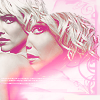
I took this thin border brush by unmasked_icons and stamped it in #93656d, a mauvey-pink color, on a separate layer. I duplicated the layer. I left the duplicated layer set at "normal" 61% opacity. I set the original border layer to "color burn" at 85% opacity.

Your icon looks like this after the border is added.
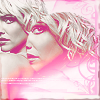
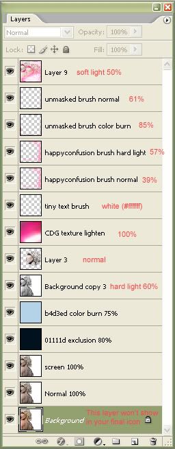
Finally, the last thing I did was I made a new layer. Then do a "alt + ctrl + shift + E" to copy all your previous layers onto the new layer. Set this top layer to "soft light" at 50% opacity. What this does is brighten up the whole icon.
Here is a graphic of all the layers in the icon.
Now you are done and the icon should look something like this.

Your icon may look different than mine. That is OK. Try experimenting with different light textures. You can set them to "screen" or "lighten". "Lighten" looks good with the red colored textures.
This tutorial is for emzcu and anyone else who is curious as to how I made that Pink Six Icon.
If anyone has any questions or there is anything unclear in this tutorial please don't hesitate to ask.
Hi-Def Promo Photograph of Six came from Dark Thoughts: Battlestar Galactica
Credits for all brushes and textures are in my Resources Entry.
We are going to make this icon.
from this Hi-Def Photograph of Six/Tricia Helfer from Battlestar Galactica.
Making the original two icons
I made the Pink Six Icon by putting together two other icons I made.
I took the photograph of Six looking over her shoulder and changed it from 300 resolution to 72 resolution. That made it smaller and easier to handle.
I made two Six icons.
This one
and this one
This is a basic idea of how I made them.
First crop your bases. One is a close up and one is pulled out a little more. Do whatever it is you do to prepare your base. This photograph doesn't need much preparation since it's hi-def.
Next use the steps below in the graphic as a guide. It's your basic icon with a blue exclusion layer and a light blue color burn layer. (Leave out the top two layers I have in the graphic. You'll see why later)

You do not have to make your icons the way I did.
Making the Pink Six Icon
This second icon will be your base. You can flatten it or just leave it in layers. It doesn't matter.
This one...
Flatten your close up icon and drag it to the top of your base. Your icon should look like this now with the close-up Six icon on top.

Take your "eliptical marquee tool" and drag it out into a circle around Six's face. Like this. This should be done on the top layer, the layer you just dragged.
(It's kind of hard to see so please look carefully to see the dashed circle)

Go to "select" and click on "inverse". Your icon should look like this.

Now hit the "delete" key. You will be left with a circle of Six's face on your top layer. (Select>deselect to get rid on the moving dotted lines.)

Now you can move that circle of Six's face around on it's layer till you get it where you want it.
I took this light texture by and put it on the top in a new layer.

Then I flipped it horizontal and set it to "lighten" at 100% opacity. Now your icon should look like this. Pretty cool, but it needs something else.

I added a tiny text brush in white and placed it near the bottom of the icon so that it blended into the white part of my light texture. (Unfortunately, I looked and looked through my brushes and I could not find that exact tiny text brush. Very frustrating. But you could use this one if you don't have any. It would work fine for this icon. Or you could just type your own tiny text on the icon) If anyone knows who tiny text brush this is please let me know so I can credit

Anyway, your icon will look something like this after you added the text.

Next, I took my eyedropper tool and picked up a med. pink color from the light texture. Which ended up being...#fd76b1. Then I used this swirly border brush by happyconfusion and stamped it in that pink color on a new layer. I left it at normal at 39% opacity.

You will notice that I have erased part of the brush. This is up to you. I thought the bottom part of the brush was distracting so I erased it.
Then I duplicated the brush layer (NOTE: I duplicated the original brush layer before I lowered the opacity to 39%) I set the duplicated layer to "hard light" at 57% opacity.
(Please note that I messed around with the opacity on these two brush layers till I got it to look the way I wanted. Your opacity settings could be different.)
Now your icon should look similar to this.

I took this thin border brush by unmasked_icons and stamped it in #93656d, a mauvey-pink color, on a separate layer. I duplicated the layer. I left the duplicated layer set at "normal" 61% opacity. I set the original border layer to "color burn" at 85% opacity.

Your icon looks like this after the border is added.

Finally, the last thing I did was I made a new layer. Then do a "alt + ctrl + shift + E" to copy all your previous layers onto the new layer. Set this top layer to "soft light" at 50% opacity. What this does is brighten up the whole icon.
Here is a graphic of all the layers in the icon.

Now you are done and the icon should look something like this.
Your icon may look different than mine. That is OK. Try experimenting with different light textures. You can set them to "screen" or "lighten". "Lighten" looks good with the red colored textures.
This tutorial is for emzcu and anyone else who is curious as to how I made that Pink Six Icon.
If anyone has any questions or there is anything unclear in this tutorial please don't hesitate to ask.
Hi-Def Promo Photograph of Six came from Dark Thoughts: Battlestar Galactica
Credits for all brushes and textures are in my Resources Entry.