(Untitled)
Hi, I want to start working on my art portfolio for school and I'm thinking about doing some pictures that have words that are visible, but don't distract you from the picture. I just wanted to ask if the picture I did do that with look tacky. And if it did, how to improve that.
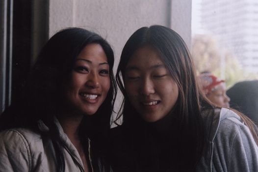
This is the first one. The original copy.

( Read more... )
This is the first one. The original copy.

( Read more... )
Comments 11
but, i think the words should be a little more visable because i didnt even notice them at first until i read what you wrote above it...
unless thats what you were going for
Reply
Reply
(The comment has been removed)
Reply
Reply
Reply
Other than that I like it (:
Reply
Leave a comment