Color theory- Part one
This is a series of tutorials which talks about the different tools and techniques for doing color corrections in Photoshop(or psp for that matter). Treat this more like a guide, well you can't treat it any other way.
So, you have an image which you want to icon. But it's horribly pink. I would just dump that image and take another one. BUT, if you're less lazy or you HAVE to icon that image, you get in a fix about what tool to use for the same. This guide, though in no way 'accurate' by the book, will tell you how color adjustments work and what tool should be used where.
We will be covering -
Basic Theory(this post)
Color Balance
Levels
Curves
Selective Coloring
Replace Color
Hue/Saturation
Manually changing the color(when you get REALLY desperate)
Color Theory
Ohkk then. I know the heading sounds boring. But a little knowledge never hurt anyone. Plus, I love the color theory so I want to talk about it stfu. :P
So what is this RGB and CMYK crap about anyways?
RGB - Red, Green, Blue. The three colors is what white light is composed of. As this is light, the RGB color scheme is obviously used by objects that project stuff, for eg. your monitor. When it wants to show red, it SUBTRACTS the blue and the green component from white light.
CMYK - Cyan, Magenta, Yellow, Black. This is how we make colors. For example, if I want to print a purple, the printer will mix Magenta and Cyan for me. So, in this theory, we ADD to make colors.
Obviously, any color will have it's respective RGB and CMYK values. The thing to remember is, RGB works on subtraction and CMYK works of addition.
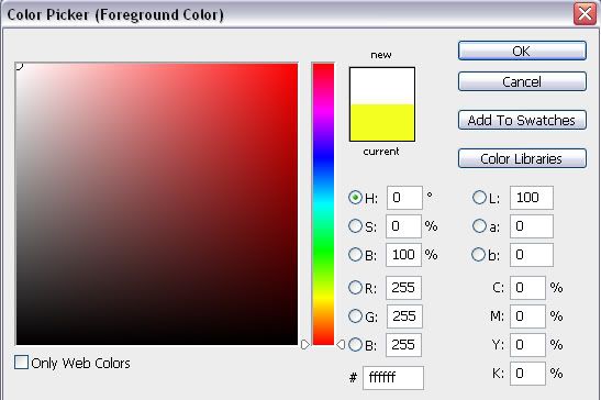
An example to illustrate this fact. Take your color palette thing. See this one for example -

White is the selected color, right? See the RGB values, they are maximum for all of them(255,255,255) while the CMYK values are minimum(0,0,0,0).
Interdependence of colors
All colors have their opposites. I am not talking about THE color wheel here. This is more about how YOU can manipulate colors using this knowledge.
Colors and their opposites-
Cyan - Red
Magenta - Green
Yellow - Blue
So, if an image is too pink(magenta), you just need to add a bit of green to it. For example (image clicked by natosh)-

to
Now, where exactly should one add this green considering the number of options available? Well, for that watch out for the next part of the series coming sooner than soon.
- Comment if this was helpful
- Friend us for more tuts
- Any question, ask.
So, you have an image which you want to icon. But it's horribly pink. I would just dump that image and take another one. BUT, if you're less lazy or you HAVE to icon that image, you get in a fix about what tool to use for the same. This guide, though in no way 'accurate' by the book, will tell you how color adjustments work and what tool should be used where.
We will be covering -
Basic Theory(this post)
Color Balance
Levels
Curves
Selective Coloring
Replace Color
Hue/Saturation
Manually changing the color(when you get REALLY desperate)
Color Theory
Ohkk then. I know the heading sounds boring. But a little knowledge never hurt anyone. Plus, I love the color theory so I want to talk about it stfu. :P
So what is this RGB and CMYK crap about anyways?
RGB - Red, Green, Blue. The three colors is what white light is composed of. As this is light, the RGB color scheme is obviously used by objects that project stuff, for eg. your monitor. When it wants to show red, it SUBTRACTS the blue and the green component from white light.
CMYK - Cyan, Magenta, Yellow, Black. This is how we make colors. For example, if I want to print a purple, the printer will mix Magenta and Cyan for me. So, in this theory, we ADD to make colors.
Obviously, any color will have it's respective RGB and CMYK values. The thing to remember is, RGB works on subtraction and CMYK works of addition.
An example to illustrate this fact. Take your color palette thing. See this one for example -
White is the selected color, right? See the RGB values, they are maximum for all of them(255,255,255) while the CMYK values are minimum(0,0,0,0).
Interdependence of colors
All colors have their opposites. I am not talking about THE color wheel here. This is more about how YOU can manipulate colors using this knowledge.
Colors and their opposites-
Cyan - Red
Magenta - Green
Yellow - Blue
So, if an image is too pink(magenta), you just need to add a bit of green to it. For example (image clicked by natosh)-
to
Now, where exactly should one add this green considering the number of options available? Well, for that watch out for the next part of the series coming sooner than soon.
- Comment if this was helpful
- Friend us for more tuts
- Any question, ask.