Tutorial 01 [Kamui]
This tut was requested by watermirror120... I personally don't think this icon is particularly exceptional, but... sure!
We're going to make this icon: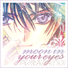
WARNING: Tutorial is overcomplicated and probably not worth following... Image heavy.
Ok, first we start off with [*gasp*] the base:
[Layer 1] The colors look fine already, but... I wanted them a bit more vibrant [or perhaps it is out of force of habit...], so I duplicated the layer and set it to Soft Light, 42%. This will, of course, vary depending on your base. You might not need any base prep at all or you may need much more. Just work on it until it looks nice to you. For this tutorial, since there are so many light textures, you'd probably want a very vibrant icon or one that has a lot of contrast so that it does not become comepletely overwhelmed by the shinies.
[Layer 2] Next, slap on this texture from bombayicons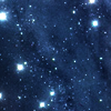
Screen 75%. As always, adjust opacity to your liking. Don't just replicate my every move. You might need to smudge out sparkles that cover important bits of your base with the smudge tool. The Blur tool can also be used.

[Layer 3] Another cosmic texture from bombayicons.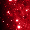
Screen 73%. Ditto my notes from Layer 2.

[Layer 4] One last shiny texture [I like shiny. *smile*].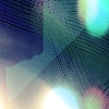
from perfetc__ Screen 76%

[Layer 5] The first brush,
from gender in #5f7484 set to Linear Burn 100% and then duplicated. It would probably work better with 1 layer in plain white set to normal in this case, but eh...
[Layer 6] Duplicate of previous layer. Optional depending on icon.

[Layer 7] Another brush,
also in #5f7484 and set to Linear Burn 100% from scarsonchest I think. If not, something similar would work just fine. I duplicated this as well, but, like I said before, a solid white would have worked well...
[Layer 8] Duplicate of previous layer.

[Layer 9] At this point, I added my text. I used skyskraper font for the main text and some random plain font for the tiny text. Both are set to Normal 100%.

I guess you could end here if you wanted to, but...I didn't quite like it yet and I tend to like to overcomplicate things. ^_^
[Layer 10] Next, another texture: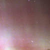
by bombayicons. Set to Screen 100%. It should be looking pretty light now. We can fix that later on though.

[Layer 11] Another texture that I can't remember where it was downloaded... [I'm so bad at this... T_T]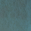
Set to Overlay 100%. This should help a little with the uber-brightness.

[Layer 12] Yet another texture [I don't remember where from, again]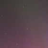
Set to Soft Light 100% Now it should look a bit more normal as far as brightness. However, my icon is looking a bit too reddish. That's where the next layer comes in.

[Layer 13] A gradient that I made...
set to Overlay 100%. This gives it a nice blue tone. Almost done!

Now all that's left to do is add a border [or not, if you don't want to]. I made a 4 pixel white border and then used a brush that I made
over it using a color that I eyedropped from my picture. Now we're done!
You should not follow this tutorial exactly but merely use it as a guideline. Believe me, if you just follow the steps like a robot, chances are, you'll make something scary. So remember that this will not look good on every base. Have fun iconing!

We're going to make this icon:

WARNING: Tutorial is overcomplicated and probably not worth following... Image heavy.
Ok, first we start off with [*gasp*] the base:

[Layer 1] The colors look fine already, but... I wanted them a bit more vibrant [or perhaps it is out of force of habit...], so I duplicated the layer and set it to Soft Light, 42%. This will, of course, vary depending on your base. You might not need any base prep at all or you may need much more. Just work on it until it looks nice to you. For this tutorial, since there are so many light textures, you'd probably want a very vibrant icon or one that has a lot of contrast so that it does not become comepletely overwhelmed by the shinies.
[Layer 2] Next, slap on this texture from bombayicons

Screen 75%. As always, adjust opacity to your liking. Don't just replicate my every move. You might need to smudge out sparkles that cover important bits of your base with the smudge tool. The Blur tool can also be used.

[Layer 3] Another cosmic texture from bombayicons.

Screen 73%. Ditto my notes from Layer 2.

[Layer 4] One last shiny texture [I like shiny. *smile*].

from perfetc__ Screen 76%

[Layer 5] The first brush,

from gender in #5f7484 set to Linear Burn 100% and then duplicated. It would probably work better with 1 layer in plain white set to normal in this case, but eh...
[Layer 6] Duplicate of previous layer. Optional depending on icon.

[Layer 7] Another brush,

also in #5f7484 and set to Linear Burn 100% from scarsonchest I think. If not, something similar would work just fine. I duplicated this as well, but, like I said before, a solid white would have worked well...
[Layer 8] Duplicate of previous layer.

[Layer 9] At this point, I added my text. I used skyskraper font for the main text and some random plain font for the tiny text. Both are set to Normal 100%.

I guess you could end here if you wanted to, but...I didn't quite like it yet and I tend to like to overcomplicate things. ^_^
[Layer 10] Next, another texture:

by bombayicons. Set to Screen 100%. It should be looking pretty light now. We can fix that later on though.

[Layer 11] Another texture that I can't remember where it was downloaded... [I'm so bad at this... T_T]

Set to Overlay 100%. This should help a little with the uber-brightness.

[Layer 12] Yet another texture [I don't remember where from, again]

Set to Soft Light 100% Now it should look a bit more normal as far as brightness. However, my icon is looking a bit too reddish. That's where the next layer comes in.

[Layer 13] A gradient that I made...

set to Overlay 100%. This gives it a nice blue tone. Almost done!

Now all that's left to do is add a border [or not, if you don't want to]. I made a 4 pixel white border and then used a brush that I made

over it using a color that I eyedropped from my picture. Now we're done!
You should not follow this tutorial exactly but merely use it as a guideline. Believe me, if you just follow the steps like a robot, chances are, you'll make something scary. So remember that this will not look good on every base. Have fun iconing!
