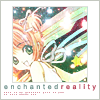
Tutorial 02 [Sakura]
This one was also requested by watermirror120, who is a far better iconer than I am.
We're going to go from this
to this
Do not copy this tut exactly, as there will always be variations for different bases... This works best on a picture with a relatively large amount of negative space and that is quite dark.
[Step 1] We start out with this image
, cropped from a picture from minitokyo.net. Set it on a 100x100 canvas. Position it however you choose. My image is 75x75.
[Step 2] Now select the base picture with the selection tool. Right click and select "Invert Selection" Then create a new layer above the picture and fill the selection with the color of your choice. I used #FFFFFF [white]
[Step 3] All textures used will go under the layer we created in the previous step and over the base image. First up is this texture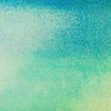
by gender set to Hard Light 84%. Because the white border covers the edges of the texture, you can move this texture and any subsequent ones around a bit to achieve the desired effect.
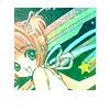
...Looks kind of icky, no? That'll be fixed later.
[Step 4] Now, another texture, this one from bombayicons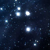
set to Screen 100%. You can remove some sparkles with the smudge tool if they are blocking an important part of your pic.
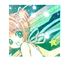
Still, icky, right? no problem!
[Step 5] Take this texture, also from bombayicons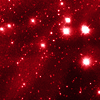
also set to Screen 100%. Same as before, remove sparkles if necessary.
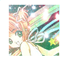
You see, the red kind of cancels out some of the blue so that it takes on a far more natural colour.
[Step 6] One last cosmic texture, again from bombayicons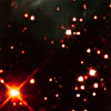
Once again, set to Screen 100% and once again, sparkles are removable.
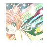
Looks kind of washed out, no? Next step.
[Step 7] Almost there! Now duplicate your base and drag on top of everything but the white border layer. Set to Soft Light. This will give your pic a bit more definition above the sparklies. The opacity depends on what you think looks good. Mine is at 54%.
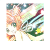
[Step 8] Now for text... Make sure you put this layer over the white border layer. Any text/font would probably work well. I used Arial 2.5 pt with kerning at 400 in 2 colours that I eyedropped from my picture. I also added some tinytext in a random plain font. You can use a brush for this if you'd like.
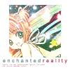
[Step 9] Finally, I added a light 1 px border around the icon on a new layer in a colour that I eyedropped from the icon set to Normal 100%. Then I added another 1 px border around the image in the same colour and set it to Normal 55% This step is not necessary if you do not like borders.
Flatten Image and you're done!

We're going to go from this

to this

Do not copy this tut exactly, as there will always be variations for different bases... This works best on a picture with a relatively large amount of negative space and that is quite dark.
[Step 1] We start out with this image

, cropped from a picture from minitokyo.net. Set it on a 100x100 canvas. Position it however you choose. My image is 75x75.
[Step 2] Now select the base picture with the selection tool. Right click and select "Invert Selection" Then create a new layer above the picture and fill the selection with the color of your choice. I used #FFFFFF [white]
[Step 3] All textures used will go under the layer we created in the previous step and over the base image. First up is this texture

by gender set to Hard Light 84%. Because the white border covers the edges of the texture, you can move this texture and any subsequent ones around a bit to achieve the desired effect.

...Looks kind of icky, no? That'll be fixed later.
[Step 4] Now, another texture, this one from bombayicons

set to Screen 100%. You can remove some sparkles with the smudge tool if they are blocking an important part of your pic.

Still, icky, right? no problem!
[Step 5] Take this texture, also from bombayicons

also set to Screen 100%. Same as before, remove sparkles if necessary.

You see, the red kind of cancels out some of the blue so that it takes on a far more natural colour.
[Step 6] One last cosmic texture, again from bombayicons

Once again, set to Screen 100% and once again, sparkles are removable.

Looks kind of washed out, no? Next step.
[Step 7] Almost there! Now duplicate your base and drag on top of everything but the white border layer. Set to Soft Light. This will give your pic a bit more definition above the sparklies. The opacity depends on what you think looks good. Mine is at 54%.

[Step 8] Now for text... Make sure you put this layer over the white border layer. Any text/font would probably work well. I used Arial 2.5 pt with kerning at 400 in 2 colours that I eyedropped from my picture. I also added some tinytext in a random plain font. You can use a brush for this if you'd like.

[Step 9] Finally, I added a light 1 px border around the icon on a new layer in a colour that I eyedropped from the icon set to Normal 100%. Then I added another 1 px border around the image in the same colour and set it to Normal 55% This step is not necessary if you do not like borders.
Flatten Image and you're done!
