Round Three - Challenge Eight - Results
Mm. I actually got a post on time. Aren't you just proud? XD Anyways, unfortunately, we've got to say goodbye to another maker this week. I hope that we'll see you next round?
Eliminated :
by diablo_dancer with -5
People's Choice:
by bubbly with +1
Mod's Choice:
by rubbrducky115
I adore the composition of this. The perspective is different, and beautiful and I love the use of the texture.
Voting Breakdown :
1.
- The icon lacks contrast.
+ The coloring is delicate and the texture works really well with the crop and cap.
2.
- It's a bit over-sharp and the orange coloring is too stong.
+ I love the coloring here, the layout and composition are also wonderful and very effective.
3.
- The crop makes the perspective really odd.
- The brush you used makes it look blotchy, and the tiny text is so miniscule it might as well not be there.
+ I love the shot you chose, very nicely cropped. The coloring is lovely.
+ wonderful cropping.
4.
- The icon is too dark and the stripes, shadows, text, and texture together make it too busy.
- The black at the bottom obscures the image of Rose and the Doctor too much.
- the faces are too obscured by the black, so the rest of the image just seems blotchy.
- The darkness at the bottom crops the picture awkwardly.
- The lighting draws attention away from the subjects.
5.
- coloring is a bit too yellow; a bit oversharp; the blend is choppy
- very bright. the yellow is quite overpowering. the texture(s) used on it make it seem oversharpened.
- The icon is too orange and a bit flat.
6.
- The coloring is rather bland and it looks as if Rose towers over the Doctor - by about a foot or two.
- too light. coloring seems very flat. I'm not sure if the text at the top of the tiny text is supposed to be legible or not (i can't make it out =\).
+ Nice composition
+ Brilliant blend and fantastic in its simplicity.
7.
+ Love the background and the layout.
The next challenge will be up soon.
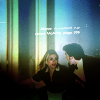
Eliminated :
by diablo_dancer with -5
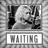
People's Choice:
by bubbly with +1
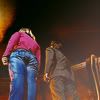
Mod's Choice:
by rubbrducky115
I adore the composition of this. The perspective is different, and beautiful and I love the use of the texture.
Voting Breakdown :
1.
- The icon lacks contrast.
+ The coloring is delicate and the texture works really well with the crop and cap.
2.
- It's a bit over-sharp and the orange coloring is too stong.
+ I love the coloring here, the layout and composition are also wonderful and very effective.
3.
- The crop makes the perspective really odd.
- The brush you used makes it look blotchy, and the tiny text is so miniscule it might as well not be there.
+ I love the shot you chose, very nicely cropped. The coloring is lovely.
+ wonderful cropping.
4.
- The icon is too dark and the stripes, shadows, text, and texture together make it too busy.
- The black at the bottom obscures the image of Rose and the Doctor too much.
- the faces are too obscured by the black, so the rest of the image just seems blotchy.
- The darkness at the bottom crops the picture awkwardly.
- The lighting draws attention away from the subjects.
5.
- coloring is a bit too yellow; a bit oversharp; the blend is choppy
- very bright. the yellow is quite overpowering. the texture(s) used on it make it seem oversharpened.
- The icon is too orange and a bit flat.
6.
- The coloring is rather bland and it looks as if Rose towers over the Doctor - by about a foot or two.
- too light. coloring seems very flat. I'm not sure if the text at the top of the tiny text is supposed to be legible or not (i can't make it out =\).
+ Nice composition
+ Brilliant blend and fantastic in its simplicity.
7.
+ Love the background and the layout.
The next challenge will be up soon.