Winners: Challenge 10
And with these we end Round 5. Congrats all, round winners will be posted soonish
First
(4 pts)
Second
(3 pts)
Third
(2 pts)



xeyra
w/ 32 votes
darlingbones
w/ 29 votes
magicallaw
w/ 12 votes
Best Cap Choice
(1 pt)
Mod's Choice
(1 pt)



lessrest
w/ 3 votes
xeyra
w/ 3 votes
immortalje
TALLIES:
votes / special category
♥ = # of special category votes
~ = concrit

+++ - gorgeous coloring and negative space use
++ - Love this, good use of colouring and negative space.
++ - great colouring and use of negative space
++ - I love the coloring and how the dark background really brings the focus to Ten.
+ - wonderful use of negative space and the background really makes Ten pop
+ - no comment
+ - no comment
♥♥
~ I think the coloring and background and crop are great, but the icon looks a bit too blurry, especially the Doctor's face.
magicallaw
12/02
+++ - Excellent crop and coloring, just all-around gorgeous.
+++ - Nice crop and composition with the fading white at the sides.
marcasite
06/00
+ - great crop
♥
~ I think the icon needs a bit more contrast, to add more color and make the shadows darker.
stillxmyxheart
01/01

+ - good use of text and b&w
+ - Nice b/w and a great text!
+ - Great use of grayscale and it's funny! That always wins in my book.
+ - no comment
+ - I love the funny text!
+ - because it's funny and has great contrast in the b&w
♥♥
thistwilight
06/02
NO VOTES
ivydoor
00/00

NO VOTES
♥
immortalje
00/01

+++ - no comment
+++ - gorgeous coloring
++ - nice colouring
♥♥♥
This one was my fourth favorite and I love the cap chosen because of its movement.
lessrest
08/03
++ - Nice use of two caps, nice coloring.
++ - Lovely combination of both caps.
++ - I like the colouring and composition
++ - no comment
+ - awww, nice cap choices and colouring
♥
blue_emotion
09/01
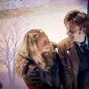
NO VOTES
~ The texture/background use doesn't really work, the tree looks very random and only distracts from the Doctor and Rose.
mattyroh07
00/00

+ - creative use of multiple frames
+ - no comment
♥
~ and 4th place to this icon :)
enviebeau
02/01
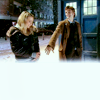
++ - no comment
+ - good crop and colour
♥
~ #11 would be perfect if there was maybe some text in the white part
ccxvii
03/01
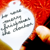
+ - Very creative and an unusual cap choice, nice!
jelly_head91
01/00

+++ - Gorgeous coloring and use of negative space.
+++ - no comment
+++ - Love the colouring and use of negative space
+++ - excellent use of space, and the coloring is beautiful, very bright
+++ - very bright, good cap and good textures and coloring
+++ - Lovely coloring and use of negative space!
++ - The negative space is great here.
++ - nice crop & texture with the negative space
++ - no comment
++ - beautiful negative space and colouring
+ - Nice use of negative space, and gorgeous coloring.
+ - Nice use of negative space.
+ - great use of texture
♥♥
darlingbones
29/02
++ - no comment
+ - Great cropping
~ Really nice coloring and crop, this was my fourth favorite
restlessme
03/00

+++ - The coloring and framing on this is fantastic.
+++ - I liked this a lot.
+++ - gorgeous concept, crop, colour - everything. great work!
+++ - no comment
+++ - beautiful coloring & cropping
+++ - excellent composition and colouring
+++ - no comment
+++ - can't really pinpoint one thing - its just a fabulous icon!
++ - the caps used are great, you definitely get the sense of the big sword fight, and the coloring is beautiful
++ - no comment
++ - Great composition and coloring. The color at the very top and bottom contrasts nicely with the white border
++ - nice coloring, good composition
♥♥♥
xeyra
32/03
♥
~ #16 could be b&w, with maybe a wider crop, so that rose was smaller.
star_girl42
00/01

++ - very bold icon, full of color
dashafeather
02/00
Congratulations!
You can view the tally board here. Feel free to check it whenever you see fit.
First
(4 pts)
Second
(3 pts)
Third
(2 pts)

xeyra
w/ 32 votes
darlingbones
w/ 29 votes
magicallaw
w/ 12 votes
Best Cap Choice
(1 pt)
Mod's Choice
(1 pt)
lessrest
w/ 3 votes
xeyra
w/ 3 votes
immortalje
TALLIES:
votes / special category
♥ = # of special category votes
~ = concrit
+++ - gorgeous coloring and negative space use
++ - Love this, good use of colouring and negative space.
++ - great colouring and use of negative space
++ - I love the coloring and how the dark background really brings the focus to Ten.
+ - wonderful use of negative space and the background really makes Ten pop
+ - no comment
+ - no comment
♥♥
~ I think the coloring and background and crop are great, but the icon looks a bit too blurry, especially the Doctor's face.
magicallaw
12/02
+++ - Excellent crop and coloring, just all-around gorgeous.
+++ - Nice crop and composition with the fading white at the sides.
marcasite
06/00
+ - great crop
♥
~ I think the icon needs a bit more contrast, to add more color and make the shadows darker.
stillxmyxheart
01/01
+ - good use of text and b&w
+ - Nice b/w and a great text!
+ - Great use of grayscale and it's funny! That always wins in my book.
+ - no comment
+ - I love the funny text!
+ - because it's funny and has great contrast in the b&w
♥♥
thistwilight
06/02
NO VOTES
ivydoor
00/00
NO VOTES
♥
immortalje
00/01
+++ - no comment
+++ - gorgeous coloring
++ - nice colouring
♥♥♥
This one was my fourth favorite and I love the cap chosen because of its movement.
lessrest
08/03
++ - Nice use of two caps, nice coloring.
++ - Lovely combination of both caps.
++ - I like the colouring and composition
++ - no comment
+ - awww, nice cap choices and colouring
♥
blue_emotion
09/01
NO VOTES
~ The texture/background use doesn't really work, the tree looks very random and only distracts from the Doctor and Rose.
mattyroh07
00/00
+ - creative use of multiple frames
+ - no comment
♥
~ and 4th place to this icon :)
enviebeau
02/01
++ - no comment
+ - good crop and colour
♥
~ #11 would be perfect if there was maybe some text in the white part
ccxvii
03/01
+ - Very creative and an unusual cap choice, nice!
jelly_head91
01/00

+++ - Gorgeous coloring and use of negative space.
+++ - no comment
+++ - Love the colouring and use of negative space
+++ - excellent use of space, and the coloring is beautiful, very bright
+++ - very bright, good cap and good textures and coloring
+++ - Lovely coloring and use of negative space!
++ - The negative space is great here.
++ - nice crop & texture with the negative space
++ - no comment
++ - beautiful negative space and colouring
+ - Nice use of negative space, and gorgeous coloring.
+ - Nice use of negative space.
+ - great use of texture
♥♥
darlingbones
29/02
++ - no comment
+ - Great cropping
~ Really nice coloring and crop, this was my fourth favorite
restlessme
03/00
+++ - The coloring and framing on this is fantastic.
+++ - I liked this a lot.
+++ - gorgeous concept, crop, colour - everything. great work!
+++ - no comment
+++ - beautiful coloring & cropping
+++ - excellent composition and colouring
+++ - no comment
+++ - can't really pinpoint one thing - its just a fabulous icon!
++ - the caps used are great, you definitely get the sense of the big sword fight, and the coloring is beautiful
++ - no comment
++ - Great composition and coloring. The color at the very top and bottom contrasts nicely with the white border
++ - nice coloring, good composition
♥♥♥
xeyra
32/03
♥
~ #16 could be b&w, with maybe a wider crop, so that rose was smaller.
star_girl42
00/01
++ - very bold icon, full of color
dashafeather
02/00
Congratulations!
You can view the tally board here. Feel free to check it whenever you see fit.