Icon Tutorials 1 & 2
gooziewoozie requested tutorials on two icons I've made. These are for Paint Shop Pro 7, but are pretty easily translated.
Learn how to take this: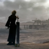
to this: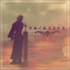
Step 1: I started out by cropping this image to this:

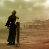
Step 2: I added a gradient by subvintage, and set it to Soft Light at 76% opacity.

>>
Step 3: I then added a texture by colorfilter, and set it to Lighten at 15% opacity.

>>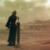
(Not a huge difference, but I liked it.)
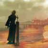
Step 4: I added a light texture by awmp at Overlay, with a 69% opacity.

>>
Step 5: Then I added a 4 pixel border around the icon, in a light tan-gray color - #EBE5E7. I set it to Normal, with a 23% opacity.

>>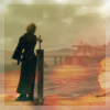
(The center of the border image is white, because it's too hard to see if it's transparent.)
Step 6: Then, around the outside edge of the icon, I added a 1 pixel border in #7E615F, over the border I put there in the last step. Then, I went in four pixels, to where I could see that the first border had ended, and made a 1 pixel border. I left the border at Normal, with a 21% opacity.

>>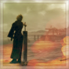
(And as for the first border, I have the picture of it with a white background, so you can see it better.)
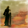
Step 7: Next, I filled a new layer with #D8C5A5, a tan color, and set it to Burn at 27% opacity.

>>
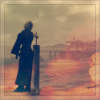
Step 8: I filled a new layer with #02317E, a dark blue color, and set it to Exclusion at 60% opacity.

>>
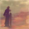
Step 9: I added another gradient by subvintage at Lighten, with 54% opacity.

>>
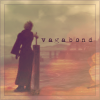
Step 10: I selected a dark purple color from the icon, #553343, and added text - 'vagabond' in the font 1942 report (which you can get at dafont.com), size 6, with a kerning of 214. Now, it's been a while since I made this icon, so I think I duplicated this layer and lowered the opacity of the copy, just to get the font a little darker and visible.

>>
Step 11: Finally, I added a brush by elyciel (from the set called 'Floral Decorations') in the same dark purple color as my text.

>>
And viola, you're done!
Learn how to take this: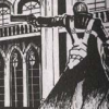
to this: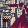
Step 1: I took this image and cropped it down to make a base:

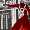
Step 2: I selected a dark red color, #7C0000, and on a new layer set to Lighten at 100%, I colored over Dante's coat. After I was done coloring it, I duplicated the layer, set it to Dodge at 11% opacity, duplicated it again and set it at Overlay 100% opacity, duplicated again and set it to Burn at 47% opacity.
So here's what the four red layers should be:

(I forgot to rename the Layer 2 copies to make it more organized. But it's not too hard to understand.)

>>
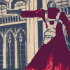
Step 3: I filled a new layer with #02317E and set it to Exclusion at 49% opacity.

>>
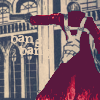
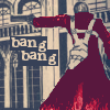
Step 4: I selected a tan color from my icon, #E8D0B4, and typed in 'bang bang' in the font Problem Secretary (available at dafont.com), size 9, bold, with a kerning of 15.

>>
Step 5: Underneath the text layer, I made a new layer. Then I selected a dark blue-gray from the icon, #374157, and used my selection tool to make a rectangle under the first 'bang'. I filled that selection with the dark blue. I repeated this step and did the same for the second 'bang'.

>>
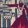
Step 6: I added a brush by random_alley in the same tan color as my text. I did the same as in Step 5 to get a blue rectangle beneath the XXXX's, so that I could see them.

>>
Step 6: Lastly, I added a splatter brush by afallenstar (At least I think so - I don't have the image pack, so it's hard to tell.) in the same dark red color as I used to color Dante's jacket. I pulled this layer underneath my text and XXXX brush layer, but above the layers with the blue rectangles.

>>
And you're done!
I hope these were helpful!
Feel free to ask my any questions. And if there's another icon I've made, and you'd like to see it as a tutorial, let me know, and I'll write one up as soon as I can. :)
Learn how to take this:

to this:
Step 1: I started out by cropping this image to this:

Step 2: I added a gradient by subvintage, and set it to Soft Light at 76% opacity.

>>

Step 3: I then added a texture by colorfilter, and set it to Lighten at 15% opacity.

>>

(Not a huge difference, but I liked it.)
Step 4: I added a light texture by awmp at Overlay, with a 69% opacity.

>>

Step 5: Then I added a 4 pixel border around the icon, in a light tan-gray color - #EBE5E7. I set it to Normal, with a 23% opacity.

>>

(The center of the border image is white, because it's too hard to see if it's transparent.)
Step 6: Then, around the outside edge of the icon, I added a 1 pixel border in #7E615F, over the border I put there in the last step. Then, I went in four pixels, to where I could see that the first border had ended, and made a 1 pixel border. I left the border at Normal, with a 21% opacity.

>>

(And as for the first border, I have the picture of it with a white background, so you can see it better.)
Step 7: Next, I filled a new layer with #D8C5A5, a tan color, and set it to Burn at 27% opacity.

>>

Step 8: I filled a new layer with #02317E, a dark blue color, and set it to Exclusion at 60% opacity.

>>

Step 9: I added another gradient by subvintage at Lighten, with 54% opacity.

>>

Step 10: I selected a dark purple color from the icon, #553343, and added text - 'vagabond' in the font 1942 report (which you can get at dafont.com), size 6, with a kerning of 214. Now, it's been a while since I made this icon, so I think I duplicated this layer and lowered the opacity of the copy, just to get the font a little darker and visible.

>>

Step 11: Finally, I added a brush by elyciel (from the set called 'Floral Decorations') in the same dark purple color as my text.

>>
And viola, you're done!
Learn how to take this:

to this:
Step 1: I took this image and cropped it down to make a base:

Step 2: I selected a dark red color, #7C0000, and on a new layer set to Lighten at 100%, I colored over Dante's coat. After I was done coloring it, I duplicated the layer, set it to Dodge at 11% opacity, duplicated it again and set it at Overlay 100% opacity, duplicated again and set it to Burn at 47% opacity.
So here's what the four red layers should be:

(I forgot to rename the Layer 2 copies to make it more organized. But it's not too hard to understand.)

>>

Step 3: I filled a new layer with #02317E and set it to Exclusion at 49% opacity.

>>

Step 4: I selected a tan color from my icon, #E8D0B4, and typed in 'bang bang' in the font Problem Secretary (available at dafont.com), size 9, bold, with a kerning of 15.

>>

Step 5: Underneath the text layer, I made a new layer. Then I selected a dark blue-gray from the icon, #374157, and used my selection tool to make a rectangle under the first 'bang'. I filled that selection with the dark blue. I repeated this step and did the same for the second 'bang'.

>>

Step 6: I added a brush by random_alley in the same tan color as my text. I did the same as in Step 5 to get a blue rectangle beneath the XXXX's, so that I could see them.

>>

Step 6: Lastly, I added a splatter brush by afallenstar (At least I think so - I don't have the image pack, so it's hard to tell.) in the same dark red color as I used to color Dante's jacket. I pulled this layer underneath my text and XXXX brush layer, but above the layers with the blue rectangles.

>>
And you're done!
I hope these were helpful!
Feel free to ask my any questions. And if there's another icon I've made, and you'd like to see it as a tutorial, let me know, and I'll write one up as soon as I can. :)