Week 26 results & LIMS2 week 3 results
Hi! Time for double results! Theme's for the next LIMS and normal week will be up shortly after, don't forget them! ^_^
first place;
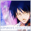
spottedtail
second place;
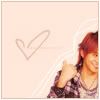
flyawayxx
third place;
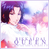
spottedtail
Congradulations!
And... LIMS2 WEEK 3 results!
Leaving us: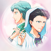
mah_tennyo
Best of show:
iceduelist
Participants for week 4;
kaneha
iceduelist
spottedtail
I must say, it was hard competition, all the icons were really great! I can't wait to see the icons for next week. :)
icon 1; (-4)
- I love seeing this pairing around, even if I don't support it too much, but I don't like the border, and the images aren't the best quality.
-- The text down the middle really makes the icon feel broken up; especially considering the theme, I think a different layout would've worked much more effectively
- The colours look strange to me. It seems too dark around Oshitari's face.
icon 2; (-2)
-- Actually, it was a hard pick. The background just didn't match, and more could have been done to the text.
+ The colours in this icon match well and I like cropping.
- I actually really like this! Regretfully, the competition is really tough. I had to look at all the icons for a while to figure out my choice. However, the thing that I figured was...what happened to Sakuno's arm on the right?
icon 3; (+3)
+ the textures match, and the text fits in.
+ I like the colour and the bold text
+ Amazing! I love the brightness of the icon~ Well done! :D
icon 4; (-5)
- I'm not really sure what to say here except that it feels like it's been done before; the selective colouring, radial blur border; I'd like to see something a little more interesting. Also, the selective colouring is a little extreme; Ootori's hair is teal in the icon, rather than it's normal colour. Perhaps adjusting the adjustment layers to fit the picture better?
-- I know I'm biased, but I've seen this style wayyy too many times (one tutorial too many, no?). Also, ootori's blue hair is kinda weird. But that's not EXTREMELY terrible; I'm just being nitpicky, because it's an otherwise beautiful icon. :)
-- It looks too blurry and I don't like colouring. The icon maker should add some more colours or improve image quality more.
And the origional voting post is here~
Also, I'd like to get the banner problem fixxed, so I'm also going to make a post just for asking all you great iconists which banners you want. :)
first place;
spottedtail
second place;

flyawayxx
third place;
spottedtail
Congradulations!
And... LIMS2 WEEK 3 results!
Leaving us:

mah_tennyo
Best of show:

iceduelist
Participants for week 4;
kaneha
iceduelist
spottedtail
I must say, it was hard competition, all the icons were really great! I can't wait to see the icons for next week. :)
icon 1; (-4)
- I love seeing this pairing around, even if I don't support it too much, but I don't like the border, and the images aren't the best quality.
-- The text down the middle really makes the icon feel broken up; especially considering the theme, I think a different layout would've worked much more effectively
- The colours look strange to me. It seems too dark around Oshitari's face.
icon 2; (-2)
-- Actually, it was a hard pick. The background just didn't match, and more could have been done to the text.
+ The colours in this icon match well and I like cropping.
- I actually really like this! Regretfully, the competition is really tough. I had to look at all the icons for a while to figure out my choice. However, the thing that I figured was...what happened to Sakuno's arm on the right?
icon 3; (+3)
+ the textures match, and the text fits in.
+ I like the colour and the bold text
+ Amazing! I love the brightness of the icon~ Well done! :D
icon 4; (-5)
- I'm not really sure what to say here except that it feels like it's been done before; the selective colouring, radial blur border; I'd like to see something a little more interesting. Also, the selective colouring is a little extreme; Ootori's hair is teal in the icon, rather than it's normal colour. Perhaps adjusting the adjustment layers to fit the picture better?
-- I know I'm biased, but I've seen this style wayyy too many times (one tutorial too many, no?). Also, ootori's blue hair is kinda weird. But that's not EXTREMELY terrible; I'm just being nitpicky, because it's an otherwise beautiful icon. :)
-- It looks too blurry and I don't like colouring. The icon maker should add some more colours or improve image quality more.
And the origional voting post is here~
Also, I'd like to get the banner problem fixxed, so I'm also going to make a post just for asking all you great iconists which banners you want. :)