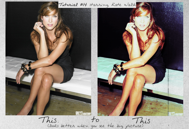
Tutorial #14
Finally antoher tutorial!
This tut only uses big pictures but I have used it on icons too.

Sorry for the massive intro pic!
Step 1. Select you’re picture. This tutorial works best with pictures that have dull colours like these (1,2). I’ll be using this one of Kate Walsh.
Step 2. Duplicate your base image and set it to Soft Light 100%.
RESULT
Step 3. Next create a Selective Color adjustment layer with these settings:
R: -100, +91, +100, 0
Y: -59, +5, +100, 0
G: 0, -100, +100, +100
C: +100, 0, -100, +100
B: +100, 0, -100, +100
W: +100, -71, -60, 0
N: 0, -24, -19, -5
RESULT
Step 4. Create a Curves adjustment layer with the settings below. If you have any trouble with this step please feel free to ask or just download the PSD and drag the curves layer from there =).
RGB:
Point 1 - Input: 61 Output: 77
Point 2 - Input: 97 Output: 134
Point 3 - Input: 186 Output: 199
Red:
Point 1 - Input: 92 Output: 99
Point 2 - Input: 126 Output: 122
Point 3 - Input: 181 Output: 181
Green:
Point 1 - Input: 84 Output: 79
Point 2 - Input: 121 Output: 143
Blue:
Point 1 - Input: 122 Output: 134
Point 2 - Input: 81 Output: 96
RESULT
Step 5. Finally, add a texture. I used a dirty grey texture on Darken 44%.
FINAL RESULT (Click to view)

Download PSD here.
Other Examples (Click to View):


This tut only uses big pictures but I have used it on icons too.
Sorry for the massive intro pic!
Step 1. Select you’re picture. This tutorial works best with pictures that have dull colours like these (1,2). I’ll be using this one of Kate Walsh.
Step 2. Duplicate your base image and set it to Soft Light 100%.
RESULT
Step 3. Next create a Selective Color adjustment layer with these settings:
R: -100, +91, +100, 0
Y: -59, +5, +100, 0
G: 0, -100, +100, +100
C: +100, 0, -100, +100
B: +100, 0, -100, +100
W: +100, -71, -60, 0
N: 0, -24, -19, -5
RESULT
Step 4. Create a Curves adjustment layer with the settings below. If you have any trouble with this step please feel free to ask or just download the PSD and drag the curves layer from there =).
RGB:
Point 1 - Input: 61 Output: 77
Point 2 - Input: 97 Output: 134
Point 3 - Input: 186 Output: 199
Red:
Point 1 - Input: 92 Output: 99
Point 2 - Input: 126 Output: 122
Point 3 - Input: 181 Output: 181
Green:
Point 1 - Input: 84 Output: 79
Point 2 - Input: 121 Output: 143
Blue:
Point 1 - Input: 122 Output: 134
Point 2 - Input: 81 Output: 96
RESULT
Step 5. Finally, add a texture. I used a dirty grey texture on Darken 44%.
FINAL RESULT (Click to view)
Download PSD here.
Other Examples (Click to View):