image map tutorial
Whew, time for another giant-sized tutorial. Today, I'll show you how to make an image map for your journal. Made in Photoshop 6, but should translate relatively well.
Techniques covered in this tutorial:
*making larger sized graphics
*coloring line art
*textures as backgrounds
*brushes on different blend modes
*making your own brushes
*various fonts in one image
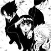
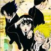
-->
WARNING: This tutorial contains 30+ images at a relatively large size. Dial-up users, be ware.
The image for this tutorial comes from Chapter 85 of the manga Naruto by Kishimoto Masashi. The full image can be found here. Here is the chunk of it that I'm working with. I do the typical steps for coloring line art. Make sure the line art layer is set on Multiply 100%, and that it has a blank, white, background underneath it.
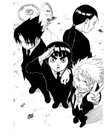
I already had a pretty good idea in my head of what I wanted the image map to look like, so I increase the canvas size. To do this, go to Image -> Canvas Size. My canvas is 404px by 527px. I want the image of the boys to look like it's in a box with rounded corners.
I begin by making a brush. Create a new layer on top of the line art. Set the layer's opacity to about 50% or so. Using the Rounded Rectangle Tool, and the color black (#000000), draw a box over the image.
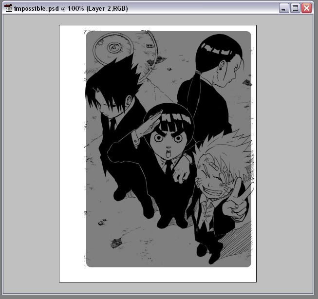
Turn the opacity back up to 100%, and turn the line art layer off. Go to Edit --> Define Brush and click ok. You've now created a box brush. Go ahead and delete the layer you made the box on. You won't need it any more.
Create a new layer on top of the line art, and flood fill it with your color of choice, in my case #B29E6E. Drop the opacity to 50%-ish so you can see the line art. Now, using the eraser and your new brush, erase out of this layer. Turn the opacity back up and you've got your border.
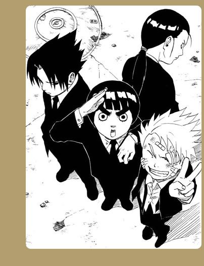
Now we're going to start the textures. All the textures will go under the line art layer.
First Texture. Created by inxsomniax. The full texture is here. It's set on Normal 100%.
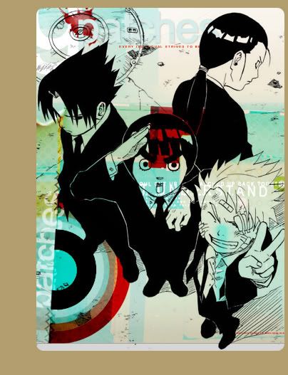
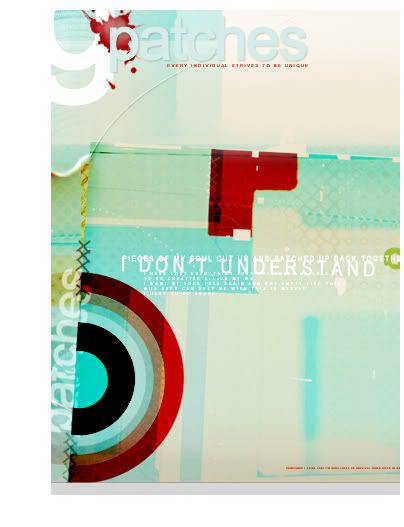
Second Texture. Created by inxsomniax. The full texture is here. It's set on Color Burn 100%.
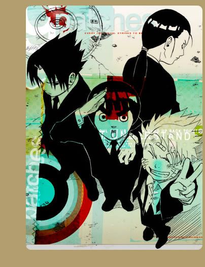
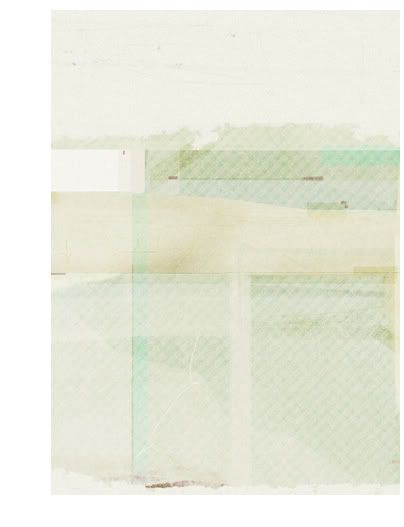
Third Texture. Created by propaganda_live. The full texture is here. It's set on Overlay 100%.
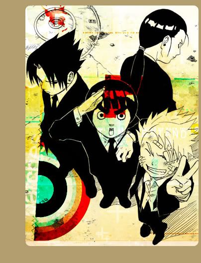
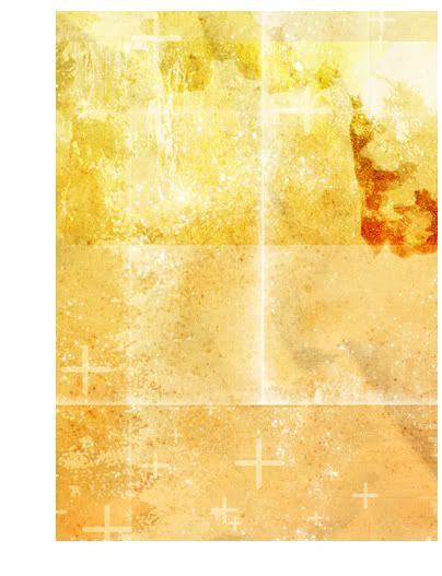
Fourth and final Texture. Created by inxsomniax. The full texture is here. It's set on Screen 100%.
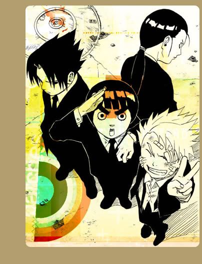
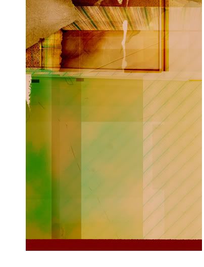
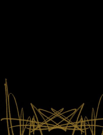
I created another new layer and filled it with this pattern from squidfingers. Then, using this brush (the bottom one) by inxsomniax, I erased most of it. The second image has a black background so it will show up better in this tutorial. Normal, 100%.
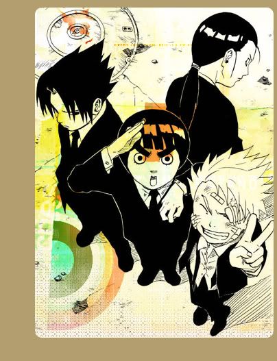
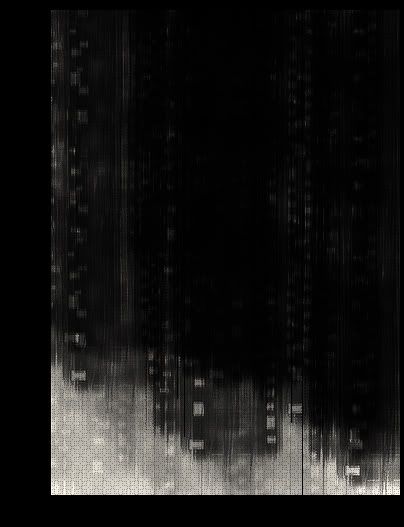
New layer. Using a soft brush on a low flow, I just did a little detail in white. Normal, 100%.
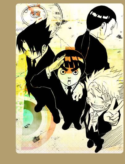
New layer. Another brush by inxsomniax, full size here. The color was either white, or a light tan, I can't remember which. Normal 100%.
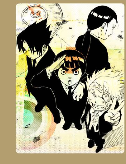
New layer, and think back to your days in kindergarten. Color to your heart's content. For a more detailed tutorial on coloring, check out this tutorial. Flatten all your coloring layers if you haven't already. Normal 100%.

Duplicate the coloring layer and desaturate it (Ctrl-Shift-U). Set it to Color Burn 100%. This deepens the colors.
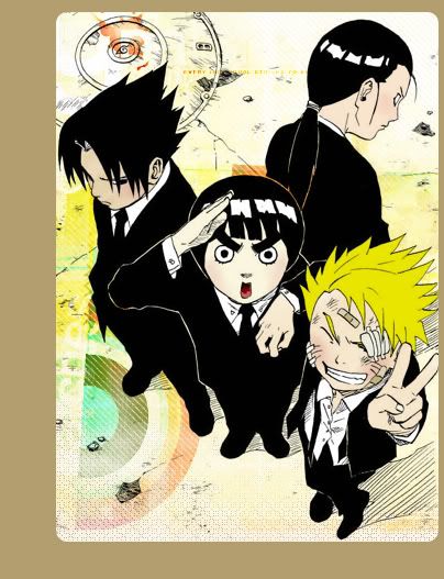
New layer for coloring the man hole cover so it would stand out more. It's set to Normal 33%.
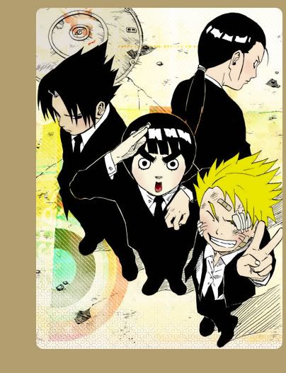
New layer and this (top one) brush by inxsomniax. The color I used was #A38742 and the layer's set to Overlay 100%.

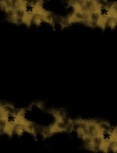
For the next layer, I created another brush by combining this brush and this brush by teh_indy. By fliping them horizontally, I created a brush that looks like this. The color used was #A88D4B and the layer was set on Color Burn 100%.

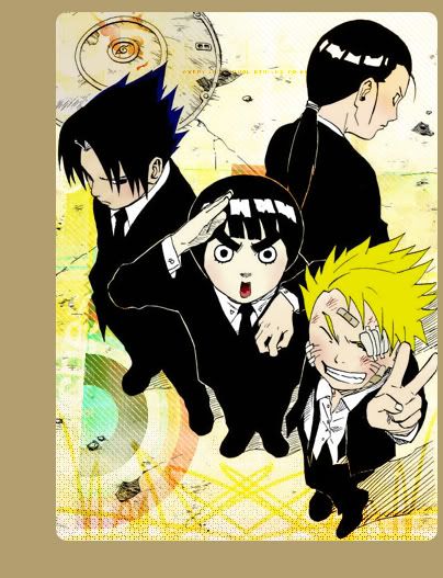
I wanted to make the scratches on Naruto(the blond kid)'s face look red, and I wanted to add a blue tinge to the end of Sauske(the one pouting on the left)'s hair. Create a new layer on top of the line art layer. Set it to Screen 100% and color over the black lines.
I wanted to add some text in the top right corner. It reads NARUTO, and the color is #B0A38B. It's set to Color Burn 100%, and then I duplicated it. The font that I used was Impact at 77px.
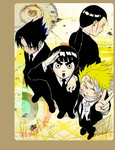
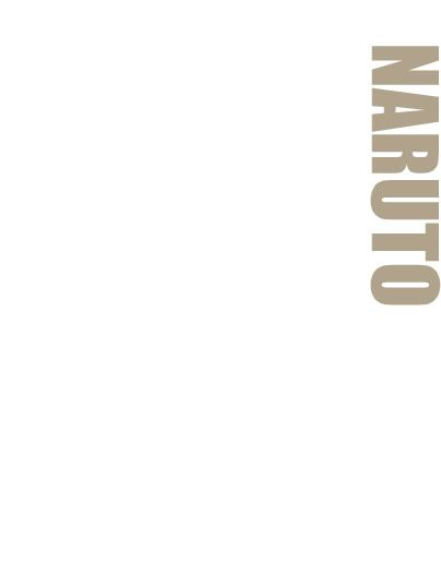
Since I've used just about every technique before, why not a navy exclusion layer? It's a really subtle difference. The color in question is #000809 (gives a pinkish tone) and is quite obviously set on Exclusion 100%.
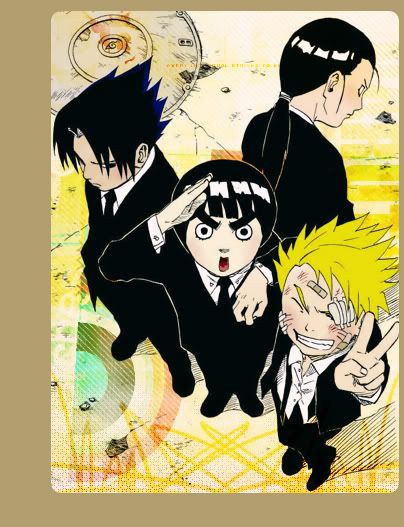
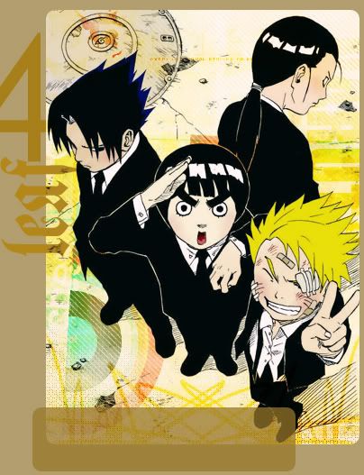
Text time. First, I begin with a large number 4. The font is Century Gothic and the size is 193px. The color is #6E571E and it's set to Overlay 100%.

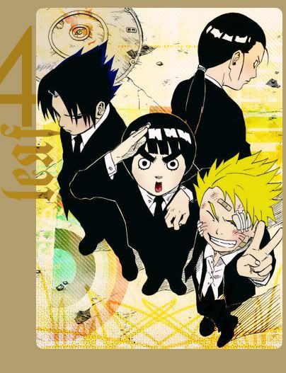
Next text. It reads leaf and the font is MuenchnerFraktur at 93px. The color is #B38719 and the layer's set to Normal 100%. There is a special technique here. I wanted the line art to be on top of this text, but since the line art is under the brown border, that means I have to duplicate the text, put one under the line art, and one on top of the border. In order to erase the part of the text that's covering the line art, you need to right click on the text layer, and click on the Rasterize Layer option. Now you can erase.
A simple box using the Rounded Rectangle Tool and the color #977729. Set the layer to Normal, 73%.
Final text for the page links. The font is Brooklyn Kid at 23px using #FFF1C0. If you are wondering where to get some of these fonts, check out dafont.
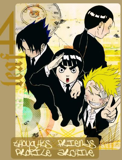
And that's it. With this many layers, things can get a bit confusing, so here's my layer pallet.

For more information on how to use image maps in your layout, check the memories over at everything_lj.
If you have any questions, ask away! I'll do my best to answer them ^_^
Techniques covered in this tutorial:
*making larger sized graphics
*coloring line art
*textures as backgrounds
*brushes on different blend modes
*making your own brushes
*various fonts in one image

-->

WARNING: This tutorial contains 30+ images at a relatively large size. Dial-up users, be ware.
The image for this tutorial comes from Chapter 85 of the manga Naruto by Kishimoto Masashi. The full image can be found here. Here is the chunk of it that I'm working with. I do the typical steps for coloring line art. Make sure the line art layer is set on Multiply 100%, and that it has a blank, white, background underneath it.

I already had a pretty good idea in my head of what I wanted the image map to look like, so I increase the canvas size. To do this, go to Image -> Canvas Size. My canvas is 404px by 527px. I want the image of the boys to look like it's in a box with rounded corners.
I begin by making a brush. Create a new layer on top of the line art. Set the layer's opacity to about 50% or so. Using the Rounded Rectangle Tool, and the color black (#000000), draw a box over the image.

Turn the opacity back up to 100%, and turn the line art layer off. Go to Edit --> Define Brush and click ok. You've now created a box brush. Go ahead and delete the layer you made the box on. You won't need it any more.
Create a new layer on top of the line art, and flood fill it with your color of choice, in my case #B29E6E. Drop the opacity to 50%-ish so you can see the line art. Now, using the eraser and your new brush, erase out of this layer. Turn the opacity back up and you've got your border.

Now we're going to start the textures. All the textures will go under the line art layer.
First Texture. Created by inxsomniax. The full texture is here. It's set on Normal 100%.


Second Texture. Created by inxsomniax. The full texture is here. It's set on Color Burn 100%.


Third Texture. Created by propaganda_live. The full texture is here. It's set on Overlay 100%.


Fourth and final Texture. Created by inxsomniax. The full texture is here. It's set on Screen 100%.


I created another new layer and filled it with this pattern from squidfingers. Then, using this brush (the bottom one) by inxsomniax, I erased most of it. The second image has a black background so it will show up better in this tutorial. Normal, 100%.


New layer. Using a soft brush on a low flow, I just did a little detail in white. Normal, 100%.


New layer. Another brush by inxsomniax, full size here. The color was either white, or a light tan, I can't remember which. Normal 100%.


New layer, and think back to your days in kindergarten. Color to your heart's content. For a more detailed tutorial on coloring, check out this tutorial. Flatten all your coloring layers if you haven't already. Normal 100%.

Duplicate the coloring layer and desaturate it (Ctrl-Shift-U). Set it to Color Burn 100%. This deepens the colors.

New layer for coloring the man hole cover so it would stand out more. It's set to Normal 33%.

New layer and this (top one) brush by inxsomniax. The color I used was #A38742 and the layer's set to Overlay 100%.


For the next layer, I created another brush by combining this brush and this brush by teh_indy. By fliping them horizontally, I created a brush that looks like this. The color used was #A88D4B and the layer was set on Color Burn 100%.


I wanted to make the scratches on Naruto(the blond kid)'s face look red, and I wanted to add a blue tinge to the end of Sauske(the one pouting on the left)'s hair. Create a new layer on top of the line art layer. Set it to Screen 100% and color over the black lines.

I wanted to add some text in the top right corner. It reads NARUTO, and the color is #B0A38B. It's set to Color Burn 100%, and then I duplicated it. The font that I used was Impact at 77px.


Since I've used just about every technique before, why not a navy exclusion layer? It's a really subtle difference. The color in question is #000809 (gives a pinkish tone) and is quite obviously set on Exclusion 100%.

Text time. First, I begin with a large number 4. The font is Century Gothic and the size is 193px. The color is #6E571E and it's set to Overlay 100%.

Next text. It reads leaf and the font is MuenchnerFraktur at 93px. The color is #B38719 and the layer's set to Normal 100%. There is a special technique here. I wanted the line art to be on top of this text, but since the line art is under the brown border, that means I have to duplicate the text, put one under the line art, and one on top of the border. In order to erase the part of the text that's covering the line art, you need to right click on the text layer, and click on the Rasterize Layer option. Now you can erase.

A simple box using the Rounded Rectangle Tool and the color #977729. Set the layer to Normal, 73%.

Final text for the page links. The font is Brooklyn Kid at 23px using #FFF1C0. If you are wondering where to get some of these fonts, check out dafont.

And that's it. With this many layers, things can get a bit confusing, so here's my layer pallet.

For more information on how to use image maps in your layout, check the memories over at everything_lj.
If you have any questions, ask away! I'll do my best to answer them ^_^