Tutorial: Morgana from Merlin
We're going from this: 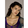
to this: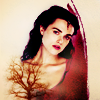
Asked by mixy101 @ Ask the Maker Meme (hosted @icon-talk)
I'm not sharing the psd for this one, because psds are not allowed in this meme. :)
However, feel free to ask if you get stuck! I'll do my best to reply as clearly as possible.
STEP ONE

>
>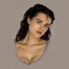
I picked a color from the background of my image with the Eyedropper tool and I created a new Fill layer under my base (#9a9087). I added a Layer Mask and covered those parts of the picture I didn't want to be visible. I wasn't much accurate, because the background of my picture was pretty even and it blended quite neatly with the grey Fill layer below.
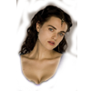
(it looks like this on a white background)
STEP TWO

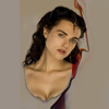
>
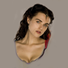
>
I wanted to refine the borders of her breast, so I picked this texture by nivani:
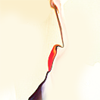
I set it to Multiply (100% opacity) and I shifted it a little to the right, so that the shape matched the right border of Morgana. Then I masked it so that only a little bit of it was showing:

(it looks like this on a white background)
STEP THREE

>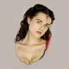
It was a tad too dark, so I added a Curves layer with these settings:
RGB - point one: O 86 I 46; point two: O 128 I 76
I lowered the opacity of this layer to 71%, because it brightened the picture a little to much.
STEP FOUR

>
>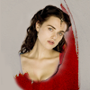
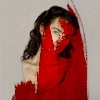
I added this texture by emonet25:
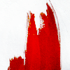
I set it to Multiply (100% opacity) and then I masked it like this:
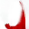
This texture helped me to frame Morgana's figure, and it added a bright red spot to juice up the quite dull and bland colors of my base.
STEP FIVE

>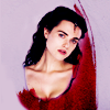
At this point, I had to fix the contrast (the icon was way too bright and washed out) and the colors (her skin was yellow and the background was plain grey).
So I created a Color Balance layer with these settings:
Midtones: 100 22 100
Shadows: -38 7 52
I added red and blue to Midtones and cyan and blue to shadows, mostly. I set this layer to Overlay, 100% opacity, to enhance its effects and add some contrast.
STEP SIX

>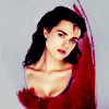
The purple hue was quite overwhelming at this point, so I created a Selective Color layer:
Whites: 100 -28 60 0
Neutrals: 0 15 16 0
I worked with Whites, basically, to change the hue of the background and the tones of the highlights.
STEP SEVEN

>
>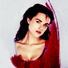
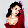
I wanted whiter whites, so I added another Selective Color layer:
Whites: 0 0 0 -100
I wanted this layer to brighten the background, so I masked the part covering her face.
STEP EIGHT

>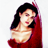
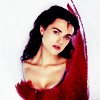
I duplicated the previous Selective Color layer to brighten the background a little more.
Again, I masked it: the effect on her face was a tad too strong.
STEP NINE

>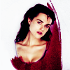
I created another Selective Color layer with these settings:
Reds: 47 15 -13 0
Whites: 0 0 -17 -22
Neutrals: 0 8 15 0
I add some magenta to reds and brightened highlights a little, basically.
STEP TEN

>
>
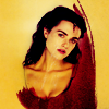
I added this texture by emonet25:
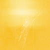
I set it to Multiply, then lowered the opacity to 13% and masked the part covering her face.
This texture adds some subtle yellow tone to the background.
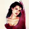
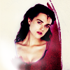
STEP ELEVEN to FOURTEEN - four layers

>
>
>
>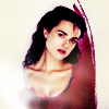
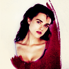
Here comes the brush work! I obviously used this brush by inxsomniax.
1. First layer - set to Soft Light, 100% opacity:
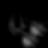
2. Second layer - I duplicated the previous one and set it to Normal, 44% opacity.
3. Third layer - set to Normal, 100% opacity:
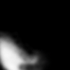
4. Fourth layer - set to Screen, 100% opacity:
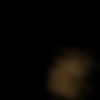
REMEMBER: this is what they look like on a black background!
STEP FIFTEEN

>
>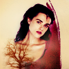
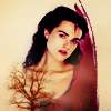
Ok, so what was the brushwork all about? I added some bright, soft spots, and created some room on the left for this texture by diane91:
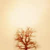
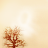
I set it to Multiply, 100% opacity. I shifted it to the left and I extended it with the Smudge tool to fill all the canvas. The I masked the bit covering her face:
STEP SIXTEEN

>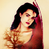
I went to Select > All, Edit > Copy Merged, Edit > Paste. I set this layer to Soft Light to add some more contrast and lowered the opacity to 52%.
STEP SEVENTEEN

>
I added a Color Balance layer to remove some yellow from the highlights and tone the red hue down a little:
Midtones: -11 0 -3
Highlights: 0 0 +17
And we're done! :)
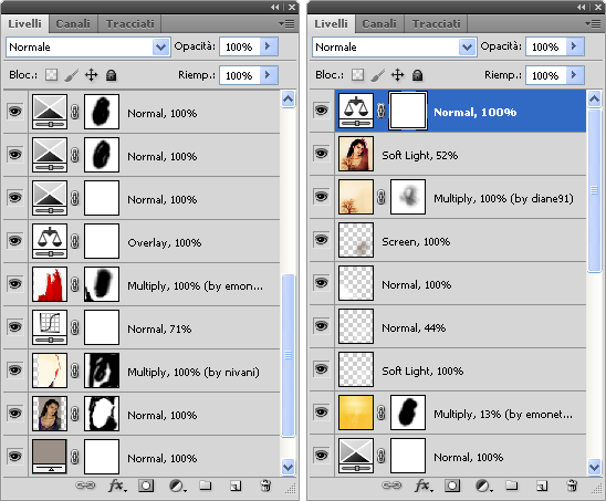
ETA - here's my layers palette:


to this:

Asked by mixy101 @ Ask the Maker Meme (hosted @icon-talk)
I'm not sharing the psd for this one, because psds are not allowed in this meme. :)
However, feel free to ask if you get stuck! I'll do my best to reply as clearly as possible.
STEP ONE

>

>

I picked a color from the background of my image with the Eyedropper tool and I created a new Fill layer under my base (#9a9087). I added a Layer Mask and covered those parts of the picture I didn't want to be visible. I wasn't much accurate, because the background of my picture was pretty even and it blended quite neatly with the grey Fill layer below.

(it looks like this on a white background)
STEP TWO

>

>

I wanted to refine the borders of her breast, so I picked this texture by nivani:

I set it to Multiply (100% opacity) and I shifted it a little to the right, so that the shape matched the right border of Morgana. Then I masked it so that only a little bit of it was showing:

(it looks like this on a white background)
STEP THREE

>

It was a tad too dark, so I added a Curves layer with these settings:
RGB - point one: O 86 I 46; point two: O 128 I 76
I lowered the opacity of this layer to 71%, because it brightened the picture a little to much.
STEP FOUR

>

>

I added this texture by emonet25:

I set it to Multiply (100% opacity) and then I masked it like this:

This texture helped me to frame Morgana's figure, and it added a bright red spot to juice up the quite dull and bland colors of my base.
STEP FIVE

>

At this point, I had to fix the contrast (the icon was way too bright and washed out) and the colors (her skin was yellow and the background was plain grey).
So I created a Color Balance layer with these settings:
Midtones: 100 22 100
Shadows: -38 7 52
I added red and blue to Midtones and cyan and blue to shadows, mostly. I set this layer to Overlay, 100% opacity, to enhance its effects and add some contrast.
STEP SIX

>

The purple hue was quite overwhelming at this point, so I created a Selective Color layer:
Whites: 100 -28 60 0
Neutrals: 0 15 16 0
I worked with Whites, basically, to change the hue of the background and the tones of the highlights.
STEP SEVEN

>

>

I wanted whiter whites, so I added another Selective Color layer:
Whites: 0 0 0 -100
I wanted this layer to brighten the background, so I masked the part covering her face.
STEP EIGHT

>


I duplicated the previous Selective Color layer to brighten the background a little more.
Again, I masked it: the effect on her face was a tad too strong.
STEP NINE

>

I created another Selective Color layer with these settings:
Reds: 47 15 -13 0
Whites: 0 0 -17 -22
Neutrals: 0 8 15 0
I add some magenta to reds and brightened highlights a little, basically.
STEP TEN

>

>

I added this texture by emonet25:

I set it to Multiply, then lowered the opacity to 13% and masked the part covering her face.
This texture adds some subtle yellow tone to the background.
STEP ELEVEN to FOURTEEN - four layers

>

>

>

>

Here comes the brush work! I obviously used this brush by inxsomniax.
1. First layer - set to Soft Light, 100% opacity:

2. Second layer - I duplicated the previous one and set it to Normal, 44% opacity.
3. Third layer - set to Normal, 100% opacity:

4. Fourth layer - set to Screen, 100% opacity:

REMEMBER: this is what they look like on a black background!
STEP FIFTEEN

>

>

Ok, so what was the brushwork all about? I added some bright, soft spots, and created some room on the left for this texture by diane91:

I set it to Multiply, 100% opacity. I shifted it to the left and I extended it with the Smudge tool to fill all the canvas. The I masked the bit covering her face:

STEP SIXTEEN

>

I went to Select > All, Edit > Copy Merged, Edit > Paste. I set this layer to Soft Light to add some more contrast and lowered the opacity to 52%.
STEP SEVENTEEN

>

I added a Color Balance layer to remove some yellow from the highlights and tone the red hue down a little:
Midtones: -11 0 -3
Highlights: 0 0 +17
And we're done! :)
ETA - here's my layers palette:
