9 psds + 2 tutorials (Misfits)
PSDS:
1. Requested by bea_addison and 12feethigh
>
DOWNLOAD @BOX.NET - PS CS4+
DOWNLOAD @BOX.NET - previous PS versions
2. Requested by bea_addison
>
DOWNLOAD @BOX.NET - PS CS4+
DOWNLOAD @BOX.NET - previous PS versions
3. Requested by bea_addison
>
DOWNLOAD @BOX.NET - PS CS4+
DOWNLOAD @BOX.NET - previous PS versions
4. Requested by bea_addison
>
DOWNLOAD @BOX.NET - PS CS4+
DOWNLOAD @BOX.NET - previous PS versions
5. Requested by bea_addison

>
DOWNLOAD @BOX.NET - PS CS4+
DOWNLOAD @BOX.NET - previous PS versions
6. Requested by bea_addison
>
DOWNLOAD @BOX.NET - PS CS4+
DOWNLOAD @BOX.NET - previous PS versions
7. Requested by bea_addison
>
DOWNLOAD @BOX.NET - PS CS4+
DOWNLOAD @BOX.NET - previous PS versions
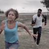
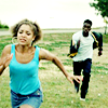
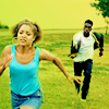
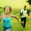
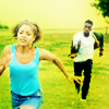
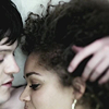
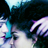
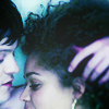
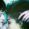
TUTORIAL #1 - Requested by before_water
>
STEP ONE
>
>
I duplicated my base, went to Filter > Sharpen > Sharpen and lowered the opacity of the sharpened layer to 60%.
Then I added a new Curves layer, I clicked on Auto and created a new point (O: 89 I: 63) to brighten the picture a little more.
STEP TWO
>
The picture was quite dull and grey, so I started to work on the colors with a Vibrance layer:
Vibrance: +100
Saturation: +15
You can replace the Vibrance layer with a Hue/Saturation one:
Master: 0 +46 0
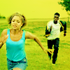
STEP THREE
>
Now, you have to keep in mind that I was working on the 20inspirations rainbow challenge when I made this icon. I wanted it to be green/cyan, so most of the layers I used add some green/yellow/cyan tones to the picture.
New Color Balance layer:
Midtones -43 +23 +24
Shadows -34 +26 0
(I added some blue, cyan and green to Midtones and Shadows)
STEP FOUR
>
I added another Vibrance layer to make the colors stand out more:
Vibrance: +58
You can replace the Vibrance layer with a Selective Color one:
Yellows: 0 0 +80 0
Greens: 0 0 +100 0
Cyan: +18 +69 +100 0
Neutrals: 0 0 +8 0
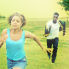
STEP FIVE
>
>
I picked this gradient texture by shalowater:
I set it to Multiply, 100% opacity. Then I masked the parts covering Alisha and Curtis to make them stand out a little more from the background.
STEP SIX
>
I created another Vibrance layer:
Vibrance: +60
You can replace the Vibrance layer with a Hue/Saturation one:
Master: 0 +8 0
STEP SEVEN
>
I created a Gradient Map layer: from #ffffff (white) to #f66634 (a bright orange).
I set it to Soft Light, 56% opacity.
This layer adds some more vibrancy to colors and enhances the bright yellow/green hues of the picture. It also softens the contrast a little, because the gradint map goes from a light color (white) to a darker one (orange). The first color works on the shadows/dark midtones mostly, while the second color works on light midtones/highlights.
So, if you want to increase the contrast of a picture with a Gradient Map layer set to Soft Light, you should do the opposite: choose a gradient that goes from a dark color to a lighter one.
STEP EIGHT
>
I went to Select > All, Edit > Copy Merged, Edit > Paste.
I went to Filter > Blur > Gaussian Blur and input a pretty high Radius (around 24px). I set this layer to Soft Light, 100% opacity, to enhance the colors a little more.
STEP NINE
>
I went to Select > All, Edit > Copy Merged, Edit > Paste.
Highlights were lost, at this point. So I went to Filter > Distort > Diffuse glow and played around with the settings of Glow Amount and Clear Amount. My settings were, more or less:
G: 0
GA: 5
GA: 9
I set this layer to Normal, 100% opacity.
STEP TEN to TWELVE - 4 layers
>
>
>
I duplicated the previous layer three times.
A. First layer:
I set it to Multiply, 100% because at this point the icons was a bit too bright.
B. Second layer:
I set it to Soft Light, 100% opacity, to regain some contrast.
C. Third layer:
I went to Filter > Other > Maximum, R: 1. I set this layer to Soft Light, 100%.
Sometimes I use the Maximum Filter instead fo using Gaussian Blur: if set to Soft Light, it gives the icon a glowing look and it also brightens it up a little.
STEP THIRTEEN

>
I created a new Levels layer and clicked on Auto. Then I worked on the contrast a little more:
RGB - Input: 46 1.00 255 (I darkened the shadows)
And we're done! <3
PSD:
DOWNLOAD @BOX.NET - PS CS4+
DOWNLOAD @BOX.NET - previous PS versions
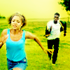
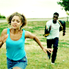
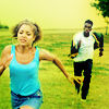
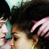
TUTORIAL #2 - Requested by before_water

>
STEP ONE
>
>
I duplicated my base, went to Filter > Sharpen > Sharpen and lowered the opacity of the sharpened layer to 71%.
Then I added a new Curves layer and clicked on Auto.
STEP TWO
>
I created another Vibrance layer:
Vibrance: +100
You can replace the Vibrance layer with a Hue/Saturation one:
Master: 0 +23 0
STEP THREE
>
I duplicated the Vibrance layer because colors were still quite bland and washed out.
You can replace the Vibrance layer with a Hue/Saturation one:
Master: 0 +40 0
Cyan: 0 +48 0
STEP FOUR
>
I created a Brightness/Contrast layer with these settings:
Contrast: 29
For previous versions of PS you can use these settings instead:
Brightness: 3
Contrast: 10
STEP FIVE
>
At this point I decided to go for a cold coloring. So I added a new Color Balance layer:
Midtones: -51 -13 +26 (I added some cyan, magenta and blue)
Shadows: -13 +19 +13 (I added some cyan, green and blue)
STEP SIX
>
I created a Selective Color layer:
Neutrals: +14 +10 -29 0
This step adds some purple tint to the icon.
STEP SEVEN
>
I wanted to brighten the picture up a little so I created a Curves layer:
RGB - one point: O 155 I 123
STEP EIGHT - optional
>
I created another Vibrance layer:
Vibrance: +8
You can replace the Vibrance layer with a Hue/Saturation one:
Master: 0 +5 0
STEP NINE
>
It was a tad too sharpened, so I went to Select > All, Edit > Copy Merged, Edit > Paste, then Filter > Blur > Gaussian Blur R: 5px, more or less. I set this layer to Normal, 16% opacity.
STEP TEN
>
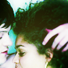
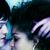
Alisha's hair was a bit too dark, so I created a new layer and I painted a little with white. I might have blurred this layer too. I set it to Normal, 39% opacity. It looks like this on a black background:

This white blob creates a soft, lighter spot on her hair without being too distracting or overwhelming.
STEP ELEVEN
>
At this point I changed my mind and I decided I wanted some more green tint in my icon. I added a Color Balance layer:
Midtones: -10 0 -47
(I added some yellow and cyan)
STEP TWELVE
>
It was a tad too dark and it lacked some contrast, plus I wanted the coloring to be even colder (= more cyan/green) so I created a Curves layer and played with all the settings:
RGB - first point: 0 174 I 155; second point: O 90 I 95
Red - first point: 0 112 I 77; second point: O 94 I 64
Green - first point: 0 125 I 109; second point: O 94 I 86
Blue - first point: 0 120 I 127; second point: O 117 I 127
And we're done!
PSD:
DOWNLOAD @BOX.NET - PS CS4+
DOWNLOAD @BOX.NET - previous PS versions
Feel free to ask if you get stuck! I'll do my best to reply as clearly as possible. :)
Comments are very appreciated, but it's not a must. No need to credit!
You can ask for psds/tutorials whenever you want, I'll be glad to share. ♥
1. Requested by bea_addison and 12feethigh
>
DOWNLOAD @BOX.NET - PS CS4+
DOWNLOAD @BOX.NET - previous PS versions
2. Requested by bea_addison
>
DOWNLOAD @BOX.NET - PS CS4+
DOWNLOAD @BOX.NET - previous PS versions
3. Requested by bea_addison
>
DOWNLOAD @BOX.NET - PS CS4+
DOWNLOAD @BOX.NET - previous PS versions
4. Requested by bea_addison
>
DOWNLOAD @BOX.NET - PS CS4+
DOWNLOAD @BOX.NET - previous PS versions
5. Requested by bea_addison
>
DOWNLOAD @BOX.NET - PS CS4+
DOWNLOAD @BOX.NET - previous PS versions
6. Requested by bea_addison
>
DOWNLOAD @BOX.NET - PS CS4+
DOWNLOAD @BOX.NET - previous PS versions
7. Requested by bea_addison
>
DOWNLOAD @BOX.NET - PS CS4+
DOWNLOAD @BOX.NET - previous PS versions
TUTORIAL #1 - Requested by before_water
>
STEP ONE
>
>
I duplicated my base, went to Filter > Sharpen > Sharpen and lowered the opacity of the sharpened layer to 60%.
Then I added a new Curves layer, I clicked on Auto and created a new point (O: 89 I: 63) to brighten the picture a little more.
STEP TWO
>
The picture was quite dull and grey, so I started to work on the colors with a Vibrance layer:
Vibrance: +100
Saturation: +15
You can replace the Vibrance layer with a Hue/Saturation one:
Master: 0 +46 0
STEP THREE
>
Now, you have to keep in mind that I was working on the 20inspirations rainbow challenge when I made this icon. I wanted it to be green/cyan, so most of the layers I used add some green/yellow/cyan tones to the picture.
New Color Balance layer:
Midtones -43 +23 +24
Shadows -34 +26 0
(I added some blue, cyan and green to Midtones and Shadows)
STEP FOUR
>
I added another Vibrance layer to make the colors stand out more:
Vibrance: +58
You can replace the Vibrance layer with a Selective Color one:
Yellows: 0 0 +80 0
Greens: 0 0 +100 0
Cyan: +18 +69 +100 0
Neutrals: 0 0 +8 0
STEP FIVE
>
>
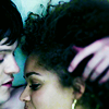
I picked this gradient texture by shalowater:
I set it to Multiply, 100% opacity. Then I masked the parts covering Alisha and Curtis to make them stand out a little more from the background.
STEP SIX
>
I created another Vibrance layer:
Vibrance: +60
You can replace the Vibrance layer with a Hue/Saturation one:
Master: 0 +8 0
STEP SEVEN
>
I created a Gradient Map layer: from #ffffff (white) to #f66634 (a bright orange).
I set it to Soft Light, 56% opacity.
This layer adds some more vibrancy to colors and enhances the bright yellow/green hues of the picture. It also softens the contrast a little, because the gradint map goes from a light color (white) to a darker one (orange). The first color works on the shadows/dark midtones mostly, while the second color works on light midtones/highlights.
So, if you want to increase the contrast of a picture with a Gradient Map layer set to Soft Light, you should do the opposite: choose a gradient that goes from a dark color to a lighter one.
STEP EIGHT
>
I went to Select > All, Edit > Copy Merged, Edit > Paste.
I went to Filter > Blur > Gaussian Blur and input a pretty high Radius (around 24px). I set this layer to Soft Light, 100% opacity, to enhance the colors a little more.
STEP NINE
>
I went to Select > All, Edit > Copy Merged, Edit > Paste.
Highlights were lost, at this point. So I went to Filter > Distort > Diffuse glow and played around with the settings of Glow Amount and Clear Amount. My settings were, more or less:
G: 0
GA: 5
GA: 9
I set this layer to Normal, 100% opacity.
STEP TEN to TWELVE - 4 layers
>
>
>
I duplicated the previous layer three times.
A. First layer:
I set it to Multiply, 100% because at this point the icons was a bit too bright.
B. Second layer:
I set it to Soft Light, 100% opacity, to regain some contrast.
C. Third layer:
I went to Filter > Other > Maximum, R: 1. I set this layer to Soft Light, 100%.
Sometimes I use the Maximum Filter instead fo using Gaussian Blur: if set to Soft Light, it gives the icon a glowing look and it also brightens it up a little.
STEP THIRTEEN
>
I created a new Levels layer and clicked on Auto. Then I worked on the contrast a little more:
RGB - Input: 46 1.00 255 (I darkened the shadows)
And we're done! <3
PSD:
DOWNLOAD @BOX.NET - PS CS4+
DOWNLOAD @BOX.NET - previous PS versions
TUTORIAL #2 - Requested by before_water
>
STEP ONE
>
>
I duplicated my base, went to Filter > Sharpen > Sharpen and lowered the opacity of the sharpened layer to 71%.
Then I added a new Curves layer and clicked on Auto.
STEP TWO
>
I created another Vibrance layer:
Vibrance: +100
You can replace the Vibrance layer with a Hue/Saturation one:
Master: 0 +23 0
STEP THREE
>
I duplicated the Vibrance layer because colors were still quite bland and washed out.
You can replace the Vibrance layer with a Hue/Saturation one:
Master: 0 +40 0
Cyan: 0 +48 0
STEP FOUR
>
I created a Brightness/Contrast layer with these settings:
Contrast: 29
For previous versions of PS you can use these settings instead:
Brightness: 3
Contrast: 10
STEP FIVE
>
At this point I decided to go for a cold coloring. So I added a new Color Balance layer:
Midtones: -51 -13 +26 (I added some cyan, magenta and blue)
Shadows: -13 +19 +13 (I added some cyan, green and blue)
STEP SIX
>
I created a Selective Color layer:
Neutrals: +14 +10 -29 0
This step adds some purple tint to the icon.
STEP SEVEN
>
I wanted to brighten the picture up a little so I created a Curves layer:
RGB - one point: O 155 I 123
STEP EIGHT - optional
>
I created another Vibrance layer:
Vibrance: +8
You can replace the Vibrance layer with a Hue/Saturation one:
Master: 0 +5 0
STEP NINE
>
It was a tad too sharpened, so I went to Select > All, Edit > Copy Merged, Edit > Paste, then Filter > Blur > Gaussian Blur R: 5px, more or less. I set this layer to Normal, 16% opacity.
STEP TEN
>
Alisha's hair was a bit too dark, so I created a new layer and I painted a little with white. I might have blurred this layer too. I set it to Normal, 39% opacity. It looks like this on a black background:
This white blob creates a soft, lighter spot on her hair without being too distracting or overwhelming.
STEP ELEVEN
>
At this point I changed my mind and I decided I wanted some more green tint in my icon. I added a Color Balance layer:
Midtones: -10 0 -47
(I added some yellow and cyan)
STEP TWELVE
>
It was a tad too dark and it lacked some contrast, plus I wanted the coloring to be even colder (= more cyan/green) so I created a Curves layer and played with all the settings:
RGB - first point: 0 174 I 155; second point: O 90 I 95
Red - first point: 0 112 I 77; second point: O 94 I 64
Green - first point: 0 125 I 109; second point: O 94 I 86
Blue - first point: 0 120 I 127; second point: O 117 I 127
And we're done!
PSD:
DOWNLOAD @BOX.NET - PS CS4+
DOWNLOAD @BOX.NET - previous PS versions
Feel free to ask if you get stuck! I'll do my best to reply as clearly as possible. :)
Comments are very appreciated, but it's not a must. No need to credit!
You can ask for psds/tutorials whenever you want, I'll be glad to share. ♥