Tutorial: Fight Club
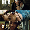
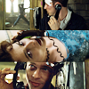
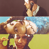
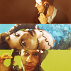
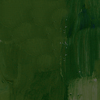
We're going from: 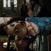
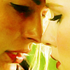
to: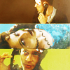
Requested by karinmcr
STEP ZERO

>
>
>
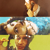
First of all, the composition I started with. I began with the picture of Tyler and placed it in the bottom side of the canvas, then I pasted Marla on top of it and masked it at bit (the lower part, covering Tyler) and finally I placed the Narrator above Marla. Since Tyler was a bit too dark compared to the other two, I created a Curves layer between Tyler and Marla:
RGB - Point 1: O 151 I 99
I lowered the opacity of this layer to 62%, because I didn't want to brighten the picture too much.
STEP ONE
>
I created another Curves layer and without touching it I set it to Screen, 100%. Honestly, I think this step works with any kind of Adjustment layer: creating a new Adjustment layer and leaving the default settings (aka, no settings at all) is the same thing as copying the merged layers and pasting it on top. On the bright side, if you change your base you don't have to change this layer, as you would have to do with a copy merged layer.
STEP TWO
>
It still was a tad dark, so I duplicated the previous Curves layer - again, no settings - to brighten it a bit more. Marla was a tad too bright compared to the other two, so I masked the middle part. In PS CS5 you can lower the opacity of the Layer Mask, so I lowered it to 57%.
I don't think you can do the same in previous versions - I know I couldn't in PC CS2, so you'll have to lower the opacity of the Rectangle Tool before using it to mask the layer. That's what I did with the translatable version of the psd, and it gives you the same result.
STEP THREE
>
At this point I thought the contrast was a tad too harsh and I wanted to add some warmer hues to the icon, so I used this texture by deny1984:
I set it to Screen, 100% opacity.
STEP FOUR
>
... and at this point I thought it lacked contrast. So I created a Brightness/Contrast layer:
Brightness: -4
Contrast: 70
For previous versions of PS, it's a bit tricky to get the same result, but fear not! You can replace this layer with:
01. A Brightness/Contrast layer:
Brightness: -3
Contrast: 21
02. Then a Levels layer:
RGB - Input 0 1.08 255; Output 0 0 247
03. Finally, a Hue/Saturation layer:
Master - 0 +6 0
STEP FIVE
>
Here comes a bit of brushwork! I thought the backgrounds of the three pics were distracting - not to mention fugly - so I painted over them with a small round brush, 100% Hardness. Well, Marla's background wasn't distracting or anything, but I wanted to even out the three pics so each one of them had to end up with a solid background.

- Narrator

- Marla

|
- Tyler*
* At first I used the paler green, but at some point I duplicated that layer and played with its Hue/Saturation. I'm including the paler one because even though it doesn't seem to affect the icon anymore, it'll become important some steps later.
STEP SIX
>
The coloring was a bit washed up, so I created a Vibrance layer:
Vibrance: +87
Saturation: 0
You can replace this layer with:
01. A Hue/Saturation layer:
Master: 0 +10 0
Yellows: 0 +19 0
Cyan: 0 +23 0
Opacity 72%, Fill 72%.
02. And a Selective Colors layer:
Reds - 0 +27 0 0
Yellows - +29 0 +49 0
Cyan - +71 0 0 0
STEP SEVEN
>
Again, I wanted to lessen the contrast a little and to add some more brown-ish hues, so I picked this texture by deny1984:
And I set it to Screen, 100% opacity. It was a tad too strong on the Narrator, so I masked the upper part of the texture and lowered the opacity of the mask to 69%.
You can use the same trick of Step two for previous versions of PS.
STEP EIGHT
>
Select > All, Edit > Copy Merged, Edit > Paste. However, before doing so, you have to turn invisible the more vivid green layer of Step five, so that only the paler one is showing. See? Told you there was a reason to include that layer! c:
I decided to give Variations a try, so I went to Image > Adjustements > Variations:
||| x ||| Midtones - More Green x1, Lighter x1
I set this layer to Soft Light, 66%. This way I increased the contrast and added some yellow/green hues back without losing the warmer colors I had been working to enhance with the previous layers.
STEP NINE
>
First of all, some brushwork to play with the contrast/lighting mostly:
- Normal, 70% opacity.

- Normal, 100% opacity.
- Normal, 100% opacity.

- Soft Light, 46% opacity.
Then, three layers to enhance the colors of the three frames:

- Soft Light, 100% opacity.

- Soft Light, 64% opacity.

- Soft Light, 49% opacity.
STEP TEN
>
And when you thought something was clearly missing but you couldn't put your finger on it... here comes an Auto-Curves layer! Checking contrast routine. c:
STEP ELEVEN
>
Raising the contrast, lowering the contrast. You get the gist of it! I used this texture by lumsx:
I set it to Screen, 48% opacity.
STEP TWELVE
>
Another texture! This time I used this one I made:

And I played with its Hue/Saturation till I got this:
I set it to Screen, 43% opacity.
STEP THIRTEEN
>
And as if it wasn't washed out enough, I created a new Curves layer to brighten it up even more! Yay, nonsense.
RGB - Point 1: O 160 I 120
Then Select > All, Edit > Copy Merged, Edit > Paste. It was a tad too sharpened so I used Reduce Noise with the usual settings:
Basic: checked
Settings: Default
Strenght: 7
Preserve Details: 1%
Reduce Color Noise: 0%
Sharpen Details: 35%
Remove JPEG Artifact: unchecked
And finally, I set this layer to Soft Light, 100% opacity and I turned the previous Curves layer invisible.
Done, at last! <3
DOWNLOAD PSD @BOX.NET
- PS CS4+
- Previous versions
NEXT

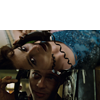
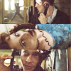
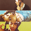
to:
Requested by karinmcr
STEP ZERO
>
>
>
First of all, the composition I started with. I began with the picture of Tyler and placed it in the bottom side of the canvas, then I pasted Marla on top of it and masked it at bit (the lower part, covering Tyler) and finally I placed the Narrator above Marla. Since Tyler was a bit too dark compared to the other two, I created a Curves layer between Tyler and Marla:
RGB - Point 1: O 151 I 99
I lowered the opacity of this layer to 62%, because I didn't want to brighten the picture too much.
STEP ONE
>
I created another Curves layer and without touching it I set it to Screen, 100%. Honestly, I think this step works with any kind of Adjustment layer: creating a new Adjustment layer and leaving the default settings (aka, no settings at all) is the same thing as copying the merged layers and pasting it on top. On the bright side, if you change your base you don't have to change this layer, as you would have to do with a copy merged layer.
STEP TWO
>
It still was a tad dark, so I duplicated the previous Curves layer - again, no settings - to brighten it a bit more. Marla was a tad too bright compared to the other two, so I masked the middle part. In PS CS5 you can lower the opacity of the Layer Mask, so I lowered it to 57%.
I don't think you can do the same in previous versions - I know I couldn't in PC CS2, so you'll have to lower the opacity of the Rectangle Tool before using it to mask the layer. That's what I did with the translatable version of the psd, and it gives you the same result.
STEP THREE
>
At this point I thought the contrast was a tad too harsh and I wanted to add some warmer hues to the icon, so I used this texture by deny1984:
I set it to Screen, 100% opacity.
STEP FOUR
>
... and at this point I thought it lacked contrast. So I created a Brightness/Contrast layer:
Brightness: -4
Contrast: 70
For previous versions of PS, it's a bit tricky to get the same result, but fear not! You can replace this layer with:
01. A Brightness/Contrast layer:
Brightness: -3
Contrast: 21
02. Then a Levels layer:
RGB - Input 0 1.08 255; Output 0 0 247
03. Finally, a Hue/Saturation layer:
Master - 0 +6 0
STEP FIVE
>
Here comes a bit of brushwork! I thought the backgrounds of the three pics were distracting - not to mention fugly - so I painted over them with a small round brush, 100% Hardness. Well, Marla's background wasn't distracting or anything, but I wanted to even out the three pics so each one of them had to end up with a solid background.
- Narrator
- Marla
|
- Tyler*
* At first I used the paler green, but at some point I duplicated that layer and played with its Hue/Saturation. I'm including the paler one because even though it doesn't seem to affect the icon anymore, it'll become important some steps later.
STEP SIX
>
The coloring was a bit washed up, so I created a Vibrance layer:
Vibrance: +87
Saturation: 0
You can replace this layer with:
01. A Hue/Saturation layer:
Master: 0 +10 0
Yellows: 0 +19 0
Cyan: 0 +23 0
Opacity 72%, Fill 72%.
02. And a Selective Colors layer:
Reds - 0 +27 0 0
Yellows - +29 0 +49 0
Cyan - +71 0 0 0
STEP SEVEN
>
Again, I wanted to lessen the contrast a little and to add some more brown-ish hues, so I picked this texture by deny1984:
And I set it to Screen, 100% opacity. It was a tad too strong on the Narrator, so I masked the upper part of the texture and lowered the opacity of the mask to 69%.
You can use the same trick of Step two for previous versions of PS.
STEP EIGHT
>
Select > All, Edit > Copy Merged, Edit > Paste. However, before doing so, you have to turn invisible the more vivid green layer of Step five, so that only the paler one is showing. See? Told you there was a reason to include that layer! c:
I decided to give Variations a try, so I went to Image > Adjustements > Variations:
||| x ||| Midtones - More Green x1, Lighter x1
I set this layer to Soft Light, 66%. This way I increased the contrast and added some yellow/green hues back without losing the warmer colors I had been working to enhance with the previous layers.
STEP NINE
>
First of all, some brushwork to play with the contrast/lighting mostly:
- Normal, 70% opacity.
- Normal, 100% opacity.
- Normal, 100% opacity.
- Soft Light, 46% opacity.
Then, three layers to enhance the colors of the three frames:
- Soft Light, 100% opacity.
- Soft Light, 64% opacity.
- Soft Light, 49% opacity.
STEP TEN
>
And when you thought something was clearly missing but you couldn't put your finger on it... here comes an Auto-Curves layer! Checking contrast routine. c:
STEP ELEVEN
>
Raising the contrast, lowering the contrast. You get the gist of it! I used this texture by lumsx:
I set it to Screen, 48% opacity.
STEP TWELVE
>
Another texture! This time I used this one I made:
And I played with its Hue/Saturation till I got this:
I set it to Screen, 43% opacity.
STEP THIRTEEN
>
And as if it wasn't washed out enough, I created a new Curves layer to brighten it up even more! Yay, nonsense.
RGB - Point 1: O 160 I 120
Then Select > All, Edit > Copy Merged, Edit > Paste. It was a tad too sharpened so I used Reduce Noise with the usual settings:
Basic: checked
Settings: Default
Strenght: 7
Preserve Details: 1%
Reduce Color Noise: 0%
Sharpen Details: 35%
Remove JPEG Artifact: unchecked
And finally, I set this layer to Soft Light, 100% opacity and I turned the previous Curves layer invisible.
Done, at last! <3
DOWNLOAD PSD @BOX.NET
- PS CS4+
- Previous versions
NEXT