Tutorial: John Watson from Sherlock
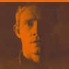
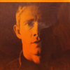
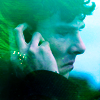
We're going from: 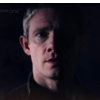
to: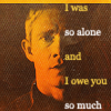
Requested by scoobyatemysnax ♥
STEP ONE
>
I created a Curves layer to brighten up the picture:
RGB - Point 1: O 176 I 102
I set this layer to Normal, 100% opacity.
STEP TWO & THREE
>
>
First of all I created a new Gradient Map layer: ███ #1e062a to ███ #e04040. I set this layer to Normal, 100% opacity.
I did this for two reasons: I was trying to emulate this icon by paperdreamss, so I needed a monochromatic coloring with vibrant midtones and dark shadows; secondly, I needed to fill the small empty space on the upper side of the icon.
Then I created a copy merged layer and... I did something to the coloring (added a lot of yellow/orange), and I'm quite sure I used Variations but I can't recreate the same effect for the life of me. Maybe there was another layer that I deleted, but I honestly have no idea. So if you want the same(-ish) effect, you have to create the Gradient Map layer but use these settings instead of those provided above: ███ #3a2124 to ███ #e25905.
Basically, to recreate the same(ish) color scheme, I used the enigmatic layer: I picked the first color from the darkest shadows I could find, and the second color from the brightest highlights I could find. It's not quite the same effect, but close:
vs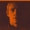
In the recreated version I also used a copy merged layer to remove the small logo in the upper left corner (with the Spot Healing Brush Tool). You can see that the original layer (on the left) was a tad brighter and maybe more yellow-ish.
Both layers in both cases are set to Normal, 100% opacity.
STEP FOUR
>
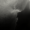
I added this texture made by me:

I set it to Screen, 28% opacity. I wanted to add some more orange/brown tones and to texturize the flat background a little.
STEP FIVE
>
I added this texture by innocent-lexys:
I set it to Screen, 27% opacity. This step basically brightens the picture and makes the icon more interesting... I think. That was the idea. Kind of smokey. Well, it's a floating head with a boring centered crop, ok? You need to do stuff to distract people enough so they don't think 'omg a floating head with a centered crop, how boring'.
STEP SIX
>
I wanted to increase the contrast, so I created a Curves layer:
RGB - Point 1: O 135 I 123; Point 2: O 86 I 99
(Normal, 100% opacity)
STEP SEVEN
>
I created another Curves layer to play with the coloring a bit:
Red - Point 1: O 128 I 141
Green - Point 1: O 138 I 117; Point 2: O 76 I 72
Blue - Point 1: O 123 I 99; Point 2: O 63 I 69
This layer increased the contrast and it changed the coloring slightly - now it's less red/orange and more orange/yellow.
(Normal, 100% opacity)
STEP EIGHT
>
I added this grunge texture by ??? (I think it's by innocent-lexys or by fuuurs or by raiindust):
I set it to Screen, 100% opacity. This texture does what every grunge texture is supposed to do: it adds noise.
STEP NINE
>
I created a copy merged layer and used Paint Daubs (Size: 1, Sharpness: 1). I set it to Normal and lowered the opacity to 48%.
However, since I replaced the enigmatic layer, at this point to get a closer result you have to add a Selective colors layer before creating the copy merged layer:
Yellows: 0 -23 +23 0
This way you add some yellow back to his face, since it was lacking compared to the original icon.
STEP TEN & ELEVEN
>
At this point I added the text: font - Georgia, size - 9pt, line-height - 22pt, anti-alias - strong, color - white and ███ #f6c941. I duplicated this layer, rasterized it and blurred it a little (Gaussian Blur, around 0.2-0.3px). The text layer is set to Screen, 36% opacity and 46% fill. The rasterized layer is set to Normal, 100% opacity.
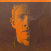
Original vs Recreated:
DOWNLOAD PSD @BOX.NET
- Original
- Recreated
(both Vibrance free)
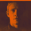
BONUS! I'm dumb and I uploaded the psd of this icon by mistake (they have very similar names):
It's raw (no labels, there might be Vibrance layers and whatnot), since nobody asked for it and I wasn't planning to post the psd or tut for this icon, but there's no point in deleting it now, right? So here you are: BONUS PSD NOBODY ASKED FOR AND WITH NO LABELS AND STUFF. Enjoy (?)
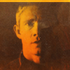
to:
Requested by scoobyatemysnax ♥
STEP ONE
>
I created a Curves layer to brighten up the picture:
RGB - Point 1: O 176 I 102
I set this layer to Normal, 100% opacity.
STEP TWO & THREE
>
>
First of all I created a new Gradient Map layer: ███ #1e062a to ███ #e04040. I set this layer to Normal, 100% opacity.
I did this for two reasons: I was trying to emulate this icon by paperdreamss, so I needed a monochromatic coloring with vibrant midtones and dark shadows; secondly, I needed to fill the small empty space on the upper side of the icon.
Then I created a copy merged layer and... I did something to the coloring (added a lot of yellow/orange), and I'm quite sure I used Variations but I can't recreate the same effect for the life of me. Maybe there was another layer that I deleted, but I honestly have no idea. So if you want the same(-ish) effect, you have to create the Gradient Map layer but use these settings instead of those provided above: ███ #3a2124 to ███ #e25905.
Basically, to recreate the same(ish) color scheme, I used the enigmatic layer: I picked the first color from the darkest shadows I could find, and the second color from the brightest highlights I could find. It's not quite the same effect, but close:
vs
In the recreated version I also used a copy merged layer to remove the small logo in the upper left corner (with the Spot Healing Brush Tool). You can see that the original layer (on the left) was a tad brighter and maybe more yellow-ish.
Both layers in both cases are set to Normal, 100% opacity.
STEP FOUR
>
I added this texture made by me:
I set it to Screen, 28% opacity. I wanted to add some more orange/brown tones and to texturize the flat background a little.
STEP FIVE
>
I added this texture by innocent-lexys:
I set it to Screen, 27% opacity. This step basically brightens the picture and makes the icon more interesting... I think. That was the idea. Kind of smokey. Well, it's a floating head with a boring centered crop, ok? You need to do stuff to distract people enough so they don't think 'omg a floating head with a centered crop, how boring'.
STEP SIX
>
I wanted to increase the contrast, so I created a Curves layer:
RGB - Point 1: O 135 I 123; Point 2: O 86 I 99
(Normal, 100% opacity)
STEP SEVEN
>
I created another Curves layer to play with the coloring a bit:
Red - Point 1: O 128 I 141
Green - Point 1: O 138 I 117; Point 2: O 76 I 72
Blue - Point 1: O 123 I 99; Point 2: O 63 I 69
This layer increased the contrast and it changed the coloring slightly - now it's less red/orange and more orange/yellow.
(Normal, 100% opacity)
STEP EIGHT
>
I added this grunge texture by ??? (I think it's by innocent-lexys or by fuuurs or by raiindust):
I set it to Screen, 100% opacity. This texture does what every grunge texture is supposed to do: it adds noise.
STEP NINE
>
I created a copy merged layer and used Paint Daubs (Size: 1, Sharpness: 1). I set it to Normal and lowered the opacity to 48%.
However, since I replaced the enigmatic layer, at this point to get a closer result you have to add a Selective colors layer before creating the copy merged layer:
Yellows: 0 -23 +23 0
This way you add some yellow back to his face, since it was lacking compared to the original icon.
STEP TEN & ELEVEN
>
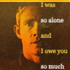
At this point I added the text: font - Georgia, size - 9pt, line-height - 22pt, anti-alias - strong, color - white and ███ #f6c941. I duplicated this layer, rasterized it and blurred it a little (Gaussian Blur, around 0.2-0.3px). The text layer is set to Screen, 36% opacity and 46% fill. The rasterized layer is set to Normal, 100% opacity.
Original vs Recreated:
DOWNLOAD PSD @BOX.NET
- Original
- Recreated
(both Vibrance free)
BONUS! I'm dumb and I uploaded the psd of this icon by mistake (they have very similar names):
It's raw (no labels, there might be Vibrance layers and whatnot), since nobody asked for it and I wasn't planning to post the psd or tut for this icon, but there's no point in deleting it now, right? So here you are: BONUS PSD NOBODY ASKED FOR AND WITH NO LABELS AND STUFF. Enjoy (?)