Tutorial: Sam from Supernatural (again)
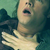
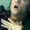
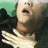
We're going from: 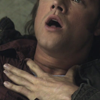
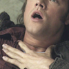
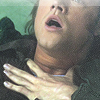
to:
Requested by reebeecaa
STEP ONE
>
I created a new Curves layer and I set it to Screen, 100% opacity, to brighten my base.
As I've said in other tutorials, you can use any Adjustment Layer to do this. You're going to leave the settings untouched, so it doesn't matter if it's a Selective Color layer or a Hue/Saturation layer.
STEP TWO
>
I created a copy-merged layer and used Topaz Clean on it, with the default settings of Crisp Style. I lowered the opacity to 31%.
If you don't have Topaz Clean installed, you can either use Reduce Noise (PS4+, I believe) or Surface Blur (previous versions of PS) to achieve a similar result.
STEP THREE
>
I created another copy-merged layer and used the Paint Daubs filter to sharpen (Brush type: Simple, Size: 1, Sharpness: 1). I lowered the opacity to 43%.
STEP FOUR
>
I was working at my inspired20in20 set when I made this icon, and I knew I wanted it to be cyan/green, so I created yet another copy-merged layer and I used Variations on it to change the color scheme:
Fine ||| x ||| Coarse - Midtones: More Cyan x1; Saturation: More Saturation x1
Fine || x |||| Coarse - Saturation: More Saturation x1
STEP FIVE
>
I created a Curves layer and clicked on Auto to fix the contrast.
STEP SIX
>
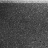
I added this texture of mine to play with the lighting:
I set it to Soft Light, 69% opacity. I don't know why, but I usually try to get the upper side of the icon to be brighter than the lower side.
STEP SEVEN
>
I created another copy-merged layer and I used Variation on it to bring back some natural tones on his skin:
Fine | x ||||| Coarse - Midtones: More Red x1; Saturation: Less Saturation x1; Highlights: More Red x1
STEP EIGHT
>
At this point I think the yellowish hue of his hand was bugging me, so I created a Selective Color layer:
Yellows: 0 0 -74 0
I masked this layer so that it would affect only his hand.
STEP NINE
>
I wanted the bit of background on the upper left part and his clothes to be more green/cyan, so I created a Curves layer:
Red - Point One: O 122 I 168
Green - Point One: O 141 I 160
Blue - Point One: O 123 I 155
I masked this layer so that it wouldn't affect his skin (both face and hand).
STEP TEN
>
I wanted his skin to stand out a bit more against the overall green/cyan coloring, so I created a new layer and painted over it with some brown-ish color:

I set this layer to Soft Light, 62% opacity.
STEP ELEVEN
>
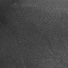
I wanted to ad some grunge-ish quality to it, so I picked this texture by raiindust:
I set it to Screen, around 79% I think (I had to recreate this step). I didn't want the brighter stripe to be on the left though, because I thought it was drawing the attention away from his face. So I rotated 90° clockwise (to have the brighter stripe on the top) and then flipped it horizontally so that the slightly darker side of the texture would be on the left:
STEP TWELVE
>
I created a copy-merged layer and used Variations in it to darken the icon and work on the coloring:
Fine ||| x ||| Coarse - Midtones: Darker x1, More Yellow x1
Fine || x |||| Coarse - Midtones: Darker x1; Saturation: Less Saturation x1
I set this layer to Soft Light, 100% opacity. Basically I added some yellow to the coloring and I also increased the contrast.
STEP THIRTEEN
>
The bright stripe on the top of the icon was a tad too strong at this point, so I went back to the texture layer (below the Variations layer). I used the Spot Healing Brush Tool to remove the stripe from it, like this:
And I also lowered the fill to 53%.
STEP FOURTEEN
>
I wanted the coloring to be more green/cyan, so I created a Gradient Map layer going from: #253029 ███ to: #155e13 ███.
I set this layer to Screen, 59% opacity. This way I also brightened the picture a little.
STEP FIFTEEN
>
I created a new Curves layer and I set it to Soft Light, 41% opacity, to increase the contrast.
STEP SIXTEEN
>
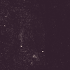
To add some more green I picked this texture of mine:

I set it to Screen, 48% opacity, 74% fill.
STEP SEVENTEEN
>
I picked this texture by innocent-lexys:
I set it to Screen, 72% opacity. I did this to add some more grunge-y noise and to warm up the shadows a bit.
STEP EIGHTEEN
>
I created a copy-merged layer and I used Variation to fix the contrast and add the last touch to the coloring.
Fine ||| x ||| Coarse - Midtones: Darker x1
Fine || x |||| Coarse - Midtones: Darker x2, More Cyan x1; Saturation: Less Saturation x1
DOWNLOAD PSD @BOX.NET
- Vibrance free
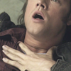
to:
Requested by reebeecaa
STEP ONE
>
I created a new Curves layer and I set it to Screen, 100% opacity, to brighten my base.
As I've said in other tutorials, you can use any Adjustment Layer to do this. You're going to leave the settings untouched, so it doesn't matter if it's a Selective Color layer or a Hue/Saturation layer.
STEP TWO
>
I created a copy-merged layer and used Topaz Clean on it, with the default settings of Crisp Style. I lowered the opacity to 31%.
If you don't have Topaz Clean installed, you can either use Reduce Noise (PS4+, I believe) or Surface Blur (previous versions of PS) to achieve a similar result.
STEP THREE
>
I created another copy-merged layer and used the Paint Daubs filter to sharpen (Brush type: Simple, Size: 1, Sharpness: 1). I lowered the opacity to 43%.
STEP FOUR
>
I was working at my inspired20in20 set when I made this icon, and I knew I wanted it to be cyan/green, so I created yet another copy-merged layer and I used Variations on it to change the color scheme:
Fine ||| x ||| Coarse - Midtones: More Cyan x1; Saturation: More Saturation x1
Fine || x |||| Coarse - Saturation: More Saturation x1
STEP FIVE
>
I created a Curves layer and clicked on Auto to fix the contrast.
STEP SIX
>
I added this texture of mine to play with the lighting:
I set it to Soft Light, 69% opacity. I don't know why, but I usually try to get the upper side of the icon to be brighter than the lower side.
STEP SEVEN
>
I created another copy-merged layer and I used Variation on it to bring back some natural tones on his skin:
Fine | x ||||| Coarse - Midtones: More Red x1; Saturation: Less Saturation x1; Highlights: More Red x1
STEP EIGHT
>
At this point I think the yellowish hue of his hand was bugging me, so I created a Selective Color layer:
Yellows: 0 0 -74 0
I masked this layer so that it would affect only his hand.
STEP NINE
>
I wanted the bit of background on the upper left part and his clothes to be more green/cyan, so I created a Curves layer:
Red - Point One: O 122 I 168
Green - Point One: O 141 I 160
Blue - Point One: O 123 I 155
I masked this layer so that it wouldn't affect his skin (both face and hand).
STEP TEN
>
I wanted his skin to stand out a bit more against the overall green/cyan coloring, so I created a new layer and painted over it with some brown-ish color:
I set this layer to Soft Light, 62% opacity.
STEP ELEVEN
>
I wanted to ad some grunge-ish quality to it, so I picked this texture by raiindust:
I set it to Screen, around 79% I think (I had to recreate this step). I didn't want the brighter stripe to be on the left though, because I thought it was drawing the attention away from his face. So I rotated 90° clockwise (to have the brighter stripe on the top) and then flipped it horizontally so that the slightly darker side of the texture would be on the left:
STEP TWELVE
>
I created a copy-merged layer and used Variations in it to darken the icon and work on the coloring:
Fine ||| x ||| Coarse - Midtones: Darker x1, More Yellow x1
Fine || x |||| Coarse - Midtones: Darker x1; Saturation: Less Saturation x1
I set this layer to Soft Light, 100% opacity. Basically I added some yellow to the coloring and I also increased the contrast.
STEP THIRTEEN
>
The bright stripe on the top of the icon was a tad too strong at this point, so I went back to the texture layer (below the Variations layer). I used the Spot Healing Brush Tool to remove the stripe from it, like this:
And I also lowered the fill to 53%.
STEP FOURTEEN
>
I wanted the coloring to be more green/cyan, so I created a Gradient Map layer going from: #253029 ███ to: #155e13 ███.
I set this layer to Screen, 59% opacity. This way I also brightened the picture a little.
STEP FIFTEEN
>
I created a new Curves layer and I set it to Soft Light, 41% opacity, to increase the contrast.
STEP SIXTEEN
>
To add some more green I picked this texture of mine:
I set it to Screen, 48% opacity, 74% fill.
STEP SEVENTEEN
>
I picked this texture by innocent-lexys:
I set it to Screen, 72% opacity. I did this to add some more grunge-y noise and to warm up the shadows a bit.
STEP EIGHTEEN
>
I created a copy-merged layer and I used Variation to fix the contrast and add the last touch to the coloring.
Fine ||| x ||| Coarse - Midtones: Darker x1
Fine || x |||| Coarse - Midtones: Darker x2, More Cyan x1; Saturation: Less Saturation x1
DOWNLOAD PSD @BOX.NET
- Vibrance free