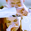
Tutorial #82
New tutorial! Finally - it feels like I haven't made one in months!
I am just finishing my latest batch of icons - including PB: Bolshoi Booze and some random SPN ones! I'm hoping to have them posted tonight or early tomorrow! :D Watch this space!
Anyway, on to the tut!
Make the following icon;
Turn:
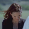
TO
In Photoshop 7.0
Uses Curves and Colour Balance
This icon was part of this post. and the tutorial was requested by tinkerbell008.
1. Open a new 100 x 100 image
2. Open your image and resize it. Drag it into your 100 x 100 image.
I got:

3. Now go to Layer > New Adjustment Layer > Curves - just to brighten the image up a bit. (you can use screen layers if you like - but I like having more control over how light it goes and stuff)
Set to:
RGB:
Point One
I:119
O:180
I got:

4. Now again go to Layer > New Adjustment Layer > Curves
Set to:
RGB:
Point One
I:175
O:197
BLUE:
Point One
I:69
O:29
Point Two
I:178
O:220
I got:

5. Now go to Layer > New Adjustment Layer > Brightness/Contrast
Set to:
Brightness: -2
Contrast: +4
6. Go to Layer > New Adjustment Layer > Colour Balance
SHADOWS: 0, 0, -40
HIGHLIGHTS: 0, 0, +3
I got:

7. Now go to Layer > New Adjustment Layer > Hue/Saturation.
Set to:
MASTER:+9
REDS: +8
I got:
And you are done!
Finished Product:

If you have any trouble at all, or need any help just let me know! I am more than happy to help!
I hope you liked this tut. If you did, feel free to check out the many others that can be found right HERE!!!
Have fun and please comment! Friend me
Also made using this colouring:


I am just finishing my latest batch of icons - including PB: Bolshoi Booze and some random SPN ones! I'm hoping to have them posted tonight or early tomorrow! :D Watch this space!
Anyway, on to the tut!
Make the following icon;
Turn:

TO

In Photoshop 7.0
Uses Curves and Colour Balance
This icon was part of this post. and the tutorial was requested by tinkerbell008.
1. Open a new 100 x 100 image
2. Open your image and resize it. Drag it into your 100 x 100 image.
I got:

3. Now go to Layer > New Adjustment Layer > Curves - just to brighten the image up a bit. (you can use screen layers if you like - but I like having more control over how light it goes and stuff)
Set to:
RGB:
Point One
I:119
O:180
I got:

4. Now again go to Layer > New Adjustment Layer > Curves
Set to:
RGB:
Point One
I:175
O:197
BLUE:
Point One
I:69
O:29
Point Two
I:178
O:220
I got:

5. Now go to Layer > New Adjustment Layer > Brightness/Contrast
Set to:
Brightness: -2
Contrast: +4
6. Go to Layer > New Adjustment Layer > Colour Balance
SHADOWS: 0, 0, -40
HIGHLIGHTS: 0, 0, +3
I got:

7. Now go to Layer > New Adjustment Layer > Hue/Saturation.
Set to:
MASTER:+9
REDS: +8
I got:
And you are done!
Finished Product:

If you have any trouble at all, or need any help just let me know! I am more than happy to help!
I hope you liked this tut. If you did, feel free to check out the many others that can be found right HERE!!!
Have fun and please comment! Friend me
Also made using this colouring:
