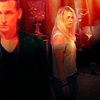
Icon Tutorial #1: End of the World
Go from this to 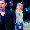
or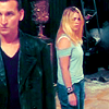
or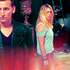
or
This tutorial is for Photoshop 7, and uses selective color so it's not really translatable to other programs, unless you can figure out a way to get similar coloring on your own. *shrugs* Sorry!
First I opened up a new image that was 100x100 pixels, with 72 resolution and a white background. I took my screencap, taken from here, clicked and dragged it into this new project, then went to Edit > Free Transform and reduced the image until I got a crop I liked. This is also where I fixed the wonky aspect ratio. The image is stretched vertically, so I made it wider to fix the problem. Then I hit enter to apply the transformation.
Next, I went to Filter > Sharpen and sharpened once. The image is a little dark so I duplicated the layer and set it to screen. Now it's a little too bright, so I lowered the opacity to 55%.
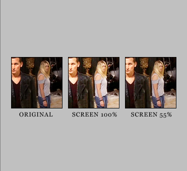
Then I clicked the little icon at the bottom of the layers palette that looked like a half-black, half-white circle (create a new adjustment layer), and under the menu that popped up, clicked on selective color. When using this little gem, I usually just fiddle around alot to see what works and what doesn't. Remember that no two images will turn out the same using selective color, but that images that have colors close to my original image here will obviously come out close.
Here's the settings I used, with the Method set to Relative:
Reds (-100, -15, -65, +20)
Yellows (-35, +25, +30, +30)
Whites (+100, -35, +20, -10)
Neutrals (+30, -10, -30, +10)
Blacks (+100, -9, -9, +10)
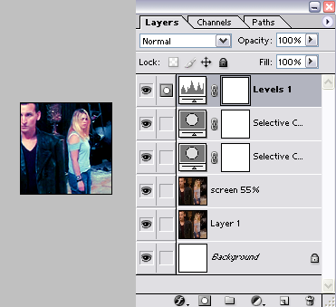
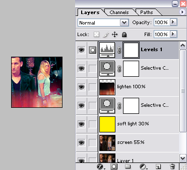
Then I duplicated the selective color layer but reduced the opacity to 50% to give the colors an oomph. After that, I created another new adjustment layer, this time levels and used these settings: RGB (15, 0.95, 230). That made the blacks blacker and added a bit of brightness to the lighter areas like their faces.
And that's it for this coloring! My Layers Palette and icon looked like this:
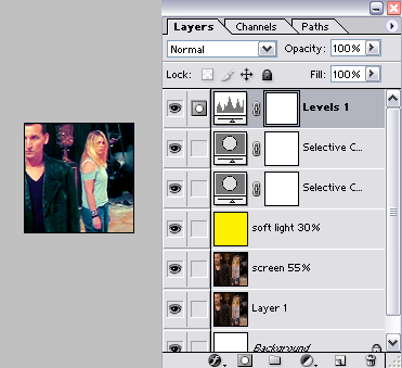
Now for some examples of variations you could do. I created a new layer right above the duplicated screen layer of Nine and Rose and flood filled it with #FFF200 (bright yellow). I set the layer to soft light and reduced the opacity to 30%. Keep in mind that you can go through every layer style and different opacity levels to see what looks appealing; overlay looked pretty good too.
My Layers Palette and icon now look like this:
Now for a texture. I used this one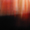
by iconographer, clicked and dragged it onto my icon and centered it, then went to Edit > Transform > Flip Vertical. I set it to lighten at 100%, but I didn't like the color and position, so a dragged the layer down a little so it wasn't covering them so much, then in the layers palette, I dragged the layer down underneath the levels and inbetween the selective color layers, which turned it from orange-y to pink-y.
My Layers Palette and icon now look like this:
Now, here's another way to use the texture. In the layer palette, I dragged it back up to the top, set it to hard light at 100%, then on my icon, I recentered it, and went to Edit > Transform > Flip Vertical (basically changing it back to it's original position).
I personally think the texture is really dark over Nine's face, so I clicked on the original image layer, then selected the Dodge tool, with a 45 pixel soft brush, settings: Range: Highlights, Exposure: 13% and just did a few quick sweeps over his face. The Dodge tool lightens colors by various means. Highlights makes the color you're lightening really bright, while Shadows has a bit of grayness to it, and Midtones is sort of inbetween. Anyway, point is, I lightened his face so you can see it better from behind the texture.
Thusly:
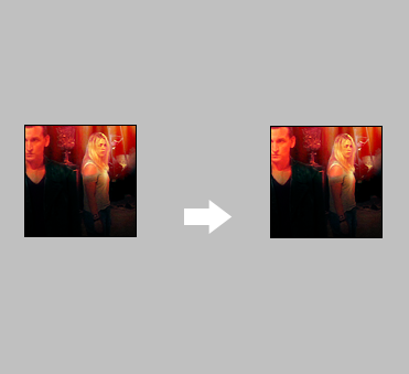
Okay, so with that finished, this variation is done!
My Layers Palette and icon now look like this:
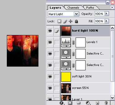
There's four icons with only changing a few things. Hope it wasn't too hard to understand!
Feel free to snag these icons, just credit me please! :D

::
::
::

or

or

or

This tutorial is for Photoshop 7, and uses selective color so it's not really translatable to other programs, unless you can figure out a way to get similar coloring on your own. *shrugs* Sorry!
First I opened up a new image that was 100x100 pixels, with 72 resolution and a white background. I took my screencap, taken from here, clicked and dragged it into this new project, then went to Edit > Free Transform and reduced the image until I got a crop I liked. This is also where I fixed the wonky aspect ratio. The image is stretched vertically, so I made it wider to fix the problem. Then I hit enter to apply the transformation.
Next, I went to Filter > Sharpen and sharpened once. The image is a little dark so I duplicated the layer and set it to screen. Now it's a little too bright, so I lowered the opacity to 55%.

Then I clicked the little icon at the bottom of the layers palette that looked like a half-black, half-white circle (create a new adjustment layer), and under the menu that popped up, clicked on selective color. When using this little gem, I usually just fiddle around alot to see what works and what doesn't. Remember that no two images will turn out the same using selective color, but that images that have colors close to my original image here will obviously come out close.
Here's the settings I used, with the Method set to Relative:
Reds (-100, -15, -65, +20)
Yellows (-35, +25, +30, +30)
Whites (+100, -35, +20, -10)
Neutrals (+30, -10, -30, +10)
Blacks (+100, -9, -9, +10)
Then I duplicated the selective color layer but reduced the opacity to 50% to give the colors an oomph. After that, I created another new adjustment layer, this time levels and used these settings: RGB (15, 0.95, 230). That made the blacks blacker and added a bit of brightness to the lighter areas like their faces.
And that's it for this coloring! My Layers Palette and icon looked like this:

Now for some examples of variations you could do. I created a new layer right above the duplicated screen layer of Nine and Rose and flood filled it with #FFF200 (bright yellow). I set the layer to soft light and reduced the opacity to 30%. Keep in mind that you can go through every layer style and different opacity levels to see what looks appealing; overlay looked pretty good too.
My Layers Palette and icon now look like this:

Now for a texture. I used this one
by iconographer, clicked and dragged it onto my icon and centered it, then went to Edit > Transform > Flip Vertical. I set it to lighten at 100%, but I didn't like the color and position, so a dragged the layer down a little so it wasn't covering them so much, then in the layers palette, I dragged the layer down underneath the levels and inbetween the selective color layers, which turned it from orange-y to pink-y.
My Layers Palette and icon now look like this:

Now, here's another way to use the texture. In the layer palette, I dragged it back up to the top, set it to hard light at 100%, then on my icon, I recentered it, and went to Edit > Transform > Flip Vertical (basically changing it back to it's original position).
I personally think the texture is really dark over Nine's face, so I clicked on the original image layer, then selected the Dodge tool, with a 45 pixel soft brush, settings: Range: Highlights, Exposure: 13% and just did a few quick sweeps over his face. The Dodge tool lightens colors by various means. Highlights makes the color you're lightening really bright, while Shadows has a bit of grayness to it, and Midtones is sort of inbetween. Anyway, point is, I lightened his face so you can see it better from behind the texture.
Thusly:

Okay, so with that finished, this variation is done!
My Layers Palette and icon now look like this:

There's four icons with only changing a few things. Hope it wasn't too hard to understand!
Feel free to snag these icons, just credit me please! :D

::

::

::
