Tutorial: Icon: Bright & Sunny: Photoshop 6 and above
I will be explaining the techniques for making icons like these:

or
Note: This tutorial assumes you have an intermediate understanding of Photoshop. I will not be explaining basic techniques.
I started out with a picture of Jennifer Garner [click here]
These techniques work quite well with pictures that are already quite brightly lit (esp with sunshine) and yellowish.
1. Preparing the Base
I chose the bit of the picture I wanted to use, cropped it and then resized it to 100x100. I made sure to not fill the whole icon with her head, because apart from not looking very good (in my opinion), I wanted to leave some space at one of the sides to put the text later. You might also want to sharpen the base once (depending on the quality of your image).

2. Colouring
Add a blue gradient.
Layer mode: Exclusion. Opacity: 33%

»»»
This will slightly reduce the contrast and give the image a bit of a sepia look.
Next we're adding a yellow to white gradient.
Layer mode: Color Burn. Opacity: 40%

»»»
This will make the image slightly more yellow in the corner (which is needed so it doesn't look too washed out later).
We're now adding a b&w gradient.
Layer mode: Linear Dodge. Opacity: 68%

»»»
Using a layer like this on Linear Dodge is a neat trick to add a burst of light that comes from one direction. I erased part of the gradient that covers her face, otherwise it will look too washed out.
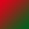
The next colour layer will be green and red.
Layer mode: Overlay. Opacity: 17%
»»»
This will add a little more contrast to her face and makes the icon look less washed out.
3. Text
It's time to do the text! I add a bar of white on the left side of my image, so the text won't blend into the background.

»»»
(The black on the example is just to indicate what should be transparent on your layer.)
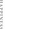
Add a text layer. And type a word that will fit.
Font: Baskerville Old Face. Size: 12pt. Anti-aliasing: Strong. Vertically scale: 130%. Horizontally scale: 130% Tracking: 150
Layer mode: Normal. Opacity: 56%
»»»
If you use a different word (which of course, you will, coz why would you want to make the same icon?? lol) you might have to change the settings a bit to make the word fit. Especially adjusting the tracking may help you if your word is too long/short. (The white on the example indicates transparency)
We're adding another text layer where we will put some tiny text (coz it's all the rage!)
Font: Baskerville Old Face. Size: 2pt. Anti-aliasing: Sharp. Tracking: 1000
Layer mode: Normal. Opacity: 61%
»»»
Just type anything you want, since no one's gonna be able to read it anyway! (White indicates transparency again!)
Now we're adding a orange/yellow gradient, but only on the part of the image with text.
Layer mode: Pin Light. Opacity: 12%

»»»
I did this because I thought the white stood out a bit too much, now the part with the text fits in nicely with the rest of the icon. (White.. = transparent)
4. Finishing up
Almost done now! You may want to skip this step depending on how sharp your image is and your preferences regarding sharpness. Select the part of your icon that doesn't have text on it (we don't want to sharpen the text, because it looks ugly). Copy Merged (Shift+Ctrl+C OR Edit, Copy Merged) and paste into a new layer. Now sharpen this layer.
Layer mode: Normal. Opacity: 29%

»»»
Increase/reduce opacity depending on whether your icon is too sharp/blurry.
And we're done!! Please let me know what you think of this tute, and if anything needs more explanation! Also, if you use this tute, I'd love to see what you come up with!

or

Note: This tutorial assumes you have an intermediate understanding of Photoshop. I will not be explaining basic techniques.
I started out with a picture of Jennifer Garner [click here]
These techniques work quite well with pictures that are already quite brightly lit (esp with sunshine) and yellowish.
1. Preparing the Base
I chose the bit of the picture I wanted to use, cropped it and then resized it to 100x100. I made sure to not fill the whole icon with her head, because apart from not looking very good (in my opinion), I wanted to leave some space at one of the sides to put the text later. You might also want to sharpen the base once (depending on the quality of your image).

2. Colouring
Add a blue gradient.
Layer mode: Exclusion. Opacity: 33%

»»»

This will slightly reduce the contrast and give the image a bit of a sepia look.
Next we're adding a yellow to white gradient.
Layer mode: Color Burn. Opacity: 40%

»»»

This will make the image slightly more yellow in the corner (which is needed so it doesn't look too washed out later).
We're now adding a b&w gradient.
Layer mode: Linear Dodge. Opacity: 68%

»»»

Using a layer like this on Linear Dodge is a neat trick to add a burst of light that comes from one direction. I erased part of the gradient that covers her face, otherwise it will look too washed out.
The next colour layer will be green and red.
Layer mode: Overlay. Opacity: 17%

»»»

This will add a little more contrast to her face and makes the icon look less washed out.
3. Text
It's time to do the text! I add a bar of white on the left side of my image, so the text won't blend into the background.

»»»

(The black on the example is just to indicate what should be transparent on your layer.)
Add a text layer. And type a word that will fit.
Font: Baskerville Old Face. Size: 12pt. Anti-aliasing: Strong. Vertically scale: 130%. Horizontally scale: 130% Tracking: 150
Layer mode: Normal. Opacity: 56%

»»»

If you use a different word (which of course, you will, coz why would you want to make the same icon?? lol) you might have to change the settings a bit to make the word fit. Especially adjusting the tracking may help you if your word is too long/short. (The white on the example indicates transparency)
We're adding another text layer where we will put some tiny text (coz it's all the rage!)
Font: Baskerville Old Face. Size: 2pt. Anti-aliasing: Sharp. Tracking: 1000
Layer mode: Normal. Opacity: 61%

»»»

Just type anything you want, since no one's gonna be able to read it anyway! (White indicates transparency again!)
Now we're adding a orange/yellow gradient, but only on the part of the image with text.
Layer mode: Pin Light. Opacity: 12%

»»»

I did this because I thought the white stood out a bit too much, now the part with the text fits in nicely with the rest of the icon. (White.. = transparent)
4. Finishing up
Almost done now! You may want to skip this step depending on how sharp your image is and your preferences regarding sharpness. Select the part of your icon that doesn't have text on it (we don't want to sharpen the text, because it looks ugly). Copy Merged (Shift+Ctrl+C OR Edit, Copy Merged) and paste into a new layer. Now sharpen this layer.
Layer mode: Normal. Opacity: 29%

»»»

Increase/reduce opacity depending on whether your icon is too sharp/blurry.
And we're done!! Please let me know what you think of this tute, and if anything needs more explanation! Also, if you use this tute, I'd love to see what you come up with!