[T#1/T#2] X/1999 and Full Moon wo Sagashite
From 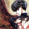
to
Using PS7
First, we choose an image. This is what I chose. After cropping and resizing, I get this base:

Now it looks a bit too dark. So, I duplicated my base and set it to SCREEN and played with the opacity. I chose 53%.

→
It's lighter now. But it still looks a bit too colorless. For this, I added a HUE/SATURATION layer [Image → Adjustments → Hue/Saturation]. These are what I placed:
Saturation: 40

→
Now it looks colorful! :3 Although there are still obvious lifeless color in some places, I added a new layer, filled it with #DDFFFC, and set it to COLORBURN. Now some of the lifeless shadows are filled with color. XD It looks a bit sharper now, as well.

→
And you're done with the coloring! To add effects, I suggest that you use GRAY GRUNGE textures. For what I did, I added a texture by toybirds and set the layer to MULTIPLY.

→
Then, a small tiny text brush.

→
Lastly, a light texture by graphic_sl and set the layer to SCREEN. I toggled the picture a bit so it would be perfect for the picture.

→
And there's your icon! :D

→
OVERVIEW
★Works best when there are lifeless colors in the image
★The image has a bit of red in the overall look
★Add the color burn layer only if you want it to look a bit sharper, and a bit darker without completely ruining the color
★For effects, it is best that you use a gray grudge texture, and a light texture.
OTHER EXAMPLES:


PSD: http://www.savefile.com/files/1527813
http://sharebee.com/72e57a32
From
to
Using PS7, with selective coloring
Again, first, we take an image. Since there are more than one person, you can choose whoever. For this image, I chose this as the base:

Just like the base before this, the color seems a bit too lifeless. For anime scans, I can say that HUE/SATURATION layers will be your best friend. XD; So, add a HUE/SATURATION layer [Image → Adjustments → Hue/Saturation]. This is what I placed:
Saturation: +51

→
It still looks a bit dull. Again, I added a new HUE/SATURATION layer [Image → Adjustments → Hue/Saturation].
Saturation: +12

→
Though it now has more color, there aren't much contrasts. So, I added a SELECTIVE COLOR layer. [Image → Adjustments → Selective Color] These are what I placed:
REDS: 100 | 100 | 100 | 100
YELLOWS: 100 | 0 | 100 | 0
CYANS: 100 | 0 | 0 | 0
BLUE: 100 | 0 | 0 | 0
NEUTRALS: 30 | 0 | -50 | 0

→
YAY FOR CONTRAST! :3 Not only that, it also enhanced the colors, and now it's darker and at least more pleasing to the eyes. From here on end, you don't have to follow the next instructions, but if you want a bit more blue in your icon, then feel free to follow. What I did after was to add a PHOTO FILTER layer [Image → Adjustments → Photo Filter].
Filter: Cyan
Density: 25%
Preserve Luminosity: CHECK

→
The layer added a bit of light to the shadows. It's now a little less red. :) The next layer won't necessarily do anything special, but it does help with sharpening the image a bit without drastically changing the color and the image. I added a new layer and filled it with #EEFFFA, then set the layer to COLOR BURN, and opacity 100%.

→
And for the final touch! A bit of blue light texture by sanami276, and set the layer to SCREEN.

→
Hence, this is the result! :D

→
OVERVIEW
★Works best with a sky and/or something blue is major in the image
★Toggle the first HUE/SATURATION layer if the image won't go well with the coloring
OTHER EXAMPLES:


PSD: http://www.savefile.com/files/1527817
http://sharebee.com/99a1e7d3
There you have it! XD; This is my second time to create a tutorial, so I do hope they're to your liking. I would love to see your results! XD;
☆Experiment on the opacity of the layers
☆Experiment on the color layers (i.e. #EEFFFA can be changed to something lighter or darker)
☆Resources may be found here.
☆Comments make me happy♥.
☆Feel free to watch.

to

Using PS7
First, we choose an image. This is what I chose. After cropping and resizing, I get this base:

Now it looks a bit too dark. So, I duplicated my base and set it to SCREEN and played with the opacity. I chose 53%.

→

It's lighter now. But it still looks a bit too colorless. For this, I added a HUE/SATURATION layer [Image → Adjustments → Hue/Saturation]. These are what I placed:
Saturation: 40

→

Now it looks colorful! :3 Although there are still obvious lifeless color in some places, I added a new layer, filled it with #DDFFFC, and set it to COLORBURN. Now some of the lifeless shadows are filled with color. XD It looks a bit sharper now, as well.

→

And you're done with the coloring! To add effects, I suggest that you use GRAY GRUNGE textures. For what I did, I added a texture by toybirds and set the layer to MULTIPLY.

→

Then, a small tiny text brush.

→

Lastly, a light texture by graphic_sl and set the layer to SCREEN. I toggled the picture a bit so it would be perfect for the picture.

→

And there's your icon! :D

→

OVERVIEW
★Works best when there are lifeless colors in the image
★The image has a bit of red in the overall look
★Add the color burn layer only if you want it to look a bit sharper, and a bit darker without completely ruining the color
★For effects, it is best that you use a gray grudge texture, and a light texture.
OTHER EXAMPLES:


PSD: http://www.savefile.com/files/1527813
http://sharebee.com/72e57a32
From

to

Using PS7, with selective coloring
Again, first, we take an image. Since there are more than one person, you can choose whoever. For this image, I chose this as the base:

Just like the base before this, the color seems a bit too lifeless. For anime scans, I can say that HUE/SATURATION layers will be your best friend. XD; So, add a HUE/SATURATION layer [Image → Adjustments → Hue/Saturation]. This is what I placed:
Saturation: +51

→

It still looks a bit dull. Again, I added a new HUE/SATURATION layer [Image → Adjustments → Hue/Saturation].
Saturation: +12

→

Though it now has more color, there aren't much contrasts. So, I added a SELECTIVE COLOR layer. [Image → Adjustments → Selective Color] These are what I placed:
REDS: 100 | 100 | 100 | 100
YELLOWS: 100 | 0 | 100 | 0
CYANS: 100 | 0 | 0 | 0
BLUE: 100 | 0 | 0 | 0
NEUTRALS: 30 | 0 | -50 | 0

→

YAY FOR CONTRAST! :3 Not only that, it also enhanced the colors, and now it's darker and at least more pleasing to the eyes. From here on end, you don't have to follow the next instructions, but if you want a bit more blue in your icon, then feel free to follow. What I did after was to add a PHOTO FILTER layer [Image → Adjustments → Photo Filter].
Filter: Cyan
Density: 25%
Preserve Luminosity: CHECK

→

The layer added a bit of light to the shadows. It's now a little less red. :) The next layer won't necessarily do anything special, but it does help with sharpening the image a bit without drastically changing the color and the image. I added a new layer and filled it with #EEFFFA, then set the layer to COLOR BURN, and opacity 100%.

→

And for the final touch! A bit of blue light texture by sanami276, and set the layer to SCREEN.

→

Hence, this is the result! :D

→

OVERVIEW
★Works best with a sky and/or something blue is major in the image
★Toggle the first HUE/SATURATION layer if the image won't go well with the coloring
OTHER EXAMPLES:


PSD: http://www.savefile.com/files/1527817
http://sharebee.com/99a1e7d3
There you have it! XD; This is my second time to create a tutorial, so I do hope they're to your liking. I would love to see your results! XD;
☆Experiment on the opacity of the layers
☆Experiment on the color layers (i.e. #EEFFFA can be changed to something lighter or darker)
☆Resources may be found here.
☆Comments make me happy♥.
☆Feel free to watch.